hi,
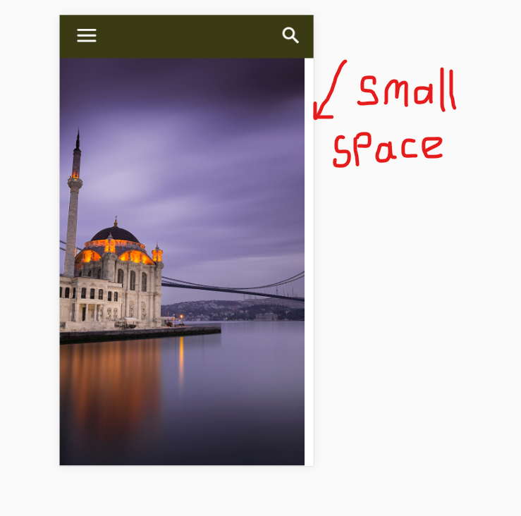
In mobile view, there is a small gap to the right of the screen in the slider. is not a problem when the page is first loaded. but then a small space appears to the right of the screen when I hit the search button. I struggled to solve it for hours. I tried on many phones. but it always happens.
what do you think? what is the reason for this?
https://i.hizliresim.com/Lb8N6Z.png
(I’m sorry to keep you busy)

Indeed there seems to be a space created when the search is opened and the keyboard appears, visible because of the transparent modal
– https://www.screencast.com/t/bb66nhr9
Try entering this code in Theme panel->Advanced CSS in the phones section
.td-search-opened .rev_slider_wrapper.fullscreen-container {

left: -20px!important;

}
The result should be like this – https://www.screencast.com/t/wxpHGEn1i
This solution only works when the search panel is open. The gap again appears when you close the search panel. Is it sourced from this theme or is it from revslider. I wonder is it happening on other sites. https://www.youtube.com/watch?v=B3-T4xR8OnU&feature=youtu.be


Hello,
This does not happen on our demo though:
https://demo.tagdiv.com/newspaper/
When I set a transparent background on my end, there is no spacing on the right. all of the content backs up a bit to make room for the mobile menu: https://www.screencast.com/t/XNBYLBVHvDe2
Thank you!