

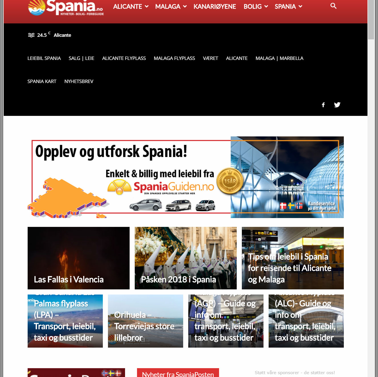
I’m not happy with the appearance of the secondary menu (black background) on my website using viewing vertical display on a tablet. A lot of space is wasted for nothing. It don’t look good and user need to scroll more. Do you have a suggestion how to make it more compact and use the space better ? I fix this with custom CSS or via theme panel?

Hi,
The menu items go on 2 lines because you have too many menu items. The only elemgant solution i see for the moment is to rmeove the weather and social icons from the top menu on tablets. Here is an example code:
@media (min-width:767px) and (max-width:1040px){

.td-header-sp-top-widget,

.td-weather-top-widget{

display:none!important;

}

}
Unfortunately if you have too many menu items, they will fall on separate rows as there is not enough space to accommodate all elements on smaller devices.
Thank you!
Hi Bogodan, my problem is related to the “spacing” around the text.. You see there if I run a menu over two lines.. that there is a HUGE amount of space there that is not nececary. That space is what I assume we can reduce in CSS?? The weather I think we can remove via theme panel.. so I don’t worry about that.
The space comes from the weather and the social icons. They fall on another line when the menu falls on 2 lines. Each of theme have their own margins and padding.
You can remove them from the theme panel but not for mobile devices in particular.
If you want to further decrease the spacing, you cna do it with the line height on the menu items. This is set from the theme panel but it will affect the desktop as well. If you do not want to affect the desktop version you can use this code:
@media (min-width:767px) and (max-width:1040px){

.td-header-style-12 .top-header-menu>li, .td-header-style-12 .td-header-sp-top-menu, .td-header-style-12 .td-header-sp-top-widget{

line-height: 28px;

}}
Thanks.
Hello,
The top menu cannot show on mobile devices. It was never designed to. You can place it at the top in the mobile version as well if needed. You can try this css:
@media (max-width: 767px){

.td-header-top-menu-full {

    display: block!important;

}

.td-header-sp-top-menu {

display:block!important;

}

.td-header-style-12 .top-header-menu > li, .td-header-style-12 .td-header-sp-top-menu, .td-header-style-12 .td-header-sp-top-widget{

line-height:30px;

}

#menu-secondary-navi-menu{

text-align:center;

}

}
Thank you!
