Hi there,
I have two requests.
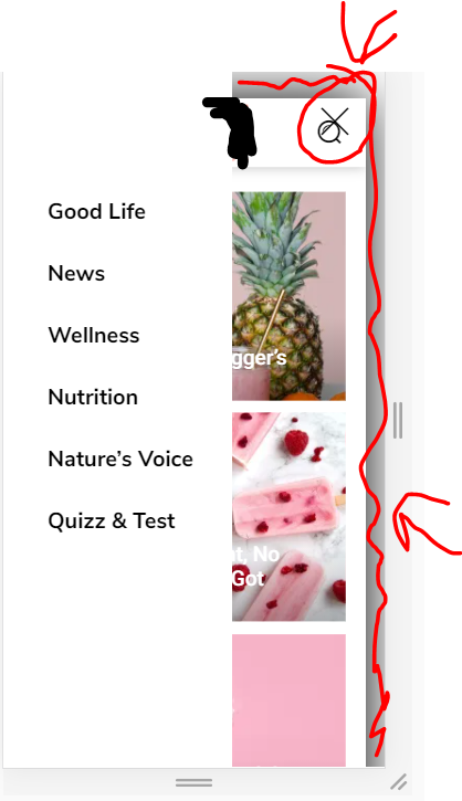
1. How to make the mobile menu to take only half the space instead of the entirety of the screen?
I already changed the (.td-menu-background class) width to 50% and the background to white. But the X button is still on the far right. How to put close icon closer, and also remove the animation of the page on the background, which becomes smaller when the menu is opened?
https://i.ibb.co/fHtP3Cf/image.png
2. The same thing for the search thingy. I want to completely remove the transparent white so it is completely transparent with no color.

Hello !
That you should be able to edit using tagDIv Composer from what I can see. Also please note that having half menu may cause you google issues due to buttons or text too small.
Please send us a link to your website in order to inspect and see what can be done.
Thank you !
Hi,
The URL is https://bit.ly/2PoxxYs.
The tagdiv composer doesn’t give any options to modify the mobile activated menu and the search form. Or am I missing something
I reverted the changes made, so you can provide a better and more unified CSS solution.
-
This reply was modified 5 years by
siteownser.
Hello !
We can take a look to see what the issue might be there. Please contact us via email at contact@tagdiv.com and provide the following:
– admin url and credentials
– A link to this topic in order to identify you
Our team will take a look !
Thank you !

Why are You Not Reply my Problem?
I have been waiting for the last 20 to 22 hours. My Blog is Crashed after 10.4 Update, still my Blog and admin Page is not Open.
Do you have nothing to do with me?

Hello!
I replied to your topic.
Please note that we try to answer to as many topics we can (support hours (GMT+2) are from Monday to Friday: 8:00 AM – 17:00 PM), we start from the oldest to newest, once that is set a new reply in a topic this will be move the new topics, therefore it can take some time until we get back to your topic.
Let’s continue the discussion in your topic!
Thank you for your understanding!