

Hi tagDiv.
Maybe this is not a part of your support, I don’t know. Maybe it is a quick fix anyway that you can help me with.
Take a look here: https://farsoavis.kennethhedegaard.com/
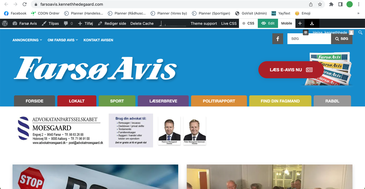
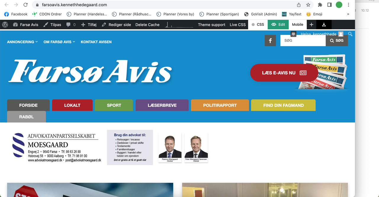
I need the header menu (the colored tabs) to be 100% width and responsive. So the tabs have to stretch from side to side.
I think I have tried everything in your composer, without luck 🙁 But it seems like a pretty default feature, right?
Thank you.

Hi,
I think that you are referring to this section https://i.imgur.com/PKu0Bxf.png normally, with our theme you can stretch the row that hold the elements using the tagDiv Composer -> https://i.imgur.com/ogrkghL.jpg
I hope this will help you!
Hi Calin.
I think you misunderstood me.
Take a look at my explanation here: https://www.youtube.com/watch?v=iwtxIUnDRL4
Hi,
Please change the padding from 41.7 to 41 -> https://i.imgur.com/2Kee7Rr.png and the results will be -> https://i.imgur.com/Y7YquFY.jpg
Thank you!
Hi,
I see, you are referring when you set some specific width size the menu element is not adjusted. I think that this is because the adjustment is set only on port views -> https://i.imgur.com/qCECWvQ.png and on each view have a variation of width, now the problem is that the menu element in each port width have a fixed with and to make it to adjust for each px width is request a little much work.
I will check the settings and see what is the most simple solution for this.
Thank you for your understanding!
Hi,
Please try this custom css:
@media only screen and (min-width: 768px) and (max-width: 785px)  {

#menu-main-menu-1  li  a{

    padding: 0px 12px!important;

}

}

@media only screen and (min-width: 1018px) and (max-width: 1033px)  {

#menu-main-menu-1  li  a{

    padding: 0px 28px!important;

}

}

 @media only screen and (min-width: 1140px) and (max-width: 1236px)  {

#menu-main-menu-1 li  a{

    padding: 0px 34px;

}

}
Set the code in the theme panel > custom code> custom css.
I hope this will help!



