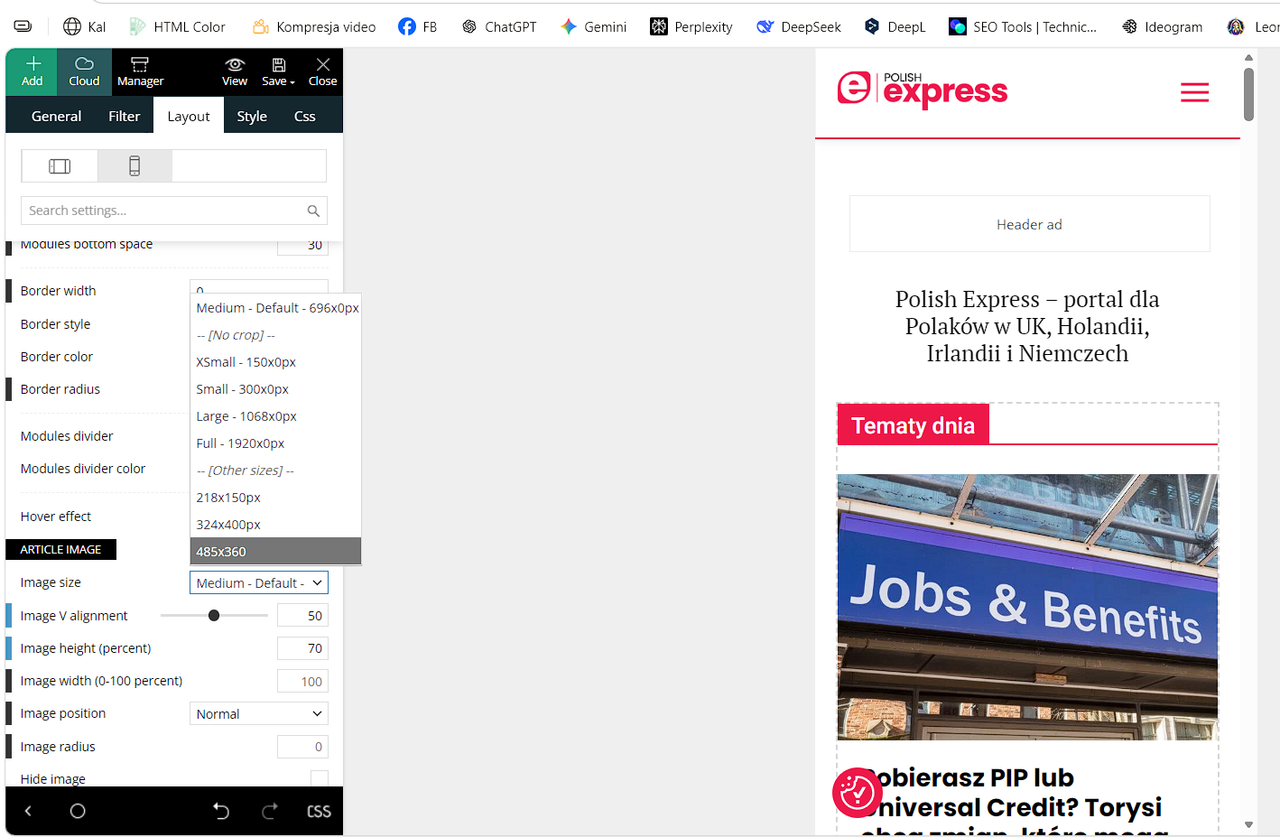
Hi,
I need clarification on how the image size selector works in Newspaper, especially when using separate templates for desktop and mobile (Single Post Desktop + Single Post Mobile).
Google Discover requires an image ≥1200px in the HTML.
However, the size dropdown (Medium 696, Large 1068, Full 1920, etc.) seems to limit the maximum size included in the HTML.
My questions:
If I select “Full – 1920px” in the mobile template, can mobile devices download the full 1920px file?
Some users report this happens when Mobile Theme or optimization plugins break srcset.
Does selecting Medium/696 or Large/1068 in the mobile template remove larger sizes from the HTML and srcset?
If yes, Discover cannot detect a 1200+ px image.
How does the Mobile Theme handle image sizes when a separate mobile template is used?
Does it override the desktop template or generate its own srcset?
What is the recommended setting for publishers who rely on Google Discover when using separate mobile and desktop templates?
Full/1920 or something else?
I need an official explanation of how this mechanism works so I can configure the theme correctly.
https://i.postimg.cc/Y9Cp6MwT/Zrzut-ekranu-2026-05-06-153554.png
Thanks.

Hi,
Based on your screenshot, I understand that you are referring to the thumbnails used in Flex Blocks. These allow you to choose the specific thumbnail format for each block individually.
Please make sure that the thumbnail size you want to use is enabled in the Theme Panel. After that, you should regenerate the thumbnails so the required thumbnail version is properly created and available for use.
Normally, when an image is uploaded and the thumbnail size is already enabled, the thumbnail is generated automatically. However, if that thumbnail size was enabled only after the images were uploaded, the corresponding thumbnail version does not exist yet. In that case, the block will use the full-size image instead.
To resolve this, you will need to use a thumbnail regeneration plugin to generate the missing image sizes.
-> https://forum.tagdiv.com/theme-thumbs/
-> https://wordpress.org/plugins/search/Regenerate+Thumbnails/
Thank you!
Hi, thanks for the reply.
My question is not about thumbnails in Flex Blocks.
I am asking specifically about the Featured Image size in the Single Post Mobile Template.
Does selecting “Full – 1920px” in the mobile template include the full 1920px file in the HTML srcset? Or does the Mobile Theme generate its own srcset?
I need to know which setting guarantees that Google Discover sees an image ≥1200px in the HTML.
Hi,
If the Full – 1920px option is selected, the full-size image will be displayed. However, this is not recommended for mobile devices due to performance and loading speed considerations.
It would be better to use a smaller thumbnail size, such as: 696 x 0, or maximum 1068 x 0
Please make sure that the selected thumbnail size actually exists. If it was not previously generated, you will need to use a thumbnail regeneration plugin. Otherwise, the full version of the featured image will be used.
Thank you!
Hi,
I need to clarify something important regarding Google Discover requirements.
Google Discover has a strict rule: the featured image in the HTML must be ≥1200 px.
If I select 696 or 1068 in the Single Post Mobile Template, the HTML will not contain an image ≥1200 px.
As a result, the article may not be eligible for Discover.
This means that the recommendation to use smaller thumbnails (696 or 1068) might be good for PageSpeed, but it is bad for Discover eligibility.
For publishers who rely on Discover traffic, the only safe option is to keep Full – 1920 px in both desktop and mobile templates, and then optimize loading via srcset, WebP, or lazyload plugins.
Can you please confirm officially:
Does the Mobile Template still include the 1920 px version in the HTML srcset when a smaller size is selected?
If not, how can we guarantee Discover compliance without sacrificing performance?
Thank you!
Hi,
Just a few follow-ups for clarification.
When you mention the “Single Post Mobile Template,” are you referring to the mobile page created with tagDiv Composer, rather than the Mobile Theme plugin?
If that’s the case, you can select the preferred size for the featured image. I believe this is the image in question and the one triggering the Google Discover notice. You may set it to 1920px, but please also ensure that the original uploaded image is at least 1200px wide. This will allow the theme to properly serve the full-resolution version of the image.
Hi, thank you for the clarification.
Yes — I’m referring to the Single Post Mobile Template created in tagDiv Composer, not the old Mobile Theme plugin.
If I choose a smaller featured image size in the mobile template (for example 696px or 1068px), will the theme still generate the full srcset, including the larger versions (1200px+, 1600px, 1920px), as long as the originally uploaded image is large enough?
This is important because Google Discover requires the mobile HTML to expose an image of at least 1200px in the srcset, not only in the desktop template.
So my question is:
Does selecting a smaller display size in the mobile template limit the largest image included in the srcset, or will the theme always include the full-size variants if they exist?
Thanks again for your help.
Hi,
“If I choose a smaller featured image size in the mobile template (for example, 696px or 1068px), will the theme still generate the full srcset, including the larger versions (1200px+, 1600px, 1920px), as long as the originally uploaded image is large enough?”
– as long as the thumbnail generation is enabled in the Theme Panel, it will be created automatically https://prnt.sc/I-hMNqYa2rj-
“Does selecting a smaller display size in the mobile template limit the largest image included in the srcset, or will the theme always include the full-size variants if they exist?”
– to ensure the image is at least 1200px wide, please use the 1920×0 size option. This will load the full-size image if it is under 1920px in width, or generate a 1920px thumbnail if the original image is larger, and use that version for the source.