
- TutorialsFrom WPBakery to tagDiv Composer
- TutorialsWhat is Ajax preloading?
 julingn
Hi,
my desktop header has a white background color. On mobile the bg color switches to black. How can I change the bg color in header for mobile devices?
Thanks in advance,
julingn
 Alin [tagDiv]
  jeffreya93
Hi,
The updates works fine, one simple question, is it possible to hide the sidebar for mobile?
In V4 we created;
div.span4.column_container{display:none !important;}
For V6 this is not working.
Thanks
 Rony123456
Hello,
I updated to v5 and most of the things are fine. I have a few issues though.
1. I want to change module 5 resolution from 324 x 235 to 314 x 160. Where is the file which contains the needed code?
2. My old featured images inside articles have bad resolutions. I want to force all them to appear on 16;9 ratio or just like all normal thumbnails with resolution of 696 x 392 pixels.
Here’s a good featured image: http://www.naldotech.com/flash-android-5-1-1-firmware-on-t-mobile-galaxy-s6-sm-g920t/
And bad featured image: http://www.naldotech.com/how-to-check-galaxy-s4-battery-temperature/
Basically, I want to limit the height of that tall image to 392 pixels.
3. When I use a mega menu with 3 sub categories, It doesn’t do anything when I click on the subcategories.
4. I have a cateofry with 2 sub menus. When I click the big category, it drops down and shows the two other categories. Any way to make the menu drop down with mouse hover instead of clicking, so users can click on the main category too?
Also, I don’t want parent categories to appear on articles, only sub categories. Basically, when I select a sub category, the parent category automatically shows up. I disabled this on v4 by commenting a line but it has changed on this version.
Well that is all I need. Have a great day!
Site: http://www.naldotech.com
Alin [tagDiv] Hi,
You have these errors in the console – http://screencast.com/t/aGLY6Hjh2 please check this without any plugins active, leave just Visual Composer active, clear cache and see if you still have this issue with gallery.
Unfortunately this delay usually happens when speed booster is used as the css and js are moved at the bottom of the page structure, so that the page will load faster. That’s why the theme’s default style appears first then changes, because of the cascading property of css. To avoid this you could try to make the changes directly into theme’s style file.
I also checked your page source and those css resources are moved to the bottom, you also can check – http://screencast.com/t/vkHNjMZu only jetpack sharing css is not moved – http://screencast.com/t/YGTYW5v11oxY Try to move also that css and see if you still have this issue when you test pagespeed on mobile.
Thanks!
Alin [tagDiv] Hi,
You can try this custom css in Theme Panel > Custom Css to change the thumb display on mobile form module 8 – http://screencast.com/t/ewsF96VpIk
@media (max-width: 767px){
.td_mod8 .item-details {
margin-left: 0px !important;
top: 15px !important;
}
.td_mod8 .thumb-wrap img {
max-height: 100%;
max-width: 100%;
width: 100%;
position: relative;
}
}
If you want to apply this only on your homepage just add .home class – .home .td_mod8 .item-details and .home .td_mod8 .thumb-wrap img
Hope this helps!
-
This reply was modified 11 years by Alin [tagDiv].
 cem
cem +1, that was the thread I started of and it helped a lot, no async plugin, no above the fold plugin, no minify plugin anymore.
I still have some nasty report from google for mobile speed but Desktop for all major speed test pages are now 94-98.
thx Chris for that !
 Crabouille
Hi,
I’m using M8 for the article list on the homepage but when switching to mobile the images are reduced to a tiny size and become useless, i was wondering if it is possible to keep M8 for desktop users and use M7 for mobile user ?
 simchris
 Why would the theme have anything to do with URLs posted on Facebook ?
The theme has nothing to do with how URLs are parsed. Meaning, if the URL you share to FB is correct and actually works, and somebody clicks that link – it will work if the site is accessible.
That is handled by your DNS, web server, and the ISP being able to resolve the DNS pointing at the IP where your website is hosted.
It might be a setting you have for Android users, or it may be that the caching of your CSS is mismatched on server and some android users or chrome users where chrome caches websites, is loading old CSS and not the new CSS and page will not load properly.
In those cases you need to clear server cache quite completely, where applicable; and a visitor who has a browser which doesn’t reload the CSS properly would need to hit “refresh” in their mobile browser to get the new CSS.
Sometimes you can force this by setting a very short TTL just for the CSS, like one hour, and let it be that way for a week — bad for pagespeed, but can “force” some browsers to make sure they only see new site CSS.
Might not be your issues; just a thought 🙂
simchris I personally haven’t found the need for retina versions — meaning, do you really want to have TWO versions of all your images AND all the thumbs ?
Fact is – most people looking at content on retina/HD are doing so on mobile devices (e.g., phone, iphone, iPad) and in effect if you have an image on your desktop version, when it appears on mobile the pixel density is still double … meaning if you show a responsive 640×480 image half size, technically the visible ‘density’ still appears “double” when viewed at 320×240 … all my desktop images look amazing on my retina iPhone 6 and iPad Air — no extra “retina” tomfoolery needed.
You may have a special need to do this, but for our sites it has been a non-issue.
If you’re trying to show retina images to UHD/retina desktop/TVs, where you want to show a 1280×960 image vs 640×480, then you’d need to find solution that does that just for the desktop viewport vs “all” viewports, where — as I’ve illustrated — it’s a bit redundant for mobile.
Not sure that helps in any way — just fully understand the hype around retina ready/compatible before wasting a lot of time on that. Content is still the most important element. 🙂
 nelito
Just installed the theme, everything was fine but i noticed something very strange. Some users can’t access the site when they click at links posted at my Facebook Page. I’ve noticed that the majority of them are using Android Phones. Since 80% of My traffic comes from Facebook and mobile, i deactivated the theme
cemHi,
the past few days I was busy getting the performance up and running without plugins (and doing not too bad so far).
But it seems that something messed up the slider display, photos are enlarged and the actual slider is not visible. And I can’t figure out what is causing this. Also the images show a darkened bottom, any chance to remove this ?
Since I’m here google pagespeed annoys with should fix this for mobiles (but not for desktop!):
Optimize CSS Delivery of the following:
http://www.dinckol.com/…-content/plugins/jetpack/css/jetpack.css
http://www.dinckol.com/…cons/genericons/genericons.css?ver=1.7.1
http://www.dinckol.com/…themes/Newsmag-child/style.css?ver=1.7.1
http://www.dinckol.com/wp-content/themes/Newsmag/style.css
I understand from what I have read so far the theme css’ hast to be loaded at top. Once you open my page you will see nonetheless a brief delay the style gets applied. any suggestions to improve mobile speed and visual experience?
Thanks
 jethron5000
Hi,
is it possible to centralize the logo for style 1 in mobile 1? If so, how can I go about doing it?
Thanks!
 p1mag
p1magHi guys,
The Mega Menu under the ‘Ultra’ section of my website only shows the first 5 sub categories/drop downs on both desktop and mobile. Any ideas why 4 are not showing? Below is a quick menu guide to show you what’s visible and what currently isn’t.
Ultra
Air (visible)
Concierge (visible)
Connoisseur (visible)
Covet (visible)
Land (visible)
Sea (not visible)
Style (not visible)
Tech (not visible)
Time (not visible)
Website: http://p1-mag.com/
 abarrell
Hey guys,
On my site – http://tweetperth.com.au/ when viewed on mobile and the mobile icon in the top left is pressed it doesn’t open.
Also I have noticed that on the desktop version that the search icon doesn’t work when pressed either.
Cheers
Adam
Alin [tagDiv] Hi,
Please check the above css solution, it is tested on your site and it should work fine(please use !important tag for width value).
@media (min-width: 768px){

.single .td-pb-span12.td-main-content .td-post-content iframe {

width: 650px !important;

display: table;

margin: 0 auto;

}

}
Yes, you are right about this, changing to 66% it will change the width also on mobiles, but the custom css should work. Please clear cache as I have checked your article and iframe is 100% as you can see – http://screencast.com/t/9eVOmWOJ554q
Thanks!
Alin [tagDiv] Hi,
Unfortunately Newsmag theme was initially designed at this width – 1021px – with an fixed grid layout, responsive as it is fluid and style for desktop/tables/mobile screens. So changing the width would not be easy as it needs changing the width value for all elements on pages and for this you would need custom work. I suggest to hire a freelancer to do this for you as we cannot provide any type of custom work at this time because we work hard on development, updates and support.
Thanks!
 gouravgola
 Hello, i am having trouble with this, when i changed it to 66%, it was also taking that 66% width on mobile screen, then i changed it back to 100%.. but still it’s taking 66% on desktop and mobs..
i have rechecked .js files many times, they are set to ‘100%’
please help!
 PLANEALIA
 Hi, I´ve made the change in menu-header.php, but now in the mobile version shown both, two logos.
Thank you very much!
Alin [tagDiv] Hi,
Unfortunately theme doesn’t have an option to change header ad position on mobile. A solution could be to disable header ad on mobile, use a custom ad bellow the menu for header style that you use(edit header.php file and use do_shortcode function) – http://screencast.com/t/PpSNXg2mbCII off course enable this custom ad for mobile from Theme Panel.
echo do_shortcode('[td_ad_box spot_id="custom_ad_1"]');
Result: http://screencast.com/t/ySMAR0Jp78IF
Thanks!
 vootou
Hi there,
I test link within page in pc , It work well at http://warrior.in.th/link-within-page/
but in mobile phone it does’t work.
(I use asus zenphone5 for testing)
how can i fix it ? ?
Regards,
Tu
 lighterside
Hi guys,
Is there a way to change the position of the 320×50 mobile leaderboard ad? My concern is ad-blindness vs click through rates. At the moment the mobile leaderboard loads “above the menu”. I hardly notice it. My eye-pattern recognizes “top menu” then I look down to get started on the content.
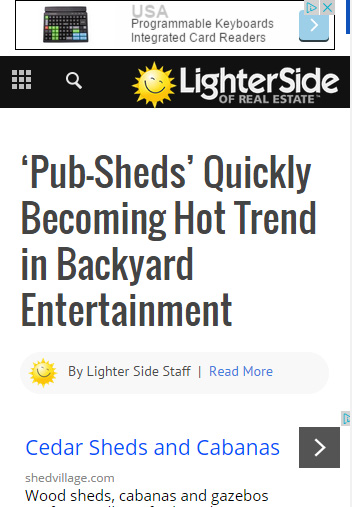
I’d like to position the mobile leaderboard ad BELOW the nav menu, just not sure how to do it without messing anything else up.
Appreciate any help!
Alin [tagDiv] Hi,
Please make sure that you set a category as megamenu properly – http://screencast.com/t/7d0cGgO5 it will display subcategories automatically on desktop and also on mobile menu – http://screencast.com/t/6a1QyzZ68IL – http://screencast.com/t/unabdNatx3Yy
Thanks!
Alin [tagDiv] Hi,
Unfortunately the header style 3(also header 6) use the same logo image also on mobile, you don’t have to upload a mobile logo. All header styles will be changed in Newspaper 5.
Until then you can try to make this change in menu-header.php file – http://screencast.com/t/2S3dTDOoo8u and now you can upload mobile logo – http://screencast.com/t/tMwGGtAbIOh this will be used on mobile devices.
You can activate the theme also when it will be moved on final domain. If you want to use it on multiple sites/domains you’d have to buy a license for each project.
Thanks!
-
This reply was modified 11 years by Alin [tagDiv].
 BrendaSarg
HI there, I have version 1.7.1 and when viewed on a mobile, the categories do not open to show articles?
Have I set something up wrong or what is the problem?
