

Hi!
I just updated to the new version of Newspaper. Everything looks good except for one thing: the header.
The name of my blog was shown on two lines. See this image below.
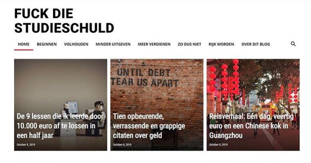
What happened? How can I change it back again?
(I used to create this effect by choosing a row that was separated into two parts. However, after the update, the text just keeps showing on one line, even though the row is separated in two parts.)
Help!
Thanks a lot,
Maaike
Oh, I forgot to mention a link.
See here:
https://www.fuckdiestudieschuld.nl

Hi,
There is no need to set the text logo on two rows, please set it like this -> https://i.imgur.com/19hBo2V.png after that adjust the size from style tab -> https://i.imgur.com/8nPZwIA.png
Hope this will help you!
Thank you!
That works on a desktop, thank you!
But not on mobile, unfortunately? It looks good in the preview but not live.
Ideas?
Hi,
Is look that you manage to set the logo on mobile too -> https://i.imgur.com/RkYyi5n.png
Thank you!
Yes, like that! But it’s fixed. Don’t ask me how, I think maybe changes in the mobile version take a little time to appear?
Anyway, I have one other question. Look at the mobile version of my site. Between the first three posts is a little white line. I like that.
Between the next three (so numbers four to six) there isn’t such a white line.
How can I add the line there as well?
Thank you!
Maaike
Hi,
You can edit the homepage with tagDiv Composer, check the mobile display, click on flex block and in css tab set a margin bottom -> https://i.imgur.com/nZM8pU4.png
Or you can use a custom css like this one -> https://i.imgur.com/shXLYuW.png
.page .td_block_big_grid_flex_1{

    margin-bottom: 2px !important;

}
Thank you!



