

Hey,
Can you include a fix, for the headers, that contain backgrounds. So if you just make it a background (colored or image), the sides go too wide (the only fix is to place 1 in the margins, and then it’s exact width like the rest of the divs/modules). Please see this screenshot: 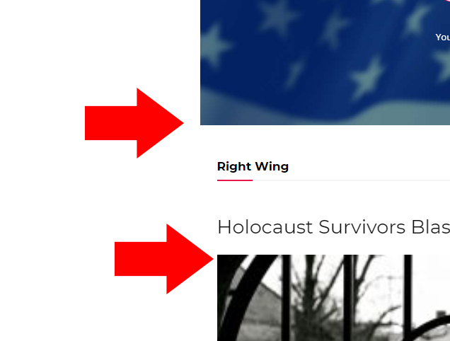
The live websites is here, you will see the top header: https://www.conservativesociety.org/
This is a problem, that we wait an update for – for a very long time, please see it, so the fix we do is like in this screenshot here: 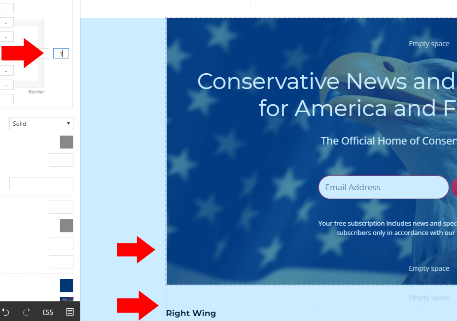
As you can see, when we type in 1, it works – but this is not a real fix, it should have the right width especially, if we own more than 20 websites, and having 4-5 header pages for each – it’s about 100 pages to fix.

Hi,
I asked the designers about this problem and they said that this is not a problem, this is the way it was made to work/look, the “EMPTY COLUMN” need to be equals -> https://www.screencast.com/t/UJqcbWa5h , if you set margin 0 or 1 this will not longer be equals -> https://www.screencast.com/t/S4nSkHA2nE6
Thank you for your understanding!
Hi Calin,
Well… why it is not by default like that? We have to each time adjust it – when it is broken basically.
Hi,
I think that you do not understand correctly, by default the “EMPTY COLUMN” need to have a equal width, by setting the margin left/right 0/1 the width of empty column will not longer be equal.
If this is a problem for you, then you can use a custom css that will be apply all time on all those row elements
-> https://www.screencast.com/t/Heyg7sTvnKab
.tdc-element-style{

    margin-left: 0px !important;

    margin-right: 0px !important;

}
You need to set the code in Theme Panel>Custom code> Custom css
Thank you!
Right, but it’s not empty, it has a background and the left-right width should be equal to below elements. Like in my case – the modules.
Hello,
The background image/color is not like you set a hero image or other element in empty column ( inside the row ), this is apply on the row.
You’ll need to set and element/block and set the background image on that element not the row, then should be show like you want.
-> https://www.screencast.com/t/h0KJhdItTN
Thank you!
I am applying background image to the row itself. Now you suggest to use some temporary patches in order to make it work – I think it should be by default like that. Why would a row show with edges off if I apply a background to it?
Hello,
This is the using space if you do not have set a background image /color on the row -> https://www.screencast.com/t/970jKUM4LL and this is when you’ll use background – on the row -> https://www.screencast.com/t/Aw4essF2d
In this was build to work, the space for row is 1116px by default and have set padding left-right 24px, when you set the background this will be apply on padding too, in this way should work and in this way is working!
Thank you for your understanding!
Right, why then modules below are not set with that padding as well? It doesn’t make sense..
Hi,
The container without padding are the columns for blocks modules, the padding is set for background image/color and for the smaller screens, in this way the content will have a blank space on the left and right (example).
If there is anything else with I can help you, just let me know!
Thanks.
