I did already to support but of course:
https://magazin.adeba.de/thema/baby/
Hi,
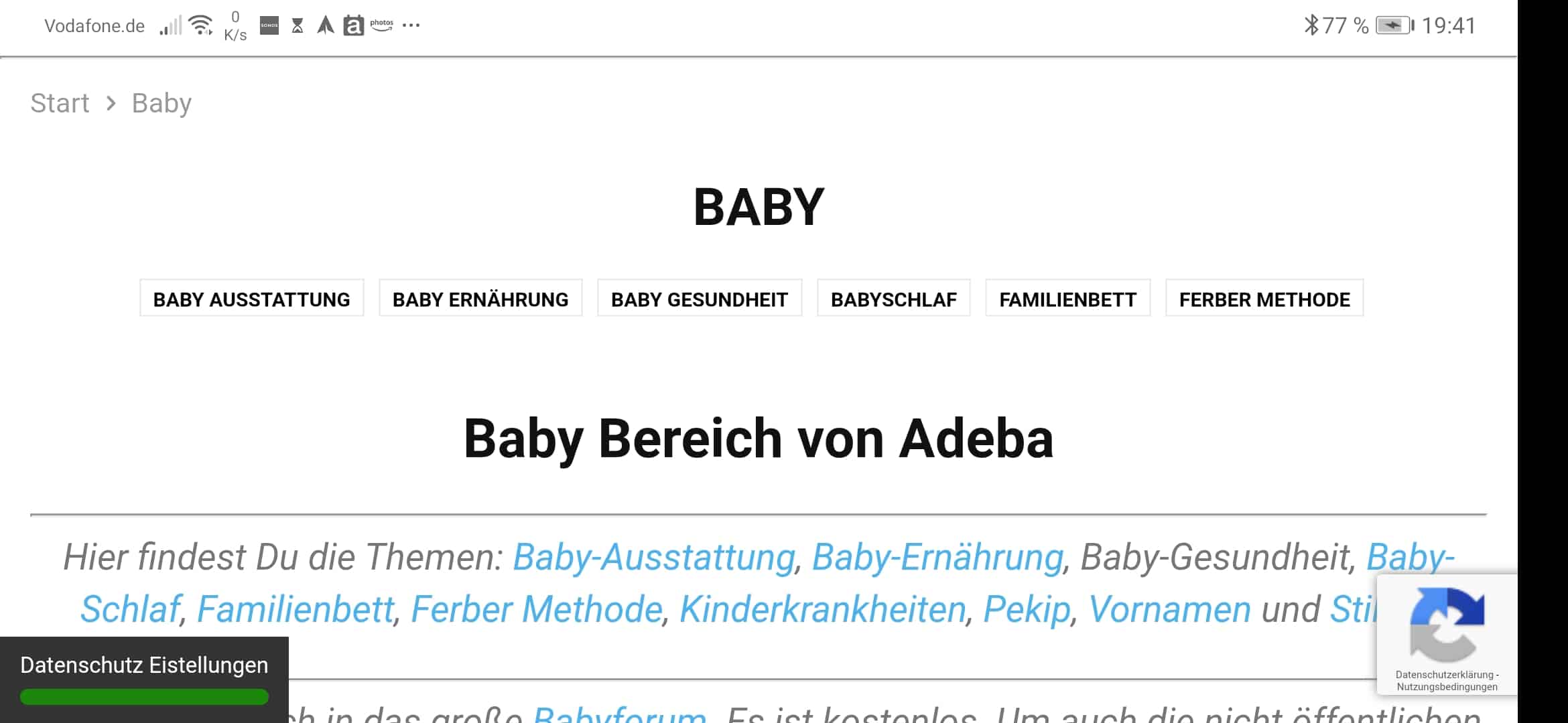
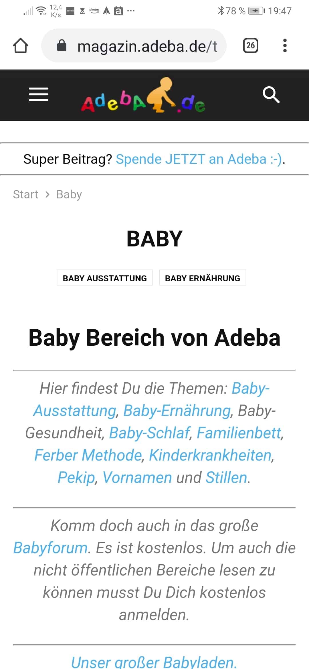
On mobile the categories that do can not be display because the space will be display in dorpdown menu https://i.imgur.com/HwZSHQ4.png -> https://i.imgur.com/g1ruEcS.png
Thank you!
On mobile the categories that do can not be display because the space will be display in dorpdown menu https://i.imgur.com/HwZSHQ4.png -> https://i.imgur.com/g1ruEcS.png
Now I changed as mentioned here:
https://forum.tagdiv.com/topic/mobile-layout-appearing-on-desktop/#post-323449
and face the problem which you show on your screenshot
the dropdown is always shown
https://i.imgur.com/g1ruEcS.png
over the article
I hope this posting will help.
So it’s quite complicated to understand what’s happen in the different views if you are not a programmer.
First of all I still have the feeling the views are jumping around.
No I figured out myself a little bit:
There is the mobile view which looks nice
and here is the amp mobile view which is very simple (to simple)
Mobile options:
Last setting (amp) (this looks best in my opinion, or?)
In the normal normal mobile view (probably just the responsive design)
the categories are with a dropdown which covers the first post.
Middle setting (amp+mobile)
In the amp mobile you may see NO DROPDOWN and limit of 2 categories because of space.
You see more but not all if you turn around mobile horizontal…..
You may see all categories if you add custom CSS
BUT!!!
Useless in the normal “custom Css”
There is a mobile custom CSS also ;).
So if you use this code
.td-category{
max-height: none;
}
you see in the mobile amp view all categories.
NOW.
How to see all categories in the mobile view without dropdown?
and what is the first position of options doing?
🙂
Hi,
From what I can see now are displaying all the categories -> https://i.imgur.com/rlXUH7s.png
Unfortunately this is a bug -> https://imgur.com/g1ruEcS in our theme, we’ll try to fix it as soon as possible, sorry for the inconvenience!
Thank you for your understanding!