Hi,
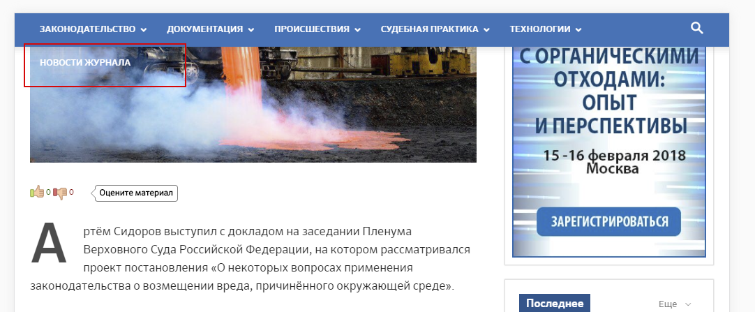
in responsive mode for tablet (width 1024px) I have my (rather long) main menu showing in two lines and the second line is beyond menu box: http://c2n.me/3PDTWrd.png. How to fix this?
My website is http://news.ecoindustry.ru .
Thanks on advance.

Sorry, this is screenshot from Opera, there I never opened this site http://c2n.me/3PEQlRe.png
The same behaviour, two line menu in narrow windows.
Never mind, I added
#td-header-menu {

    height: 48px!important;

    overflow: hidden!important;

}
to ipad portrait/landscape advanced css, problem seems to be solved.

Is there an elegant fix for this yet? I don’t want to hide overflow, as you can imagine, It’s important to show everything in the top menu, on all devices. Can you fix the responsive properties of the top menu please.
It’s the same problem as before.
Here is my site: trailandkale.com – you will need to test on an iPad/tablet.
Alastair
Ah come on man, don’t be lazy and please stop delaying customer support response time.
If you followed my simple instructions you would clearly see that the top menu is overflowing ON AN IPAD and not acting responsively as it should. I’ve attached a screenshot to help you further.

Hello Dixon,
I have inspected your website and I saw that you have added a custom code for all devices which break the theme functionality. -> https://www.screencast.com/t/huSL6XeUpMy If you want to add that code only for the desktop, for example, you should insert that code in Advanced Custom CSS box from here -> https://www.screencast.com/t/ckDeAYBXYnR
Hope this helps!
Thanks.