
- TutorialsDefault Block Settings Guide
 ioannisch
Hey isntall mobile theme and AMP and work very good site but i didint see ads from adsense . Ad sense give me code . One for header and one for body already i put via Code snippets and give me one more again for amp ads . I put this code on theme panel AMP Ads ?
 felipeaguiar
 Hi,
Thanks Anamaria!
I have one more question.
How do I use modal popup from (image 1) in the website header for desktop and mobile (image 2).
Kind regards,
Felipe.
(image 1) https://prnt.sc/TcF8HyqUpcRK
(image 2) https://prnt.sc/ol3aOBvAOaH7
 franciscorgl
 Si este anuncio que esta corriendo es Adsense, en header del sitio, tenemos un anuncio de Ad Manager, que esta corriendo.
Seguimos paso a paso la documentación de Ads, pero en las notas no logramos que se vean los anuncios.
Además tenemos anuncios para el Home, Secciones y Notas, al menos 6 en cada una, no podemos hacer correr todos juntos, tanto para mobile como para desktop.
 Lysiteleia
I have a problem that only happens in “content”; the “header” and “footer” work fine.
When I try to move items or add new, the green box indicating the position of the new item doesn’t get positioned correctly but more to the right. Do you know what is wrong and how can I fix it? Thanks!
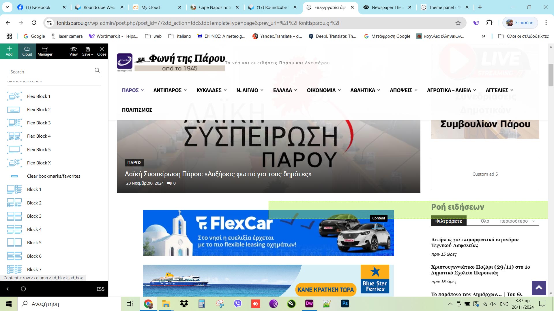
https://fonitisparou.gr/
 mikevic80
Hello,
We are using Advance Ads to rotate our advertisements and we are running into a slight issue with sizing.
When viewing on desktop it looks great (near header), we have a 900×300 ad and a 600×300 ad. There is a space between the two etc. When someone is viewing on a smaller screen, such as a laptop, instead of the images resizing to fit etc, the banners just over lap each other making it look messy.
Here is an image on desktop:
And here is an image more zoomed in to give an idea:
Here is what it looks like from TD editor if that helps:
We tried a bunch of different settings but just not having any luck and wondering if there might be a solution without having to change the banners. Thanks!
 lavozdelfestejo
 Dear Ana María,
Thank you for your detailed response and for the resources provided. I’ll review them thoroughly to address the issues I’ve encountered. However, I have a few additional questions and concerns:
As mentioned earlier, I’ve used TagDiv Composer for creating the entire page structure, but for posts, I’ve been using the Classic Editor combined with Elementor Pro for final adjustments. Do I need to recreate or modify all the posts I’ve already built? Will this require starting from scratch?
The header and menus have already been set up using TagDiv Composer, and they work well on desktop. However, the mobile version doesn’t display correctly, and I’m unable to adjust it properly. Could you assist me with optimizing the mobile view?
I’d like clarification on the use of multiple page builders. Is it safe to deactivate Elementor entirely after migrating to TagDiv Composer for all templates? Would this impact the content and structure of posts already created using Elementor?
Regarding categories: I’ve noticed that my category pages are not displaying posts dynamically as expected, even though they work on the homepage. Is this related to the cloud templates or the blocks applied to category pages?
How can I change the parts of the template that are still in English into Spanish? Is there a specific setting or approach for translating these elements?
Additionally, if possible, could you provide your response in Spanish? This would greatly help me in better understanding and implementing your recommendations.
Thank you very much for your assistance and guidance. I look forward to resolving these issues with your support.
Best regards
 David
David Oh I see its sticky for mobile as well it was just covered by the mobile sticky header. But is there any way to make it just sticky on mobile? it looks like if I remove the checkmark for desktop its removed for mobile as well.
DavidHi,
I do have a title (not header) that I want to make sticky on mobile devices. I tried it the following way:
I add “sticky” to a new row and placed my title in it. Now the the title is sticky, but only on deskop. But I need it exactly the other way round. On desktop the full page content is visible, so I have no need to make it sticky here. But on mobile where the user has to scroll I want this specific title sticky so that the user can see it all the time in his viewport.
Is there any way to achive this? Sticky on mobile while normal on desktop?
Thanks in advance for any help!
 maxcrandale
Hi everyone,
We’ve been facing an issue with caching on our website, specifically with Cloudflare. We are using the mobile theme exclusively (no mixing of mobile with Google’s AMP version or desktop version). The problem we’re encountering is that Cloudflare caching seems to conflict with our mobile theme, sometimes breaking it while the desktop theme works fine.
We’ve tried multiple solutions, including using Cloudflare’s caching settings such as Cache Everything and Standard Cache Level, along with Bypass Cache on Cookie and other strategies for mobile-specific caching, but we haven’t been able to successfully get the mobile theme to function properly without issues. Here’s the specific code we used in an attempt to address this problem:
// Cloudflare Worker code to bypass cache for mobile devices
export default {
async fetch(request, env, ctx) {
let userAgent = request.headers.get(‘User-Agent’);
if (userAgent && /Mobile|Android|iPhone/i.test(userAgent)) {
// Mobile logic – Bypass cache for mobile users
return fetch(request, { cache: ‘no-store’ }); // Ensures the cache is bypassed
} else {
// Desktop logic – Allow caching for desktop users
return fetch(request);
}
},
};
We’ve applied this code to bypass cache for mobile devices, and tried several approaches using Cloudflare’s Bypass Cache on Cookie option, but the problem persists. The mobile theme works intermittently, sometimes caching properly and sometimes breaking.
Additionally, we’ve been wondering if there is a distinct mobile theme other than the one we’ve been using that might be causing this issue. If anyone knows about a different mobile theme or specific settings for mobile theme caching that we might have missed, we would appreciate any guidance.
What we are looking for:
We are seeking advice from anyone who has faced a similar problem or knows how to properly configure Cloudflare for caching mobile themes while ensuring they load properly for users. Specifically, we are trying to:
Cache the mobile version correctly without affecting the desktop theme.
Ensure that the mobile theme doesn’t break due to cache conflicts.
Identify any additional configuration steps or tools that might help in fixing this issue.
Any help or insights on this issue would be greatly appreciated. Thank you in advance!
lavozdelfestejoHello,
I created the structure of my site using TagDiv Composer, but when it comes to creating and editing posts, I couldn’t find the option to “Edit with TagDiv Composer”. Since I couldn’t edit posts with this editor, I installed Elementor Pro and disabled Gutenberg. However, now I would like to know if there is any way to use TagDiv Composer for editing posts or if I need to continue using another editor like Elementor Pro, as I prefer it over Gutenberg.
Additionally, I’m having some issues with image galleries. I’ve tried adding image galleries to posts, but I would like them to display as carousels or thumbnails, instead of showing all the images one after the other. I’ve managed this on the desktop version, but on mobile, the images are still shown one by one. Also, when I add a carousel in the header, I have to remove the featured image to prevent both from showing. Is it possible for the carousel to be the featured image?
Another issue I’m facing is with categories and how posts are displayed. I’m not sure how to properly organize everything so that categories look good and content is filtered appropriately on the main page and archive pages.
If there’s any way to use TagDiv Composer to edit posts or if I need to use another editor, I’d like to know how to proceed. I’d also appreciate assistance with the mentioned issues.
Thank you for your help.
 Daniel Finch
Can you run me through how Header Template – Office Nexus works exactly and how to edit the mobile menu? Because it doesn’t seem to operate like a normal menu instead its got a page template which I cannot seem to edit or make work in anyway.
 Anamaria
 Hello,
First of all, we no longer recommend AMP because it is deprecated https://developer.bigcommerce.com/docs/storefront/wordpress/platform-integration/enabling-amp
To change the logo please edit with tagDiv Composer,select the header logo and change it => https://i.imgur.com/cR7F0v4.png -> https://www.youtube.com/watch?v=HXQQygkCCJo -> https://forum.tagdiv.com/add-logo-newspaper/
For mobile please edit with tagDiv Composer, select the viewport on phone, select the header logo and change it => https://i.imgur.com/cR7F0v4.png
When the mobile theme plugin is used, you need to set for pages the page content in the mobile editor using only the options from that editor – https://i.imgur.com/p8EqE1b.png. also, there is an option to disable the mobile theme from a page/post – https://i.imgur.com/d3kTBRf.png. This option appears in the Gutenberg editor. After you disable the mobile theme on the page, you can assign the mobile page.
Please check this topic where I explained each mobile version -> https://forum.tagdiv.com/topic/mobile-version-not-working-properly-2/
You can translate them from Theme Panel -> Translations -> Translations
Thank you!
 kapow
kapowHi team, our site has updated to latest version of Newspaper theme, and it has caused problems with the website header.
Site: https://whitsundaynews.net.au/
Previous header per archive.org: https://prnt.sc/VVH6Hum4pdba
Current header after update: https://prnt.sc/GzMh7fppa3J9
When I try to edit the header area via TagDiv: https://prnt.sc/XoZDOyoqC8yD
What I have done to troubleshoot:
Re-downloaded header and re-installed.
Cleared cache server and client side.
Removed serverside caching completely.
Checked in file structure in cPanel for any notifications of errors in the log (none found).
The tagdiv editor does not seem to be working within the editor anymore. When I click on a column area and try to add a new block element, the block won’t add in. Nor can I click to edit the code shown within the columns. https://prnt.sc/mJGCzNRp-kZR
When I preview the page and check the network cascade, there is 1 jpg with a 404, but everything else is 200. https://prnt.sc/y01OD1uPpnbO
I’m hoping you can assist!
 babak.s.z
Hi there
In the picture, you can see a redundant box between the menu and the mega menu. I marked it with an arrow, and the name of the last category, Rural photography, is displayed on it. I downloaded the header from the cloud and edited it. The redundant box covers the top of the post images in the Megamenu. How can I remove this box? I did not find a way.
bsiminzar.com/blog/
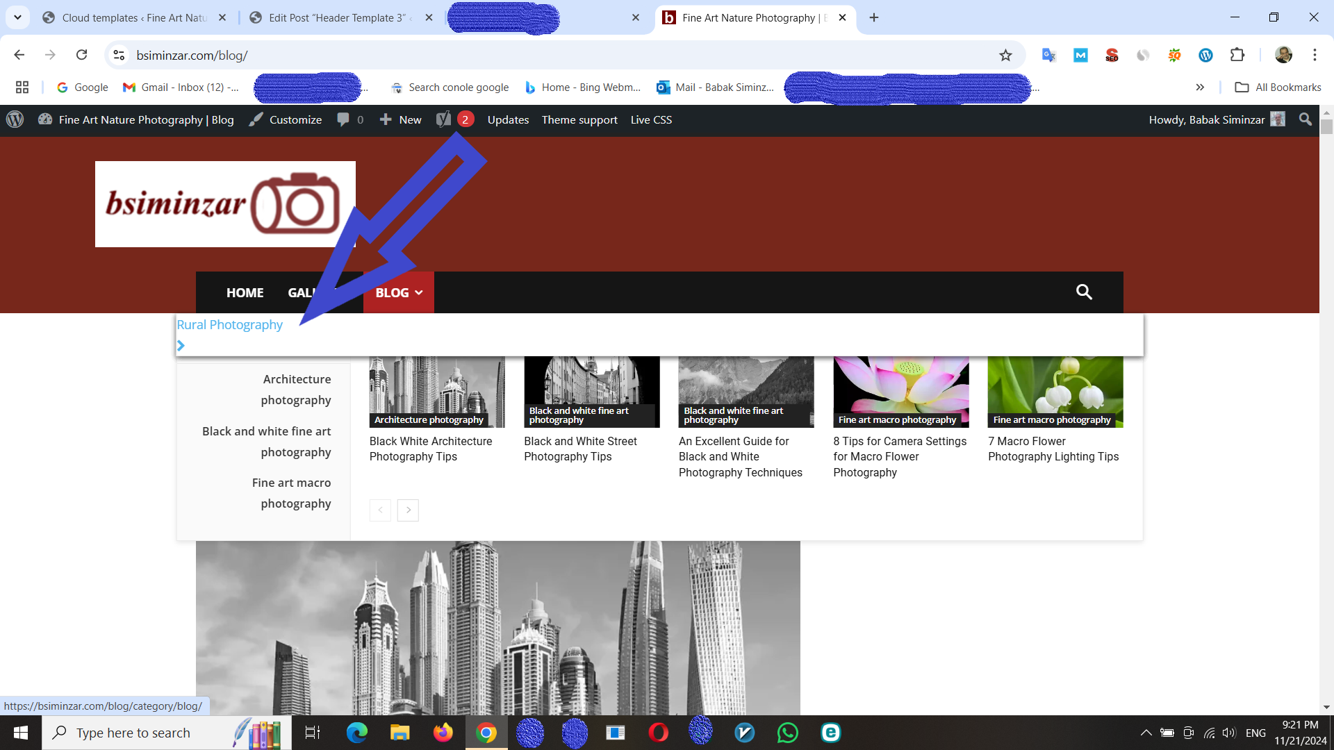
Anamaria Hello,
There are two options for the sticky menu: always sticky and smart snap -> https://i.imgur.com/uM8oczC.png. Smart snap will show the header when the user scrolls to the top.
Thank you!
 aimeestock
 Or Header Template 7 if my logo wouldn’t show up well.
aimeestock Anamaria could you please email me at aimeestock@aol.com? Something is not right. I tried to do what you said, but the logo was too big and cut off. I then tried to replace the header with a simpler version, HEADER TEMPLATE 6, but it now says NO LOGO and will not allow me to successfully upload a new header template. I’d like to let you login if possible? The desktop was working fine, but now both are missing.
 ammarr
Hello Everyone 👋,
Hope you guys are doing great.
Apologies if this sounds too basic, I’ve a website on which I would like to decrease the padding from left and ride throughout the website. I’ve tried to change the option from themepanel -> page template option but that didn’t work. Basically, I want to have the header, page container, and the footer as full-widget with slight padding just in case it doesn’t stick to the side. Can someone help me w/ this? my site URL is – https://htjap-dev.kreadevs.com/
Here’s the screenshot – https://prnt.sc/lGG3VIFJEr_7
Looking forward to your response.
TIA
Best Regards,
Ammar
Anamaria Hi,
Normally the most used one is the one that appears on comments, the one from opt-in builder was added for the options provided with the opt-in builder plugin, but it can be used now for anything.
Here are all the files that are related to login and register and can be used with our theme (depends on the templates and options you choose):
– wp-content/plugins/td-composer/legacy/Newspaper/parts/register.php
– wp-content/plugins/td-composer/legacy/Newspaper/parts/header/td-login-modal.php
– wp-content/plugins/td-cloud-library/parts/tdb-login-modal.php
– wp-content/plugins/td-cloud-library/parts/tdb-comments.php
Thank you!
Anamaria Hello,
Unfortunately, we don’t have functionality exactly like that, but you can create a header sticky and set it to smart snap -> https://i.imgur.com/2VHRnZL.jpeg
Thank you!
Anamaria Hello,
To change the logo please edit with tagDiv Composer,select the header logo and change it => https://i.imgur.com/cR7F0v4.png -> https://www.youtube.com/watch?v=HXQQygkCCJo -> https://forum.tagdiv.com/add-logo-newspaper/
For mobile please edit with tagDiv Composer, select the viewport on phone, select the header logo and change it => https://i.imgur.com/cR7F0v4.png
Thank you!
 ilouie
 Hi, I am trying to do something different. Is there a way to make a header sticky and have the transitional header scroll up and replace the sticky header? I want to create header like the one used on this site: https://www.newyorker.com/ where the main header would scroll up, stick to the top and as it scrolls, the transitional header takes over. I got something similar but I don’t like the transition header to scroll down. I want it to just blend into the main header. TY
 happypeoplepickleball
 nevermind – found it in the header. thank you!
happypeoplepickleballHi, I forget how to remove the notification under the homepage header banner.
Mine says “Happy People Pickleball receives marketing award in the inaugural Intuit Mailchimp Forward Awards 2024!”
How do I update that? Thank you!
http://www.happypeoplepickleball.com
 ecolivable
 Hello
As I stated before “adding Adsense code”. These are Google Ads and yes they need to be in the Header. Appreciate any help you can provide.
A



