
No search results were found in Documentation!
 hdraye
 Thanx, I managed to fix it, the reversal of columns did the trick. I am using RTL website, my menu is ok in desktop mode, but in mobile mode it makes first from right at the bottom, I tried t make a mobile menu, but if I use it in composer, it affects all views. I thought changes in a viewport will affect only that view, it does not. please help.
 carlo.monetta
Hello,
I am currently using Newspaper version 11.5.1 and I’m experiencing an issue with the sticky mobile menu.
On inner pages the sticky header disappears and the browser console shows this error:
Uncaught TypeError: Cannot read properties of undefined (reading ‘top’)
at tagdiv_theme.min.js
Could you please provide me with the correct tagdiv_theme.min.js file from the fixed build (v11.5.2 or newer) so that I can replace it in:
/wp-content/plugins/td-composer/legacy/Newspaper/js/
I only need the patched file, not a full theme update, as everything else on the site is working fine.
Thank you very much for your support!
Best regards
 GulfAiMagazine
If you click the 3 lines menu icon on iphone, it doesnt open.
https://drive.google.com/file/d/1S68tu7l40ipRsdyG_VaHmAVdXLOgfage/view?usp=sharing
 Jeffmart
Guys, I need help.
How do I prevent the tagDiv Mobile Theme from using the mobile theme on the homepage only? I have special advertising positions on the homepage and a complete editorial organization, and the mobile theme doesn’t allow customization. I also can’t create a mobile version of the homepage in Page Builder (these options simply don’t appear, and I’m a Newsmag PRO user).
Oh, yeah… Also, I can’t get the login option to disappear from the mobile menu. It’s disabled in the theme panel, but it still appears.
Can you help me?
 Simion C.
 Hi,
The sign in option from the mobile menu can be disabled in the theme panel https://prnt.sc/xODt0uJu3iMU I see you already disabled it https://prnt.sc/1njQ72WD7MLW
By default there are a few socials that display in the mobile menu. They don’t lead anywhere they just have placeholders set. Please check in the theme panel and remove those placeholders https://prnt.sc/iswjPoXA8-Gc for the ones that have them.
A background image for the mobile menu can be set in the theme panel https://prnt.sc/VqMT7qadQXlZ
Background colors can also be set https://prnt.sc/kaA-dC2Ds8aS
If you make changes and they are not visible on the website, I suggest clearing the cache.
Thanks.
Simion C. Hi,
Sorry for the delay.
We are all checking with various mobiles including iPhones, and the menu is working on your website at this time https://prnt.sc/975pz4s0ndif Does it maybe not work when you are logged in? Or how exactly does it show when you check?
The only thig that is not working is the search on mobile. This might be if you disabled this option https://prnt.sc/AEL2tfQ_JeOc
Maybe it would be best if we check directly on the website, logged in, to see what exactly you are using and what’s happening. Please send us an email at contact@tagdiv.com and provide admin login (user and pass) for the website. We will then check more.
Thanks.
 De Karperhoeve
Hi,
I’m really into for support.
URL: https://dekarperhoeve.com/
I’ve followed every documentation steps, I’ve been working with ChatGPT for the last 48 hours on this menu, nothing seems to work.
On the webpage, the menu looks amazing. But when I browse via browser on phone, it’s a struggle to work on it. Somehow it’s a Cloud template and I tried so many steps with TD Composer I lost track. On the mobile version the menu I see the signin option and the social media buttons. I want these to dissapear. I can’t find it. Also when I select background color I don’t see this option.
Please Please assist me in this matter, thank you so much.
De Karperhoeve Hi,
Can I reply on this, please?
I need some support, so via laptop/computer I browse to: https://dekarperhoeve.com/
From here the website looks great, the menu works good.
Now, I move to iPhone or iPad.. and the website is not looking good.
The articles are published fine, but the menu is not showing correctly.
As you described I used tagDiv Composer to select the mobile icon (right side).
Also in the settings from menu and in theme (mobile) I select the demo header (which I edited) to my needs. On the computer it looks great, but on mobile the menu is not showing. Also when I clear cache from mobile (Safari or Firefox) it doesn’t show. Please help me out.
Simion C. Hi,
That is possible. The background of the mobile menu can be customized in the theme panel.
The image can be set here https://prnt.sc/9UgyjT99W-MN
And the colors here https://prnt.sc/q7kxpE2fvUBb
Using a popup can be useful sometimes, like when you want to display something else as the mobile menu. But if you just want the basic things like a menu, login, socials, then the default mobile menu can be used just fine.
Please let me know if I can help more.
Thanks.
Simion C. Glad it worked.
On mobile its a different page, here it is https://pastebin.com/9n0X045G Same thing with this one, create a new page and paste the code in it, then add a popup in the mobile menu and set the ID of the page. It should work just as well.
Thanks.
Simion C. Hi,
That is possible. The element that you can use is called the mobile horizontal menu https://prnt.sc/62nltOWn3QgU Sometimes it’s a great alternative to the classic mobile menu. Please try it.
Thanks.
 newzSupport
Hi,
Can anyone suggest a simple way of editing the Mobile Menu element. After selecting the menu, it shows
well enough. Now I want to format the text and background of that simple menu. I would rather not use the Modal popup element instead because it’s too complex and presents some challenges that I wish to avoid altogether. The Mobile Menu element gives me what I need but I cant find a way to make simple edits to make the colours and text harmonize with the rest of the site.
As an example, I’d like to get from the blue gradient background of the default to something that looks like these:
https://demo.tagdiv.com/newspaper/mobile-menu/mobile-menu-2/
Help, please…
Simion C. Hi,
There could be such issues unfortunately. I can add this on our list but I can’t say if or when our developer team will have the time to check. We try to maintain compatibility with the WPML plugin and this as well takes a lot of time and effort.
My suggestion is to not use the mobile theme plugin in this case. The responsive version works fine with the menus. Please consider disabling the mobile theme plugin.
Thanks.
 poporil
Hi,
I’m using the Newspapers theme and I want to create a horizontal menu that doesn’t show all items at once on mobile. Instead, users should be able to swipe left/right to see all menu items.
Is this possible with the theme? If yes, could you guide me on how to set it up?
Thanks in advance!
 Taras
TarasHello,
I am writing to report an issue with the tagDiv Mobile Theme plugin on my website, MODISTA (modistaua.com).
I am using the Newspaper theme with the Polylang Pro plugin to create a multilingual site. I have set up the Ukrainian and English versions, and the content on the pages switches correctly when a user changes the language.
However, the mobile menu does not change language. It remains the same regardless of which language the user selects.
I have already tried the standard troubleshooting steps, including:
Creating a separate menu for each language (e.g., “Main Menu UK” and “Main Menu EN”).
Assigning these menus to their respective languages within the Polylang settings.
Despite these steps, the mobile menu functionality remains static. It appears there may be a conflict between your mobile plugin and Polylang.
Could you please investigate this issue and provide a solution or a workaround? I’m happy to provide temporary login credentials if needed.
Thank you for your time and assistance.
Best regards,
Taras
 c386
c386 Hi Simion,
Thanks for the suggestion.
The ‘Don’t load on mobile’ option is enabled, but I actually prefer it this way, as it prevents the menu from displaying on mobile devices in a landscape orientation.
Using Cloudflare for cache.
Simion C. Hi,
There is a setting that could have this effect in some cases, it depends on the caching configuration.
In the composer if you click on the header menu on desktop, is this option active? https://prnt.sc/G7wrnliJdZt7 If it is, please disable it and clear the cache.
Normally that should not cause a problem. But for example if the cache is not created separately for desktop and mobile, and the mobile version is cached first, the visitors will see the desktop header without the menu. It can be random, depending on which version is accessed first after the cache is cleared. What caching are you using for the website?
Let me know.
Thanks.
 Hoàng Trí
I use modal popup to create menu on Mobile, however it doesn’t work even though I added page ID, it always says “You have not selected a page or another modal in order to display its contents.”
How to fix it ?
Thanks
 Calin
Calin Hi,
Unfortunately for that element the slide option is not available. What you can do is to use a the mobile horizontal menu – https://i.imgur.com/5K182bd.png (but this element is different from the one you want to have that option).
Thank you!
De KarperhoeveHi,
I’m working on this amazing theme newspaper and my website is looking great so far.
However, on the desktop version the site looks so much better then mobile.
When I browse via my browser on mobile, I get a weird menu, colors are different. I want the same view as desktop. How can I change this?
 SiemenG
Hello
Would it be possible to display all categories next to each other in the mobile view, so that users can slide/scroll horizontally to reveal the next categories?
Please see my screenshot for reference.
https://share.cleanshot.com/Rpr81srs
Kind regards
 Atithya
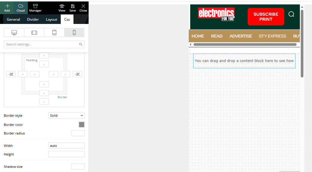
Hi, I want to make a grey menu bar, but even after selecting gray colour from left panel, not able to change colour in mobile version, in desktop version I am able to change colour.
 3 Narratives News
 I am really confused. I created a mobile page for the ‘About Us’ section, but it’s not working. Instead of taking customers to the menu, it wants them to log in to WordPress. Is there someone on your team who can see my WordPress site and fix things, or at the very least, a video so I can watch? The article you sent me makes no sense.
 Marcellino
Hello, in my sito https://ilpicentino.it I’m not able to modify via Tag Div Composer the mobile menu (see attached image)
I’m not able to tranlsate the text neither to add socials link
Problem is that when I’m in mobile mode in tag dive composer, even if clicking on the mobile menu it doesn’t open and settings don’t appear
Can you help me, please?


 barrydmoore
 HI Calin, try this page. https://www.stockchartpro.com/dragonfly-doji/
You can see the modal popup in mobile view. “Candle Patterns Main Menu” Button.
27 headings
<h1>[Missing heading]
<h2>[Missing heading]
<h3>Candle Patterns Main Menu
<h1>Dragonfly Doji Candles

