
- TutorialsFrom WPBakery to tagDiv Composer
- TutorialsWhat is Ajax preloading?
 sabedott
Modal Pop Up work with tagDiv Mobile Theme?
 aizaz.zazii
I mostly use tables in my blogs, but those tables are not responsive. The text often goes to the side of the screen. I want it to fit perfectly on the screen, both on desktop and mobile. I use Gutenberg for tables. Is there a solution for this?
I am providing you the link of the article at the end you will see a table I want to make all the tables fit to screen user should not be able to drag right or left it gives so bad impression
Here is the link: https://myelectricsparks.com/toyota-will-soon-launch-its-new-electric-compact-cruiser-ev/
 Ned Donev
 Hi Anamaria,
I use different parts of your templates. Header is from one template, Footer is from another template, Categories page is from a third template. I no longer remember the names of the templates, and I have renamed them to make it easier for me to work. Then I changed these different parts with tagdiv Composer beyond recognition and they look nothing like the original.
The above css code will do the job. Hopefully this will be the last thing that gets in the way of my site design.
And one more question, on the home page of the site I have a menu on the left side that I want to hide in the mobile version of the site. I looked for an option in the theme for this functionality, but I didn’t find it, and I did it again with css code:
@media only screen and (max-width: 800px) {
body .tdi_42 {
display: none;
}
}
Does such functionality exist, and if so where?
Thanks for the reply and have a nice day!
 sidog
sidog Your screencast is upside down. Also, it’s not clear what you’re changing and in what order as yours is in Russian.
Can you please provide a step by step on how to fix the template so that the article body displays before the “related stories” block on mobile. Also, I would like this to apply to all posts. Will editing the template from the back-end wordpress “cloud templates” area achieve this?
Thank you.
 almyssilgado
 Hi, Anamaria
Thanks for your help.
Your example is right, but it’s for other reason. The video plugin didn’t import correctly the url in the cuestom post.
Anyway, I checked all the items mentioned in the post that you’ve told me.
I’m sending you three examples that URLs where the post appears in deskopt, but doesn’t appear in mobile.
We’re using wp-rocket, but now is not actived, traying to solve this problem.
We don’t have any object cache plugin.
Please, check them:
As you can see, the post shows the video in desktop, but doesn’t in mobile.
Thanks
 Bettina
 Hello!
The social icons from the mobile menu are coming from the Theme Panel -> Social/Apis -> Social Networks -> https://i.imgur.com/kKYIECB.png remove/edit them after your needs.
Thank you!
Bettina Hello!
The social icons from the mobile menu are coming from the Theme Panel -> Social/Apis -> Social Networks -> https://i.imgur.com/kKYIECB.png remove/edit them after your needs.
Thank you!
 24.lutsk.ua
 24.lutsk.ua
 Anamaria
 Hi,
You can change the order of columns on mobile and after the block, after the post content -> https://www.screencast.com/t/kbLa0WnN
Thank you!
sidogI’m using the “Single Template – NFT PRO” for a post with no customizations. It looks great on desktop but on mobile, the right side “Related” column (1/3 column) wraps above the article content (2/3rd column). This means a viewer would have to scroll down, past the related news stories to get to the content.
This seems like a bug. Any way to fix this?


Anamaria Hi,
You can try to import a cloud header to have another menu for mobile and then you can edit it with tagdiv Composer https://forum.tagdiv.com/header-manager/, or if you want to have the standard one, then you need to edit it from Theme Panel -> Header and you can’t use other menu for mobile.
Thank you!
 libertylens
 I think I just figured the author block out. (I had to create a mobile template.)
 Brian
Brian Your theme is very confusing, My same menu should work in the mobile version. But it’s not working. Please let me know where I can find the way to add mobile menu. Please answer me ASAP.
Thanks.
 Iqtidar
Hi, I just checked my website on Pagesped Insights, link: https://pagespeed.web.dev/analysis/https-www-teslaoracle-com-2023-08-08-elon-musk-bids-farewell-to-tesla-cfo-and-master-of-coin-zachary-kirkhorn-after-13-long-years-at-the-company/i2nd18bkx4?form_factor=mobile
The huge Performance issue is originating from an issue with the theme. It is loading Full-Size images while it should load Medium by Default. I have even set it to Small/XSmall in some areas but no use.
This is creating increased load times and performance issues.
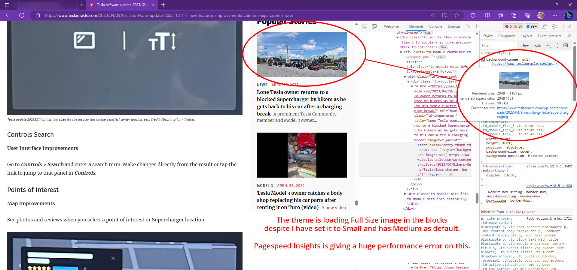
Please tell me how to fix this. A fast response will be appreciated.
Thanks.
Brian Please watch this video. There has no option to edit the header.
So, Now my question is from where this desktop and mobile header is coming?
almyssilgado Hello Anamaria
I don’t know what you mind.
Currently, we use site post templete 11.
You can see the theme panel option here: https://tinyurl.com/22gzshlk
The video appears perfectly in desktop version, but in mobile doesn’t.
Bettina Hello!
You can build a sticky header and add only that white row. Please follow the video to see where you can find and build your sticky header on mobile and desktop too: https://www.screencast.com/t/l6v2Belt
Thank you!
Anamaria Hello,
To change the font and color for the mobile menu please go to Theme Panel -> Theme Colors -> Mobile menu/mobile search => https://www.screencast.com/t/0CvSgXp9H to set a background image go in Theme Panel -> Background -> Mobile menu/mobile search => https://www.screencast.com/t/uvDejzbX to change the font from Theme Fonts => https://www.screencast.com/t/ANBQe7hQhJd
Thank you!
Anamaria Hi,
For mobile please edit with tagDiv Composer, select the viewport on phone, select the header logo and change it => https://i.imgur.com/cR7F0v4.png https://www.youtube.com/watch?v=HXQQygkCCJo -> https://forum.tagdiv.com/add-logo-newspaper/
Thank you!
 amrit.atc.in
Hi,
The homepage format ie Article image is not showing (only the top section), kindly check the screenshot: https://prnt.sc/T1XKXtPzEYj8. How can I fix this please let me know.
Thanks.
Brian how can I edit the mobile header? Could you help me please?
 msassanelli
I create my home page with TagDiv Composer.
This page contains many article lists from different topics. To title the section I use the “Title” shortcode and to display the articles I use a flex-block.
In the mobile view, I want that when scrolling, the title always remains visible while scrolling over the article list. The title should then disappear again when a new area is reached while scrolling.
Is this implementable with the features provided?
Thanks for the support.
 toimata
Hi,
How can i replace the logo on mobil header please ?
See attached capture: https://ibb.co/Pjnb21B
Regards,
Nicolas
almyssilgadoHello
We use the theme newspaper on the web hola.tv.
Some time ago, the mobile version doesn’t show the embed videos as video post. The video appears in the version for computers, but not in the smartphone version.
We have removed the Google Adsense ads, thinking that this would be the problem, but it has not.
We have done all kinds of tests and nothing works.
Somebody could help me?


