juliusuk
 AH, finally found the solution.
The problem was that the thumbs were not generated so the big grids use the full image size with specific aspect ratio. The images were not cropped at all.
SOLUTION: Check if gd library is enabled on the server as wordpress requires it for cropping. You can see it in Cpanel, if not, contact hosting provider.
Then try to regenerate your thumbs and see how it goes.
So, what i did was install php-gd and regenerate thumbnails, and everything worked fine. Might be an issue on some specific hosting providers.
Thanks for the email support!
Julius
juliusuk Hi,
thanks Chris, i now tried this plugin as it was suggested in many threads. I installed the plugin and regenerated thumbnails, but did not solve this issue. Probably because the images loaded were large enough, but they scale wrongly inside the boxes.
Example: here this behaviour, which in this example only happens at viewport > 1140px. The pictures scale as they should on widths below this.
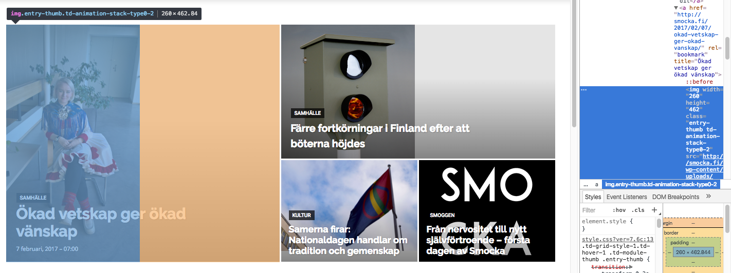
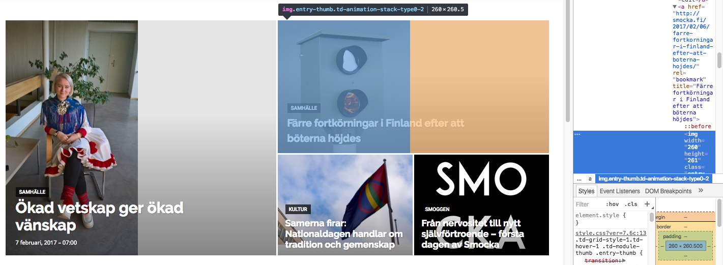
Both images in these boxes get width=”260px” written directly into the img-tag as properties. Don’t know if that is the issue (this also happens at the lower viewports where the layout works). However, the images that actually are loaded into the big grid are of widths 1400px (the one to the left) and 1022 px (the one to top right), i.e. large enough to fill the space if they were cropped to fit.
I’m trying to add “width 100%” or height “100%” at different places in css but this seems only to stretch images rather than crop them so this is not the solution.
I’m really puzzled why the center-top cropping that is described in some earlier threads is not taking place here?
Greetings,
Julius
juliusuk Hello,
I’ve read the discussion and documents on regenerating thumbnails. I’ve used the tool to regenerate thumbnails without success. My uploaded images are large enough (2000px width), but still, depending on which bLock or Big Grid module, the pictures get grey bars in different modules.
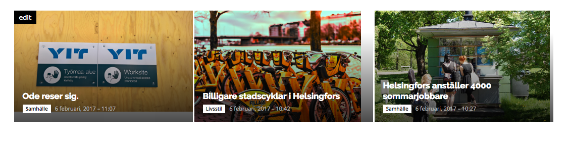
example of big grid: http://smocka.fi/wp-content/uploads/2017/02/Screen-Shot-2017-02-06-at-11.14.34.png
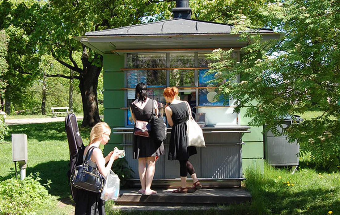
These images are uploaded with widths of 2048 (http://smocka.fi/wp-content/uploads/2017/02/29180864370_5656e4cdec_k-1.jpg, http://smocka.fi/wp-content/uploads/2017/02/30704050895_a54f481393_k.jpg) and 1100 (http://smocka.fi/wp-content/uploads/2017/02/Smocka-kesatyo.jpg). WHy do the images not crop correctly in all big grids or blocks?
The site is now live at smocka.fi if you want to have a look.
Since there are so many thumbnail options, cropping a picture correctly for one certain big grid size manually is not an option since the aspect ratios change between modules.
I’m quite sure the theme is not supposed to work like this. Is there some setting for thumbnails that i might have missed?
juliusuk Hi Bogdan,
thanks for the reply. This is however not the issue. My grids will resize lage enough images so that grey bars will appear either below or to the right, if the given image has wrong aspect ratios. Example:
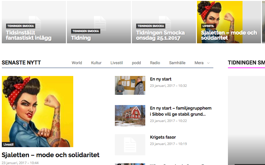
This square image is larger than either of these two module boxes in which it is showed here. It will fill proportionally any grid box or module/block image area to full height, but leave white space or grey area next to it since the boxes are of different aspect ratio. Vice-versa, any picture which fills the full width but not the height due to its aspect ratio, fills width 100% with image and leaves a grey area below – instead of cropping it to left & right, and filling the height to make the box look nice.
Can this behaviour be changed anywhere in the settings? I.e. So images fill either width/height to fully cover module/block box area and cropping things out, rather than just filling either and leaving grey bars?
– Julius
juliusuk Hi!
I have the same issue, regenerating thumbnails will not however remove the wrong sizing of pictures in big grid blocks. It seems like the container fits the image by its width, but if the aspect ratio in the image is of lesser height than that of the grid container, there is a grey area in the bottom of the grid box.
Is there a way to set the fitting so that it in these cases would fill the height and crop (centered) the picture on left and right instead? The images on my site are of enough pixel widths for this to be possible.
– Julius
juliusuk Ah ok, I just realised the reason was that the bug appears only when I’m logged in to wp-admin, and the admin bar pushed the sticky bar down, making it look like this only for logged in user. Not a problem in my case. Thanks!
juliusuk Hi!
I’m having that same question, and based on the forum it seems like there is no such option in Newspaper 7 right now.
Only plugin that seems used at least to some extent seems to be Co-Author Plus:
https://wordpress.org/plugins/co-authors-plus/
This works as promised out-of-the-box in the backend, and does so also for Newspaper 7. However, to implement this to the front you need to edit the template php files: https://vip.wordpress.com/documentation/incorporate-co-authors-plus-template-tags-into-your-theme/
“To integrate Co-Authors Plus, you’ll want to replace existing author template tags in your theme with a simple conditional that uses the Co-Authors Plus template tags if Co-Authors Plus is available”
This seems like a somewhat easy task to do on one of the standard themes, but in Newspaper 7 there are LOTS of templates to change this in. My question is
1) could you point out the places where the author info part in the php templates are found?
2) … keeping the nice standard style of Newspaper 7 showing name, gravatar, description etc?
On a sidenote, i think this would be an extremely powerful function to have out-of-the-box in a theme that works wonderfully otherwise! 🙂