Matija
 hi
tried all that but nothing helps
ist now different blocks but still different on live page…
Matija yes I get that now thanks 🙂
The mobile editor is just for simple things, not for “builder code”…
Matija Yes I see now in the video
I have enabled mobile theme, and it works great for us…but with that enabled, I cant create mobile pages for each page 🙂
Matija yes but it would be nice to have the “same” options for this mobile theme, because its working great, we just need a little tweaking 🙂
Matija and can I remove the “category meta box”…slager…on my featured articles?
Matija On my desktop theme I have featured category named “slager” I there are 5 articles…
I mirror them to the new featured category for the mobile theme but it only shows three of them… !?
Matija okay that I found…
one more thing, how can I remove “ABOUT US” in the footer, just above the subfooter text?
Matija yes I was just wondering is this possible as well…
that would bi great…as we can now only put 1 (adsense) inline ad, after a number od paragraphs…
It would be great to put ads after 1, 2 or a number of paragraphs 🙂
Matija thanks I got it
bye for now 🙂
Matija It wil be okey like this, just need to move everything to the left…
the margin css wont work, can you fix it?
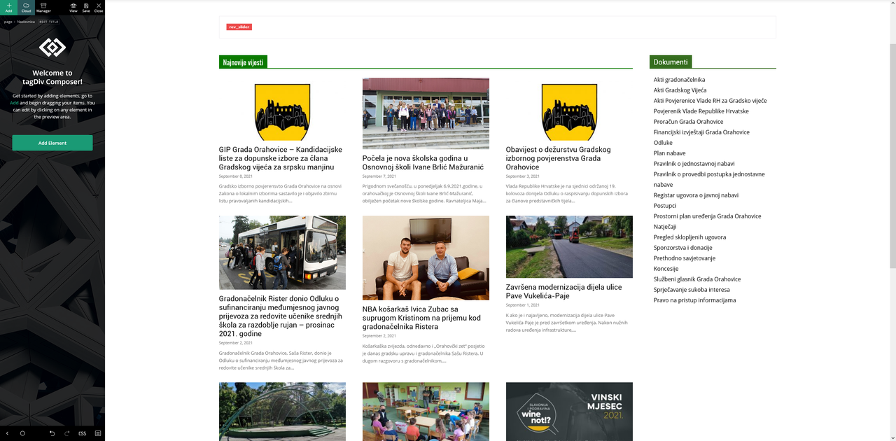
I need it like this: https://postimg.cc/kV2qdrsL
Matija Ah yes its okey…another person is working something on that home page…
can you just fix that search widget above just like I described…
Matija we got seomthing but still it isnt quite ok…and now the revolution slider isnt quite right…
http://www.pitomaca.hr/wp-admin
can you do it? 🙂
-
This reply was modified 7 years by
 Calin.
Matija I also need this header ad more to the left…
Matija I want it always visible without that search icon that has to activate by mouseclick
Matija I want it like this: https://postimg.cc/qtCXC7yN
the logo above is actually the header ad code: 
I resized it so that we can put that widget there on the right
Matija I want the whole widget, not just the icon…
can that be made?
Matija One more quesstion 🙂
How can I put the search widget in the header right of the header AD which is my logo above the menu?
Hope you understood me 🙂
Matija now its okey 🙂
I just put the 1400px instead of 1024px
tnx
Matija tnx I think it works now
but the logo (little house – home) is still on the left hmm
Matija I now have this: https://postimg.cc/3yr73zdV
this is all my custom css:
.td-header-style-4 #td-header-menu ul.sf-menu > .td-menu-item > a {
word-break: break-word;
max-width: 142px;
min-height: 78px;
line-height: 20px;
/* Internet Explorer 10 */
display:-ms-flexbox;
-ms-flex-pack:center;
-ms-flex-align:center;
/* Firefox */
display:-moz-box;
-moz-box-pack:center;
-moz-box-align:center;
/* Safari, Opera, and Chrome */
display:-webkit-box;
-webkit-box-pack:center;
-webkit-box-align:center;
}
.td-header-style-4 #td-header-menu .td-icon-menu-down {
display: none;
}
.td-header-style-4 #td-header-menu {
margin: 0px auto;
display: table;
}
header style is 4…
Matija Matija excelent 🙂
tnx
Matija yes now it works
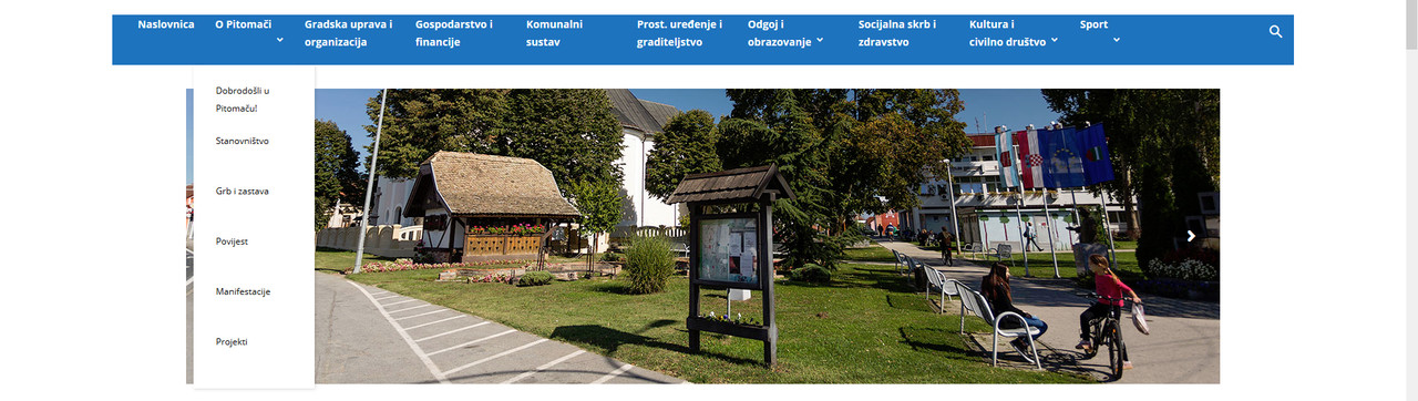
but I need it to be verticaly center aligned… and I noticed that the submenu is also now breaked into two rows, but that I need to be as it was, not like this…
https://i.postimg.cc/N0KvTq93/hsergsfsfs.jpg
AND I need those arrows for submenu removed…
Matija I’m using style3 header
This is what I get now… https://i.postimg.cc/cCfP3Ldz/easgfswfwfw.jpg
Matija I cant give you the link because the site is not live yet