- NewspaperWP Rocket and Newspaper Theme: Optimization Guide
- TutorialsFrom WPBakery to tagDiv Composer
- TutorialsDefault Block Settings Guide
- TutorialsHow to use custom fonts
 ySV
ySV Thanks for your reply, i use a theme child because if i use the Theme panel -> Custom CSS area when the site start to loading it load the default setting and after rewrite with custom css. Instead with theme child it load with custom css.
The code that i write not work on child theme because i suppose that the edits make on tg composer have a high priority and rewrite my code.
 Catalin
 Hi,
Please notice that all the custom CSS code should have to be added in Theme panel -> Custom CSS area without any problem. When you update the theme, all the code from there will remain there. Regarding on Child Theme, please check here -> https://forum.tagdiv.com/the-child-theme-support-tutorial/
Thanks for your understanding!
 tomatoco
Hi,
I am customizing CSS by Theme Panel or Child theme(style.css).
I forgot where I write the CSS to because I cannot find the code.
Seeing source HTML code, <style id=”tdw-css-placeholder”> before <body>tag has my custom css code.
Where can I find and edit this code??
 Calin
Calin Hi,
Please note that both example that you provide are for posts, and in order to achieve the next or continue button instead of numbered pagination you’ll need to make some changes in theme files.
But you can achieve the next/prev button like in your screenshot using some custom css here is an example -> https://www.screencast.com/t/cGvm7NDMqY
.td-post-next-prev .td-block-span6 {

  padding: 15px;

  text-align: center;

  width: 40%;

  margin-left:5%;

  margin-right: 5%;

  border-radius: 15px;

  margin-bottom: 42px;

}

.td-post-next-prev .td-block-span6:nth-child(1) a{

  margin: 0;

  color: #333;

}

.td-post-next-prev .td-block-span6:nth-child(3) a {

  margin: 0;

  color: #fff;

}

.td-post-next-prev .td-block-span6:nth-child(1) span{

    color: #333;

    font-size: 18px;

    font-weight: 700;

}

.td-post-next-prev .td-block-span6:nth-child(3) span{

    color: #fff;

    font-size: 18px;

    font-weight: 700;

}

.td-post-next-prev .td-block-span6:nth-child(1){

  border: 1px solid #e6e6e6;

  background-color: #e6e6e6;

}

.td-post-next-prev .td-block-span6:nth-child(3){

  background-color: #4db2ec;

  border: 1px solid #4db2ec;

}
-> https://www.screencast.com/t/m1VgxwIc
You need to set this custom css in Newspaper>Theme panel>Custom code>Custom css
Thank you for your understanding!
 David
David Hi Catalin, Thanks for your reply. The screenshot you sent is exactly what I’m looking for. I tried your proposal and modified the retro-footer template but the problem with that is that on TD Composer I can add only one CSS setting. If the screen size now changes from desktop to tablet and mobile landscape, the alignment will be destroyed again. Do you know another way how I could solve this?
 boothyuk123
 I answered my own question…just needed to put in the Advanced CSS for Desktop only.
ySVHello i have a problem with Accent hover color of read more button in block header 8. When i set option in tG composer.
Screenshot of problem:

For resolve problem i try to use this code, but it work only in custom code theme area and not in my style.css of child theme:
.td_module_17 .td-read-more a {

    background-color: transparent !important;

}
Screenshot solved problem:

Can you help me to write a code that work on a theme child style.css ?
 Paradoxer
 I was able to fix my first issue by discovering the “object-fit” CSS, so what I wanted for post template 1 is achieved with the following code:
@media (min-width:141px){

.td-post-template-default .td-post-featured-image img {

    width:100%!important;

    height:337px;

    object-fit: cover;

    margin-left: auto;

    margin-right: auto;

    }

}
However, I don’t have a solution for why the featured image appearance isn’t standardized for posts as they appear on pages other than the posts loop.
Calin Hi,
Here is how is look on may install -> https://www.screencast.com/t/LhKc3Y9WUz4o please make sure that you do not have any css set in theme panel that can change the layout.
If there is still a problem please provide a link were I can inspect this problem.
Thank you for your understanding!
Calin Hi,
If you are using the mobile theme all you need to do is to set this custom css in Theme panel> Mobile Theme> Custom code / css –
.comment-form .td-form-url {

  display: none;

}
or you can comment in wp-content/themes/Newspaper/mobile/comments.php
-> https://www.screencast.com/t/lXMwafFzqEeE
Thank you!
Calin Hi,
Did you check if you have some custom css in theme panel?
If you want you can use a custom css, set the code in Theme panel>custom code> custom css
-> https://www.screencast.com/t/FIe0A8T6YHIP
.tdm-header-menu-btns .tdm-menu-btn1 .tds-button .tds-button1 {

     border-radius: 0;

}
Thank you.
Calin Hi,
Please provide a link were I can make some inspects, in this way I will be able to provide you the right custom css.
Thank you for your understanding!
Calin Hi,
This will not affect the site speed and, the image will still there, but will apply a style on it with css.
Thank you for your understanding!
 mwnp
mwnpWhen the search icon is moved into the top bar, as opposed to the main nav bar, when you click it, it appears with white background and white text, even when using dark mode.
Calin Hi,
Sorry was my mistake, I understand wrong.
For that you’ll need to select the row and the elements from them, and change in css the margin, for less set “-” before the number, or set the number “0” -> https://www.screencast.com/t/UWK6B3YxX4
-> https://www.screencast.com/t/iHqaiuAiORG
Thank you!
Calin Hi,
Please make sure that all those settings are set to default -> https://www.screencast.com/t/okJc5rzx
Also please make sure that you clear all cache, and you do not have some custom css that for the text for links (“a”), or some plugins that can do that.
Thank you.
 Meranda Devan
I used this theme for a new photography site I am building where some of the images are stretched. In doing so, on my computer the graphics look great. The text follows the graphics quite nicely.
Yet, I look at the same website on my husbands Mac computer where the computer screen is larger, and the print is very small.
What I would like is for the website to be pulled up the same no matter which screen is viewing the content.
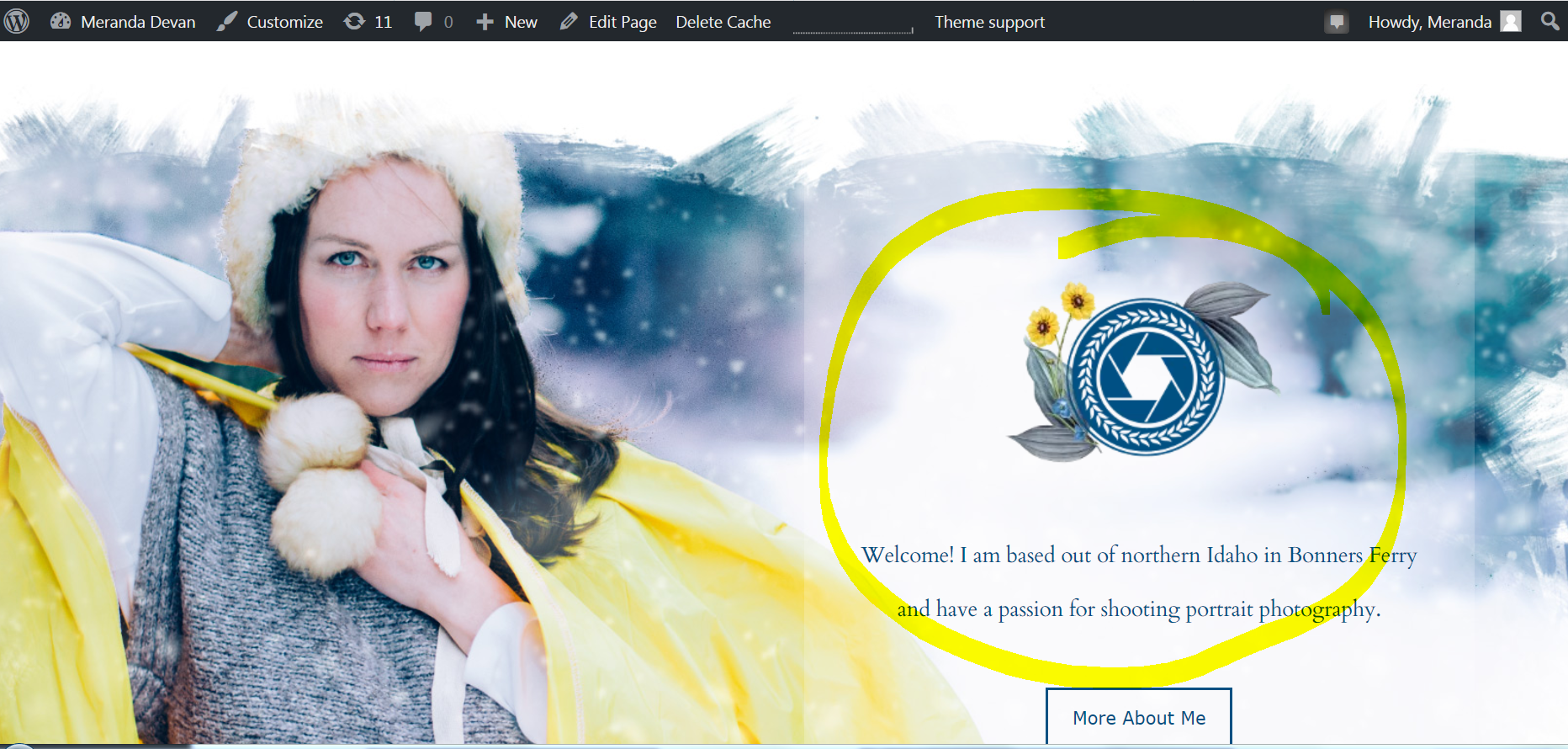
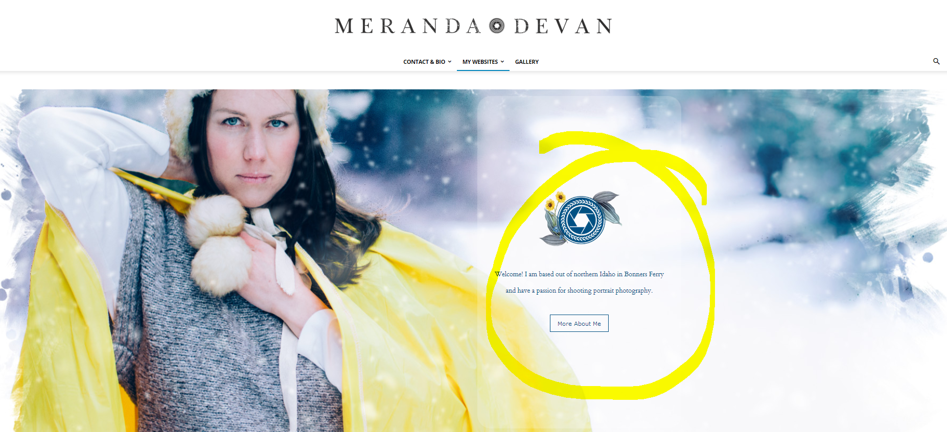
Here you can see the text is large which is how I want it.
http://merandadevan.com/wp-content/uploads/2019/02/right-4.png
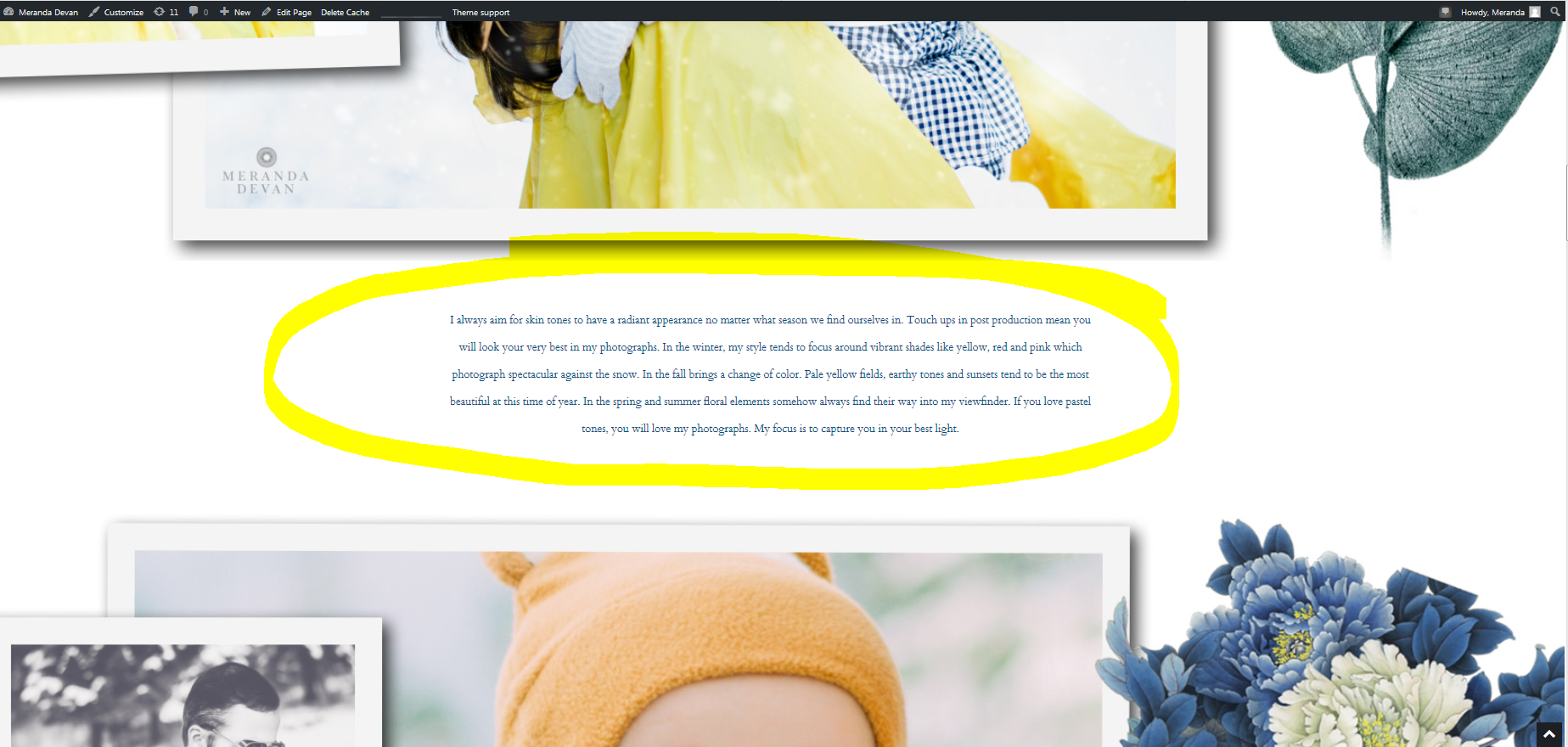
On the mac, the text appears very small
http://merandadevan.com/wp-content/uploads/2019/02/mac-5.png
How the text should appear on the front page…
http://merandadevan.com/wp-content/uploads/2019/02/right.png
On the mac, the graphics are stretched, but the text remains small.
http://merandadevan.com/wp-content/uploads/2019/02/mac.png
I have tried the option of stretching the graphics and the text.
Is there a fixed width CSS option where on mac computers my website would show up with space on either side?
What do you think would fix this for me? I appreciate anyones help here….
Meranda
 lazdim
Hey guys,
OK, I have created the following .php page which “reads” the 5 best articles form another portal via JSON.
I don’t to mess up with extra CSS code and using iframe so I thought it would be a good idea to create a block which will show these articles. I want the block’s layout to be exactly the same as Block 1.
So, I copied all the HTML code for Block 1 and I ended up with the following:
<?php
$carStr = file_get_contents('http://www.caranddriver.gr/xml/json/getjson.asp?platform=web&ret=cu&method=oPublicationJSON.getCategoryPublications(41547,1,5)');
//Now decode the JSON using json_decode():
$carJson = json_decode($carStr, true);
// decode the JSON into an associative array
$i = 1;
?>
<?php
function trunc($phrase, $max_words) {
$phrase_array = explode(' ',$phrase);
if(count($phrase_array) > $max_words && $max_words > 0)
$phrase = implode(' ',array_slice($phrase_array, 0, $max_words)).'...';
return $phrase;
}
?>
<?php
echo '<div id=car>';
echo '<div class="td-block-row">
<div class="td-block-span6">
<div class="td_module_4 td_module_wrap td-animation-stack td-meta-info-hide">
<div class="td-module-image">
<div class="td-module-thumb">';
$counter = 1;
foreach ($carJson['publications'] as $row) {
$srcid = $row['src_id'];
$imgid = $row['photos'][0]['img_id'];
$img_type_small = 14000;
if($counter == 1) {
$img_type = 14001;
echo '';
echo '</div></div>';
echo '<h3 class="entry-title td-module-title">' . $row['art_title'] .'</h3>';
echo '<div class="td-module-meta-info"></div>';
echo '<div class="td-excerpt">' . $row['art_summary'] . '</div></div></div> <!-- ./td-block-span6 -->';
} //end if
else {
$img_type = 14001;
echo '<div class="td-block-span6"><div class="td_module_6 td_module_wrap td-animation-stack td-meta-info-hide"><div class="td-module-thumb">';
echo '';
echo '</div></div>';
echo '<div class="item-details"><h3 class="entry-title td-module-title">';
echo '' . $row['art_title'].'</h3>';
echo '<div class="td-module-meta-info"></div>
</div>
</div>
</div> <!-- ./td-block-span6 -->';
}//end else
$i++;
$counter++;
};// end foreach
echo '</div></div>';
?>
I went to Developer Info and read the instructions of creating a new block using a shortcode.
However, the example is simple. It doesn’t help me a lot.
Can anyone guide me to a more relative tutorial which will help me make this code to a block same as Block 1?
Thank you in advance.
Calin Hi,
Please try like this, set the header logo in the same row/column with menu and display the logo from css to inline-block -> https://www.screencast.com/t/X2CiZQqgsZzh -> https://www.screencast.com/t/MwLYEzNhvC
Hope this will help you!
Thanks.
Calin Hi,
Please make sure that you do not have some plugins that are in conflict with the theme, please deactivate all non theme plugins and clear all cache; also please check if you have any custom css set in theme.
Thank you.
Catalin Hi,
If you want to hide the page title, only for that page, you need to use a bit of CSS code for that. Please use the code below and place it in Theme panel -> Custom CSS area.
The code is here ->
.page-id-2272 .td-page-title{

display:none;

}
The result is here -> https://www.screencast.com/t/AmDA8Z4Y9
Thanks for your understanding!
 DKF
DKFHi there,
I installed the Mobile Theme plugin and it works fine! Speed is now a lot better.
There’s only one thing: the top posts on my homepage and category page are not displayed well. There’s an opacity layer halfway. So the upper part is darker. What goes wrong? Is there a way to adjust the css? Where can I find the css file for mobile? Can you give a hint?
Thanks!
https://www.wandelingen.info
Catalin Hi,
1)By default, please notice that’s the order of them. So, if you need to make some changes over this section, you need to edit the loop single according to your post template used by you and make the following modification. As an example, if you are using the post template style 8, you need to edit the loop-single-8.php like this -> https://www.screencast.com/t/lQqVWBYvDv and the result is here -> https://www.screencast.com/t/P1KbqoAbwO
2)Yes, it’s possible if you will use such a custom CSS code for that. If you want to tune that section, you need to create your own custom CSS code, after using the Inspector Browser, according to our useful guide from here -> https://forum.tagdiv.com/create-custom-code-using-the-browsers-inspector/ As a hint, you can try using the code below and place it in Theme panel -> Custom CSS area.
.td-tags a {

color:red;

background:blue;

}
The result is here -> https://www.screencast.com/t/jQNDceBb9
3)If you want to move that section at the top of the page, you should edit the above core file and move the code which I have pointed you above. All of these custom modification can be added to a child theme if you do not want to be overwritten for a next theme update. For more information about how you can use Child Theme please check our useful guide form here -> https://forum.tagdiv.com/the-child-theme-support-tutorial/
Hope this helps!
Thanks for your understanding!
 Rajvivan
 Hi callin,
Thanks for all help and Support.
I did further digging and realized that my menu bar is not working because of SSL Cache which WP rocket is doing.The moment I unchecked the option,my menu bar started working and mobile theme is showing the result as expected.
But the problem is when I disabled it ,my page speed score on google changed drastically which I can’t afford as I already paid 49$ jsut to improve my page speed score. There are some backend js and CSS code which is directly affecting my menu .
Would it be possible for you write some code on backend and get it resolved.
Page Speed before unchecking SSL checkbox
https://photos.app.goo.gl/Tzcp1dUr9odSiKD37
Page Speed after unchecking SSL checkbox
https://photos.app.goo.gl/Ju85LpQbjsGMaCyi7
 madamcza
Dears,
i am using ‘source’, ‘via’ and ‘tags’ on individual post page. However tags are thrid on the list, below ‘via’ and below ‘source’ items.
1. I’d like to have tags above them. How can this be achieved?
2. Is it possible to have tags respresented visually in a different way (e.g. other color, bigger font size) compared with via/source elements?
3. Would it be possible to have tags list on the top of the post rather than on the bottom (e.g. right below author/date line and above sharing buttons)?
It is fine if some CSS or child theme manipulation is required, please kindly guide on how to achieve those.
Thanks,
Michal