I used this theme for a new photography site I am building where some of the images are stretched. In doing so, on my computer the graphics look great. The text follows the graphics quite nicely.
Yet, I look at the same website on my husbands Mac computer where the computer screen is larger, and the print is very small.
What I would like is for the website to be pulled up the same no matter which screen is viewing the content.
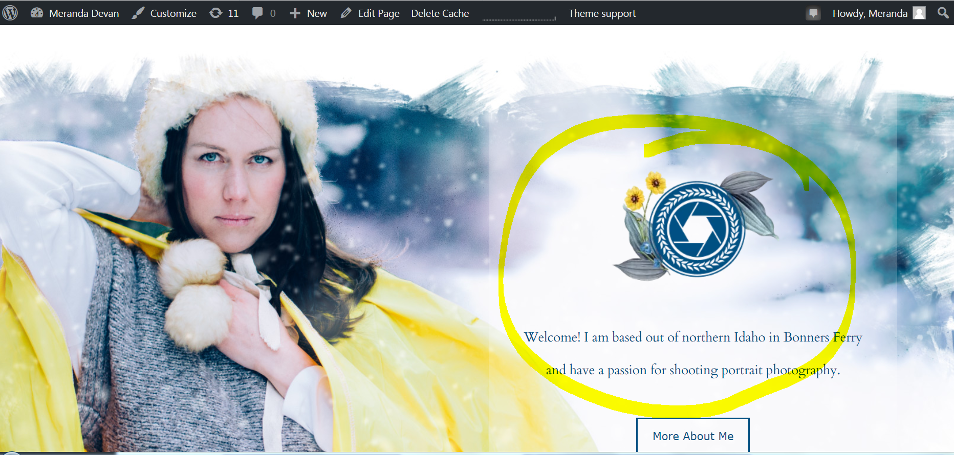
Here you can see the text is large which is how I want it.
http://merandadevan.com/wp-content/uploads/2019/02/right-4.png
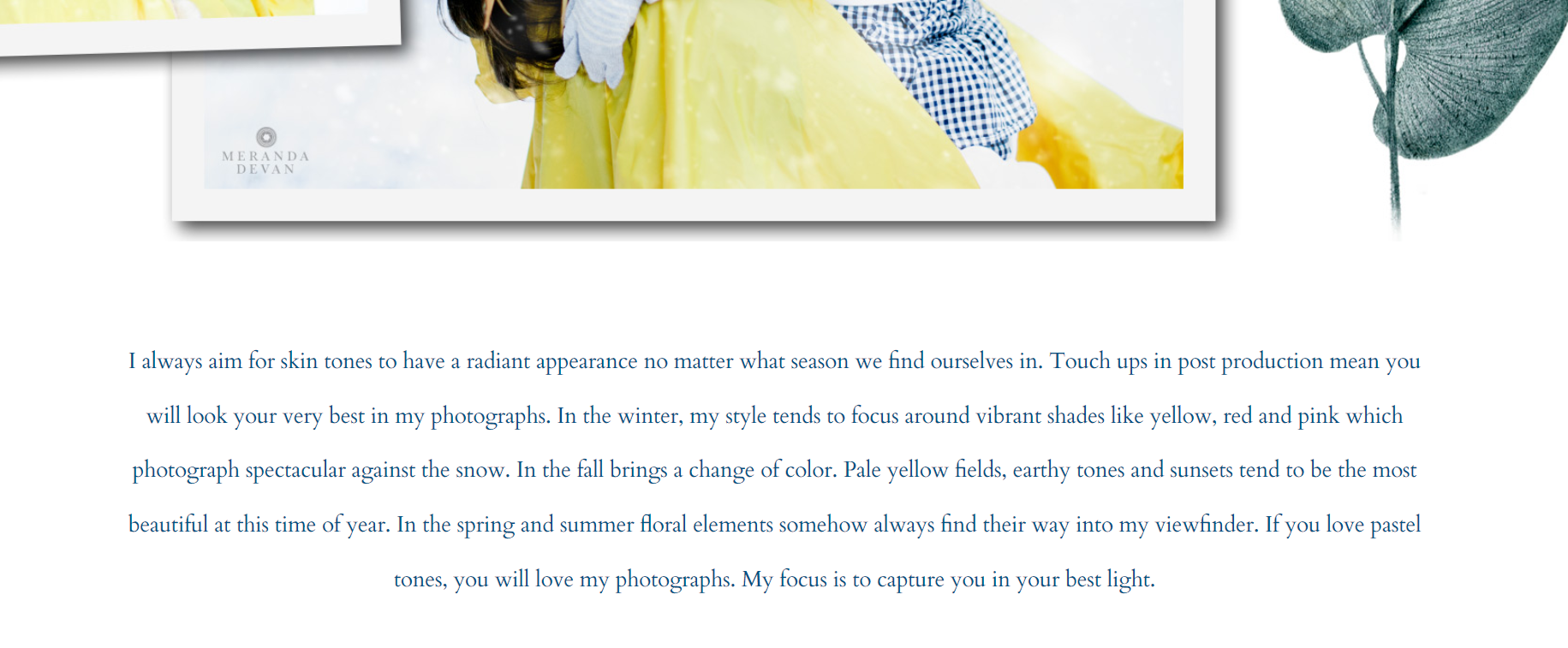
On the mac, the text appears very small
http://merandadevan.com/wp-content/uploads/2019/02/mac-5.png
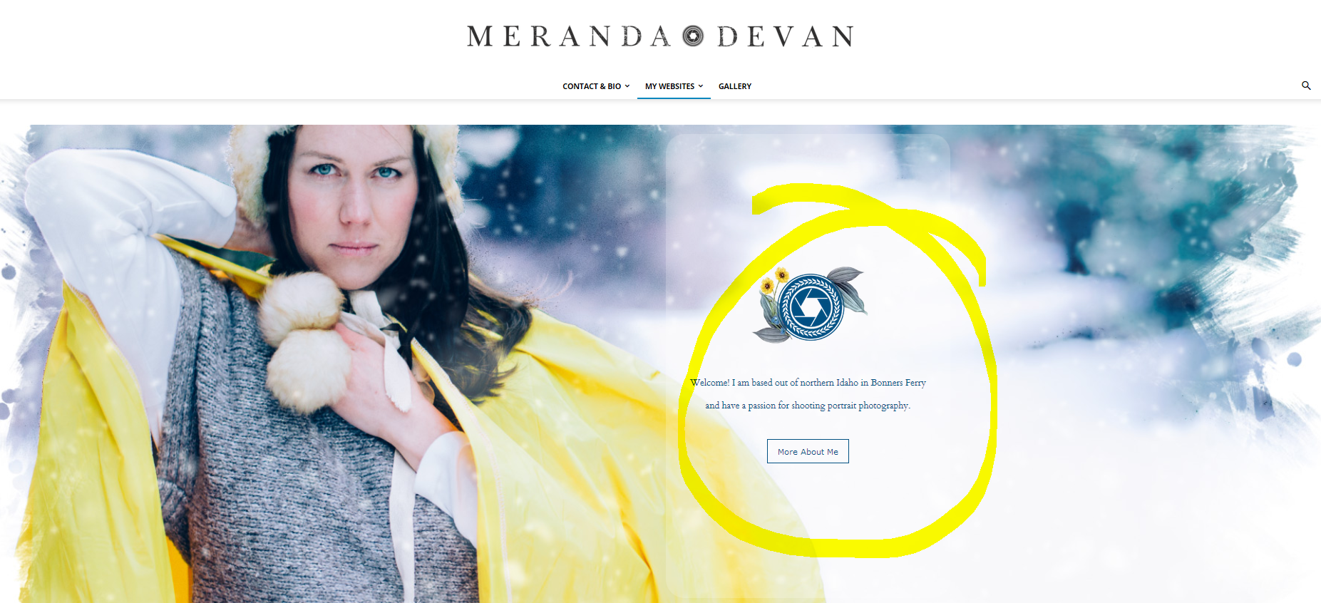
How the text should appear on the front page…
http://merandadevan.com/wp-content/uploads/2019/02/right.png
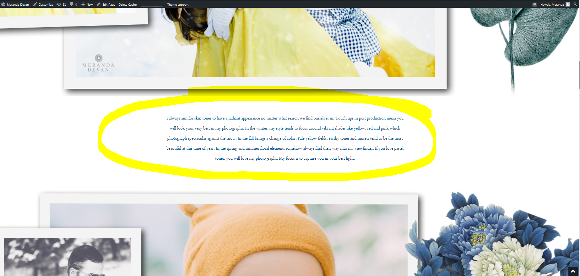
On the mac, the graphics are stretched, but the text remains small.
http://merandadevan.com/wp-content/uploads/2019/02/mac.png
I have tried the option of stretching the graphics and the text.
Is there a fixed width CSS option where on mac computers my website would show up with space on either side?
What do you think would fix this for me? I appreciate anyones help here….
Meranda
-
This topic was modified 7 years by
Meranda Devan.

Hi,
Here is how I see the text in your website -> https://www.screencast.com/t/BtrtwT7gM
Please make sure that you clear all cache when you make some changes, also the text is set only 17px size -> https://www.screencast.com/t/bKhWqFWV5 , I think that you make this settings in a laptop that have a small screen, or you have a low resolution to your desktop.
Thank you for your understanding!
Calin…
Thank you for looking into this for me. Unfortunately, this doesn’t solve my problem. It shows up nicely on most of our computers but on my husbands stretched MAC screen the pictures are stretched (which I want)… but the text doesn’t follow suit. It appears extremely tiny.
What would the settings be for the content like the other photos on the site, along with the text to follow suit on a big screen?
OR, how can I make my website be fixed, so I know that what ever screen it is being viewed on – it appears the exact same?
Unless you have a mac, my website may appear normal…as it does on my screen.
Thank you
Hi,
I check your website on a mac and normal desktop too, and for me is look very good.
Mac version -> https://www.screencast.com/t/Wgyridur
Desktop version -> https://www.screencast.com/t/8iCidAQ0c
What you can do is to check the website with different browsers on both mac and you computer.
Is possible to have some old version of browsers or to have zoom in the browsers or on desktop.
After you check all those and the problem is still there you can make a full backup to your website and make update to the theme to Newspaper 9.5
How to update the theme ->https://forum.tagdiv.com/how-to-update-the-theme-2/
Install via WordPress – https://forum.tagdiv.com/install-via-wordpress/
Install via FTP – https://forum.tagdiv.com/install-via-ftp/
Thank you for your understanding!