- NewspaperWP Rocket and Newspaper Theme: Optimization Guide
- TutorialsFrom WPBakery to tagDiv Composer
- TutorialsDefault Block Settings Guide
- TutorialsHow to use custom fonts
 Andrei L.
 Hi
All this customizations require custom modification in theme files and unfortunately i can’t provide a solution now. Basically the html structure must be changed in order to generate a unique class depending by the primary category then use that class in css to apply the desired style.
In order to achieve this you will need some serious customizations which involve good coding skills and lot of time and tests.
If you’re not aware of the steps you need to take in this regard please consider hiring a developer or a freelancer to do this for you as we can’t offer customization services at the moment.
Thanks for your message
Andrei L. Buna
Ca sa obtii acest resultat: http://screencast.com/t/azUGCkerG primul pas e modificarea functiei care genereaza comentariile pe module. Va trebuii sa adagi aceasta clasa aici: http://screencast.com/t/ioN5NP2fSL
Apoi adauga acest css in theme panel > custom css:
.td-icon-views{

display: inline-block;

}

.td-icon-views:before{

    margin-right: 5px;

}
Multumesc!
 Vilfredo
Hello,
I tried to get rid of black borders in Youtube videos on the top and bottom (approx. 10 px each). Therefore I changed the aspect ration from 0.6 to 0.5625 in the tagdiv_theme.js:
> td_video.css(‘height’, td_video_width * 0.5625, ‘important’);
Doesn´t work, you can see it here:
http://www.iphone-fan.de/displayschutz-fluessigglas-iphone-glaz/
Any other ideas to get rid of those ugly borders?
Thanks
Dirk
 Bogdan B.
 Hello,
Unfortunately there is no different version of the website for mobile phoines. It is the same version of the theme/page. You can however use a css trick to hide the particular block on all other devices except mobile.
For example you can add a block and add an extra class on the row in visual composer: http://screencast.com/t/arlc4Qu1Dt and then use thios custom css in the theme panel->custom css box:
@media (min-width:767px){

.customclass{

display:none!important

}

}
I hope this helps.
Thanks.
Andrei L. Hi
I am not sure how you implemented the chat bar for logged in users but I suppose that you’re using a plugin for this. I can’t say exactly what causes this issue but most likely it’s a css issue.
Please address us via email at contact@tagdiv.com and provide wp-admin so we can take a closer look at this issue and maybe we can help you. However I can’t promise that we can provide a solution as I am not aware yet how the chat windows it’s added and how many customizations are required in order to have it displayed fine.
Also include a link to this conversation in your mail.
Thanks!
 Catalin
 Hello mayunathan,
For achieving that, you have to do some customization in the core file according to block style used by you. Below I presented you the steps would be followed in order to achieve as you want. Please consult these screenshots and then you should try to implement for your side. http://screencast.com/t/l9uIyKQ7 and then you have to use a bit of CSS code for style and add it in Theme panel->Custom CSS area and the result you should see here -> http://screencast.com/t/dizdPFioa0L
These customizations are required for each block style that you are using for your site.
Hope this helps!
Than kyou for the message!
Bogdan B. Hi,
This can be done only by altering the theme files. You need to remove the code for the ad place in teh header style 3 file: http://screencast.com/t/MZ0vGILsmG and then use this css for the logo positioning:
.td-header-style-3 .td-header-sp-logo{

    margin-left: auto;

    margin-right: auto;

    float: none!important;

}
result: http://screencast.com/t/MjMAIP1k
Thanks
Bogdan B. Hi,
If you want only the background to show on the homepage, you can hide all the content with css{
.home .td-content-wrap{

display:none!important

}
Thanks.
Bogdan B. Hello,
It is possible but it will require a bit of css knowledge to adapt it to your own case. You can remove the this code from the specific top bar template you use: http://screencast.com/t/cNbVHo90SN
Then you need to paste the code in the header-menu file: http://screencast.com/t/uSStTxxMGVLJ
It will require further customization for positioning though.
Thanks.
 libtetto
Hi there. I am using a plugin to show related posts in sidebar. But I don’t like how it shows. Don’t know how to change the CSS on it either.
Is there a way to implement matching tagdiv blocks on sidebar showing related posts by tags?
Thanks!
Christoph
 craigmc
Hi guys,
I am using the Superfly menu plugin and have a requirement to disable the top, main navigation and mobile menus.
I can see how to easily disable the top menu but the main navigation and mobile menus there is no option in the theme panel.
Ideally would rather alter the theme code files to remove theme as I have found previously when I hide with css some elements show for a split second before hiding.
Thank you
 jacobicho
 Thanks a lot Bogdan! I’ve just learn how to hide/show elements in mobile/desktop versions via CSS, setting up the Newspaper panel in Custom code > Advanced CSS. However, now the slider I configured in my mobile-version homepage overlaps the subsequent block, altering the expected layout. Do I need to set up any offset for the first block, or what should I do to fix the layout? If needed, you can see the current look of my mobile site via the aforementioned link.
Thank you!
Oscar
 Dhananjay
 Using a custom CSS? You might want to delete your site cache, and recheck?
 Reza
Reza Hi;
I have a question regarding StumbleUpon share button, I have read about it in forum and already added it in the td-module-single.php.
i added this to php : <su:badge layout=”6″></su:badge>
and this in the custom java script code :
<script type="text/javascript">

  (function() {

    var li = document.createElement('script'); li.type = 'text/javascript'; li.async = true;

    li.src = ('https:' == document.location.protocol ? 'https:' : 'http:') + '//platform.stumbleupon.com/1/widgets.js';

    var s = document.getElementsByTagName('script')[0]; s.parentNode.insertBefore(li, s);

  })();

</script>
as you can see it in our article pages, e.g:http://glossycover.com/the-all-things-glossy-weekly-round-up-ii/
would you please help me to decorate it ? its not in a line with other buttons 🙁 .
I know I have to decorate it by myself with css, but I’m totally new in wordpress and web develop.
if you could help me, I would be great.
Best Regards;
Reza.
 geolits
Hello,
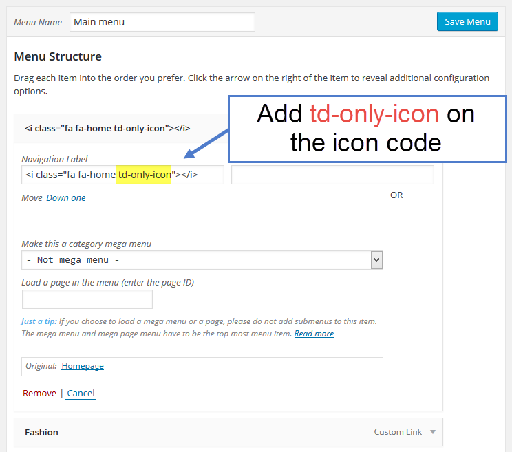
i have a problem with font awesome icon.
first of all at your documentation you have this: https://forum.tagdiv.com/wp-content/uploads/2015/05/2015-06-18_13-00-03.png
but at my site when i’m going at menu edit, is like this :

there where i have “fa-home” if i put all “<i class=”fa fa-home”></i>” the icon is not displayed at the page, if i put only “fa-home”, the icon is displayed correct with the menu name after that. If i put “fa-home td-only-icon” i have the same result as to have only “fa-home”.
Why my menu edit is different from your documentation? and how can i have only the icon without the text?
Here is my page: http://testgeolits.myipservers.gr/Olaballa/ . Now i have at class css this “fa-home td-only-icon”
 Pohtecktoes
 Hi Bogdan,
Thanks for the reply.
(1) Is there a custom css where I can instead standardise the size of of the logo on the main menu and sticky menu? I would like to decrease the size of the logo.
 DaneOLeary
 I realized that something I assumed would be happening with the tweaks mentioned above is actually not occurring. Off the top of my head, this might be more complicated than simply putting code into “Custom CSS”, but hopefully this can be done.
So right now, as the mouse hovers over each of the tabs in my navbar, a colored bar appears, running at the bottom. However, I’d hope that the colored bar would remain on the tab of the category that’s currently active. For example, let’s say that my navbar consists of categories A, B, C, and D. In each category, there are three posts numbered 1, 2, and 3. I’ll identify the categories of posts like this: B2 is the second post in category B, D3 is the third post in category D.
Hopefully you’re with me so far.
What I want to happen is when a person was browsing a category (A-D) or viewing a post, the “active” category’s tab would have the little colored bar fixed, running along the bottom of that tab. It would stay there for as long as the viewer remained on that page or in the category to which that page belonged. When he or she hovered the mouse over the navbar, the little colored bar would appear at the bottom of whichever tab the mouse was hovering over as the code provided above had intended for it to do, but there would also be the fixed colored bar along the bottom of the active tab that would remain no matter where the mouse was hovering because the person is currently on a page that belongs to that category. In other words, that category is still “active”. Then, if the viewer went into another category, the new category would have the colored bad fixed along its bottom because it would now be the “active” category.
Viewing post A2 would mean that category A would have the fixed, colored bar.
Viewing post C1 would mean that category C would have the fixed, colored bar.
Viewing post B3 would mean that category B would have the fixed, colored bar.
I hope this makes sense, I don’t know if I’m explaining it right. The purpose for me wanting this is so that a viewer could glance at the navbar and it would tell him or her which category he or she was currently browsing, or in which category the post he or she was reading belonged.
Again, hopefully I’m explaining this right and I really, really hope this is possible.
 newtag
 Hi, thx – but there is one more css file for a google font. Without the functions code i calls 3 files..
Any idea to remove also the other one
best
 CEOELLIS
 CAN YOU READ ME A CUSTOM CSS CODE HOMEPAGE ONLY BLACK?
Andrei L. Hi
You can use media queries to hide an element on mobile devices:
@media(max-width: 768px){

.elemnt-css-classes{

display: none;

}

}
Here is an example referring at more article box: https://forum.tagdiv.com/topic/view-on-mobile-mode-the-more-stories-covered-all-content/
Thanks!
Bogdan B. Hi,
That’s the information we needed. In order to add code to a block, you can modify the specific file for every module (blocks are made up of modules): http://screencast.com/t/oIIZeKWbl4
You can verify which block uses which module here: http://screencast.com/t/yaKm2ihTvm
It might require a bit of css for positioning after you add the code.
I hope this helps.
Thank you!
 charlieh10
 Brilliant thanks, solutions 2,3 and 4 worked perfectly. However 1. Didn’t seem to work at all. I entered the css but no change.
Charlie
Catalin Hello 12sea,
1)If you want to remove the number of the post into the smart list, you have to use a bit of CSS to hide it and if you want for a specific post to do this, you have to target the certain post by post ID. Please try the code below and add it in Theme panel->Custom CSS area.
The code is ->
.postid-1209 .td-sml-current-item-nr {

display:none;

}
The result -> http://screencast.com/t/I6JLkxDg -> http://screencast.com/t/lOQx8NtT4
2)The post will be counted only once, no matter how many slides has your smart list.
Hope this helps!
If you need more assistance in this regard, please provide your website and provide a link with your smart list so I will be able to provide a more accurate code. This could be different in the case of the smart list that you are using.
Thank you for the message!
Bogdan B. Hello Charlie,
1) This happens because when you set a fixed height to the imge, it loses responsiveness. It will keep the set height on mobile as well. In this case you need to exclude the mobile version by targeting the viewport size with css. You can use the code like so:
@media(min-width:767px){

.td-post-template-6 .td-post-header {

height: 500px !important;

}

.td-post-template-7 .td-post-header {

height: 500px !important;

}

}
2)You can change the name from the translations section of the theme panel: http://screencast.com/t/x49Vt6hxYvTR
3)Our theme uses the wordpress time and date format so you can change it from the wordpress settings: http://screencast.com/t/9aQfuYWCmCi
You can do an online search on how to customize wordpress date and time.
4)You can use css to target only category pages like so:
.category .entry-date{

display:none!important

}
Thank you!
Catalin Hello Melissa,
Please try the code below and add it in Theme panel->Custom CSS area.
The code is ->
.td-mega-menu ul {

left: 342px !important;

}
The result you should see here -> http://screencast.com/t/4PmEMZ7b
Thank you for the message!