
- NewsmagLogo & Favicon
- NewsmagWhat’s included in Newsmag theme package
- NewsmagMain menu
- NewsmagHeader styles
- NewsmagFooter templates
- NewsmagTheme colors introduction
 Tikeswar
when i put a logo in newsmag theme (footer section) it can’t show logo in mobile , it show newsmag4 logo
 Simion C.
 Indeed there are requirements for most header styles in terms of logo size
– https://forum.tagdiv.com/logo-favicon/
Simply make sure you upload the full size of the image when setting the logo
– https://www.screencast.com/t/graHsimAEo
– https://www.screencast.com/t/HsOr4LblR
Changing the theme name could cause issues, but there are content protection plugins you could try if required.
 Bogdan B.
 Hello,
We added the h1 on logos where there is no h1 on the page. SEO requires a h1 tag.
If you want to remove it, you will have to either use the page builder + page title template where the h1 is shown in the page content, and the logo does not get a h1 tag anymore, or by editing the theme files and removing the h1 tag from the theme code: https://www.screencast.com/t/9uXujjSj
Thank you!
 srky333
 Hi, can someone explain me what happens with space around my logo. In theme panel says that I have 272x90px for logo, and now (see attachment) I have 150×90. How I can solve this?
And second question is whether it is allowed to change the name of the theme, that when someone inspect or ctrl+u dont see:
/wp-content/themes/Newspaper/… and see for example /wp-content/themes/site-name/
and how to do this?
Thanks!
 SweetAceee
Hi guys, I’ve checked your documentation but I can’t find a way to remove h1 tag from logo on pages.
Could you please help?
Simion C. Hi,
That demo uses header style 10 with top bar style 1. There is a logo used with a similar background color
– https://www.screencast.com/t/BAzlLLpwM4
Some icons are used in the menu, those are the only that were created, there are no other icons like those.
All the font properties of the header can be customized in the theme panel. You can also check the craft demo stylesheet to see what customization has been used
– https://www.screencast.com/t/XL7rWsuFthB
It would not be hard to replicate the same look.
Thanks
Simion C. Hi,
@KEllc-Admin The logo should resize, check this theme demo which uses a large logo with header style 10
– https://demo.tagdiv.com/newspaper_cars/
Try to resize the window, the logo will resize accordingly.
Thanks
 badnursie
All of my pages except “Posts Page” and “Contact” page JUMP upon loading.
I’ve removed all custom CSS and my header logo. I’ve also deactivated several plugins. Nothing yet has fixed this.
Please tell me what’s causing this and how to fix it.
 bhanu039
Hey Guys, I like the header style of craft Ideas demo and the way top menu + logo + main-menu looks and wants to do the same without installing the demo cuz it then affects another styling of category tags etc. So it would be really helpful if u can provide the styling or the code snippet which I can then put in my child theme stylesheet.
I have tried it by selecting the same header style and all but cannot achieve the same style for top menu + logo + main menu.
reply ASAP.
Thanks
 KEllc-Admin
 I want to ask a follow-up question RE header styles 9-19-11: when uploading larger image files, the logo itself does not seem to resize. Is there something else which must be done?
Thanks
 Patrik
 Thanks for your answer!
Wordpress is up to date, Newspaper Version 8.7.2 is running. What I tried so far:
- deactivate all third-party plugins – including cache
- switched from child to main theme and back
- tried other header-styles with and without logo-img
nothing worked.
here is the url: http://www.papaausleidenschaft.at/

 Saikological
Hi guys, how can i reduce the header height?
I want it to be without the extra space around the logo.
See image in link. Is there some custom code for this?
http://i201.photobucket.com/albums/aa183/Saikological/header%20height_zpsvu1kqj7s.jpg
Kind regards.
PatrikHello there,
I just wanted to add a menu to my site, but it doesn’t show on the frontend. I’m using header style 10 with text-logo.
Here are screenshots of the style and menu settings:


 hildi
hildiHi,
I’m using the tagdiv-AMP plugin. I don’t see the ads on the AMP pages (when adding /amp at the end of the url).
There are OK on the website and I put the same ad settings (Adsense and Taboola) as on the non-AMP articles.
Should I create specific new codes in Adsense for the AMP ?
Thanks
ps : by the way, the logo is not centered but left aligned, which is not so pretty on AMP showed on big screens.
 hellonikoloz
 Catalin, Thanks for your reply.
Let’s start from the logo, I am using text logo not the image logo, you could have noticed, if you have checked it, it is text logo, header style 10, on News Week theme demo.
So why theme is not resizing the logo for mobile devices?
Second, about the sign in / join buttons.
Of course i am aware that the styles are different for desktop and mobiles, and that is exactly why i opened this topic to get help to make it the same. I mean the theme is one, so why should i have different view on mobile devices? Just answer me. Styles are different is not the answer, because styles should not be different. I am just asking for help to either make 2 buttons in desktop view or 1 button on mobile view, so the website will be the same for any device. Just tell me how and what to edit in the theme editor.
Thanks.
 Catalin
 Hello,
Yes, please notice that the theme will auto resize the Text Logo on mobile devices if you will use the text logo, as you can see here -> https://www.screencast.com/t/OZ27ZVglCq Regarding on Sign in / Join buttons the style are different on mobile than the desktop version, sorry!
Thanks for your understanding!
Catalin Hello mvonplato,
If you want to make some changes to the logo text, you should use a bit of CSS code and place it in Theme panel -> Custom CSS area.
.td-header-style-10 .td-header-text-logo span{

font-family:Arial;

}
Notice that the font family used in this code should have to be loaded from the Theme panel in order to achieve good results.
Thanks.
 phil_ilo
I’m not sure why my header and logo image are displaying improperly. The main menu is partially hidden behind the top menu. The logo is very small.
Screenshot: https://drive.google.com/file/d/1HBC0poKJ1J4kdx4XYl_4w-11_08JUGfo/view?usp=sharing
 trcanada
Hi, i placed logo on Footer but it keep shows very small and position looks weird.
please see the url for screenshot – https://ibb.co/gnhPmc
The Logo size is not small, it’s same as Retina Logo size.
Please help!
Thanks.
 mvonplato
Hi,
I would like to change the text logo font on my website. I am not seeing any way to do this. Is it possible for you to insert custom CSS to accomplish this? I would like the font to be Glacial Indifference Bold.
Thanks
Catalin Hello pozitron21s,
Check the logo to have a good size in order to achieve well results. From what I see, your logo is too small and that’s why you bring that results, sorry! Please check it from here
-> https://www.screencast.com/t/IWCx7KhZ
Thanks for the message!
hellonikoloz And about the logo size, I understand that it has many letters and that’s why it is not fully visible, however theme should be adjusting it for mobile, i mean theme should minimizing the logo text font for mobiles, isn’t it right?
Catalin Hello hellonikoloz,
I have checked your mobile responsive version and it seems to work as expected. Notice that your mobile logo is not fully displayed because the size of it is too big. You should load another logo for mobile mode. The social networks are here -> https://www.screencast.com/t/0rYoc6NI Only two as you have it on the desktop view as well.
Thanks for your understanding!
 pozitron21s
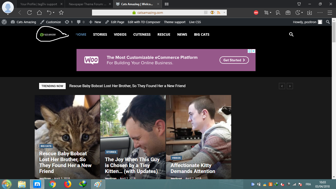 hellonikoloz
Hello,
I am using “News Week” demo theme on my website, I do not have mobile plugin installed.
There are some differences between mobile and desktop view and i just want website to be the same for any device.
1st difference:
The desktop view:

Mobile View:

In Mobile View, the logo’s not showing completely.
How to adjust it for mobiles to view the logo fully?
2nd difference:
Mobile view:

There are 2 buttons, First is Sign in and the second is Join, However in Desktop View, there is just one button
Sign in / Join. I’d prefer to have 2 buttons in desktop view as well.
So, how could i make it both mobile and desktop view the same?
Thanks in advance.

