
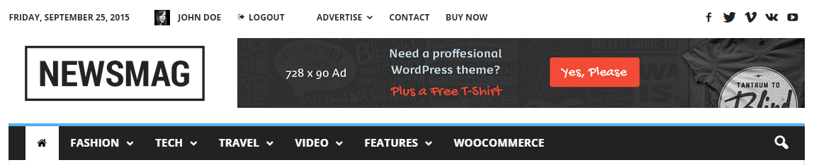
The Newsmag theme is so versatile, that you can choose where you want to use the menus. The theme supports custom WordPress menus, with multiple levels of drop-down for the main menu. There are 3 areas of the theme where you can display a menu: the Top bar, the Main Menu and the Footer Menu. In this section you will learn how to create a new menu, make it a sticky one (on desktop, mobile and retina ready devices) and customize the Main Menu.
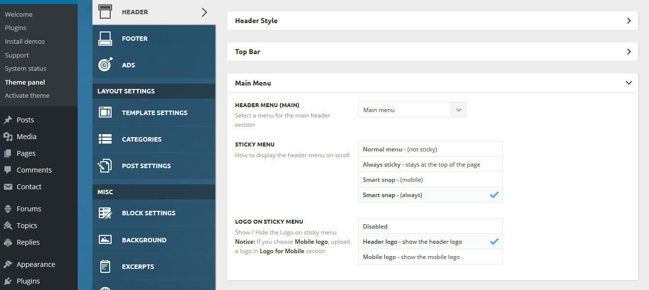
The theme comes with some general options for the Main Menu. Go to Theme Panel > Header, and expand the Main Menu section.
The available options
1. Header Menu (Main) – This option allows you to load a menu created earlier as the main menu. With this function, you can also choose to display a menu for the footer or the top bar.
2. Sticky Menu – This option gives you the freedom to decide how to display the header menu while scrolling.
- Normal menu – This is a non-sticky one. Choosing this will make your main menu stay fixed in the top section of your website and will disappear from the viewport when you scroll down the page.
- Always sticky – This option makes your website’s menu sticky all the time. Even when you scroll down the page, the main menu will always stay in the top section of your viewport.
- Smart snap (mobile) – Define the behavior of your main menu on the mobile and retina ready devices. If you choose this option, the sticky menu hides on mobile devices when you scroll down and it shows up when you scroll up.
- Smart snap (always) – This option defines the behavior of your main menu on the desktop, on mobile and retina ready devices. By choosing this option, the sticky menu hides when you scroll down, and it shows up when you scroll up, extending the viewport for a better user experience.
3. Logo on the sticky menu – You can decide if you need a logo to be loaded on the sticky menu and how it should behave in different environments.
- Disabled
- Header logo – The header logo will be loaded on the sticky menu
- Mobile logo – This option allows you to add a mobile logo to your sticky menu. Notice: You can use this option only if you uploaded a mobile logo earlier (Theme panel – Header – Logo for mobile).
After you finished customizing this section, click the Save Settings button.
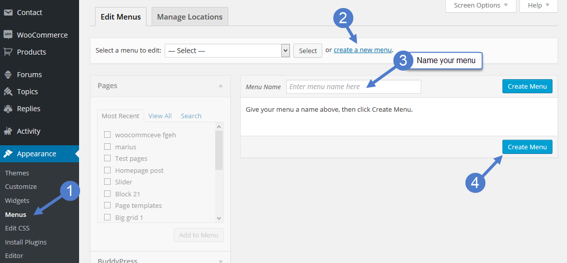
To create a new Main Menu go to:
- Go to your WordPress Dashboard > Appearance > Menus
- Select the link Create a New Menu
- Write a name for your menu
- Press the Create Menu button
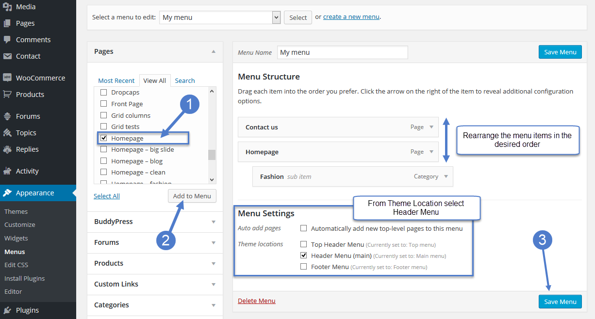
How to customize your new Main Menu:
- Start adding menu items from the left panels (Homepages, Pages, Links, Categories)
- You can manage your menus by using the drag and drop functionality and rearrange the menu items in the desired order.
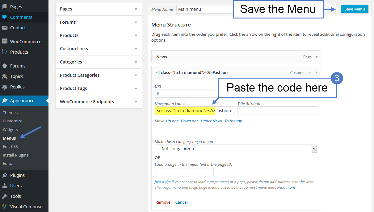
After setting up your menu, scroll down to the bottom of the page, and assign the menu to one of the 3 Theme Locations at the bottom. Select Header Menu (main) for Main Menu. - Click the Save Menu button
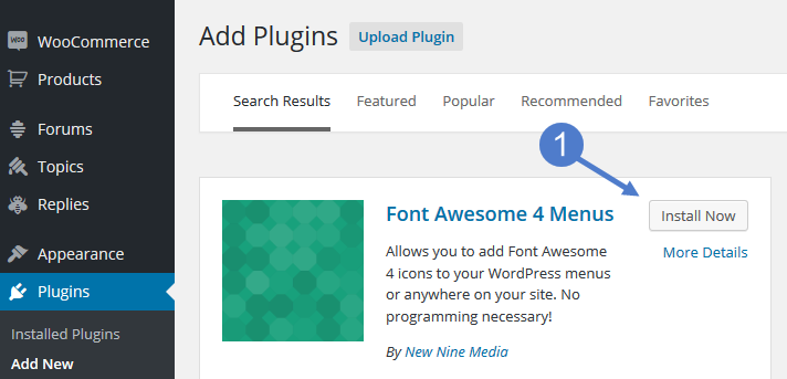
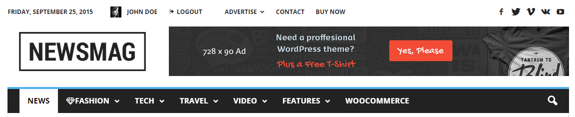
To add a font ICON on the Main Menu/Top menu:
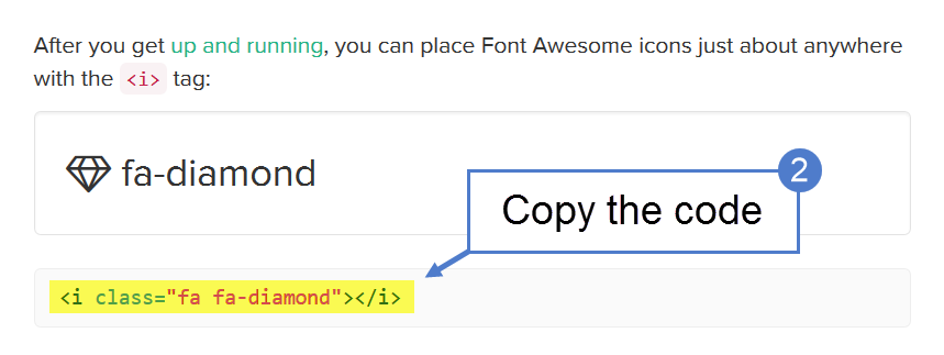
- Go to Plugins -> Add new, and install the Font Awesome 4 Menus plugin.
- To preview all available Font Awesome icons, go here. Click on an icon that you want to use, and then copy the icon’s code
- Go to Appearance -> Menus, select a menu that you want to edit, and paste the icon code in a menu item; then save the menu.
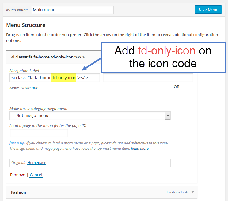
- If you want to add only one icon the menu(without text), add this td-only-icon to the icon code for a better alignment.