
Newsmag theme allows you to set your logo as an image file or a text. It is only required to upload one logo, and it will be used in every location. In Newsmag you have an additional option to upload a retina logo for high resolution devices.
To comply with the best SEO practices, on the site’s homepage, the logo is wrapped inside a H1 HTML container. On the other pages (category, tag, archive, post single etc.), the title is wrapped inside a H1 container.
How to add a logo
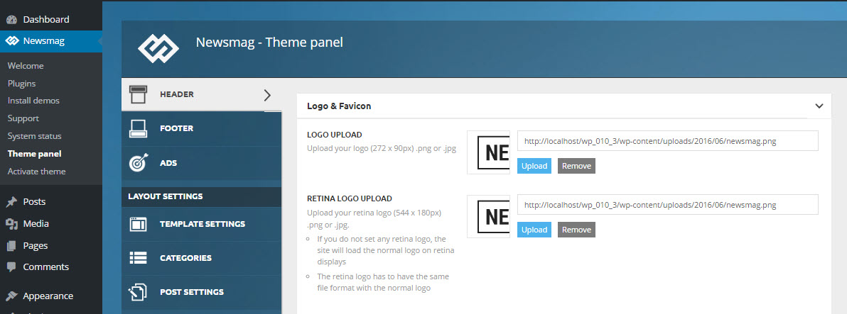
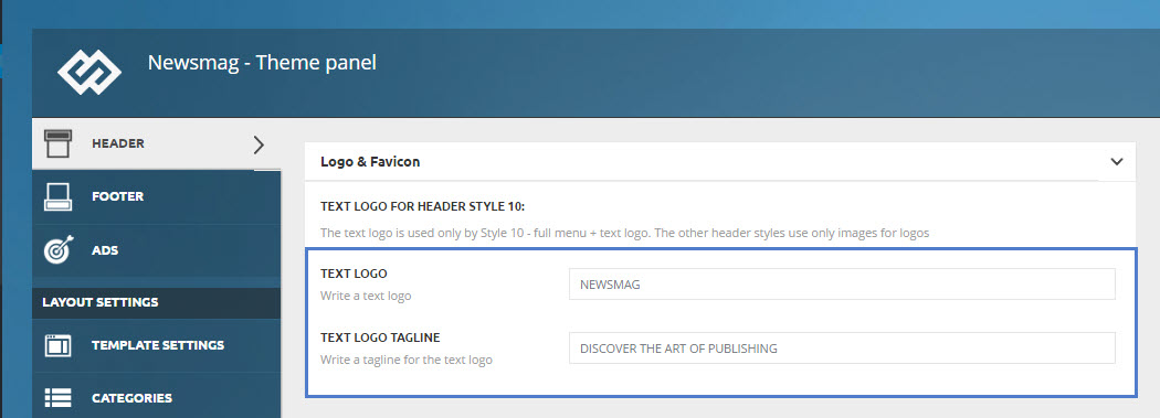
To upload a logo, go to Theme Panel > Header and expand the Logo & Favicon section. You will find 3 options: Logo upload (default logo for desktop), Retina Logo Upload (Retina Version for retina ready devices) and Favicon (optional). Please read below how to set up the logo for you website.
Logo upload:
To upload your logo, go to Theme Panel > Header and open the Logo & Favicon section. The Logo upload is the section where you add a logo for the desktop. The logo must be a .png or .jpg file.
The text logo can be used only in Style 10. The other header styles use only images for logos. If you want to use Style 10 for the header, you can write your text in the Text logo area and it will be used as a logo.
Note: If you have a logo uploaded, any text logo will be ignored.
After finishing the upload, click the Save Settings button.
Retina logo upload:
To upload your logo, go to Theme Panel > Header and open the Logo & Favicon section. The Retina logo upload is the section where you add a logo for retina ready devices. Your logo must be a .png or .jpg file.
- If you do not set any retina logo, the site will load the normal logo on retina displays.
- The retina logo must have the same file format and to be double in size as the normal logo.
- After finishing the upload, click the Save Settings button.
Logo Size
There are several Logo Size variations, depending on what Header Style you want to use.
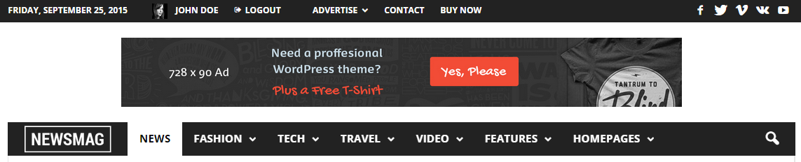
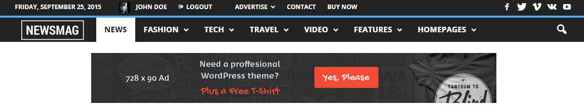
Header Style 1, 2, 3
For best results, use this logo size:
- Logo Upload: 272 x 90px
- Retina Logo Upload: 544 x 180px
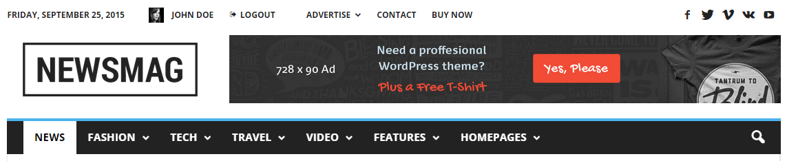
Header Style 1
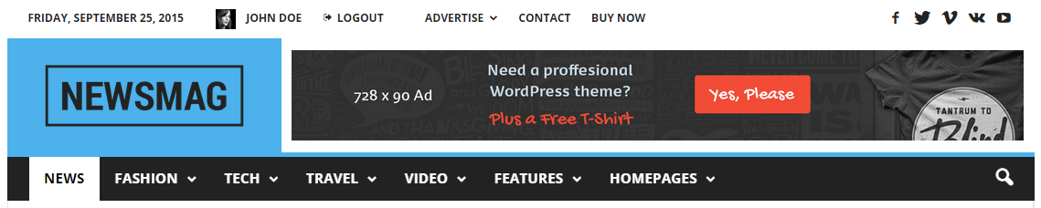
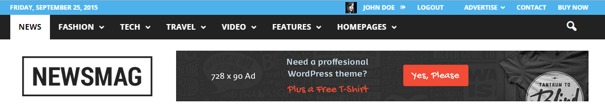
Header Style 2
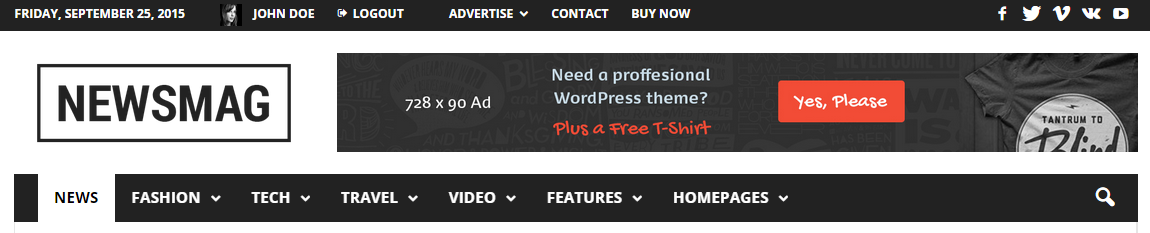
Header Style 3
Header Style 4, 5:
For best results, use this logo size:
- Logo height: 44px
- Retina logo height: 88px
The width is not limited; for retina use a double resolution, for ex:
- Logo width: 150px
- Retina logo width: 300px
Header Style 4
Header Style 5

Header Style 6:
For best results, use this logo size:
- Logo Upload: 272 x 90px
- Retina Logo Upload: 544 x 180px
Header Style 6
Header Style 7, 8:
- Width is limited only by the content area container which has 1021px
- Height is not limited
For retina use a double resolution, ex:
- Logo size: 250 x 150 px
- Retina logo size: 500 x 300 px
Header Style 7
Header Style 8
Header Style 9:
For best results, use this logo size:
- Logo height: 44px
- Retina logo height: 88px
The width is not limited; for retina use a double resolution, ex:
- Logo width: 150px
- Retina logo width: 300px
Header Style 9
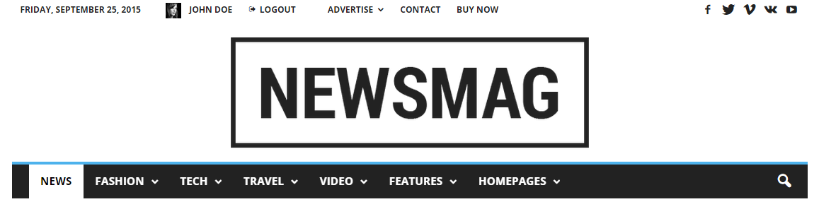
Header Style 10:
Image logo
For this header you can use a full width header logo, for example a full width image. For retina use a double resolution, ex:
- Logo size: 250 x 150 px
- Retina logo size: 500 x 300 px
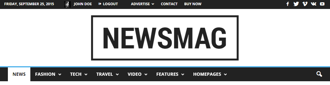
Text Logo
In our Classic Blog Pre-built Website, we are using Header Style 10 with a text logo. The logo font parameters are predefined. To modify them, you have to add a custom CSS in the Theme Panel -> Custom CSS, ex.
/*logo text parameters*/
.td-logo-text {
font-size: 75px;
line-height: 60px;
}
/*tagline text parameters*/
.td-tagline-text {
letter-spacing: 1.8px;
font-size: 11px;
opacity: 0.5;
}
Header Style 10
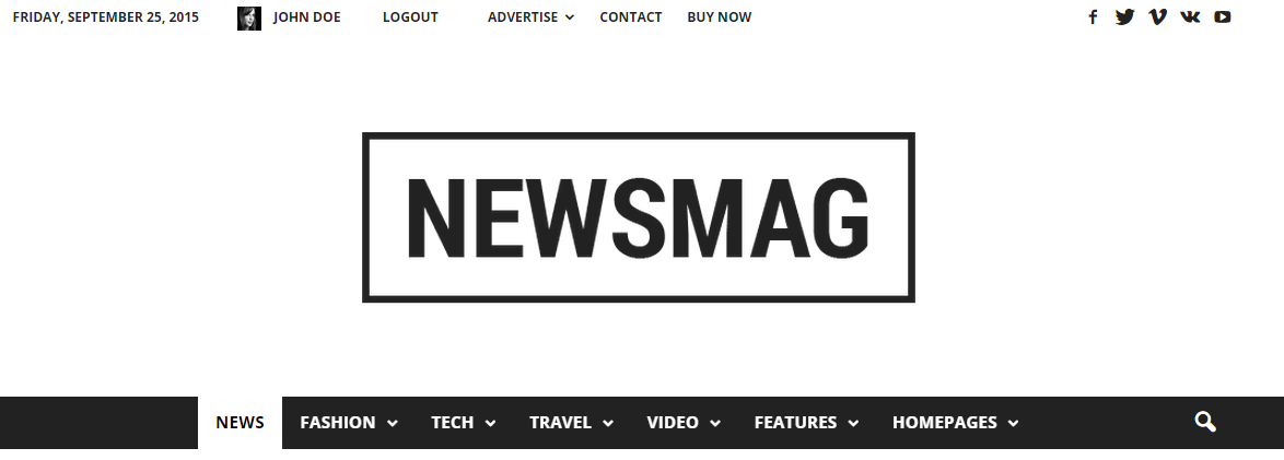
Header Style 10 – Text Logo:
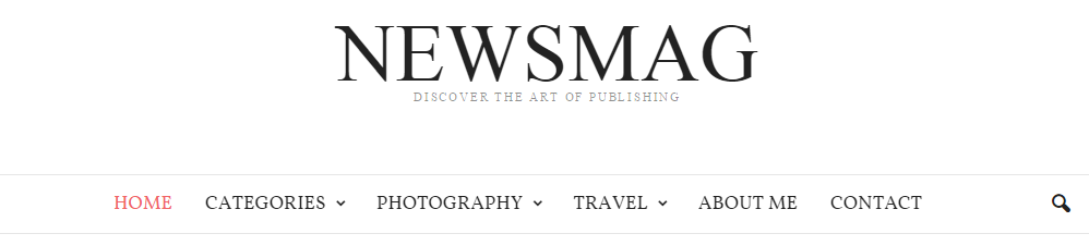
Text Logo settings
Logo for mobile
1. You can optionally load a different logo on mobile phones and small screens. Usually the logo is smaller, so that it can fit in the smart affix menu.
- To upload your logo for mobile, go to Theme Panel > Header, and open the Logo for mobile section. Logo mobile is the section where you add a logo for the mobile.
2. iPhone, iPad, Samsung S3 S4 S5 and a lot of phones use the Retina Logo.
- To upload your Retina Logo for mobile, go to Theme Panel > Header and open the Logo for mobile section. Retina logo Mobile is the section where you add a logo for version for retina ready devices.
Mobile Logo Size:
For best results, use this logo size:
- Logo height: 44px
- Retina logo height: 88px
Notices:
- The mobile logo width is not limited, but you should take into account the menu and search buttons.
- If you don’t upload any Logo Mobile, the default one will be used (the one you set on the Logo & Favicon section). This option is recommended when the default logo doesn’t scale perfectly on mobile devices.
- Don’t upload a logo for Mobile if you use Header Style: Style 4, Style 5 or Style 9. It’s not necessary.
Favicon Upload:
The favicon is an icon associated with a URL that is variously displayed, such as in a browser’s address bar or next to the site name in a bookmark list.
To add a favicon to your website, go to Theme Panel > Header, and open the Logo & Favicon section, select the favicon file you would like to use and click Upload. Your Favicon must be a .png file.
- The recommended size for the Favicon image is 16px x 16px.
- After finishing the upload, click the Save Settings button.
iOS Bookmarklet:
The bookmarklets work on iOS and Android. When a user adds your website to the home screen, the phone will download one of the icons from here (based on the screen size and device type), and your site will appear with that icon on the home screen.
In this section you can upload the icon you would like to be displayed. The icon must be a .png file.