No search results were found in Documentation!
 nute
nuteHi all
I created the top menu, this is visible in the desktop version but is no longer visible in the mobile version?
How is it possible ?
 benh_82
 OK guys, i reverted back to the previous version of the theme as the latest one was kind of breaking the website.
Im going to leave on this version now i think.
I do need help resolving the purple mobile menu background showing in between navigating the website though please.
https://news.lovepattayathailand.com
Move off the homepage to another and you see the mobile menu background flashes before the page is loaded.
THanks
benh_82Hi,
Yesterday i noticed that the website had developed an issue. The problem was that when navigating between pages on the website there was a flash of the mobile menu background before the page would load. So before the pages load theres a quick flash of the purple background used on mobile menu.
I decided to look in my envato account to check on theme updates. I saw that i was on version 7.7 so needed to update my theme.
Since updating the the latest version of the theme my website layout has broken.
Now the website homepage has changed to full width. Now there is also something called TD composer in place of visual composer tab on the homepage.
The website also seems much slower to load now. https://news.lovepattayathailand.com
Anyway,if possible i would like to re-install the previous version of the theme and go back to how it was before.
Or id like some support in fixing the mess my update has caused please.
Thanks
 mally
mallyPLEASE HELP!
I have the Newspaper theme and as of recently, my mobile function is not working the way it used to. I have the dark theme selected and on mobile it shows something completely different. The theme is white and only shows just one category and not my whole homepage. And my menu bar displays nothing.
However, on desktop, everything functions the way it’s supposed to. Please help!!!
 Simion C.
 Hi,
1. Please note that the theme width overall cannot be changed. It should not be attempted by custom code. The theme has a fixed width, and all the elements used are dependent on this fact. Modifying the width will most likely break the website. There are precise values used that will not display properly under different circumstances.
On pages you can stretch rows to full width, using the composer. Header and footer elements can be stretched in the theme panel. But a general setting for width is not available.
2. You could adjust the line height for the header menu
– https://www.screencast.com/t/ki24ggk4sU
Increasing the line height value will affect the header menu height.
3. The search icon is a font, it could be increased with some CSS
– https://www.screencast.com/t/WobUXDutVP4
Hamburger menu icon as well
– https://www.screencast.com/t/hOC404fGB
This is the code used in the example, adjust it as you like
.header-search-wrap .td-icon-search {

font-size: 50px;

}

#td-top-mobile-toggle i {

font-size: 50px;

}
The Travel blog demo uses a different header style, so the code will not work. Either change the header style to 6, or modify the header style in the code. Might need to adapt more of the code as well.
When you uninstall the demo, this will remove all the demo settings. The theme panel will be reset. The theme has an option to export/import theme panel settings
– https://forum.tagdiv.com/import-export-theme-settings/
That should be the only case that the theme panel is affected.
Thanks
 Rafael Fernandez
 Hi,
It does not work, maybe I’m not putting it where it should go
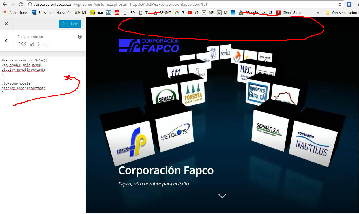
This is another code, but hide the menu on all pages and I just need it to be on the landing page and I’m learning as fast as I can.
thank you very much for your help,
regards
@media(min-width:767px){
.td-header-main-menu{
display:none!important;
}
}
.td-icon-mobile{
display:none!important;
}
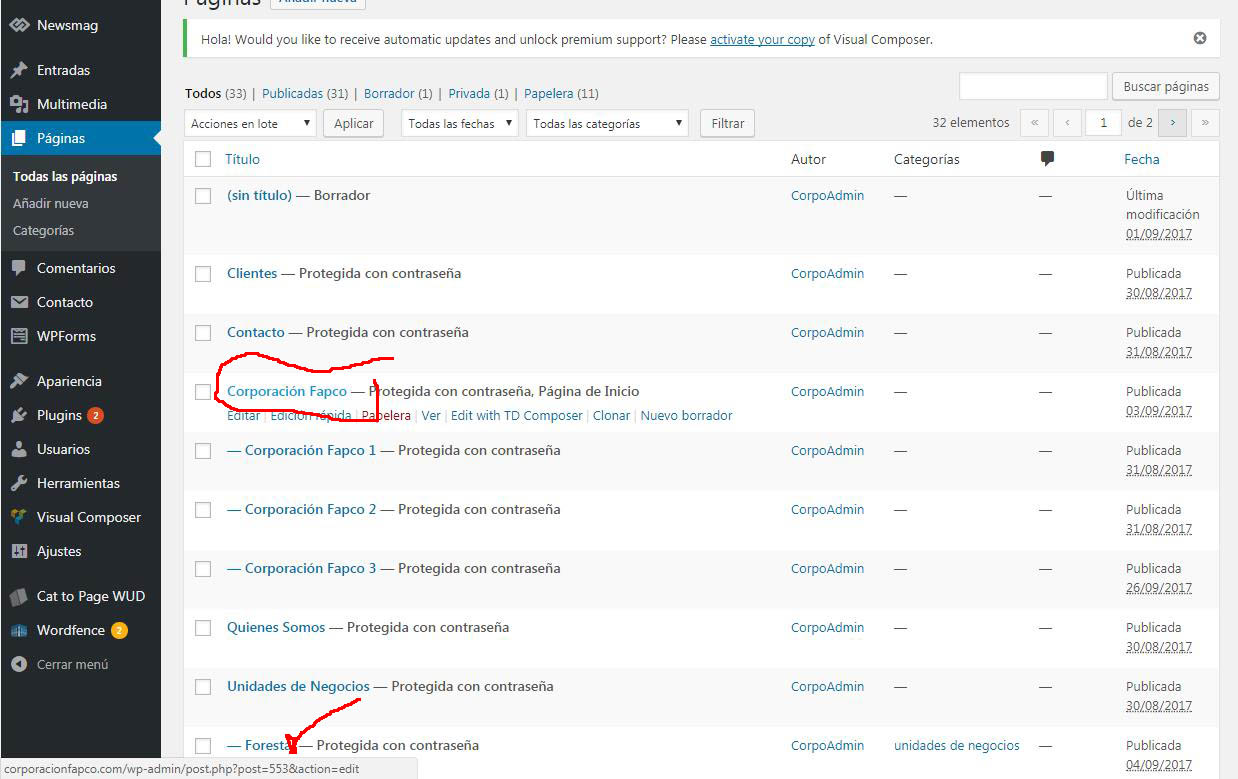
http://corporacionfapco.com/wp-content/uploads/2017/10/Clip0001-1.jpg”
http://corporacionfapco.com/wp-content/uploads/2017/10/Clip0002-1.jpg
http://corporacionfapco.com/wp-content/uploads/2017/10/Clip0003-1.jpg
Simion C. Hi,
You could do it for specific pages, using the unique page IDs. For example this code will remove the menu on desktop and mobile, just for a specific page
– https://www.screencast.com/t/X7Syqm1juG
– https://www.screencast.com/t/KFeQeTPIf
.page-id-2906 .td-header-menu-wrap-full {

display: none;

}
Thanks
Rafael FernandezHello,
How can I hide the main menu on mobile and desktop devices, I already saw an excellent code that does it for the whole site, but I need it to be just for the landpage on mobile and desktop devices
thanks a lot for your help
 gundo
gundo Thanks for getting back to me!
1. You are correct, I do have both plugins enabled. I don’t want to remove the TagDiv composer because how will I be able to edit the layout of the homepage without it?
2. I removed the zoom feature for now.
Now I have a new issue.
3. The lightbox feature is not working. When I click a product image the lightbox pops up underneath my site’s menu like this https://www.screencast.com/t/BpvVikxR when I am on Mac using Chrome. It works fine on mobile but not on a desktop.
I looked at the theme demo https://demo.tagdiv.com/newspaper_tech/product/woo-logo-3/ and when you click on a product image it redirects the user to the large jpg view which is not the desired behavior requiring the user to click back on their browser. Either the lightbox needs to work or I need to remove the link to the larger image?
Any idea on how to fix this?
 Alin [tagDiv]
 Hi,
Please try to download the theme again from your themeforest account and reinstall it – https://forum.tagdiv.com/topic/menu-does-not-open-on-mobile-devices/#post-194543
If the issue persist, please send an email at contact@tagdiv.com and provide wp-admin access so we can take a closer look.
Thanks!
 jasonrhl
 I disabled the tagDiv Mobile Theme and now I can get to the menu and search.
If someone can look at it I can re enable it. I am in Adelaide AU so hopefully we can synchronize up and see if we can get it working
jasonrhlHi, I have inherited a website that has a few issues. I am now looking at the menu on mobile devices. It looks like there is something over the top stopping access. Can I get some advice please? It is really annoying me.
 jassada
 Hi Catalin,
Thank you for your information, I have been setting by using the mobile theme as your recommendation –>screen capture but it still show only main-menu not show sub-menu in mobile browser
Regards,
Jass
Alin [tagDiv] Hi,
Unfortunately All menu item appears only on megamenu, but the megamenu doesn’t have a functionality for mobiles, so only the subcategories will appear there.
Also there is no option to replace All with a category, sorry!
A solution may be to use Mobile Theme plugin, so you could set a different menu for mobile devices, but you will not have the same content like on desktop, it will be a predefined content. You can read more about Mobile Theme here – https://forum.tagdiv.com/the-mobile-theme/
Thanks!
 Fredwin3000
Hi,
first want to say thank you for your great theme. Great work!
We have a small issue concerning the mobile version of our website docs.at
At “Filme” we use a megamenu. On the desktop version, there´s additionally a menu-item “Alle” (all), which we like.
This menu-item isn´t visible at mobile devices.
Is it possible to make it appear there?
Or the other way round, if it´s not possible, is there a possibility to remove the menu-item on the desktop-version, so we could use a category for “all” instead?
Best
Michael
 Edward
 1. Hiding Header and Footer for specific page: https://forum.tagdiv.com/topic/hiding-header-and-footer-for-specific-page/
2. Lower case on the mobile menu:

 lettogsunn
Hi!
Two questions:
1) I would like to create a page without showing the header, meny and footer. Is this possible? I don’t see any options to deactive or hide header, menu or footer on specific pages.
2) Is it possible to force meny navigation to be uppercase on desktop and lower case on the mobile menu? If I write the menu navigations in Appearance -> Meny in either lower or upper case it will be same for both desktop and mobile menu.
Thanks!
 sector
Hi,
i want to change or hiding the mobile social icon as below screen
jassada Hi Catalin,
I have been check link that you give me but cannot find information about how to set menu for mobile,
But I have been set as Screen Capture (as link) which it show sub-menu only in theme’s simulator but still not show in the real mobile browser
Please kindly help me for these
Regards,
Jass
 Catalin
 Hello jassada,
You would create your own menu for mobile theme. Please ensure that you have selected the right one menu from Mobile Theme, according to our documentation here -> https://forum.tagdiv.com/the-mobile-theme/ I have tested on my side and the sub-items from the mobile menu works as expected.
Thanks for your understanding!
jassadaHi,
I really need help because I just install Newspaper theme for my website DedTongDon.com
but the sub-menu in the main-menu not show on mobile (in pc browser it work properly)
Regards,
Jass
 Federico
Good morning, sorry, but I have a problem with your template. Using the litespeed cache and enabling the “Defer Javascript” entry, the first time you open a page, does not work in the search button, or the menu button on mobile. But then, continuing the navigation and opening a new post, after loading, everything works. How could I fix it? the site is https://www.ecomesifa.it. Thanks
Simion C. Hi,
On mobile, if you would like to remove the menu toggle you will have to remove it from the code in the same files
– https://www.screencast.com/t/RQ4QS0DO7IAN
– https://www.screencast.com/t/ydQ9OG6s30
The result would be like this
– https://www.screencast.com/t/hZxlwkHdD
Thanks
Catalin Hello Sebastian,
If you want to have another main menu than the desktop menu, the only way would be to use our Mobile Theme which allows you to do this. For more information about our Mobile Theme, please check here -> https://forum.tagdiv.com/the-mobile-theme/
Hope this helps!
Thanks for your understanding!
 ldjohn
 Hi Simon
Thanks for the reply.
I am able to remove it from desktop view, however the menu keeps appearing in the top left hand corner on mobile devices.