
- TutorialsWhat is Ajax preloading?
 johanvillegas
 gfran5
 Would i really have to replace all of the matches though? I only want the menu to stay as mobile menu until iPad landscape size, and keep all the content as it is.. i know it’s possible to do, was just hoping you could point me in the right direction. What happens when the screen is no longer 767px are you using display: none? or are you changing the visibility to hidden?
Thanks
 Mos Martin
Hello! I’d like to remove “no categories” from mobile menu. Until now to “remove it” i have change the “no categories” name to ” ” but stil no luck.
Thank you!
 Bogdan B.
 Hello,
Unfortunately this happens when you customize the theme and not do it properly. That is the mobile menu that was supposed to be hidden out of sight. It is now visible due to your modifications. This is why we do not recommend RTL customization and do not provide solutions in this matter as there are lots of things affected by the change of direction. It is not an easy customization to make. If it were, RTL would have been no problem in our theme.
Sorry but we cannot offer any help for this type of customization. If you cannot use our theme and you require rtl you can ask for a refund and we will provide it so you can choose a theme that can be used in a RTL environment.
Thank you!
 Joerg Lachmann
Hello from Germany.
We have two little problems with the Newspaper-7-Theme.
The first problem we have with the td-pulldown-filter-display on the category-sites. The items in the category view obscure the pull-down menu.
For example go to:
https://ilovecycling.de/category/technik-produkte/
and activate the filter-function.
The second problem is the search-box on mobile phones (only the start-page):
The search function can not be clicked.
Please help us.
 joventu
Hi,
Im trying to see if I can replace the back to top icon with an image and instead of being at the bottom right of the site, for it be be at the top right to show below the mobile menu “search” icon. Is this possible?
Thank you,
-Franklin
 dianalamanda
Hi,
We try to create mobile menu on our site http://mdg.co.id but all mobile menu directed to About Us page.
 Catalin
 Hello sgt_carbonero,
This behaviour happens due you do not have set it your menu for mobile theme. From here -> http://screencast.com/t/HWtWIOdDe of from here -> http://screencast.com/t/J7pnuYrAq you can do that.
Thanks.
 sgt_carbonero
when i go to the dropdown menu on mobile (Iphone) this shows:
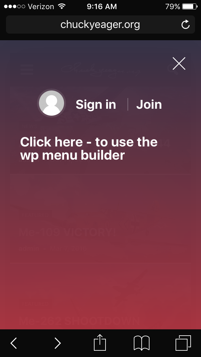
–it wants me to sign in?
Help!
Thanks
 Andrei L.
 Hi
Yes you can add a background image for mobile menu from theme panel > background: http://screencast.com/t/TIucsFQd4f
Thanks!
 tagdivchick
Hi, I’m trying to find the location for the above search box in mobile.
I’ve done excessive searching and its NOT
mobile/parts/search.php
mobile/parts/td_walker_mobile_menu.php
mobile/parts/menu-mobile.php
mobile/parts/header-menu.php
mobile/search.php
Help! I’ve looked everywhere!
 computerpalm
Please see this page: http://independent.ae/3500/educating-girls-south-sudan/
Article is using Post Template 8 and there is a strip of the mobile menu background appearing. I have tried disabling plugins but no luck. Any suggestions?
Browser: Chrome on Windows.
Andrei L. Hi
The ads for mobile theme can be added in theme panel > mobile theme > mobile ads: http://screencast.com/t/jJ40skymRo The top menu was not intent to be displayed on mobile devices and you will need some customization in theme’s code to achieve a similar rezult.
Thanks!
Andrei L. Hi
I’ve checked your site and mobile menu works fine now: http://screencast.com/t/t4opXnZLHmQN If you still have this issue try to clear all caches, purge the cdn files if you’re using then test the site again.
Let us know ho it goes.
Thanks!
 barnisayz
 In addition, how can I get top menu link to show on mobile please?
Andrei L. HI
I’ve just tested the option for mobile menu from theme panel > theme colors and works fine on my end: http://screencast.com/t/SjGhozVX – http://screencast.com/t/Tt9rDtMg If you still have this issue try to deactivate all plugins, clear all caches then test the site again. Also check if you can save other settings from theme panel.
Let us know ho it goes.
Thanks!
 nawaz
nawazHello there.
I have added background image for mobile menu and search. And as documentation says after adding an image we need to change opacity of color in theme color option of mobile segment. But i don’t see any opacity option to change.
Secondly even if i change mobile menu background color to say #fff in start and end. The image does appear but very but very because of high opacity of foreground container.
For information i am using version of the theme downloaded from themeforest
 AppsVilla
How to change mobile menu / search background? currently it shows light blue color.
In Theme Colors -> Mobile menu/mobile search is not working.
Your support would be appreciated.
Thanks
 rman
rmanHi there,
We had the below conversation with Bogdan B at themeforest.net:
rboye PURCHASED
1 day ago Flag
Hi guys,I have rather many categories added in my “main” menu. I have chosen these items to be in white color with a blue background. The issue is that when I reduce the size of the web browser screen (on my computer), I notice that the menu items jump down one row. However, the row that it jumps down to is in white (since the background of my website is white) so you can’t even see the last items of the menu anymore, they just get hidden based on the color. It just results in an extra white row. I have to reduce the screen size significantly more for it to start using the “mobile menu” instead.
This creates problems for everyone using those screen sizes in the middle, between full size and “mobile size”, since they can’t see the items of the menu. How do I fix this? One idea, which many themes do, is that the background color of the menu also gets one more row when the menu items get one more row (which in this case would mean that the blue color also gets one more row when the white menu items get it). Is this possible, or do you have any other fix for this issue?
Thank you in advance.
tagDiv
tagDiv AUTHOR
about 5 hours ago Flag
Hello,I’m not sure how you changed the header color. If you change it from the theme panel as recommended, and not with custom css, then it will show properly even if your content falls on 2 rows: http://screencast.com/t/vY1ELC9a Here is the back-end setting required for this: http://screencast.com/t/jjDCCU4ab Please use the theme panel settings to change theme colors. If you have any further questions, please open a nw topic on our official support forum at https://forum.tagdiv.com/forum/newspaper/
Thank you! Bogdan B
rboye
rboye PURCHASED
about 4 hours ago Flag
Thanks Bogdan.I did change the color in the theme panel settings, but I am still getting this issue.
Could it be that I am using version Version: 4.6.1? I would really not like to update, because I did try to update a while ago but so many things had changed and I spent a whole day trying to get things back to the same look and function as I had with the older version, and in the end I down-graded again to the older version since I didn’t get things the way I wanted them to be. Therefore, can I solve this issue with 4.6.1? From what I can understand, it should be just a small code-change for the menu-strip to expand in accordance with the menu.
Thank you.
tagDiv
tagDiv AUTHOR
about 1 hour ago Flag
Hello,Please open a new topic on our support forum and provide a link to your site so we can take a look at it and maybe provide the proper code for the menu. We suggest updating the theme though eventually as more and more things will start to break as you update everything around the theme, but not the theme. Newspaper version 4 is almost 2 years old. We cannot assure it’s compatibility with the latest versions of wordpress or plugins. Eventually you will have to take this step and update the theme.
Thank you! Bogdan B
Would you be able to help me and provide the proper code for the menu? I would very much appreciate it. The website is homereviewed.com.
Thank you.
 portillo1987
Hi there. Great theme, but I’m have some issues with the mobile version.
I had the same problem as in this thread: https://forum.tagdiv.com/topic/mobile-theme-issue-2/#post-138844 and I installed the version you provided.
I don’t know if it’d happen with the original version too, but right now, nothing is clickable. You can get into the homepage (http://www.foroatletismo.com/) and search and open the menu, but the posts aren’t clickable. The same happens in inside categories.
What could be the solution?
Thanks in advance
Salva.
Bogdan B. Hello,
Unfortunately our theme does not have such an option, The mobile version offers a mobile menu and a search icon. These elements cannot be removed from the theme settings in order to have the full width logo and no menus. it will have to be made through customization.
Thank you!
 crmo
crmoHi, I need mi site logo appears fullwith in smartphone WITHOUT Menu and Search icons in the same file like the attached sample image. That image is of Broden Theme, is of another theme. I want to know how do it with Newspaper theme.
I tried some setting options but always appears Menu and Search logos on the sides of the logo in the same file.
Attached files (Broden Theme and NewsPaper Theme) on: https://we.tl/wDlWdUu5OI
Please, I want just the logo without icons on the sides, but I need logo and ads keep in the same file in the desktop computer version like default configuration, my problem is only in mobile…
Please I don´t want to use the version with logo centered y want logo on left and ads on right.
Thanks
 Afterglow
Hello,
For my site http://pavlikeni.com, the latest news ticker under the main menu does not work on mobile devices after I added yellow colour to background.
It works fine on desktops and laptops.
The code I added to the Custom CSS is:
.td-trending-now-wrapper {
background-color: #FFFF00;
height: 19px;
}
Please advise.
Thanks,
Peter
Catalin Hello smga,
I guess that you want to change the color for your menu and the other menu parameters for your mobile version, right? There is an option for it in Theme panel->Theme colors section, like this -> http://screencast.com/t/CVLjk0hTg For more information about this, please check here -> https://forum.tagdiv.com/theme-colors-introduction/
If is not what you mean, please provide more detail so I will be able to provide a more accurate response.
Thanks.
Catalin Hello wilkwilk,
Unfortunately, our theme does not have any such an option that allows you to change the structure of the main menu for mobile mode, sorry! Please notice that it is not a simple task and if you are not aware of the steps which are needed to take here, please consider hiring a freelancer/developer to help you because we cannot provide custom work at the moment, sorry!
Thanks for the message!


