
- ApiUsing the Theme API in plugins
- ApiPractical example – How to add a new Block and Module
- ApiAPI – Smart Lists – Introduction
- ApiAPI – Category top section style – Introduction
- ApiAPI – Category top section template – Introduction
- Apitd_api_module::update
- Apitd_api_module::add
- ApiAPI – Modules – Introduction
 Simion C.
 Hi,
That could happen. The basic cloudflare setup as far as I know does not cache or deliver the content based on device/viewport. While this is not a problem for a responsive website, it will probably be a problem when using dedicated mobile content. From what I know they do provide cache by device type like so https://developers.cloudflare.com/automatic-platform-optimization/reference/cache-device-type/ But that is a premium service unfortunately. Other than that, I don’t recall seeing a working solution for using dedicated mobile content with cloudflare. In this case the solutions would be to either not use the mobile theme, or use cloudflare APO and activate cache by device type.
Thank you!
 Anamaria
 Hello,
You have activated the tagdiv mobile theme plugin, so please disable it.
Please check this topic where I explained each mobile version -> https://forum.tagdiv.com/topic/mobile-version-not-working-properly-2/
You can use the WP ROCKET plugin, which we recommend, but you need to set the options to get better results.
To increase page speed, I recommend checking which thumbnails you are using on your blocks. You might want to avoid having all of them enabled and optimize and regenerate images. You can use the EWWW Image Optimizer for image optimization and the OMGF plugin for fonts.
Thank you!
 maxcrandale
Hi everyone,
We’ve been facing an issue with caching on our website, specifically with Cloudflare. We are using the mobile theme exclusively (no mixing of mobile with Google’s AMP version or desktop version). The problem we’re encountering is that Cloudflare caching seems to conflict with our mobile theme, sometimes breaking it while the desktop theme works fine.
We’ve tried multiple solutions, including using Cloudflare’s caching settings such as Cache Everything and Standard Cache Level, along with Bypass Cache on Cookie and other strategies for mobile-specific caching, but we haven’t been able to successfully get the mobile theme to function properly without issues. Here’s the specific code we used in an attempt to address this problem:
// Cloudflare Worker code to bypass cache for mobile devices
export default {
async fetch(request, env, ctx) {
let userAgent = request.headers.get(‘User-Agent’);
if (userAgent && /Mobile|Android|iPhone/i.test(userAgent)) {
// Mobile logic – Bypass cache for mobile users
return fetch(request, { cache: ‘no-store’ }); // Ensures the cache is bypassed
} else {
// Desktop logic – Allow caching for desktop users
return fetch(request);
}
},
};
We’ve applied this code to bypass cache for mobile devices, and tried several approaches using Cloudflare’s Bypass Cache on Cookie option, but the problem persists. The mobile theme works intermittently, sometimes caching properly and sometimes breaking.
Additionally, we’ve been wondering if there is a distinct mobile theme other than the one we’ve been using that might be causing this issue. If anyone knows about a different mobile theme or specific settings for mobile theme caching that we might have missed, we would appreciate any guidance.
What we are looking for:
We are seeking advice from anyone who has faced a similar problem or knows how to properly configure Cloudflare for caching mobile themes while ensuring they load properly for users. Specifically, we are trying to:
Cache the mobile version correctly without affecting the desktop theme.
Ensure that the mobile theme doesn’t break due to cache conflicts.
Identify any additional configuration steps or tools that might help in fixing this issue.
Any help or insights on this issue would be greatly appreciated. Thank you in advance!
 miixtapechiick
For the last 24 hours, I’ve been trying to get my mobile template to show up via miixtapechiick.com
and it refuses to show up on mobile. I do not have the mobile plugin activated. I have looked up countless tutorials and can’t seem to find the answer. I really need this to work so my website can pass the speed test. it is horrible right now, scoring at 38 despite downloading WP Rocket (godaddy will not let me download WP Super Cache due to security issues)
 Davidpinto
 Ok I’ve the plugin mobile theme active and when I deactivated the plugin I saw the site with template, but I really don’t like it. So I reactivated the mobile theme plugin.
In the desktop mode with the template I insert an element for a box newsletter like that:
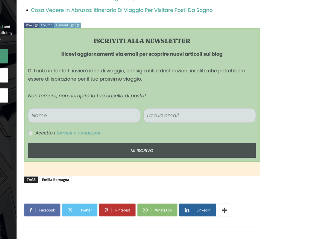
I need to put this bloc in the mobile site too, how can edit or add it inside the theme mobile plugin?
Thank you
 JunaidTahir
 GTMetrix is loading mobile page probably, the loading time of desktop with TagDiv theme fully setup, taking upto 15 seconds sometimes.
I received your email where i cannot respond (its from noreply@tagdiv) so i cannot send you the snapshot of actual website, nor i can attach here, it seems. Please load the website using Edge or Chrome browser. Also, please run the code compiler plugin and see the results (Execution time is 18 seconds)
Regards
Anamaria Hello,
First of all, we no longer recommend AMP because it is deprecated https://developer.bigcommerce.com/docs/storefront/wordpress/platform-integration/enabling-amp
To change the logo please edit with tagDiv Composer,select the header logo and change it => https://i.imgur.com/cR7F0v4.png -> https://www.youtube.com/watch?v=HXQQygkCCJo -> https://forum.tagdiv.com/add-logo-newspaper/
For mobile please edit with tagDiv Composer, select the viewport on phone, select the header logo and change it => https://i.imgur.com/cR7F0v4.png
When the mobile theme plugin is used, you need to set for pages the page content in the mobile editor using only the options from that editor – https://i.imgur.com/p8EqE1b.png. also, there is an option to disable the mobile theme from a page/post – https://i.imgur.com/d3kTBRf.png. This option appears in the Gutenberg editor. After you disable the mobile theme on the page, you can assign the mobile page.
Please check this topic where I explained each mobile version -> https://forum.tagdiv.com/topic/mobile-version-not-working-properly-2/
You can translate them from Theme Panel -> Translations -> Translations
Thank you!
 jatt
jatt Thanks for the tip, I moved it to the second option in wprocket instead of remove unused css option. But I deleted the mobile theme plugin already as it was not refreshing the content even after clearing cache. This is why you are seeing desktop option.
Please also let me know if the design is still showing broken on your end after changing to load CSS asynchronously option.
Thank you.
Simion C. Hi,
The mobile can’t have serious caching issues, because the theme doesn’t have a cache. In normal circumstances it would be impossible for a deactivated plugin to still function.
If I check the website now, I get the correct desktop version https://prnt.sc/aoTMyo8dzEX- and the same version on mobile (responsive) https://prnt.sc/8zNRk7pgiFzn
But if I refresh the page a few times, the design gets broken. As I see it the mobile theme is not active however, it’s just the design of the desktop page getting broken. This is not the mobile theme https://prnt.sc/ajvt4_Uv9xz5
And if I add the design back, it looks fine – https://prnt.sc/3YjuNvepe5XW
As I see it the wp rocket feature to remove the unused CSS is removing much more than it should. I suggest switching to the other option https://prnt.sc/WFHuk2xLzUcA Then clear all caches again and it should be fine.
Let me know.
Thank you!
jatt Thank you but what about the mobile theme? I deactivated amp, cleared all caches and the result is still the same.
jatt The mobile theme os has serious issue of caching. I even deleted the cache plugin wprocket, delete cache files from the server and still it shows the older version for the mobile theme.
jattHi all,
I am using newsmag with movile theme and amp and have cache plugins like wprocket. I tried clearing all cache including varnish cache, wp rocket cache, cloudflare cache but the mobile theme is still showing old version of my site and i am not able to know how to fix this. Please help to have the mobile theme clear its cache everytime a post is published or changes are made.
Site: androidcrunch.com
Anamaria Hello,
This implementation needs to add some custom code in the theme files please check those topics
-> https://forum.tagdiv.com/topic/edit-mobile-login-popup/
-> https://forum.tagdiv.com/topic/how-can-i-add-recaptcha-and-login-with-social-accounts-at-login-forms/
Unfortunately, we don’t have a tested plugin for adding a custom fields in the login form.
Thank you!
 DDN-Magazine
I’d be grateful for some advice please.
For smaller screen resolutions, is it possible to position the sidebar column above the content column – rather than the default where it’s shown below it.
I can’t see any settings to achieve this and haven’t been able to find anything online for this theme.
Thank you for your time.
Anamaria Hello,
Go to Newspaper -> Theme panel -> Header -> Sign In/Join and disable that option.
For menu, go to the mobile viewport, click on the menu icon and check if you choose a menu from this dropdown: https://app.screencast.com/kXblv69NkhU60
Thank you!
 sohailahmed160
  ioannisch
I have one issue with mobile theme . I install and work corectly from mobile , but also and pc user showing mobile version . How can i edit to user from pc showing pc version and mobile user showing mobile version ?
Anamaria Hello,
You have the mobile theme plugin activated; please deactivate it and clear the cache.
Using our theme, you can choose from 3 mobile versions
-> mobile responsive => https://www.screencast.com/t/oJ2ShOp47
-> mobile theme plugin => https://forum.tagdiv.com/the-mobile-theme/
-> mobile page => https://tagdiv.com/newspaper-10-3-7-update-brings-customizable-and-fast-mobile-pages/ The option that you need to use.
Suppose you created the mobile pages with tagDiv Composer. In that case, when you install the Mobile Theme plugin, your pages will be overwritten by the plugin (the mobile theme comes with its templates for page, post, category, etc, so your current templates from the desktop theme will get converted to the mobile theme layout, the page content is made without builders in mobile editor => https://www.screencast.com/t/xbgZG8kH also, the options that are provided to edit the mobile theme version are limited (this keeps the things simple)).
This is a video about Responsive Newspaper Theme, AMP & Mobile Theme, Mobile Pages & Templates -> https://www.youtube.com/watch?v=SpGkOnJeNZY.
So, the mobile responsive is what you see when that you select the viewport on phone => https://www.screencast.com/t/matV17hH, so some settings may apply for each viewport(where is the border blue), and others are not(where the border is black).
The mobile page has the mobile templates from Cloud Library => https://www.screencast.com/t/YCcZ8rL8
The Mobile responsive version of the theme and the mobile page editor can be edit with tagDiv Composer, the mobile theme plugin cannot.
For example, you can have the mobile theme plugin activated and use the mobile page/mobile responsive version for the homepage/pages, but for the categories pages/404 page, you can’t use the mobile page/mobile responsive version if you have the mobile theme plugin activated.
So, if you want to design the pages with tagDiv Composer, you can use the mobile page or mobile responsive version.
Thank you!
Anamaria Hello,
it is normal to refresh the page to see the mobile version. Also, you use the mobile theme version, which is different from the responsive version.
Thank you!
 mitchyg
Team,
My mobile view site won’t allow anyone to click the top articles – it is like the hyperlink is broken.
I recently attempted to install mobile theme and uninstalled it and my settings are/were messed up.
Can a professional take a look at this and identify the problem for me please
 pcrio22
 how did you solve it last time?
You said the solution was “There was a hidden modal popup element in the mobile viewport that should be deleted.”
Guide me and ill do it, I disabled AMP and Mobile as well, but its still there
 Bettina
 Hello!
Uninstall the Mobile theme and AMP plugin.
Thank you!
 Kira Nevo
 Thanks! The option to disable the mobile theme (https://i.imgur.com/42Bj2XY.png) is the one that best suits what I require, everything works correctly now.
Regards!
Bettina Hello!
Yes. Check this thread and make sure you set up the page in the mobile editor as explained here: https://forum.tagdiv.com/topic/issues-with-buddypress-in-mobile-theme/. We have 3 options available for mobile versions that you can use:
1. Responsive version: A responsive version of your website looks similar to the desktop version. TagDiv Composer is used to edit the page. Click on the mobile viewport: https://www.screencast.com/t/XDQJedlggSB. You can see your mobile version there and edit or adjust the elements to look better.
2. Mobile pages: https://tagdiv.com/newspaper-10-3-7-update-brings-customizable-and-fast-mobile-pages
3. Mobile theme plugin: The Mobile Theme is a performance-optimized theme included in the main Newspaper theme that only loads on mobile devices. It comes with its own templates and designs for pages, posts, categories, etc., so your current templates from the desktop theme will get converted to the mobile theme layout. Please see https://forum.tagdiv.com/the-mobile-theme/ and https://forum.tagdiv.com/mobile-theme-introduction/ for more information.
A full explanation is here: https://www.youtube.com/watch?v=SpGkOnJeNZY
If you need to use mobile version 1 or 2, then you need to uninstall the Mobile Theme plugin and AMP.
Thank you!
Kira NevoHi.
I would like to disable the mobile theme on certain pages, is this possible?
Because Buddypress pages do not load in the mobile version of the theme.
DESKTOP VERSION https://ibb.co/zRTMnsS
MOBILE VERSION https://ibb.co/BGh3yBx
MOBILE VERSION FROM DESKTOP https://ibb.co/VS18w0f
thanks in advance, regards.



