
- ApiPractical example – How to add a new Block and Module
- ApiAPI – Smart Lists – Introduction
- ApiAPI – Category top section style – Introduction
- ApiAPI – Category top section template – Introduction
- Apitd_api_module::update
- Apitd_api_module::add
- ApiAPI – Modules – Introduction
- ApiUsing the Theme API in plugins
 Bettina
 Hello!
The social icons from the mobile menu are coming from the Theme Panel -> Social/Apis -> Social Networks -> https://i.imgur.com/kKYIECB.png remove/edit them after your needs.
Thank you!
 Lamb
Lamb Ok, however, I realize there isn’t a secondary menu in the mobile version. Is there a way to have a secondary menu in the mob version (My secondary menu = contact, events, etc. and I need to make it available somewhere in the menu).
Thanks for your help.
Lamiaa
 OTAdmin1
In TagDiv Composer, I am able to create a Social Icons element and place that wherever I would like on the page. Currently, I have it in the Header of my website. However, the element does not display in my header on mobile—which is fine, because there are social icons displayed in the mobile hamburger menu.
However, I cannot edit the icons shown in the mobile menu. There are some missing, and I cannot click on them to edit/manipulate them in TagDiv Composer. How do I edit the social icons displayed in the mobile menu?
Screenshots:https://imgur.com/a/bxBet7C
 Anamaria
 Hello,
I just checked the website now and it seems that you managed to solve the issue -> https://i.imgur.com/Ll02YW0.png https://i.imgur.com/aDcptTq.png
The only issue remains with the logo on the mobile. Did you have a mobile template for the single post template?
Thank you!
 benj0612
 Ok, so you do not know how to diplay a lighter image on mobile, right ?
You do not have any solution ?
Anyone else ?
Thank you
-
This reply was modified 2 years by
benj0612.
 conbrio
 Sorry, but it doensn’t work.
I changed mobile version logo but it’s still got chained logo
Maybe because i’m using mobile template.
Can you give me extra advise?
-
This reply was modified 2 years by
conbrio.
Anamaria Hello,
This is how it looks on the desktop and mobile for me -> https://i.imgur.com/xUuN0me.png -> https://i.imgur.com/wOsAhHl.png how should it be displayed?
Thank you!
 marcusdoc
 It now removes BOTH logos when printing; how can I just remove the mobile logo text?
Anamaria Hello,
The issue is that you have a desktop, the logo is an image, and for the mobile, it is a text, and somehow those are added both .
Thank you!
 Kaneta Makoto
 Hello Bettina!
Thank you for message.
What is the name of this element?
My screen does not have the settings you provided in the screenshot.
What I’m using is
Mobile horizontal menu
Thank you.
 nolandolce
The header logo is set to 100 pixels on mobile, both for the logo that appears on load, as well as for the logo that re-appears in it’s place on scroll. When inside designer, and looking at the mobile view, everything looks fine. However, on my mobile device, the landing page logo is 3x the size it should be. The second logo that replaces it on scroll is fine. Any ideas? This is not occurring on the homepage, just all other pages.
https://rareparenting.com/early-signs-of-a-neurological-disorder/
Thanks!
nolandolceHello, for some reason the color designated in designer is not reflected in mobile, for the social share buttons. The color is correct on desktop, but on mobile each social icon reverts to it’s original color. Please let me know?
Example article here:
https://rareparenting.com/early-signs-of-a-neurological-disorder/
benj0612 Hi,
Thank you for the answer.
If I indicate 350px for width on mobile, then do I have to change or ad this new size somewhere ?
For now, on mobile the feature size image (when I download it) is still the computer size (700 x 467px) Example : https://www.objectifs-fitness.com/graine-chia-sante/
Anamaria Hello,
Please disable the mobile theme and amp plugins.
Using our theme, you can choose from 3 mobile versions
-> mobile responsive => https://www.screencast.com/t/oJ2ShOp47
-> mobile theme plugin => https://forum.tagdiv.com/the-mobile-theme/
-> mobile page => https://tagdiv.com/newspaper-10-3-7-update-brings-customizable-and-fast-mobile-pages/ The option that you need to use.
Suppose you created the mobile pages with tagDiv Composer. In that case, when you install the Mobile Theme plugin, your pages will be overwritten by the plugin (the mobile theme comes with its templates for page, post, category, etc, so your current templates from the desktop theme will get converted to the mobile theme layout, the page content is made without builders in mobile editor => https://www.screencast.com/t/xbgZG8kH also, the options that are provided to edit the mobile theme version are limited (this keeps the things simple)).
This is a video about Responsive Newspaper Theme, AMP & Mobile Theme, Mobile Pages & Templates -> https://www.youtube.com/watch?v=SpGkOnJeNZY.
So, the mobile responsive is what you see when that you select the viewport on phone => https://www.screencast.com/t/matV17hH, so some settings may apply for each viewport(where is the border blue), and others are not(where the border is black).
The mobile page has the mobile templates from Cloud Library => https://www.screencast.com/t/YCcZ8rL8
The Mobile responsive version of the theme and the mobile page editor can be edit with tagDiv Composer, the mobile theme plugin cannot.
For example, you can have the mobile theme plugin activated and use the mobile page/mobile responsive version for the homepage/pages, but for the categories pages/404 page, you can’t use the mobile page/mobile responsive version if you have the mobile theme plugin activated.
So, if you want to design the pages with tagDiv Composer, you can use the mobile page or mobile responsive version.
Thank you!
 hostrocket
Hi Team,
I am facing an issue while switch to mobile theme https://panjabpost.com/home-mobile/ and theme url https://panjabpost.com/. but when it open in mobile layout change due to amp. Could you please help me to configure right settings.
 heathcliff
 Hey @bettina, instead of doing this manually I wrote this code instead:
/* Default padding for desktop */

article p, .wp-element-caption, .wp-block-heading {

    padding-left: 60px;

    padding-right: 60px;

}
/* Remove padding for p elements inside blockquote */
article blockquote p {
padding-left: 0;
padding-right: 0;
}
/* Reduced padding for mobile */
@media only screen and (max-width: 767px) {
article p, .wp-element-caption, .wp-block-heading {
padding-left: 10px;
padding-right: 10px;
}
/* Remove padding for p elements inside blockquote on mobile */
article blockquote p {
padding-left: 0;
padding-right: 0;
}
}
About the Google Tag Manager issue, I failed to find the source.
Anamaria Hello,
Please provide some screenshots and the link to your website. Also, please let me know what cache plugin you use. Maybe if you have the mobile theme plugin, you need to check in your cache plugin if there is this option to have a mobile cache, for example https://i.imgur.com/6b3cmCl.png
A solution for sending a screenshot/video is this:
Download, capture, and send: https://www.techsmith.com/jing-tool.html
After making the screenshot, you will have a link; paste it here.
Thank you!
Anamaria Hello,
Please select the port view on the phone, select the content zone and set the margin-left and right to -20 and set this code in width
calc(100% + 40px)
=> https://www.screencast.com/t/Ek89ppzTGldT You can use this method for both (mobile responsive version or mobile page)
Thank you!
benj0612Hi 🙂
On GG SpeedTest, I have an issue with the feature image loading (LCP or Largest Contentful Paint problem).
In fact, it’s the same size as on computer (no problem in score on computer).
My question is : how can I easly make mobile feature images just small as needed for mobile ?
Hope am clear.
Thank you guys 🙂
Benj’
marcusdocI don’t know if this was introduced from NP12.6.5 or NP12.6.6, but now my site prints the top logo 2 times; the site display correctly when just viewing (which is why I may have missed the problem).
The top most logo is shrunk (almost looks like the size of the mobile logo), then the properly sized logo is immediately below it (seen when the page is printed)
Thank you for the assistance!
 findbitter
Hi,
I tried to setup fonts under theme panel-theme fonts-post content but didnt changed i cleared cache but didnt work i attc picture. https://ibb.co/NWyTx5q
Thank you
 Christian Messenger
Hi. I am the admin of http://www.christianmessenger.in website. We use the Newspaper theme. For the last few months we have been experiencing redirects to spam websites from mobile browser. Upon investigation we found out that tagdiv composer had been injected with a malware. The current version is very old. And we are not able to enable auto update of the plugin. Please help.
 random123
Hello,
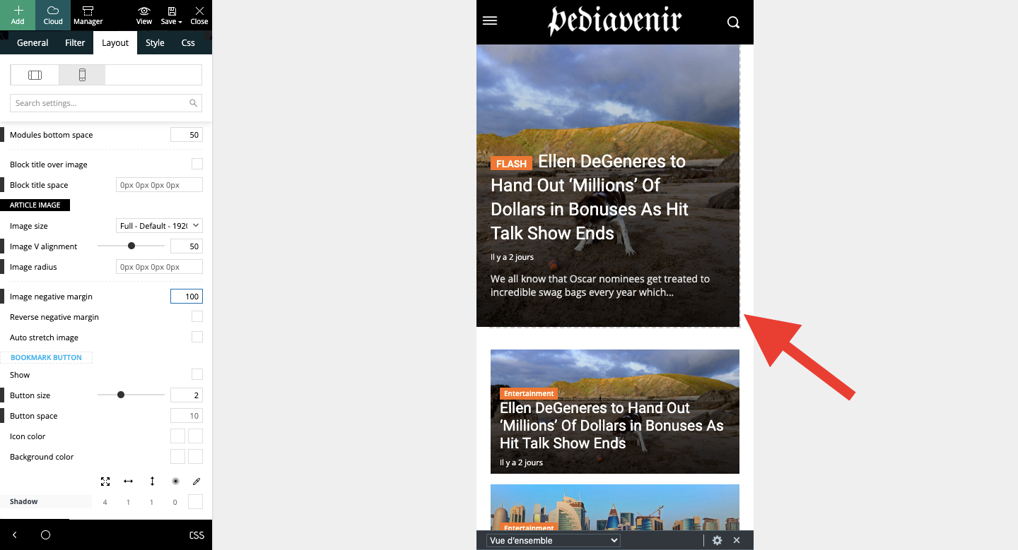
I’d like to make the flex box take up the whole width on mobile. I’ve tried several configurations but nothing works, there’s always this white space.
Thanks for your help!
 techsable
I tried my theme installing but somehow some of my blog pages showing mobile view.. how to fix?
Bettina Hello!
Make sure that the image is set to show and hide the SVG code. Check the threads: https://forum.tagdiv.com/topic/logo-not-showing-6/ -> https://forum.tagdiv.com/topic/mobile-logo-doesnt-work/
Thank you!



