
- ApiPractical example – How to add a new Block and Module
- ApiAPI – Smart Lists – Introduction
- ApiAPI – Category top section style – Introduction
- ApiAPI – Category top section template – Introduction
- Apitd_api_module::update
- Apitd_api_module::add
- ApiAPI – Modules – Introduction
- ApiUsing the Theme API in plugins
 simchris
 The AMP plugin from Automattic works just fine with TagDiv themes.
The AMP endpoint /amp/ and the mobile version should coexist, as the /amp/ endpoint only works for amp-compatible devices/apps.
Remember to resave permalinks after enabling the AMP plugin. See the AMP help forum for more info.
( I don’t work here. )
 barrydmoore
 here is the file that works perfectly – if you do not use buddypress.
<?php
/* —————————————————————————-
the default page template
*/
get_header();
//set the template id, used to get the template specific settings
$template_id = ‘page’;
$loop_sidebar_position = td_util::get_option(‘tds_’ . $template_id . ‘_sidebar_pos’); //sidebar right is default (empty)
//get theme panel variable for page comments side wide
$td_enable_or_disable_page_comments = td_util::get_option(‘tds_disable_comments_pages’);
//read the custom single post settings – this setting overids all of them
$td_page = td_util::get_post_meta_array($post->ID, ‘td_page’);
if (!empty($td_page[‘td_sidebar_position’])) {
$loop_sidebar_position = $td_page[‘td_sidebar_position’];
}
// sidebar position used to align the breadcrumb on sidebar left + sidebar first on mobile issue
$td_sidebar_position = ”;
if($loop_sidebar_position == ‘sidebar_left’) {
$td_sidebar_position = ‘td-sidebar-left’;
}
/**
* detect the page builder
*/
$td_use_page_builder = td_global::is_page_builder_content();
if ($td_use_page_builder) {
// the page is rendered using the page builder template (no sidebars)
if (have_posts()) { ?>
<?php while ( have_posts() ) : the_post(); ?>
<div class=”td-main-content-wrap td-main-page-wrap td-container-wrap”>
<div class=”<?php if (!td_util::tdc_is_installed()) { echo ‘td-container ‘; } ?>tdc-content-wrap”>
<?php the_content(); ?>
</div>
<?php
if($td_enable_or_disable_page_comments == ‘show_comments’) {
?>
<div class=”td-container”>
<div class=”td-pb-row”>
<div class=”td-pb-span12″>
<?php comments_template(”, true); ?>
</div>
</div>
</div>
<?php
}
?>
</div> <!– /.td-main-content-wrap –>
<?php endwhile; ?>
<?php }
} else {
//no page builder detected, we load a default page template with sidebar / no sidebar
?>
<div class=”td-main-content-wrap td-container-wrap”>
<div class=”td-container tdc-content-wrap <?php echo $td_sidebar_position; ?>”>
<div class=”td-crumb-container”>
<?php echo td_page_generator::get_page_breadcrumbs(get_the_title()); ?>
</div>
<div class=”td-pb-row”>
<?php
switch ($loop_sidebar_position) {
default:
?>
<div class=”td-pb-span8 td-main-content” role=”main”>
<div class=”td-ss-main-content”>
<?php
if (have_posts()) {
while ( have_posts() ) : the_post();
?>
<div class=”td-page-header”>
<h1 class=”entry-title td-page-title”>
<span><?php the_title() ?></span>
</h1>
</div>
<div class=”td-page-content”>
<?php
the_content();
endwhile;//end loop
}
?>
</div>
<?php
if($td_enable_or_disable_page_comments == ‘show_comments’) {
comments_template(”, true);
}?>
</div>
</div>
<div class=”td-pb-span4 td-main-sidebar” role=”complementary”>
<div class=”td-ss-main-sidebar”>
<?php get_sidebar(); ?>
</div>
</div>
<?php
break;
case ‘sidebar_left’:
?>
<div class=”td-pb-span8 td-main-content <?php echo $td_sidebar_position; ?>-content” role=”main”>
<div class=”td-ss-main-content”>
<?php
if (have_posts()) {
while ( have_posts() ) : the_post();
?>
<div class=”td-page-header”>
<h1 class=”entry-title td-page-title”>
<span><?php the_title() ?></span>
</h1>
</div>
<div class=”td-page-content”>
<?php
the_content();
endwhile; //end loop
}
?>
</div>
<?php
if($td_enable_or_disable_page_comments == ‘show_comments’) {
comments_template(”, true);
}?>
</div>
</div>
<div class=”td-pb-span4 td-main-sidebar” role=”complementary”>
<div class=”td-ss-main-sidebar”>
<?php get_sidebar(); ?>
</div>
</div>
<?php
break;
case ‘no_sidebar’:
?>
<div class=”td-pb-span12 td-main-content” role=”main”>
<?php
if (have_posts()) {
while ( have_posts() ) : the_post();
?>
<div class=”td-page-header”>
<h1 class=”entry-title td-page-title”>
<span><?php the_title() ?></span>
</h1>
</div>
<div class=”td-page-content”>
<?php
the_content();
endwhile; //end loop
}
?>
</div>
<?php
if($td_enable_or_disable_page_comments == ‘show_comments’) {
comments_template(”, true);
}?>
</div>
<?php
break;
}
?>
</div> <!– /.td-pb-row –>
</div> <!– /.td-container –>
</div> <!– /.td-main-content-wrap –>
<?php
}
get_footer();
 Achraf91
Hello
We want to use amp plugin with newspaper template
but it not working
anyone can help us to give us steps
Should us desactivate mobile plugin ?
Thank you
 snowsbest
 Hello Catalin
I haven’t uploaded a background image. Currently the ‘background’ is the two ‘skins’ or ‘gutters’ that are grey in color on either side of the main body of the website as per the red arrows in the image link below.
http://www.snowsbest.com/wp-content/uploads/2017/12/skins.jpg
Obviously these only show on laptops and desktops and not on mobile devices. Also these gutters are different dimensions depending on size of laptop or desktop.
Traditionally you can place customized advertising in these positions by uploading a background image and inserting a hyperlink for that background image.
However I am looking for the dimensions for the background image, the dimensions of the main central website space so as to know what dimensions to give to my clients to create artwork to ensure their gutter ad space shows on the majority of laptop and desktops.
Thank you
 fenomeno0chris
Hi and thank you very much for choosing my homepage for your showcase!
(By the way: the name of my page is PS4source with a small “s” letter)
Lastly I noticed, that it would be appropriate to change some font styles.
Especially on those elements, where the headline stays on top of an image (see images).
So my question is, how can I change fonts for one element and not the entire page?
I think it would be great to add contour or shadows to the headlines.

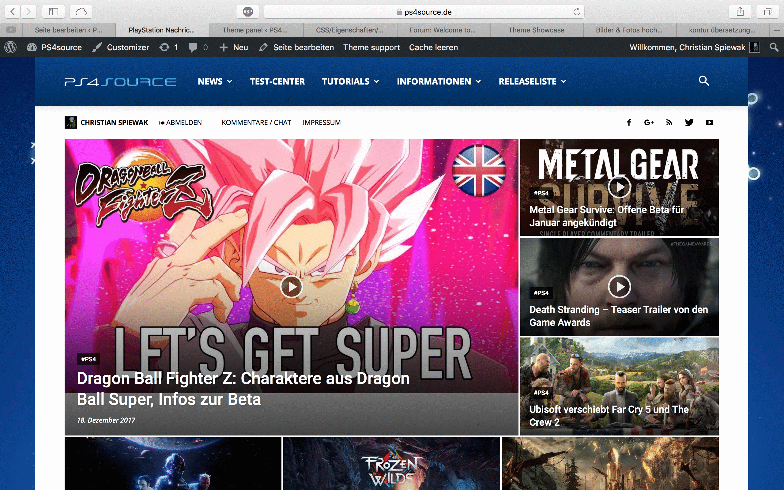
Would be great, if someone can help me!
 Catalin
 Hello Alle79,
Provide your website URL so I can check it for Mobile Devices. DO you are using the Mobile Theme?
Thanks for the message!
 Simion C.
 Hi,
It will be considered, more ad placement options could be added in a future theme update, both desktop and mobile. I could not give you a time estimate however.
Thanks
Simion C. Hi,
I believe it was a design choice to hide the excerpts for that block on mobile. I could give you a code to make them visible if you need it, the block will look like this with excerpts
– https://www.screencast.com/t/ZyTu00ZxQ
Enter the code in Theme panel->Custom code->Advanced CSS in the phones section.
.td_block_12 .td_module_11 .td-excerpt {

display: block;

}
The length of the excerpt can be controlled for each module
– https://forum.tagdiv.com/excerpts-introduction/
Thanks
Simion C. Hi,
You could use inner rows to multiply the columns, maybe you could create a different layout in this case
– https://www.screencast.com/t/B8LzYYuJbd
On mobile the columns will be displayed one after the other. Also a possible solution would be to hide the row or elements on mobile
– https://www.screencast.com/t/9jbTF9cfaniq
– https://www.screencast.com/t/UZbsPqVtzS
Or you could leave it like it is and I could give you a code to display the team members like this. First add a custom class to the row containing the team members
– https://www.screencast.com/t/Uy3tksy6Nb7
Then based on that class a code like this will display the members like this
– https://www.screencast.com/t/rBvRg2pCr
That could be a solution. If you decide to use it here is the code used in the example
.myclass.td-pb-row [class*="td-pb-span"] {

width: 49%!important;

float:left;

padding-left: 5px;

}
This code must be entered in Theme panel->Advanced CSS phones section.
Thanks
 Alle79
 P.S.
I read that “Mobile Theme” comes with a single predefined page template that includes two section:
top grid – displays 3 featured posts (posts included in the Featured category)
latest articles – displays the latest articles”
Well, this would be fine for me, the problem is on mobile displays only latest articles, not top grid.
Alle79Hello guys,
when I edit the homepage with tagdiv composer i look at the preview on the mobile device as i want it to be, when I publish the update on the mobile nothing has changed. I tried to make a lot of changes but it’s still the same on mobile. The homepage is set as static, I tried both with mobile plugin active and without. Can someone help me?
 Francis
Hi Team,
As Adsense and some ad platforms have removed the limit on ads on pages, would you consider adding more ad placements for the mobile theme too? Now, there are only three inline ads we can use. Thank you.
 k440092
 Hi,
Ok. Thank you.. my bad =)
Another question:
I would like to show all my posts excerpts on my homepage.
I know i can do it with Visual Composer.
But if i use example “Block 12” it will show post excerpts in computer, but in mobile it shows only title?
Is there anything to do, so it would show also the excerpts in mobile view?
Simion C. Hi,
There seems to be a delay before the code loads. If you used a custom code to remove the header menu gradient tr entering that code directly in the theme stylesheet, at the end of the code. This should reduce or remove the issue entirely.
Regarding the mobile menu background, the current color set would be white from what I can see. This is set through the theme panel setting it seems. So there should be no problem changing the background color.
If you are choosing a different color and the result is not as intended, you can send us an email at contact@tagdiv.com and provide admin login information. We will take a look and try to identify why the background color is not applying properly. Also paste a link to this topic in the email.
Thanks
Simion C. Hi,
Removing these elements by this method should not have an impact on SEO, they will still be loaded in the page source, but they will not be visible.
To remove the comment count in the author page author box, in both desktop and mobile
– https://www.screencast.com/t/UonRDOc6E
– https://www.screencast.com/t/xdSL2ZgLQ
.author .td-author-counters span:last-child {

display:none;

}
Enter the code in both Theme panel->Custom CSS code, and Theme panel->Mobile theme->Custom CSS section. The code will remove the comment counts in these situations.
Thanks
snowsbestI have sold the skins/gutter space on my site http://www.snowsbest.com for advertising and I need to give them specs for artwork.
Obviously the background will not show on mobile devices and tablets but I need specs for laptops and desktops.
Does anyone have any idea on which specs to give please?
 bengaloorism
Hello, the website i run has more than 10 authors. And, with the team member element i am only able to add 4 members per row. That makes three rows anecessity, which looks fine on the web version. But, the mobile version has just one member filling up the screen space and making it a endless scrolling adventure. So, i was wondering if there is any way i can add 8 members per row, or a css code that optimises the mobile view. Thanks.


 PatWire
 I have this same issue after update to 8.5.1 – search bar just below menu on desktop and on mobile ( not td mobile theme ) it is on the opposite side, the same side as the hamburger for the menu – instead of one icon on each side. Cleared all host caches and Cloudflare cache.
Thanks
 E_Normus
 Hey Catalin,
Last thing, I noticed that on the mobile version of the video template (I’m using style 10) the youtube videos are not as crisp/hd as the desktop version. Is there a way to fix that? Do videos on the phone not play at 720p60/1080p60?
Thanks Again!
 E_Normus
 Hello Catalin,
I got it working for both desktop and mobile. You pointed me in the right direction, Thanks!


 dralim
my website is tbtbangla.com jump to top button is not showing in mobile version of my website please solve this. thank you.
 Incrosnatu
 Great, thank you! Can this change have a bad effect on SEO or google indexing?
Also, I want to remove from author page WordPress comments counts (desktop + mobile) because I use facebook comments and I don’t want to show 0 comments on.
Simion C. Hi,
Module 12 would be this one
– https://demo.tagdiv.com/newspaper/category/module-12-layout/
On mobile it looks like this
– https://www.screencast.com/t/woHtHMm4c
The excerpt should be visible on mobile as well using his module. Please provide a link to your website where the issue is happening so we can inspect it.
Thanks
k440092Hi,
Great theme!
I got one question:
I use module 12 and my post excerpts are showing on computer, but in mobile view i can see only headline.
So is there any way to show post excerpts also in mobile view?
Example like this: http://bit.ly/2od9iy9
(that is differend theme, but if you look it with mobile you can see excerpts)
Simion C. Hi,
@biggleem In almost all cases plugin conflicts or theme modifications are causing the mobile theme to not function correctly.
If you tried deactivating all plugins as a test and the mobile theme is still not functioning correctly, please send us an email at contact@tagdiv.com and provide admin login information. We will take a look. Also paste a link tot his topic in the email.
Thanks

