- TutorialsFrom WPBakery to tagDiv Composer
- TutorialsWhat is Ajax preloading?
 Arsenio Spadoni
 As you can see in the video, sometimes the correct mobile version is displayed (blue band and Google ads), other times (randomly) the desktop version is displayed (gray band). It’s not clear why. The site uses WP Super Cache.
 Anamaria
 Hello,
Please delete the logo from theme panel, and assign it with tagdiv Composer https://i.imgur.com/bfPZEps.png https://i.imgur.com/EmzWCmI.jpg
For mobile please edit with tagDiv Composer, select the viewport on phone, select the header logo and change it => https://i.imgur.com/cR7F0v4.png https://www.youtube.com/watch?v=HXQQygkCCJo -> https://forum.tagdiv.com/add-logo-newspaper/
Thank you!
Anamaria Hello,
This is how your mobile version looks: https://we.tl/t-u4Sam1iyPG. Did you enable the option for cache for mobile?
Thank you!
 ipro-wpadmin
Hello,
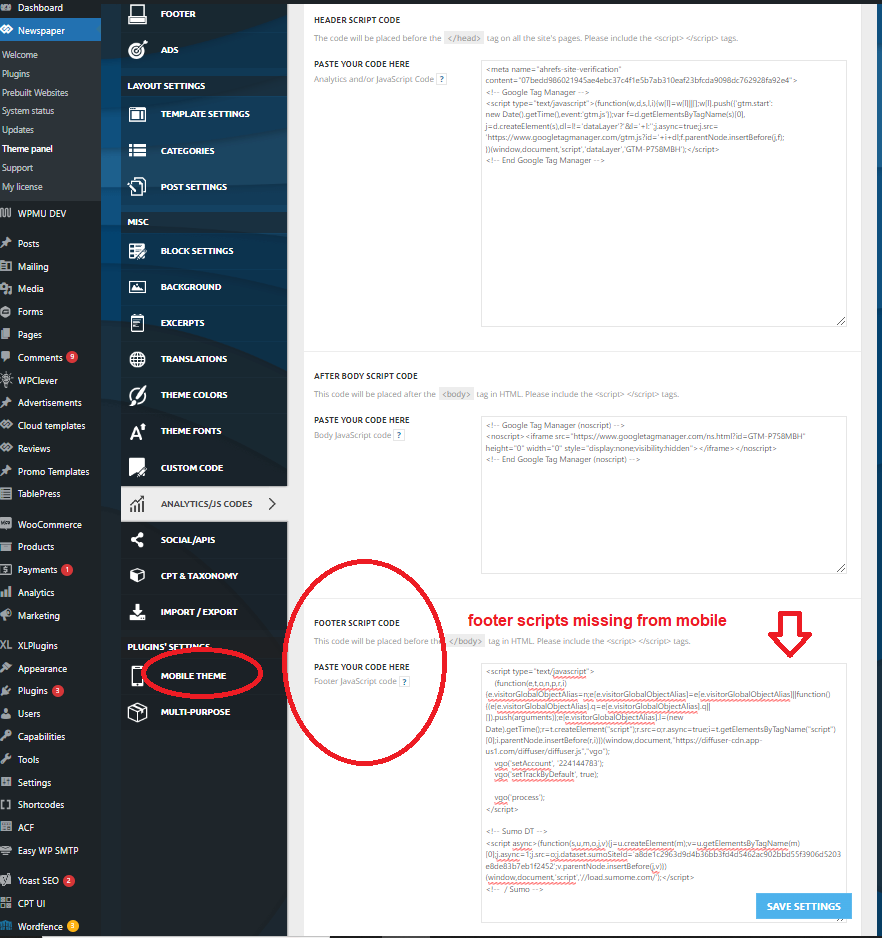
Scripts added into the Analytics Footer Script area in theme settings are not loaded on mobile when using the “mobile theme”. They load fine on desktop but are missing from mobile when the mobile theme is active. The header scripts do load on mobile.
Let me know if you have any questions or need any more information.
screenshot image – https://www.gun-tests.com/wp-content/uploads/2024/04/newspaper-footer-script-1.png
Thanks-
Stan
 smartjockz
 i change the header and footer in global newspaper themepanel and i will send screenshots showing the change and what pops up on mobile. I dont even have the newspaper image in my media library so not sure how it even displays in the absence of words or logo
Arsenio Spadoni Below, the right mobile home page:
https://www.elettronicaemercati.it/wp-content/uploads/2024/04/Screenshot_20240408-164941_Chrome.jpg
 Bettina Bettina
 Hello Alex!
Hide the structure of rows you’ve built on mobile, create another structure for mobile, and hide it on desktop. So, you can display them differently on mobile layouts.
Thank you!
 dscom
dscomHello,
We would like to load AMP ads inside the article ads in the mobile template. We are currently only using the mobile theme for AMP, and we would like to utilize the Article ADS section to load AMP ads. Could you tell us if something like that is supported by your theme? If not, can you guide us on how to achieve this?
Thank you.
 deekendown
Hello everyone,
I’ve been reading up on Largest Contentful Paint (LCP) and thanks to WP Rocket, I’ve been able to significantly improve my site. Here are my current metrics:


Site:Link
As you can see, everything is running smoothly except for the desktop version and the LCP value. Unfortunately, I haven’t passed Core Web Vitals. I’ve tried several things, but I can’t seem to reduce this value. Does anyone have any tips? I’m using WP Rocket, and all images are in WebP or better format. Rocket CDN is also enabled.
Thanks!
Arsenio Spadoni The correct mobile version has the top band in blue color and pages contain Google advertising.
The wrong version (which corresponds to the desktop one) has the top band gray.
 shuddhatm9
 https://pagespeed.web.dev/analysis/https-tellymantra-com/tq8ozqqoif?form_factor=mobile
i have checked page speed insight it is also showing the same issue of LCP and CSS please look into it and resolve
Bettina Hello @ilouie!
My account page should be found in Dashboard -> Pages: https://app.screencast.com/XFCYlKk5zZKCe and this is the mobile viewport layout: https://app.screencast.com/61qFIwdvUb2es
Thank you!
Anamaria Hello,
Can you please provide some screenshots with the right version of the mobile?
Thank you!
Bettina Hello @mathclash!
We have 3 options available for mobile versions that you can use:
1. Responsive version: A responsive version of your website looks similar to the desktop version. TagDiv Composer is used to edit the page.Click on the mobile viewport: https://www.screencast.com/t/XDQJedlggSB. There, you can see your mobile version and edit or adjust the elements to look better.
2. Mobile pages: https://tagdiv.com/newspaper-10-3-7-update-brings-customizable-and-fast-mobile-pages
3. Mobile theme plugin: The Mobile Theme is a performance-optimized theme included in the main Newspaper theme that only loads on mobile devices. It comes with its own templates and designs for pages, posts, categories, etc., so your current templates from the desktop theme will get converted to the mobile theme layout. Please see https://forum.tagdiv.com/the-mobile-theme/ and https://forum.tagdiv.com/mobile-theme-introduction/ for more information.
A full explanation is here: https://www.youtube.com/watch?v=SpGkOnJeNZY
If you need to use mobile version 1 or 2, then you need to uninstall the Mobile Theme plugin and AMP.
Thank you!
Anamaria Hello,
Your website is not working. Please provide some screenshots. You can disable the mobile theme plugin from Newspaper -> plugins.
Thank you!
 ilouie
Hi, could someone please tell me where to find the Default Temp Pages-such as, My Account, Login, etc. I’d need to edit the links that go to a mobile page. I was able to edit the page for the website, but I can’t find a way to change the entire page for mobile. Here’s what I’m talking about: tds-checkout-2. For the website I can edit, but I can’t find it for mobile. I am using a template for Subscriptions but, I can’t find the link to edit on the mobile version. Thanks in advance.
 c386
c386 Also experiencing sub-optimal CLS and LCP performance on mobile. We choose not to use the dedicated mobile plugin, opting instead for the versatility of a single, responsive site. Please make image loading optimisations a priority for forthcoming updates.
Arsenio SpadoniOn my website http://www.elettronicaemercati.it I have prepared a mobile home page that works well when – from a smartphone – I access the site from any link but not from the main page. I’ll explain.
If I type http://www.elettronicaemercati.it from the Google bar, the desktop home page is displayed on my smartphone and not the mobile page I prepared. However, if I arrive at the site from any other link (e.g.: https://www.elettronicaemercati.it/samsung-rilancia-e-raddoppia-gli-investimenti-in-texas-mentre-gli-utili-impresali-crendosi-in -exponential-manner/) I am correctly accessing the mobile version (the correct one) of the site. Why does this happen?
smartjockzIt hides all the images on the home page and basically turns the layout to just words on top of words. In the mobile preview it has images but when visiting the website on my mobile phone no images. I will attach images to your follow up email.
smartj.sh-host.com
Bettina Hello @Wriper!
Sure. This is the path: td-composer\mobile\includes\shortcodes\td_block_big_grid_mob_1.php
Thank you!
Bettina Hello Joachim!
Do you mean these thumbs?: https://forum.tagdiv.com/thumbs-on-modules-and-blocks/
If you deactivate a dimension from there, next time when you will upload an image, it will not be resized to that dimension.
After changing the thumbnail sizes you need to regenerate your thumbnails using a plugin. Check this: https://forum.tagdiv.com/using-the-theme-with-existing-content/
NOTE: If the thumb specific for that block is not enabled, then the image won’t be displayed.
NOTE: The Mobile theme layout is not customizable as the responsive version or mobile pages. Please see https://forum.tagdiv.com/the-mobile-theme/ and https://forum.tagdiv.com/mobile-theme-introduction/ for more information.
Please provide an example of the issue you have now, and it wasn’t when you installed the theme, so we can check if there is a bug or not. You have the option to hide the featured images from Flex Block, for example.
Thank you!
 Fontaine
Hello
Problem with the menu on cell phones is a problem encountered by many people. The problem is not fixed and I’ve read over 300 messages and I’m not even halfway through the messages about problems with the mobile menu. No solution
isn’t there a problem with the theme?
 datingvergleich
Dear Support Team
I am having the same issue with the TownTalk Child theme. LCP check is failing for mobile view in Google Page Speed tests. LCP for the mobile view of posts is about 5 seconds.
I am using WP Rocket Premium with all optimizations turned on.
Obviously, this is mainly related to the thumb image on top of the posts. This image is loaded in full size and then resized to the mobile width.
For some reason, I did not have this issue when installing the theme first time. Could it have turned up with the latest version updates?
Example URL: https://www.dating-vergleich.com/alternativ/gleichklang/
There must be a better way to include this image. I assume, that all your child themes have this same issue.
If there is no way of optimizing this part from a developers point, would it be possible to do a custom workaround: removing this feature image from the mobile theme for posts and pages?
Looking forward to a feedback on this.
Best regards
Joachim
datingvergleich I am having the same issue with the TownTalk Child theme. LCP check is failing for mobile view in Google Page Speed tests. LCP for the mobile view of posts is about 5 seconds.
I am using WP Rocket Premium with all optimizations turned on.
Obviously, this is mainly related to the thumb image on top of the posts. This image is loaded in full size and then resized to the mobile width.
For some reason, I did not have this issue when installing the theme first time. Could it have turned up with the latest version updates?
My URL: https://www.dating-vergleich.com/alternativ/gleichklang/
There must be a better way to include this image. I assume, that all your child themes have this same issue.
Looking forward to a feedback on this.
Best regards
Joachim