
- ApiPractical example – How to add a new Block and Module
- ApiAPI – Smart Lists – Introduction
- ApiAPI – Category top section style – Introduction
- ApiAPI – Category top section template – Introduction
- Apitd_api_module::update
- Apitd_api_module::add
- ApiAPI – Modules – Introduction
- ApiUsing the Theme API in plugins
 cloverjim
 Hi,
Why doesn’t the “View Cart” button go to the end of the row, like in the original version?
In the mobile version, the text is also left-aligned and stuck to the “View Cart” button. How can I fix this?
Thank you!
 Calin
Calin Hi,
If the layout and error persist, please disable the mobile theme and use only the amp plugin and set the template mode to reader.
Thank you!
Calin Hi,
The mobile header will be displayed when you eit the desktop header, then in tagDiv Composer you select the mobile viewport or you use the Manager to select the headers – https://forum.tagdiv.com/header-manager/
Thank you!
 Atithya
Hi, I want to make a grey menu bar, but even after selecting gray colour from left panel, not able to change colour in mobile version, in desktop version I am able to change colour.
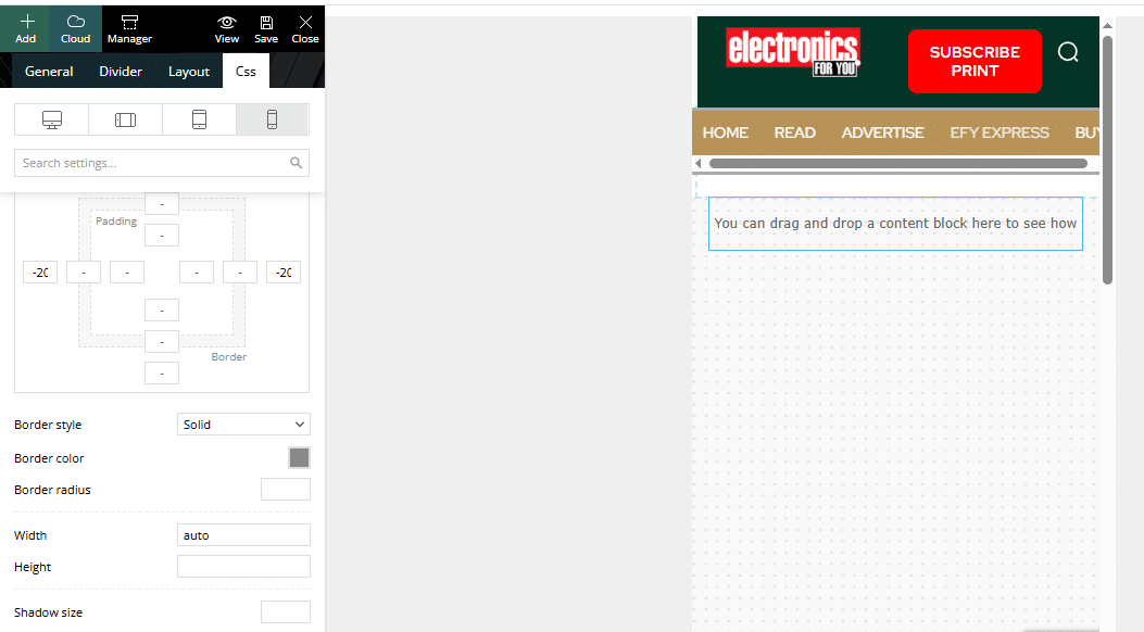
 mikespothelfer
Hello Support Team,
I’ve noticed two issues on my website ecommerce-watchblog.de that I need help fixing:
At the very top of the header area, there is a black horizontal line running from right to left. How can I remove this?
On the homepage article list, the text under the article image does not extend to the right edge. Instead, the line break happens too early, roughly in the middle of the content area. This happens both on desktop and mobile. How can I fix this so the text uses the full width properly?
Thanks in advance for your support!
Best regards,
Mike
 rahlplx
I am trying to use a different mobile header template on my site, but I cannot find the option anywhere in the panel. I already checked the settings and the documentation, but the option doesn’t appear.
https://prnt.sc/a_gUTwB4b4jH
 sibyxaviery2k
 Can I have both versions. Means mobile + amp
I have already configured all things you mentioned. Except selecting amp version for mobile. Can I have two versions for mobile.
Calin Hi,
Please do like this, install amp plugin and tagDiv Mobile theme plugin and go to Newspaper > theme panel > Mobile theme and set the mobile settings only for amp – https://i.imgur.com/es0kaR6.png after that, go to amp plugin and let it only for posts – https://i.imgur.com/Qfp2Ypn.png last thing, make sure that the amp option for redirecting mobile users to amp is disable – https://i.imgur.com/bJzB3JD.png
Calin Hi,
Here are some fast settings, and I think that after you make them, you’ll know how to improve the layout. Set the Woo Product block, go to the layout tab and set it as in my screenshots – https://i.imgur.com/rKrAkkW.png https://i.imgur.com/KVGyRlo.png (you can adjust the paddings, seo tabs and the rest of the options after your needs). After that, from the Style tag, you can set the fonts and colors you want to use – https://i.imgur.com/OfbRrXB.png, then in the General tab, set a class for example, cls-wpb – https://i.imgur.com/Cf8zW0r.png then in css add this code – https://i.imgur.com/KHdGiQa.png to set the reviews in the bottom right. Then the last review is on mobile, set only one module per row – https://i.imgur.com/6J78MgO.png
I hope this will help you!
Calin Hi,
If ads are covering the header area of your website on mobile devices, you can resolve this by adjusting your Google AdSense Auto Ads settings.
Please follow these steps:
– Sign in to your Google AdSense account.
– Go to Ads > Overview.
– Click on the Edit icon for your site under “Auto ads.”
– In the Ad formats section, disable specific formats like Anchor ads or Vignette ads, which often affect the visibility of header content on mobile.
– Save your changes.
This should prevent ads from obstructing the header area on mobile devices.
Thank you!
 plotwit-team
Hi Team,
I’m using Newspaper theme on my site with Google AdSense Auto Ads enabled. On mobile, the sticky/anchor ads at the top are extremely large — it covers around 60% of the screen and doesn’t collapse. Also covers the logo too
Can you please help me either limit the sticky ad size or adjust the layout so it displays properly? This issue is hurting user experience and site readability.
Thanks!
 3 Narratives News
 I am really confused. I created a mobile page for the ‘About Us’ section, but it’s not working. Instead of taking customers to the menu, it wants them to log in to WordPress. Is there someone on your team who can see my WordPress site and fix things, or at the very least, a video so I can watch? The article you sent me makes no sense.
Calin Hi,
This is because using the tagDiv Mobile theme plugin none of your pages will no longer display on mobile if you are not using the mobile editor to set content there. https://i.imgur.com/PIlD1sj.png
Thank you!
Calin Hello,
If you are using the mobile theme plugin please check our documentation for this plugin. When this plugin is used the pages no longer display the desktop content and you need to create a content for the pages using the mobile editor https://forum.tagdiv.com/mobile-theme-introduction/ also, you need to use the theme panel for the settings that are provided for the mobile theme plugin https://forum.tagdiv.com/the-mobile-theme/
Thank you!
3 Narratives NewsI followed your suggestions, and my mobile theme is still not working properly; the title doesn’t appear, and the about us links don’t work. Please help – Please see 3narratives.com
 scohen
 Hello, thank you!
I added you to my siteground account using the contact@tagdiv.com email. The problem is that even though I keep changing the header on the mobile version to say Better With Age NJ, it keeps reverting back to the “Town Talk” header, but only on the home page. Thank you for taking a look!
Calin Hi,
Please connect to your website dashboard and go to AMP > Settings and disable the amp redirect from mobile to amp – https://i.imgur.com/CwjkmnB.png
Thank you!
 Marcellino
Hello, in my sito https://ilpicentino.it I’m not able to modify via Tag Div Composer the mobile menu (see attached image)
I’m not able to tranlsate the text neither to add socials link
Problem is that when I’m in mobile mode in tag dive composer, even if clicking on the mobile menu it doesn’t open and settings don’t appear
Can you help me, please?


 barrydmoore
 HI Calin, try this page. https://www.stockchartpro.com/dragonfly-doji/
You can see the modal popup in mobile view. “Candle Patterns Main Menu” Button.
27 headings
<h1>[Missing heading]
<h2>[Missing heading]
<h3>Candle Patterns Main Menu
<h1>Dragonfly Doji Candles
 adityabansal
Hello, I have enabled AMP on my website which is working smoothly. https://legalpress.in
When I try to open any posts on the website through mobile device, by default the post loads the AMP page. I want the website to open as normal mobile device website. It happenes only while opening the posts. How to redirect users to mobile site.
 projectya
 Thank you, I managed to translate it, it’s nice to have it solved without having to install external plugins 🙂
However, I have a few more questions 🙂
1. How does a subscription work on the portal, how can it be set up, and what does it offer the user? https://prnt.sc/XL9gBxCIHWpO
2. How to set blocks to have identical width?
https://prnt.sc/h14e3RyoGMjf
https://prnt.sc/SNKY90epEW-T
https://prnt.sc/_iIW7rCzpTAp
3. How can I set up the mobile version of the website to display on phones because now it displays a demo
Calin Hi,
I just checked the metrics and the CLS for mobile is 0 – https://i.imgur.com/LhWPca0.png, so this will be updated on time when you’ll have ebnought real user data – https://i.imgur.com/UV6jQQI.png
Thank you!
Calin Hi,
1. Edit the homepage using tagDiv Composer – https://i.imgur.com/VtfDXeh.png after that, select the manager and in header, tab uncheck the sticky option for desktop https://i.imgur.com/8nHMYyn.png you can do it for both, desktop and mobile.
2. Select the mobile viewport in tagDiv Composer – https://i.imgur.com/8nHMYyn.png then if the image and mobile element are in the same column, use the layout tab to align them https://i.imgur.com/yg1SbqV.png if are in different columns, but under the same row use the layout tab from the row – https://i.imgur.com/UNv0zTL.png
3. For this, you should set the header you want to use as global, then this will be used on the entire website that is not using an individual header. Right now you are using an individual header on the homepage and a global one on the rest of your website. So when the header is edited as you want just set it as global, this can be done from multiple places, for example, from Composer using the manager – https://i.imgur.com/tBSbwLu.png ot from cloud templates – https://i.imgur.com/ZMHim4S.png or from the theme panel – https://i.imgur.com/FE5hmWR.png
Thank you!
 Alex
AlexHi,
Since July, we’ve had an issue with our website that we can’t resolve. Our CLS, measured with PageSpeed Insights, is greater than or equal to 0.30 on mobile. We can’t figure out what’s causing this high CLS. For example, on the desktop side, we have a CLS of 0.002. The problem only affects mobile, and since this issue began, the site hasn’t met Google’s requirements, preventing our articles from being published on Goolge Discover (before, when we met all the mobile requirements, we were always on Goolge Discover).
Our magazine is this: http://www.moviemag.it
Can you check and tell us how to fix the problem?
Thanks for your help.
See this screenshot https://ibb.co/M5KM0LV2
 duck1970
 Hi Calin, you’re a genius, you’ve mastered your craft. I’m just a beginner.
I think I was able to restore everything by following your instructions. It’s now displayed correctly, but I still have three problems that I can’t figure out how to fix. That’s why I’m asking for your help again.
1. I’m still having the same problem I mentioned with the menu bar on the website: when you scroll, the NEWSPAPER tab appears in the menu. How can I remove that tab?
2. I still don’t know how to control the mobile header. I’m doing my best. I’m attaching a photo of the home screen to see if it’s possible to make the first module appear a little larger with the photo I display in the header.
3. How can I customize the header of the other sections?
If you click on the dots on the home screen and go to any of the pages, the header only displays a logo.
How can I replace the current logo and display the same photo I have on the home screen?
ONCE AGAIN THANK YOU FOR EVERYTHING Calin.
https://new.radiomarcabarcelona.com/capture/header-mobil.png



