
- ApiPractical example – How to add a new Block and Module
- ApiAPI – Smart Lists – Introduction
- ApiAPI – Category top section style – Introduction
- ApiAPI – Category top section template – Introduction
- Apitd_api_module::update
- Apitd_api_module::add
- ApiAPI – Modules – Introduction
- ApiUsing the Theme API in plugins
 Anamaria
 Hello,
Please try to use a header template, to can set on the logo width and height => https://i.imgur.com/GcyAdcr.png
Please check this topic about page speed https://forum.tagdiv.com/topic/why-is-my-websites-mobile-google-test-slow/
Thank you!
 Satheeshraj
 I have modified the files in the below path to not show ads in 404 pages and few other pages.
1) plugins / td-composer / mobile – ( header.php / footer.php )
2) td-standard-pack – Newspaper – parts – header – ads.php
3) td-standard-pack – Newspaper – parts – footer- td_footer_template_5.php
 kibiribi
 I’ve read this article and did the same https://tagdiv.com/newspaper-10-3-7-update-brings-customizable-and-fast-mobile-pages/
But transformed Template doesn’t show. Only desktop is visible.
 Kalamir
Hi,
I would like to remove the custom mobile theme and revert to the default one.
How is it possible?
Thx
kibiribiI’ve imported pre-made Template.
PC version looks great.
But mobile version for Template page is empty.
It seems, there are 2 ways:
opt1 – use simple manual Mobile editor – screen – https://drive.google.com/file/d/1RrraJ7XlZ29EErRVp6i-VZZhqv4VuQhe/view?usp=sharing
opt2 – when AMP is disabled – I thought that Ready template should be compatible for response design.
screen – https://drive.google.com/file/d/1hFoYFc95riMeFiuqf3HrXEusiujBz-i_/view?usp=sharing
But it was not created.
After that I tried to switch into Mobile template here – https://drive.google.com/file/d/1ID5PR1H-g66xLeTNbiXDFAzbbihAwNRN/view?usp=sharing
But mobile responsive format was not available after that.
Could you provide step-by-step manual how to enable pre-made Template into ready Mobile responsive design?
P.S. By the way some part of mobile design was not ok – screen – https://drive.google.com/file/d/1M2ILQ26MQSehoo2_94o7dtBnZA4Flg7a/view?usp=sharing
 Sebastian
 Hi Bettina,
That worked nicely on the desktop version of the theme, thank you, but on the mobile version, in the popup with the mobile menu, the link of the user name shown above is not changed. How I could change the link also in the mobile menu popup?
Cheers!
Sebastian
 knthdgd
Hi!
This is kind of strange.
I designed a header using tagDiv Composer, and it works great on my desktop in different browser window resolutions. Works perfectly.
But when I visit the website on my iPhone it is a completely different design showing?
Live at desktop:
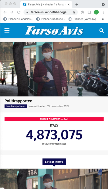
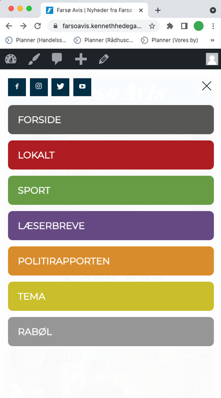
Live on mobile:
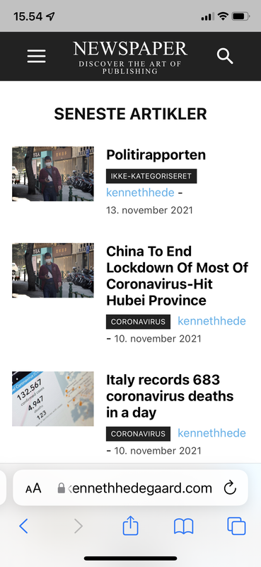
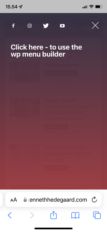
Heeeelp 🙁
 dimitrisv
Please see this video
https://1drv.ms/v/s!Akul2ygARwfdh5U9aNewFazgZXqf0w?e=HLVAlu
on the 9th second you will see the layer appearing…
Possibly I made a mess with some options in theme panel. What can I do to make it disappear completely?
 giriraj
 Hello Anamaria,
Thank you for your suggestions.
I deactivated the plugin and it has changed my customizations like title font and color for h2,h3,h4 etc.
I added custom script to adjust, but I couldn’t get the related articles option.
As you instructed It worked once made changes in the mobile theme and activate the standard pack plugin, but I want to continue the standard pack as deactivation.
Pls let me know If there is anyway to bring ‘related article’ back to desktop view.
Thanks
Giri
 Testventure
 I have totally the same issue, this only happens when the mobile theme is activated. On AMP it is working.
-
This reply was modified 4 years by
Testventure.
 AWAY FROM LIFE
 Yes, we’re talking about the same.
So you have done following steps, right?
1. Deactive all TD-Plugins on the site
2. Activate all TD-Plugins on the network
3. Setting on the theme panel on the site: Mobile Theme -> USE MOBILE THEME FOR: -> AMP
Anamaria Hello,
Unfortunately, we don’t have tested the WP Rocket, but if you want to use it, please make sure you have enabled the mobile cache for wp rocket ->
https://docs.wp-rocket.me/article/140-wrong-display-mobile-tablet-desktop
Thank you for your understanding!
 Amit
Amit1. Add child theme support for mobile theme.
Many sites alter the layout or add some extra ad codes, widgets to a single post page. So, every time the theme gets an update, the developer needs to redo those customizations. (Single template, header, footer) [/wp-content/plugins/td-composer/mobile/]
2. td Plugin updates
Every time we update the theme it’s doesn’t auto-update all the plugins. Consider fixing this or provide plugin updates in the plugin section directly. Most of the time you just change the updated date of the plugin and not its version which confuses most of the users. Also, make sure it should not install or update the td plugin which is not in use. In our case, we don’t use td social counter plugin but on every update, it is being auto-installed from the welcome screen.
3. Changelogs and Patch files
Provide clear changelogs (you used to provide it earlier before you introduced td standard plugin and td composer) Now even on the minor updates like (Newspaper 11.3.2), we have been asked to update td composer plugin and we lose all the customizations made in the plugin files (especially for mobile). So releasing even minor updates takes a lot of time for each site. Earlier it was really super easy to release minor updates just by overwriting theme files with patch (https://www.screencast.com/t/BXNL8iaX). Now every update has a few changes to the plugin files as well. I will suggest you provide clear changelogs for plugin files as well.
4. AdSense Responsive ad units for AMP (AMP Compatible ad unit)
Google recommends using responsive ad units on the site as they have started auto optimizing ads on the page. The mobile theme supports responsive ad units, but it uses fixed-size for AMP.
AMP should support Responsive AMP-compatible ad units. I am using Responsive AMP-compatible ads and I have seen improvements in earning. The last time I shared a solution for this via mail was on April 2, 2019, with you, but you have not implemented it yet.
 /*

		         * if its a google adsense ad on amp..

		         * we use the 'g_data_ad_client' && 'g_data_ad_slot' to generate a adsense ad type > amp ad component

		         *

		         * <amp-ad width=300 height=250

				 *    type="adsense"

				 *    data-ad-client="ca-pub-2005682797531342"

				 *    data-ad-slot="7046626912">

				 * </amp-ad>

		         *

		         * */
/*
* Modified by Amit Refer: https://support.google.com/adsense/answer/7183212?hl=en
**/
$buffy .= '<amp-ad width="100vw" height="320" ';
$buffy .= 'type="adsense" ';
$buffy .= 'data-ad-client="' . $ad_array['g_data_ad_client'] . '" ';
$buffy .= 'data-ad-slot="' . $ad_array['g_data_ad_slot'] . '" ';
$buffy .= 'data-auto-format="rspv" ';
$buffy .= 'data-full-width> ';
$buffy .= '<div overflow></div> ';
$buffy .= '</amp-ad>';
5. Newsletter
The theme comes with Newsletter plugin, but it does not work with mobile theme and AMP. Now Google has started mobile indexing first. From the sites I am handling, I can see 80-85% of overall traffic is from mobile devices.
Try to make a Newsletter plugin compatible/usable with a mobile theme/AMP version. Having a Newsletter popup will be the cherry on the cake. Currently, we have added Newsletter on Mobile and AMP by modifying the code.
That’s it for now.
Anamaria Hello,
I’m glad you solved the issue.
I saw you use the mobile theme, so to change the header color you need to go in Theme Panel -> Mobile Theme -> Theme Colors -> Menu bar =>https://i.imgur.com/Aes2jN8.png
Thank you!
 zarpe77
For some reason the desktop theme frequently switches to mobile view on a desktop. I use WP Rocket and every time this happens I have to clear the cache from the plugin to get it to view the desktop view correctly.
I have check with both WP rocket theme and cloudflare about this issue and both state that this is not caused by them and that I should check with the developers of the theme.
For context… I used both of these services with the old theme (before making the change to newspaper theme) and did not have this issue. This leads me to think that it may be theme related
Can you assist in letting me know why this may be happening with this theme? I have snippets if that would help in resolving the issue.
 Andreazanetti
 i contacted siteground, their support is workinf 7/7 24h. i solved with them. Nother question. How can i change the mobile header colour?
Andreazanettihi guys, as a title, the images in the posts are not showing anymore on mobile. the website is earth2italia.net
thanks
 Matop
MatopI want to create a mobile page. I follow the instructions. But the form doesn’t show completely and I can’t create the page. 
 rahulroushan
 Simon, frankly I’m yet to take the changes I made live, but on a staging server, it appears to be working for me i.e. the mobile site is responsive desktop site only, while the mobile theme is used only for AMP. The settings get saved for me so far as staging server is concerned. The setting I’m talking about is Theme Panel –> Mobile Settings –> AMP settings. Are you talking about the same? If so, as I said, at least in the staging environment, the changes are saved for me.
AWAY FROM LIFE Hi rahulroushan, thank you for your help! Sadly it don’t work by me, cause everytime I want to change the mobile Theme from “mobile” to “AMP” it don’t save the settings (I use the mobile theme just for AMP). Have you any idea why does the setting always reset?
rahulroushan Hi Simon, just network activate all the tagdiv plugins, esp the mobile, composer and cloud library plugins, and it should work.
 Bettina
 Hello!
Check if you have stretch row and set in the CSS tab on mobile viewport -20px margins left and right.
Let me know the results!
Thank you!
Bettina Hello!
If you use Mobile theme plugin, then you can not edit the pages with TagDiv Composer.
You have only some settings for this layout, which you can find in Theme panel -> Mobile Theme. Please note that if a page is made by Composer, than the content won’t be displayed on Mobile theme version. You should create the content with the Mobile Editor.
For more details, please take a look here:
– https://forum.tagdiv.com/mobile-theme-introduction/
– https://forum.tagdiv.com/the-mobile-theme/
You can edit the mobile pages like this and create your own design: https://www.screencast.com/t/mCDwGFln
Hope that helps you!
Thank you!
 avertizor.ro
Warning: Invalid argument supplied for foreach() in /home/avertizo/public_html/wp-content/plugins/td-composer/includes/tdc_mapper.php on line 42
Warning: Cannot modify header information – headers already sent by (output started at /home/avertizo/public_html/wp-content/plugins/td-composer/includes/tdc_mapper.php:42) in /home/avertizo/public_html/wp-includes/functions.php on line 6712
Warning: Cannot modify header information – headers already sent by (output started at /home/avertizo/public_html/wp-content/plugins/td-composer/includes/tdc_mapper.php:42) in /home/avertizo/public_html/wp-admin/includes/misc.php on line 1310
Warning: Cannot modify header information – headers already sent by (output started at /home/avertizo/public_html/wp-content/plugins/td-composer/includes/tdc_mapper.php:42) in /home/avertizo/public_html/wp-admin/admin-header.php on line 9
What can i do? This error comes from tagDiv.mobile.themes and AMP plugins.
Bettina Hello!
The CSS code you need to add in Newspaper -> Theme panel -> Mobile Theme -> Custom code:
#td_amp_menu .td-menu-background, #td_amp_search .td-search-background {

    background-color: transparent!important;

}
Hope that helps you!
Thank you!

