- TutorialsFrom WPBakery to tagDiv Composer
- TutorialsWhat is Ajax preloading?
 Bettina
 Hello!
Please check this topic https://forum.tagdiv.com/topic/image-lighthouse-on-mobile-version/
Thank you!
Bettina Hello!
I see you’ve added the menu only on the sticky header. Please check if those options are enabled: https://app.screencast.com/QraEF3FK3gj0l
Please follow the video to see where you can find and edit/build your sticky header on mobile and desktop, too: https://www.screencast.com/t/l6v2Belt
I hope that helps you!
Thank you!
 JapanGeeck
Hi,
I have a question about my blog using last version of NewsPaper theme.
Everything works fine with Desktop Version.
My blog : https://julliette.fr
But when click on the button to show the menu on Mobile phone, nothing happends. the menu isn’t diplayed. How can I resolve because I think it’s a problem to crawl all pages of my website for Google.
Thank you.
 Simion C.
 Hi,
While on larger devices there is enough room to display a mega menu https://prnt.sc/U_H3fg3efF_q on mobile it will automatically converted to a sub menu https://prnt.sc/ndjEvcLEhShu There is no way to display the same mega menu on mobile unfortunately. Please let us know if you have more questions.
Thank you!
 victortrongvu
I’m creating Mega menu. It’s working fine and showing on Desktop but not on Mobile phone. How can I enable Mega menu to show on Mobile phone as well?
 yordan
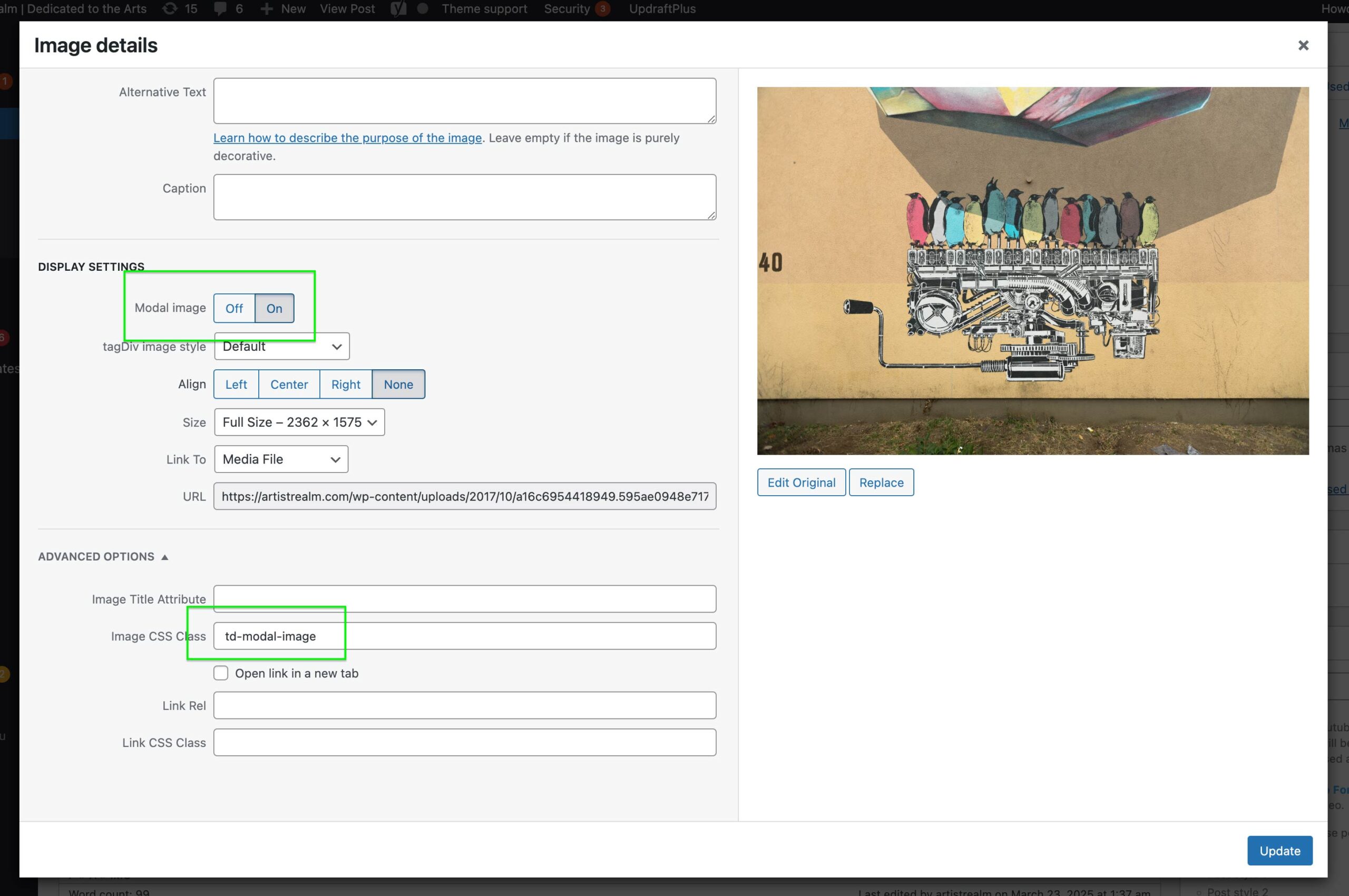
I am using Newspaper, classic editor, but the Lightbox td-modal-image on my posts is not working on mobile. It’s working beautifully on a desktop. It may be that it is set as a click event vs on touch, but I am not a developer.
I have also tried to turn of the modals on mobile to avoid sending the user to to the image file, but it does not work either.
This post page is just an example. It’s happening on all.
https://artistrealm.com/2017/10/09/propagating-machine-piece-nevercrew/
Reference images from the admin side:
https://artistrealm.com/wp-content/uploads/2025/03/Screenshot-2025-03-22-at-9.38.21 PM.png
https://artistrealm.com/wp-content/uploads/2025/03/modal_image_settup-scaled.jpg
 Tangerine
 thanks!!
So, when I click the login button on my mobile, I want to go to that login page. Where do I change this?
 iamsergiomarin
Hello. I’m having trouble with the mobile pages. I’ve created both for the posts and the homepage. The problem is that sometimes it gets messed up automatically. The default desktop homepage appears, and other times the mobile version appears. I didn’t set the desktop version on my mobile. The same thing happens with the posts. Sometimes the mobile version appears on the desktop, and other times the one created for mobile. What could be happening?
I don’t have the Mobile Theme plugin installed.
 nanjingfrank
 Thank you Bettina for such a quick reply!
Unfortunately, none of you what you suggest has worked. In fact, I have also noticed that the mobile menu is in fact sticky by default, irrespective of the setting in the the website manager.
What else could it be?
Thank you!
Frank H
 shammi1986
 I changed the to Mobile Menu here is the snapshot for your reference
https://app.screencast.com/pK7PiDBCIEnev
and I also select the menu from drop down but it’s not show again on mobile
 Anamaria
 Hi,
You can hide the author on that grid for the mobile theme plugin, from Theme Panel -> Block Settings -> Meta info on Modules/Blocks => https://www.screencast.com/t/CvxrWymeyk
Thank you!
Anamaria Hello,
Your mobile menu is a modal popup, so you need to edit it and change the elements from the page, add a menu, and delete blocks as you want.
Thank you!
nanjingfrankHello! I have been half successful at making my site’s main menu sticky, in so far as it works perfectly on mobile. However, on desktop, while the Website Manager’s header section says it is the Main Menu that is sticky, in practice I get the Top Navigation menu instead.
All appears to be correctly configured in Appearance – Menus – Manage Location
Hope you can point me in the right direction!
Tahnk you very much!
 Jongsoo
 It doesn’t work. What’s the problem? And is there a way to delete the field where you write website in the comments on mobile? Thank you.
JongsooI looked for it but it’s gone. I know it’s not recommended to use AMP (mobile), but I have no choice but to use it because otherwise it would overwrite everything. Please tell me how to remove the author mark.
Anamaria Hi,
This usually happens with cache plugins. If the cache plugin does not have mobile support, the mobile version can be delivered instead. Please make sure that you have enabled the mobile cache -> https://i.imgur.com/W1KaV3U.png
Please check this topic where I explained each mobile version -> https://forum.tagdiv.com/topic/mobile-version-not-working-properly-2/
Thank you!
Anamaria Hello,
It depends on how you want it. Do you want it to have it on all pages? If yes, then you need to add it to mobile menu zone -> https://i.imgur.com/zjOjJbL.png
Thank you!
 janw33
Good morning,
I’m using the TagDiv Newspaper theme and have a question regarding the mobile display.
I’m aware that there are two options for mobile devices:
The Mobile Template via Cloud Templates
The Mobile Theme using the AMP plugin
My question refers specifically to the Mobile Template, not the AMP version.
I have created two separate templates via the Cloud Templates:
– one Homepage Template for Desktop
– one Mobile Template for mobile devices
However, on many mobile devices, the Desktop Template is still being displayed instead of the intended Mobile Template.
How can I ensure—or force—that mobile devices reliably display the Mobile Template?
Thank you in advance for your support!
 rahlplxTangerine
The search speed of Header live search is too slow on mobile.
I want to go straight to the search screen when I click on the icon on mobile only. Is that possible?
TangerineThe element is hidden and cannot be clicked. What should I do?
TangerineThe PC search speed of the newspaper theme is fast, but the mobile search speed is too slow.
What should I do?
Anamaria Hello,
For mobile theme you can not add a sidebar.
AMP is deprecated as of January 2023-> https://developer.bigcommerce.com/docs/storefront/wordpress/platform-integration/enabling-amp so we don’t longer recommend it.
Thank you!
 Divyanshudeo
Hello Team,
I installed Newspaper theme on my site and use mobile theme and AMP. I also want to add default sidebar for mobile visitor. Can you suggest me how can add this
Anamaria Hello,
I checked and those are two different templates also, for desktop -> https://i.imgur.com/awI9Jjo.jpeg
Also, I see that you haven’t changes the logo for mobile. For mobile please edit with tagDiv Composer, select the viewport on phone, select the header logo and change it => https://i.imgur.com/cR7F0v4.png
Thank you!