Hi,
This kind of issue usually occurs when a different version of the site is used for mobile (as in your situation), and the caching system is not configured to deliver separate caches for desktop and mobile.
To resolve this, you need to check all layers of caching you have:
– the caching plugin on your site
– server side caching
– cloudflare or any other CDN cache
Make sure that each layer is set up to deliver a separate cache for the mobile version of the site. Once this is configured correctly, the mobile specific template should load consistently.
Thank you!

@Calin What’s happening, this has been happening for quite some time now, everything I click on appears with an orange outline and I don’t know what to do to fix it, I spent hours and hours trying to find a solution via the hosting terminal, the only thing I found via the terminal and was interpreting along with it. This is the REAL CAUSE OF THE ORANGE OUTLINE
The orange is NOT coming from:
❌ the td-cloud-library
❌ external minified CSS
❌ a separate plugin
It’s coming from the Newspaper theme (TagDiv) directly from:
text
wp-content/themes/Newspaper/style.css
And mainly from the files:
text
/wp-content/themes/Newspaper/includes/td_css_generator.php
/wp-content/themes/Newspaper/includes/wp_booster/td_wp_booster_functions.php
What’s happening:
✅ Newspaper has a global primary color variable (accent color)
✅ This color is set to #ff6600
✅ The theme uses this color to generate dynamically: I’ve looked everywhere to see how to remove this in some theme setting and nothing, nothing, look how it is That’s bad, https://ibb.co/xKbTTBg2
https://ibb.co/wFs0qrBw
https://ibb.co/VYDF9sgJ
https://ibb.co/gZczySt5 Everything I click on shows this orange outline, I don’t know what to do, I’m asking for your help to solve this.
Hi,
If I’m correct, that is because you have the option for Accessibility (Keyboard + Skip link + Search dialog) from the theme panel. Please go to Newsapper > Theme Pnale > Template Settings – https://prnt.sc/pA3qARHhVaZc
I hope this will help you!
Hello,
Thank you for your previous help. I need assistance with two issues in the Newspaper theme / TagDiv Composer.
1. Google Fonts and local fonts
The theme is loading fonts from Google, and this is heavily affecting the site’s performance because of render-blocking requests. The theme does not properly use local fonts by default.
I tried using local fonts inside TagDiv Composer, but I had to do a workaround, and that is not the correct solution. I also created a Newspaper-child theme and managed to load local fonts from there, but the result was not good because the fonts do not look exactly the same as the original Google Fonts.
What I need is a proper solution that makes the theme use local fonts, while still allowing me to select the fonts normally in TagDiv Composer. In other words, I want the theme to keep the same visual appearance, but load the font files locally instead of requesting them from Google.
What is the correct way to do this?
2. Hiding the “Most Watched” section title
I am trying to hide the title of the “Most Watched” section shown here:
https://ibb.co/6cmh3VH8
This section appears in this post:
https://glostv.com/tv-ao-vivo/tv-cultura
and also in all other posts.
I used the following CSS:
CSS
.tdi_54 .entry-title,
.tdi_54 .td-module-title,
.tdi_54 .td-module-title a {
display: none !important;
}
The problem is that this is also hiding titles on the Popular page:
https://glostv.com/populares
This should not happen. These elements should not be sharing the same .tdi_54 behavior for this case, or at least I need a more specific way to target only the “Most Watched” section inside posts.
How can I hide that title only in the post section, without affecting the Popular page?
Thank you.
Hi,
1. For the font issue, you can try the OMGF plugin https://wordpress.org/plugins/host-webfonts-local/. It helps host Google Fonts locally and often improves performance. Also, check whether your caching plugin includes any optimization settings for Google Fonts, as that can make a difference.
2. I understand the concern. I recommend adding a custom class https://prnt.sc/5AtT-epD1137 to the element where you want to apply custom CSS. This approach helps you avoid conflicts like the one mentioned earlier. Keep in mind that on each page, template IDs such as tdi_1 are generated dynamically, starting from 1 and incrementing based on the number of elements—so they may change and aren’t reliable for targeting.
Thank you!
Hello @Calin
I am writing to you after a deep technical audit that lasted two days, conducted by a Senior Infrastructure Engineer and Web Performance Specialist. We had to take this measure because our PageSpeed scores are stuck between 31% and 41% on mobile, despite running on a high-end VPS with persistent cache (Redis/Object Cache) and every possible server-side optimization.
Google has officially notified us regarding this poor performance, stating that our site is no longer a priority in search rankings due to failing Core Web Vitals. After a thorough investigation of the source code and database, we have pinpointed the root cause: The Newspaper theme is loading both Desktop and Mobile assets simultaneously on mobile devices.
Even with dedicated mobile pages (separate IDs), the theme “stacks” the entire desktop framework on top of the mobile one. This redundancy is killing our performance.
I need you to take this diagnostic to the tagDiv development team immediately. We need to know if and when a fix will be released. If this architectural flaw is not resolved, I will be forced to migrate to another theme or develop a custom one, as I cannot afford to lose my SEO ranking due to theme bloat.
Technical Diagnostic:
Problem: Mobile pages heavier than desktop pages
Date: 03/05/2026
Theme: Newspaper 12.7.5
Plugin: td-composer
Server: VPS Ubuntu — CyberPanel — LiteSpeed
CONTEXT
The site glostv.com uses the Newspaper 12.7.5 theme with the td-composer plugin and has a system of separate pages for mobile and desktop, where each version was built individually in the Newspaper visual editor (tagDiv Composer). The site owner reported that pages on mobile are significantly heavier than on desktop, even though there are separate and optimized mobile pages already built.
MOBILE SYSTEM ARCHITECTURE
The following pages were created as mobile templates inside the tagDiv Composer itself and are marked in the database with the flag tdc_is_mobile_template = 1:
ID 7584 — tv ao vivo Brasil (mobile version)
ID 7617 — POPULARES TOP (mobile version)
ID 8700 — Estados (mobile version)
ID 8872 — Homepage (mobile version)
ID 9944 — Política de Privacidade (mobile version)
ID 9948 — Termos de Uso (mobile version)
ID 10581 — Sobre Nós (mobile version)
ID 10597 — Política de Cookies (mobile version)
TECHNICAL PROBLEM IDENTIFIED
Problem 1 — td-composer loads assets WITHOUT any device distinction
Confirmed directly in the file:
wp-content/plugins/td-composer/legacy/common/wp_booster/td_wp_booster_functions.php
Line 362 — Composer JS loads for ALL devices:
add_action(‘wp_enqueue_scripts’, ‘load_js_composer_front’, 1000);
Line 430 — Full Newspaper CSS loads for ALL devices:
add_action(‘wp_enqueue_scripts’, ‘load_front_css’, 1001);
Line 744 — Full theme JS loads for ALL devices:
add_action(‘wp_enqueue_scripts’, ‘load_front_js’);
None of these functions have any device check. They load for both desktop and mobile equally, without any condition whatsoever.
Problem 2 — The mobile engine loads ON TOP of the desktop engine
Confirmed in the file:
wp-content/plugins/td-composer/mobile/functions.php
Line 149 — Mobile CSS loads ON TOP of the desktop CSS already loaded:
add_action(‘wp_enqueue_scripts’, ‘tdm_load_front_css’);
Line 173 — Mobile JS loads ON TOP of the desktop JS already loaded:
add_action(‘wp_enqueue_scripts’, ‘load_front_js’);
Line 184 — Mobile specific script loads ON TOP of all previous ones:
wp_enqueue_script(‘td-site’, TDC_URL.’/mobile/js/tagdiv_theme.min.js’);
Problem 3 — The flag tdc_is_mobile_template does NOT remove desktop assets
Confirmed in the file:
wp-content/plugins/td-composer/includes/tdc_state.php
Line 42:
private static $is_mobile_template = false;
Line 202:
public static function set_is_mobile_template($is_mobile_template) {
self::$is_mobile_template = $is_mobile_template;
}
This flag only serves to let the visual editor know it is on a mobile page. It does not execute any removal of desktop CSS or JS. It is purely an internal state variable with no effect on asset loading.
Problem 4 — Proof: Zero wp_dequeue for mobile anywhere in td-composer
I ran the following command directly on the server via terminal:
grep -r “wp_dequeue|deregister” wp-content/plugins/td-composer/ -n | grep -i “mobile|desktop|css|js”
The only result found was the removal of Visual Composer scripts in the backend administrative editor, not in the frontend. Throughout the entire td-composer codebase, there is not a single wp_dequeue_style() or wp_dequeue_script() instruction conditioned on mobile device detection in the frontend.
WHAT THE MOBILE BROWSER IS ACTUALLY DOWNLOADING
When a user accesses the site from a mobile device, the browser downloads all of this before rendering the mobile page:
From the desktop engine (which should NOT load on mobile):
Full legacy CSS of Newspaper
td-composer frontend JS (desktop visual engine)
tagdiv_theme.min.js desktop version
td-cloud-library CSS
td-standard-pack CSS
td-multi-purpose/style.css
Desktop version fonts
From the mobile engine (which loads ON TOP of the desktop):
Newspaper mobile CSS
tagdiv_theme.min.js mobile version
Mobile specific scripts
Fonts loaded again
The mobile browser is downloading the complete Newspaper framework twice. Once for the desktop layout that is discarded and once for the mobile layout that is actually used. This directly explains why mobile pages feel heavier and slower than desktop pages. DIRECT QUESTION TO SUPPORT
Does td-composer 12.7.5 have any native mechanism to remove desktop engine assets—specifically the functions load_front_css, load_js_composer_front, and load_front_js located in td_wp_booster_functions.php—when the page being served is already marked with tdc_is_mobile_template = 1 in the database?
If yes, in which file and on which line does this asset cleanup occur?
If no, when is the development team going to release an update to fix this? It is unacceptable that a high-end theme like Newspaper forces a mobile device to download the entire desktop framework AND the mobile framework simultaneously. My server-side analysis confirms that even when using dedicated mobile pages, the theme simply “stacks” assets instead of “swapping” them.
This redundancy is causing a massive performance overhead and killing our Core Web Vitals. We have separate pages for a reason, and the theme should NOT be loading desktop junk on a mobile-dedicated template. We need a clear position on when this will be resolved so that tdc_is_mobile_template = 1 actually triggers a wp_dequeue of unnecessary desktop resources.
Hi,
I will forward this to our developers, and they will check it out.
Also, I want to let us know that using a mobile page/template will still load teh tagDiv Composer and cloud library (because those are used to create those pages and cloud templates for the mobile version). Normally, this option should be used when you need to have different content on mobile pages and mobile templates, maybe a smaller page with fewer elements, blocks, and for a different layout. Having the same layout and content will be better to use the responsive version, instead of the mobile page/template.
Here are a few additional recommendations you can try. For some users, all themes work without issues, while for others, only certain ones function properly. This can vary depending on the extra plugins in use, as well as any caching or optimization plugins installed.
-> Footer delayed load https://prnt.sc/FS34hBno40sx (under the theme panel > footer > footer delayed load)
-> MINIFY INLINE CSS and AGGREGATE INLINE CSS – https://prnt.sc/en14t6CQChM- (under the theme panel > block settings> inline css)
-> Don’t load on mobile/desktop, this option is only on the cloud header for HEADER MENU https://prnt.sc/udlAW4icvSPP on HEADER MENU STICKY https://prnt.sc/9pKnilQdWyex on MOBILE MENU https://prnt.sc/ff7fRQvTnaXt and on MOBILE MENU STICKY https://prnt.sc/Mm-4mbC4WB68
-> Flex Blocks cache – https://forum.tagdiv.com/use-flex-blocks-cache-option/
Also, it is recommended to use a good cache plugin and even Cloudflare (CDN)
Thank you!
I appreciate your suggestions and I will follow them. Thank you for reporting this issue to the theme developers. I hope they can fix it permanently in the next update, because mobile traffic is the most important. If it’s already like this on a VPS, I can only imagine how it must be for users on shared hosting.
I also forgot to mention that Google Fonts are significantly affecting performance. The theme depends on them, and they are adding about 37.8 KiB of render‑blocking resources in PageSpeed, as you can see in this screenshot: https://ibb.co/4H1PDGc
You suggested the OMGF plugin (https://wordpress.org/plugins/host-webfonts-local/). I installed it, but unfortunately it’s very limited and constantly shows messages encouraging you to upgrade to the Pro version to improve performance. The Pro version requires an annual payment.
I looked for alternative plugins, but most of them are also paid. My suggestion is something much simpler: please ask the theme developer to include an option to download and host the fonts locally directly within the theme, instead of depending on paid third‑party plugins. This would improve site speed and overall performance.
If you could also pass this suggestion on to the theme developer, it would help a lot.
Hi,
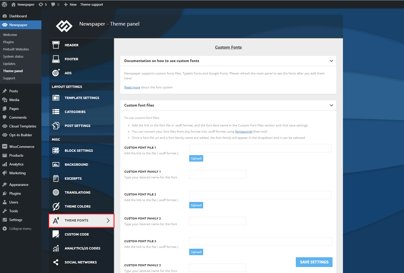
As an alternative approach for managing fonts, we recommend downloading and uploading the desired fonts manually via the Theme Panel (Fonts section). Once uploaded, assign these fonts to the relevant theme elements.
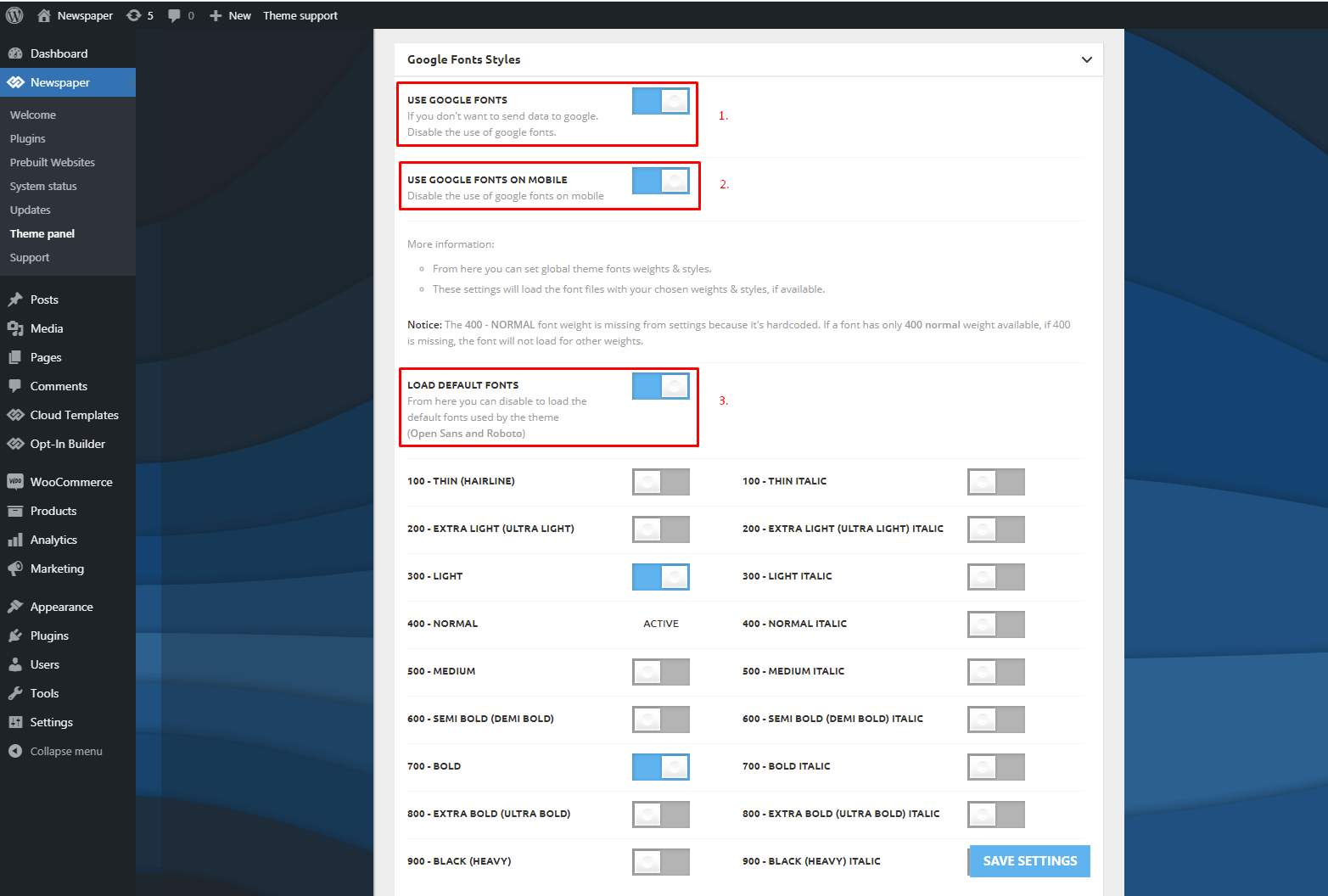
After confirming everything is properly configured, disable Google Fonts from the Theme Panel. This will prevent external requests and ensure that only the locally uploaded custom fonts are used.
For more detailed guidance, please refer to our documentation here: https://forum.tagdiv.com/font-customization/ – https://forum.tagdiv.com/wp-content/uploads/2015/05/Newspaper-Theme-Fonts-Settings.png – https://forum.tagdiv.com/wp-content/uploads/2015/05/Google-Fonts-Styles.png
@Calin, You know what’s happening, the theme is ignoring the post made for mobile (there’s a separate mobile theme), you can see it here: https://ibb.co/DgpbbLbT. It loads the desktop page on the phone, analysis: faint blue header and an ad like this (it’s for desktop), there’s no ad on mobile, the ad is only for desktop. Remember you told me to activate this? https://ibb.co/Rkjbv6bP It’s activated. Even so, the theme is loading the desktop theme on mobile, it doesn’t know how to separate them and isn’t separating them. The cache is correct https://ibb.co/JRVBbRqz it’s activated to generate mobile cache, look at this loading from https://ibb.co/TBT7jJLr, I mean, I did this last year, separate mobile theme, look at this https://ibb.co/x8c0yx07 everything is correct. I ask for a solution to fix this. You saw the performance is bad, horrible, because of this. I think the theme developer needs to create a plugin to redirect pages created on the mobile theme, so that when you open the mobile theme, you only open the desktop theme, and only the desktop theme, to avoid this mess. I’m asking for help; if you can’t help, talk to the person who created this theme and ask for guidance. I’m losing audience and rankings because of this.
Hi RENATO,
I understand that this situation is frustrating.
From what I can still see, the cache does not appear to be functioning correctly. Since I do not know the exact configuration or behavior of LiteSpeed Cache (and this is not a tested plugin), I cannot confirm whether the issue is directly related to that plugin, server-side cache, CDN configuration, or another caching layer. There are multiple possible factors involved.
At the moment, the mobile page you created with fewer blocks, smaller thumbnails, and more optimized content should normally provide significantly better mobile performance. However, because the dedicated mobile version is not loading, visitors are instead receiving the responsive desktop version, which is heavier and not fully optimized.
Unfortunately, there is not much more I can assist with from the support side. I have already provided all the recommendations and guidance available, even though performance optimization and PageSpeed improvements are outside the standard scope of support. We still did our best to help, despite the fact that the support period has not been extended for more than 8 years.
If you would like this issue to be investigated further and fully resolved, I recommend submitting a custom work request to services@tagdiv.com. Please include all relevant details and temporary wp-admin and cPanel access. The team responsible for custom services will review the situation and let you know what can be done, along with the associated costs.
Thank you for your understanding.
@Calin, I need all URLs to be the same, both the desktop and the mobile-created versions. For example, my homepage is https://glostv.com/, but the mobile-customized page has a URL like this: https://glostv.com/glostv-assistir-tv-online-ao-vivo-gratis. I can’t remove “glostv-assistir-tv-online-ao-vivo-gratis” and leave only https://glostv.com/ because when someone accesses glostv.com on their phone, they go to the desktop version, not the custom version https://glostv.com/glostv-assistir-tv-online-ao-vivo-gratis. I need to make glostv.com the same on both. What’s the secret? I’ve looked everywhere and haven’t found it. What’s the right way to make this the same? Would doing this allow me to do it with other pages as well? This needs fixing, it’s a mess. I haven’t finished customizing a professional mobile page because of this mess. It’s like this: https://ibb.co/7JQhH5rh. Can you help me match the URLs of the two? What’s the right way to do that?

Hi,
Not sure what you are doing there exactly. Are you setting the mobile page as the homepage for the website? Why exactly are you doing that?
The way it works is like this. You have a desktop page which is used as the homepage. You create a mobile page for it, which is basically a regular page.
When you set the mobile page for the desktop page, the theme displays the content from that mobile page on mobile. Nothing else has to be done. The URLs are not changing. The theme doesn’t actually load that mobile page in the browser via it’s link, it uses the content from it. I don’t think this is a mess, it’s quite easy to use.
Or am I misunderstanding the problem?
Thank you!
You misinterpreted it, because what happens in practice is not the way you said before. In practice, it happens like this, I’ll give an example showing it in practice.
The normal URL without a mobile page is this: https://glostv.com/estados. However, when I create a separate page for mobile to customize it using the Dav Composer, it asks for a name. I put “estados” (states), and the URL changes to https://glostv.com/estados-2 on mobile. The same thing happens with the homepage. The problem with the homepage is that I have to put a name, and that name goes to the page’s URL. Do you understand? I need to know the right way to do this. This can’t happen, changing the URL when creating a mobile version. Understand that it really can’t. This is confusing; Google indexes both the mobile version and the desktop version, and this all gets messed up. You need to talk to the theme owner who created this logic and developed this to find out what the logic is, the solution to all this, and if they will release an update to fix this.
The pages must have names, they are regular pages after all. The feature is called mobile page. If you set the same name for the mobile page as the desktop page, then it will have a “-2” at the end, that’s how wordpress treats duplicates. You can all it anything you want however, the page itself is not meant to be accessed directly anywhere on the website.
The URL isn’t changing desktop vs mobile. So this page https://glostv.com/estados has the same URL on desktop https://prnt.sc/-1vo-VhmDr3J and on mobile https://prnt.sc/zsWdJWIKnyxJ The theme just displays the content from the mobile page, it’s not actually switching the pages and the URLs. It switches the content from the desktop page with the content from the mobile page, the URL remains the same.
If this https://glostv.com/estados-2 is the mobile version of this https://glostv.com/estados I’m not sure why you are using a mobile page, they look exactly the same. Or maybe it’s just as an example.
At this time from what I know there aren’t plans to change how the mobile pages and templates work. Many of our users use these and there are no issues with them to fix.
Thank you!
I need some guidance on the homepage; please understand this. Regarding glostv.com (desktop), the mobile version is currently https://glostv.com/glostv-assistir-tv-online-ao-vivo-gratis, but when accessing glostv.com via mobile, the mobile version https://glostv.com/glostv-assistir-tv-online-ao-vivo-gratis doesn’t appear. Should I change the URL? Create another page with name 1 or 2? What is your recommendation for the mobile homepage? I need a clear answer on this. Another question: where is Calin? Did he leave the forum?
That’s the same page. Assuming you did set a mobile page for this page https://glostv.com/glostv-assistir-tv-online-ao-vivo-gratis and it doesn’t look exactly the same, then it means the mobile page isn’t being served. The page looks exactly the same for me on desktop and mobile. I can’t see any differences.
One thing that can cause issues with dedicated mobile content, such as mobile pages, is the caching. For example if the desktop page is cached, then it will be served to everyone regardless of the device they are using to access it. I believe you are using litespeed, please activate this option -> https://prnt.sc/qIm-aoyqUiIe and clear the cache. Then the desktop page and the mobile page should be served properly.
I should mention again, that the purpose of using a mobile page is if you want to display something different on mobile. If not, there is no reason to use them.
Thank you!