

 vallartamirror
 This seems to occur only on Google Chrome.
vallartamirror I am able to add the row, but then where do I divide it into columns?
vallartamirror Oh… silly me.
Thank you.
vallartamirror But how do we get the posts loop block to only display articles within the category? I don’t see a filter option.
If one doesn’t exist, do you have a suggestion on how to display ads within a category?
-
This reply was modified 2 years by
vallartamirror.
vallartamirror I found the issue. It was within one category. For some reason the layout would not save. I was able to correct the problem by creating a new category and moving the articles there.
vallartamirror I have switched to Magazine PRO on both the home and categories templates to attempt to fix this. It did not work. I will repost in that forum.
vallartamirror I have downloaded a new template and will test now.
-
This reply was modified 2 years by
-
This reply was modified 2 years by
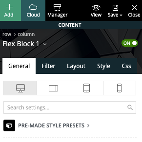
vallartamirror Here is a screenshot showing the block used (Flex Block 1).
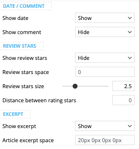
… with settings set to show excerpt and hide comments.
Here is also a screenshot of the category sections from my mobile…
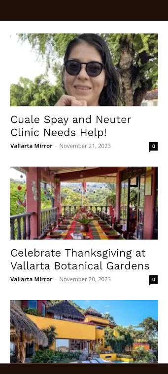
The page shown above can be found here. It displays correctly on desktop but not on mobile.
vallartamirror Thank you. This seems to have fixed the issue I was having with mobile… and the other issues I was having with the footer.
YOU ROCK!
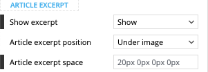
Can you help me determine why my article excerpts do not appear with the default layout… and why the comments icon is displayed (this is set to hide). Here are screenshots from the template…
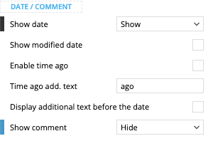
vallartamirror I switched for the “Header categories list” to “Mobile menu”. This seems to have corrected the problem… at least for now.
vallartamirror I cannot find any reason why this occurring, as I made not changes since posting the item above. I closed out my browser and opened it again. Now it displays correctly on the category and post pages but not on the home.
vallartamirror I have made my menus match for “Categories” and “Primary”.
I have set the header to show “Primary”.
I have added the “Header Categories List” back to the mobile design.
Now the menu shows correctly on the mobile home, but it does not display correctly on the mobile categories pages or the mobile individual posts.
Correct:
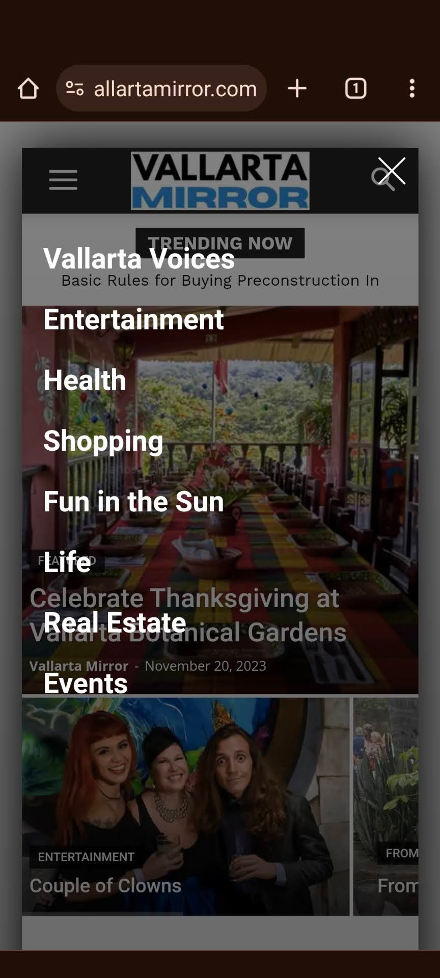
Incorrect:
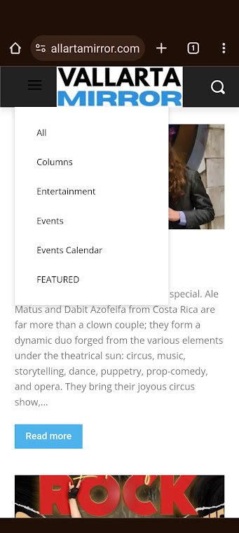
Also… the correct one shows a nice white hamburger menu, and the incorrect hamburger menu is dark.
-
This reply was modified 2 years by
vallartamirror The menu is built.
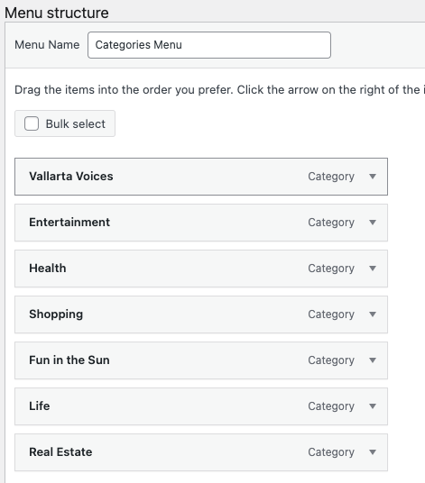
Selected in header.
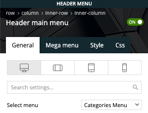
It displays fine on desktop but not mobile
The site is now live at vallartamirror.com if you would like to take a look on mobile and desktop.
vallartamirror I’m not quite sure how to do this. I cannot add a menu in the mobile home template.
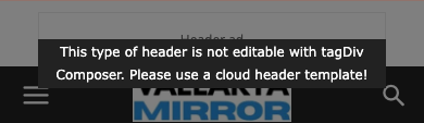
I have the categories menu selected for the desktop design.
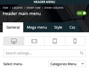
However, the mobile design does not have a selector and displays the categories from primary. Do I need to just edit these… and if so, where?
vallartamirror 1. This worked. Thanks.
2. It worked. YOU ROCK!
3. Unfortunately, I am not as successful on this one. I need the header categories list, so I can’t turn off the categories, and I don’t see where I can do anything is the modify section to make the “Categories Menu” appear instead of “Primary”. Should I just change the primary categories, and if so, where do I do this? Any additional insight you can offer here?
vallartamirror Can anyone help?
