
- NewspaperWP Rocket and Newspaper Theme: Optimization Guide
- TutorialsFrom WPBakery to tagDiv Composer
- TutorialsDefault Block Settings Guide
- TutorialsHow to use custom fonts
 jrh
jrhThe email field will not inherit the transparency or background color as all other fields do? I have searched and search css and am at a dead end, please look here: http://hallesque.com/contact-hallesque/
Any assistance would be greatly appreciated….
Thanks – and by the way, Newspaper 8 is by far the best on the marketplace.
 Ernesto Justiniano
 I have the same problem!
I do have to change the style.css to avoid this.
 Dartfreakz
Hi,
I want to remove the left and right margin for widgets in my sidebar.
The widget sidebar: https://drive.google.com/open?id=0B9YFwahE9sS2RkZUZ3lQRFRzRFE
I have tried different codes (Theme panel->Custom Css) but unfortunately not yet with the desired result.
My website is still under construction so not public..
Can you help me with the custom css code that i need?
 Edible-Alpha
 Hello,
I am trying to do a similar thing on this site:
http://dev-edible-alpha.pantheonsite.io/
However, when I add the CSS, nothing happens. Any thoughts as to why?
Zac
 mayuxi
I know there is a CSS workaround to hide categories from Popular Categories widget, but I think exclude option (same logic as in Module blocks settings) would be better and more user-friendly
Thanks
 Nerves
Hello Tagdiv,
Have you got a custom css code for mobile theme to desactivate / not display / disable the “latest articles box” in the homepage ?
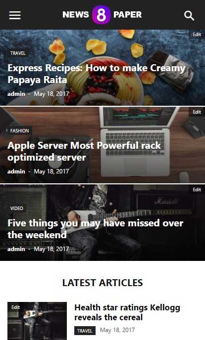
Thank you in advance.
 Simion C.
 Hi,
I am assuming it does not work fine on mobile, that is what I can see in the screenshot. On mobile try removing the float properly. Use a code like this and see if it displays properly
#ad1 {

float: none;

}
Enter it in Theme panel->Advanced CSS in the phones section. However it would be helpful if you could provide a link to your website if possible, so we can see the issue and try to give you a more accurate solution.
Thanks
Simion C. Hi,
I think this is somewhat of a misunderstanding. If you would like to display a smaller font size on mobile for the article titles in the big grid, use something like this
– https://www.screencast.com/t/V8Y2HOsw6
Please remove the previous code related to the big grid (leave the one for the block), and enter this one in Theme panel->Advanced CSS in the phones section
.td_block_big_grid_12 .entry-title a {

font-size: 12px;

}
Please let us know if this is a solution in this matter.
Thanks
 jmark4455
 I’m having trouble editing the excerpt css that I added to the big-grid-3. In the chrome developer tool the excerpt code appears like this:
<div class="td-big-grid-meta">

                                                <h3 class="entry-title td-module-title">Drug Safety Services</h3>This is the excerpt I want to edit</div>
I tried the following versions below for changing the excerpt css but nothing worked:
.td-big-grid-post .td-excerpt {color:#fff; font-size:14px;}

.td-big-grid-meta .td-excerpt{color:#fff; font-size:14px;}

.td-module-excerpt{color:#fff; font-size:14px;}
Can you please guide me to how I edit the css for the excerpt function I added to the big grid?
Simion C. Hi,
There seems to be a huge padding set on the video element
– https://www.screencast.com/t/dDXt5cvp8iwi
You could try as a quick fix a code like this
– https://www.screencast.com/t/IDC6dQsiLZZ
Enter it in Theme panel->Custom CSS and check if it works. If you have caching installed, clear it after entering the code
.fluid-width-video-wrapper {

padding-top: 392px!important;

}
Visual composer can be used for posts, but this is not recommended. It should be only used on pages
– https://forum.tagdiv.com/how-to-use-visual-composer/
The tagDiv composer is a front-end page editor and can be used for pages only
– https://forum.tagdiv.com/tagdiv-composer-tutorial/
In future updates more options and elements will be added to this editor exclusively, not for Visual composer.
Thanks
Simion C. Hi,
You could maybe create a condition where the sidebar is called, to not display it on the shop page only
– https://www.screencast.com/t/CKWIy0y5LS5
Try something like this and see if it works
– https://www.screencast.com/t/9NR8zcdv9eK
Or maybe you could hide the sidebar with some CSS on the shop page only
– https://www.screencast.com/t/P209TUSDi
Try this code
.post-type-archive .td-main-sidebar {

display: none!important;

}
Thanks
 d_alinus2004
Hello,
I try to add a second ads on post content.
I have add on the custom css this code:
#ad1 {
top: 10px;
left: 10px;
float: right;}
and then on the CSS Advanced the same, for mobile display.
But the code dosen’t work line on desktop
See this photo for better understend:
https://pasteboard.co/GGPtu6y.png
Any ideea how i can solve this problem for mobile versions?
 majorfuss
 I’ve changed the 16px size but it’s still not showing. No big red x in my custom css box. In the phones css box, I see an ‘info’ icon saying “Don’t use adjoining classes.”
My custom css: https://snag.gy/DZFhuM.jpg
My phones box: https://snag.gy/KuXnOS.jpg
My mobile site: https://snag.gy/1F0dSw.jpg
 Bogdan B.
 Try to change the 16px size. It should work fine. Please also check if you do not have a big red x in the custom css box as it would indicate an incorrect code. Maybe you have an un-closed tag in your previous css.
Thanks.
Simion C. Hi,
There is no option to disable the comment when using the mobile theme. However you could make a small modification in the theme and remove them from the post page on mobile. Comment or remove this line of code from this file
– https://www.screencast.com/t/o426OMatf0
– https://www.screencast.com/t/ZP0myqMNg
This will remove the comments from the post page when using the mobile theme. Or you can enter a code like this in Theme panel->Mobile theme->Custom CSS section
.single .comments {

display: none;

}
If you are not using the mobile theme plugin, this setting from the theme panel will disable the comment for the post page
– https://www.screencast.com/t/1viE3zUtK
Thanks
Simion C. Hi,
There is no easy way to do this with CSS. The containers have fixed widths and all the elements depend on that fixed width. It could be done with strong code, but it may affect other elements.
Try adding a code like this
– https://www.screencast.com/t/OtAd9AgSmS
.bbp-pagination {

clear: both;

}

#bbp-search-form {

width: 1068px;

margin-left: -1068px;

}
I believe you should use these codes in the Advanced CSS desktop section, so it will apply only on desktop. These modifications may not work properly on other devices.
Thanks
Bogdan B. Hello,
Unfortunately your site just comes up blank. There is not even an under construction message. I cannot see what you mean exactly. Please contact us via email at contact@tagdiv.com and provide wp-admin so we can login to your site and see if your request is possible through a css modification. Please also include a link to this topic in the email body so we can identify you.
Thanks.
Bogdan B. Hello,
On mobile the fonts can only be changed through css so please use this code to change them:
for the big grid:
@media (max-width: 767px){

.td-big-grid-post.td-big-thumb .td-big-grid-meta .entry-title, .td-big-grid-post.td-medium-thumb .td-big-grid-meta .entry-title {

    font-size: 16px;

}

}
for block 11:
@media (max-width: 767px){

.td_module_10 .entry-title {

    font-size: 16px;

}

}
Thank you!
Bogdan B. Hello,
You are probably using the mobile theme plugin. That is why the footer cannot be removed because it is not the same on as on desktop. In this case you can remove it with this css code:
@media(max-width:767px){

.td-mobile-footer-wrap{

display:none;

}

}
Add the code in the theme panel-> custom css box.
Thank you!
Simion C. Hi,
I have inspected your website, and I see the problem. It seems that a plugin is affecting the page layout. It ads a margin to the main content and the sidebar section
– https://www.screencast.com/t/pfeJQqbeFM4w
– https://www.screencast.com/t/KsU9n3Ai9
I could give you a code that will remove that margin as a quick fix
– https://www.screencast.com/t/ou6sJ4jDZb
Enter this code in Theme panel->Custom CSS section
– https://www.screencast.com/t/5hgK7J73Zbj
[class*="span"] {

margin-left: 0;

}
Thanks
 Thakksy
 Most elements have a container I just thought you guys would be able to give some css to overlap the parent container. Anyway, I have worked out how to get the main search area full width like in the image below but for some reason, the search bar doesn’t display correctly.
https://goo.gl/photos/zGawwWXTUJwvGvGc9
I used the following css:
#bbpress-forums {
background: transparent;
clear: both;
margin-bottom: 20px;
overflow: visible;
font-size: 12px;
}
#bbpress-forums div.bbp-search-form {
float: right;
background-color: #f5f5f5;
margin-right: -3000px;
margin-left: -3000px;
padding-right: 3000px;
padding-left: 3000px;
}
Simion C. Hi,
To open the image box link in a new window, use this option
– https://www.screencast.com/t/tnnx9psBKQWM
For the font of the title there is no theme option, but you could use some CSS to customize it as you wish (add more properties and modify the ones in the as needed)
– https://www.screencast.com/t/dguexICH
.td_block_image_box .entry-title a {

font-size: 20px;

color:yellow;

}
Thanks
 marcing14
Hello,
I’ve been having difficulties with photo galery recently. Ever since I’ve inserted into a content post Block (td_block_big_grid_fl_4) using „[vc_row][vc_column][td_block_big_grid_fl_4 tag_slug=”goracytemat” tdc_css=””][/vc_column][/vc_row]” – my galery doesn’t work properly. It creates as usual – pictures are opened in litebox, but isn’t possible to wind prev next. Every time I must open and close litebox. Please, help me with that.
Bogdan B. Hello,
Please install the fontawesome 4 menus plugikn and then add this code in your theme panel-> custom css box:
.td-mobile-content .td-icon-menu-right:before{

    content: '\f055';

font-family: fontawesome;

}
Thank you!
Simion C. Hi,
That code has to be entered in Theme panel-Custom CSS section here
– https://www.screencast.com/t/6oWfVjuGmUG
If you have a different problem, please provide a link to your website so we can inspect it, and give you a more accurate solution.
Thanks



