
- TutorialsDefault Block Settings Guide
 don_poky
 Thanks for your response
I cannot achieve what I require unless I add another search plugin or function?
On One page I need a search bar that only searches in custom type post. Regardless the header search element
 nguyenxuan
 Oh, i just discovered Fixed TOC plugin on my website that display error too.
The cause is a conflict with Modal popup (mobile menu).
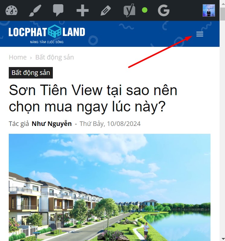
I tried changing another header, the result was that both TOC and the stars displayed normally.
-
This reply was modified 2 years by
nguyenxuan.
nguyenxuanHello i am using header cali.
And the plugin Schema Pro (by Brainstorm Force) sticks stars on posts.
However, on the mobile, when entering any article, for example: https://locphatland.com/son-tien-view/
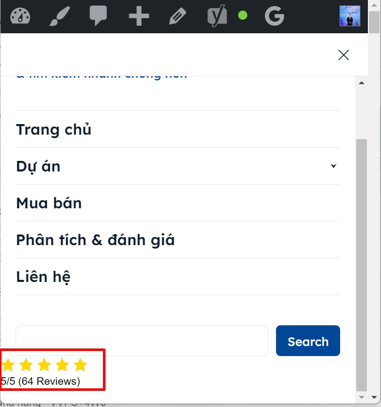
You click on the menu icon, stars appear below the search bar (I’ve never seen this before with a regular menu and header). How to turn off this display, without turning off the display of post stars?
Thanks in advance 🙂
 museooggi
 Hi Anamaria,
thank you for the prompt reply and the assistance!
I followed your recommendation and used the live header search, problem solved!
For social icons, on reading your screenshot I eventually realized my problem is in the social icons that appear in the mobile menu (clicking on the “sandwich” top-left), as next to facebook and linkedin there there is also the email icon/link which is not in the social icons in the footer desktop version. I am looking in the theme/composer settings but I can’t find from where can I manage that menu. Of course I don’t mean the menu itself, I am trying to reach and manage those icons that appear just above the menu.
Regarding the other errors, I understand what you said regarding the design of the theme, although with the only addition of a free plugin I am using it’s scoring pretty high, just below the pass threshold.
Is there any way I can add some code to flex blocks so that the image too has a description attached to the link?
Again thank you so much for the help!
Paolo
 Anamaria
 Hello,
Our theme might not be fully designed to pass through this test completely, but as far as I know, optimisations have been added.
For example for social icons should be no issue https://i.imgur.com/oVorYz4.png
For the search, I recommend using the live header search.
Thank you!
 Tommycreative
 Thanks for the check.
The problem occurs a few times and the same thing also happens on the mobile homepage, created by me. But I don’t understand the reason.
For example, this is the incorrect display of an article from mobile (IOS iPhone). Where the header changes:
Here is the exact visualization of what it should look like:
It seems that the theme, from desktop and from mobile, does not work correctly.
Anamaria Hello,
Please let me know what template you use, a cloud or standard template.
Do you have created a mobile page? You must convert the header and footer -> https://www.screencast.com/t/HrjOBNayd to be able to edit with tagdiv Composer. Please check this video https://www.youtube.com/watch?v=SpGkOnJeNZY
Thank you!
 PSIall
 I do NOT want to design a special mobile view. I want whatever I create for desktop to have an optimized mobile view. I would rather design an optimized mobile view that looks decent on desktop because data shows most of my web visits are from mobile devices, but now on my phone there is a BLANK page where content used to be after I started playing around based on your detailed note above. God knows what I checked/unchecked to go from a header messed up site to a good header and zero content on my mobile phone. My tablet shows content for the site but now the header is wider than the page, that was not happening before but at least unlike my mobile phone the tablet does show content on the pages. I am so frustrated.
PSIall WHATEVER I did, now the header is fixed but there is zero content in mobile. UGH!
PSIall Also, what I saw when I clicked the mobile edit as you showed, is NOT what I see on my phone so there is another disconnect. On my phone when I enter the website I do see the cover and the header is what I was complaining about, but when I click the mobile as per your screenshot, the header is fine but the cover page does not show and it repeats to infinity the page it does show. UGH! I am going to go with what I see on my phone. While it has a header issue, it is otherwise fine. While the header is fine on the other mobile view, the page is not.
 simchris
 Facebook sometimes has issues with capturing images. Nothing to do with the theme. If you look at the header source code for your post, and the og tag is there, and showing link to image, then as long as the image works, then FB can capture it. Sometimes they have caching issues; and the only solution is to do the post on FB, then come back and use the ‘refresh content’ option.
Also, good to learn some basics, like you can google “what is 503 error” to learn what that is.
(I don’t work here.)
 andreibalici
 The only workaround I can find is to go to any mobile template and edit the mobile header template from there. I cannot find any option to view all my templates, regardless if they are mobile or not.
 huang allen
When I import a mobile template and want to modify the Header, it says that it cannot be modified. I also cannot modify the Header of the mobile template in Header and Footer Templates
 dweb35
Greetings. I manually insert my advertising banners. They are banners from local sponsors and I don’t use Google Adsense. Would it be possible with your theme to program the visibility of the banners? I would like to have the possibility to insert the banner in the header (https://italiait.it//) by programming it for 30 days. After that, upon expiration, it should no longer be seen, unless the sponsor renews for 30 days. Thank you.
Anamaria Hello,
Please don’t use the AMP plugin because it is deprecated. You need to use the composer, select the viewport for the phone and try there to fix the header.
Using our theme you can choose from 3 mobile versions
-> mobile responsive => https://www.screencast.com/t/oJ2ShOp47
-> mobile theme plugin => https://forum.tagdiv.com/the-mobile-theme/
-> mobile page => https://tagdiv.com/newspaper-10-3-7-update-brings-customizable-and-fast-mobile-pages/
If you created the mobile pages with tagDiv Composer, then when you install the Mobile Theme plugin, your pages will be overwritten by the plugin (the mobile theme comes with its templates for page, post, category, etc so your current templates from the desktop theme will get converted to the mobile theme layout, the page content is made without builders in mobile editor => https://www.screencast.com/t/xbgZG8kH also, the options that are provided to edit the mobile theme version are limited (this keeps the things simple)).
This is a video about Responsive Newspaper Theme, AMP & Mobile Theme, Mobile Pages & Templates -> https://www.youtube.com/watch?v=SpGkOnJeNZY
So, the mobile responsive is what you see then that you select the viewport on phone => https://www.screencast.com/t/matV17hH, so some settings may apply for each viewport(where is the border blue), and others are not(where the border is black).
The mobile page has the mobile templates from Cloud Library => https://www.screencast.com/t/YCcZ8rL8
Mobile responsive version of the theme and the mobile page editor can be edit with tagDiv Composer, the mobile theme plugin not.
For example, you can have the mobile theme plugin activate and use the mobile page/mobile responsive version for the homepage/pages, but for the categories pages/404 page you can’t use the mobile page/mobile responsive version if you have the mobile theme plugin activate.
So, if you want to design the pages with tagDiv Composer, you can use the mobile page or mobile responsive version.
Better deactivate the mobile theme plugin and see the results, and assign the mobile page for page, like this => https://www.screencast.com/t/lektAhyjd
Also, clear your cache.
Thank you!
PSIallIn the Tutorial theme panel settings, there is a section called mobile theme to access mobile settings in the plugin’s settings. That block is not there for me. Under plugin settings, I only have one option, and that is multipurpose. The mobile setting is not there. I was hoping some info there would help me fix my header on mobile.
PSIallThe pages of my newspaper are blocked to the right of the header. I cannot see how to get the page contents centered. So I have a huge margin to the left. How do I edit that please?
PSIall the mobile versions of my site, especially the phone version looks terrible at the header. How do I fix that? This is the site I am building. https://influencemedianews.com/
The mobile header is black and I cannot read anything that should be around it, nor can I see the logo.
 mubassirhayat
Configuration
– WordPress
– Newspaper theme
– Doctors Pro Templates in use
The live search in the header is working fine but no results are shown on the search page. In the tag div editor I have removed Post Type from CPT search. I have also removed all the custom Taxonomies and Post types. Any help will be appreciated.
 Calin
Calin Hi,
For this you can use a custom css like this one:
.td-scandal .td-grid-style-2 .td-big-grid-meta, .td-scandal .td-scandal-videos, .td-scandal .td-scandal-videos .td_video_playlist_title, .td-scandal .td-scandal-instagram, .td-scandal .td_module_11 .td-read-more:hover a, .td-scandal .td-post-template-4 header,

.td-scandal .td-scandal-big-grid .td-grid-style-2 .td-big-grid-meta {

    background-color: green!important;

}
This code should be set in the theme panel > custom code> custom css.
-> https://forum.tagdiv.com/newsmag-theme-colors-introduction/
 robertskrg
 Hello again,
I think I completed every step you listed, and reinstalled all the tagdiv plugins.
The theme is updated, and I have come across these issues. I can’t edit the header which is not displaying the logo, the content doesn’t display, as you can see there are blocks of code visible.
Also the widgets are broken. The theme settings seem to be saved, visible in the last picture. Is there a way to repair the page quickly?
<img src=”https://ibb.co/NKCMv7T
https://ibb.co/Gx8Z1Sx
https://ibb.co/5RQMKtw
https://ibb.co/3ycX49v” alt=”Screenshots” />
 RVPSRichard
I have lost the correct formatting on my Newspaper site at https://rvtravellife.com. It looks perfect in TagDiv Composer, but doesn’t render correctly on the live site.
It should look the same as its sister site at https://thisoldcampsite.com. I’ve double checked all the settings are the same in TD composer between the two as well.
Any ideas on what might be causing this?
Anamaria Hi,
Please remove the code from the header file or any other files where you added it. If the code needs to be added to the header, then you should add it to the Theme Panel -> Analytics/JS code in the head -> https://i.imgur.com/UypAKbc.png.
Thank you!
 Scion Social
Hi Team,
I need to add GTM tracking codes to the website, after placing the code under header.php file the code is not reflecting. Also, I tried to place the code under theme panel settings even then the codes are not working can you tell us what is the issue with the header file.
When I ctrl+U to check if the code is added or not then also the code is not visible.
Just to places codes under header & body, I have to use a plugin
Please look into this at the earliest
Your attention to this matter will be much appreciated.
 FranceGallCollection
Hello.
I have a question about “Header Template No. 6” (block header 6) because I want the list of items that appear in “more” to be on the line because when there are many items the list goes down too far and in this example, not all the years are displayed (by choosing for example the year 1975, you will see that the list of years is not complete)
https://www.francegallcollection.fr/discographie-integrale-par-annee-de-france-gall/


