
- TutorialsDefault Block Settings Guide
 thelacivert
Hello,
I am making tries at my localhost to use dark template on my live website. I have a specific problem;
How to give every widget a background and border including wordpress widgets. I mean I can do it with theme’s widgets but how to apply this background and header settings to wordpress’s default widgets?
 Catalin
 Hello,
If you want to remove the top header container for mobile devices, you need to use the code below and place it in Theme panel -> Custom CSS Area.
@media(max-width:767px){

.td-header-menu-wrap-full{

display:none;

}

}
The result is here -> https://www.screencast.com/t/CHUijlH4
Thanks for your understanding!
 sonnymarojahan
 ah….so the tagdiv newspaper theme panel –> header –> logo & Favicon force a new site title?
got it!
thanks edward
sonnymarojahanHi,
I just realize that my site tittle appear twice in search result.
ex: This is the title | Mysite.com – Mysite.com
it should be like this: This is the title | Mysite.com
I’ve been searching across the internet and found everbody make a suggestion about changing the script on header.php with this stuff –> <title><?php wp_title(”); ?></title>
is it true? can anybody help me with this issue?
what causes this to happen?
Thankyou 🙂
 Simion C.
 Hi,
Please check if the tagDiv composer plugin is active. Seems to mention that a multi-purpose header style is/was selected in the theme panel, without the tagDiv composer active that message may be displayed.
If there is still a problem we could take a look. Send us an email at contact@tagdiv.com and provide admin access, as well as cPanel or FTP if possible. Include a link to this topic in the email.
Thanks
Simion C. Hi,
The force full width settings in the theme panel, for the header and footer, should stretch the respective sections despite having a background image or color
– https://www.screencast.com/t/JuPlrSOXRTg
The page content will not stretch because from what I can see currently there is a background color set for the website. If you would clear that color
– https://www.screencast.com/t/5o09rgxQLy
Then the rows in the page can be stretched. With a background color or image the website will be boxed, in order to display the background.
Thanks
 Calin
Calin Hi,
If you try every header from the header panel ( https://www.screencast.com/t/3c35antYv Header styles documentation), then only way to adjust your header is with custom css.
If you need help with that please provide a link to your website.
Thank you.
-
This reply was modified 8 years by
 Calin.
Calin Hi,
Unfortunately for the moment that can be done just with some custom css ( a lot of css ).
here is an example, bat will affect some part of your website
.td_category_template_8 .td-category-header {

    margin-top: -90px;

    height: 400px;

}

.td-header-wrap .td-header-menu-wrap-full {

    background-color: transparent!Important;

}

.td_category_template_8 .td-crumb-container {

    top: 150px;

}

.td_category_template_8 .td-category-title-holder {

    top: 150px;

}

.td-main-content-wrap {

    margin-top: -100px;

}

.vc_column-inner{

      padding-top: 100px;

}
Thank you for your understanding.
 tariqrana
Hello Sir!
I want To Adjust My Header Size so That It could Cover The Selected Area As mentioned in the screenshot also i need my logo at very left side of header. how is it possible.?
 tnqks
tnqks I’ve never uploaded logo in footer. no text, no ABOUT US.
I only uploaded the logo in header.
you can check my footer setting, here.
https://hrbulletin.net/temp
Calin HI,
Please add this custom css in Newspaper>Theme panel>Custom code >Custom css:
#menu-td-demo-header-menu-1 .td-module-image img {

    height: fit-content;

}
See results: https://www.screencast.com/t/BShBTmeBzq
Thanks.
Simion C. Hi,
Try a code like this – https://www.screencast.com/t/jwhr3psw
@media (max-width: 767px){

.td-header-top-menu-full,

.td-header-sp-top-menu {

display: block!important;

text-align:center ;

}

.menu-top-container {

margin-right: 0;

}}
I could modify it if needed, let me know. Enter it in Theme panel->Custom code->CSS section.
Thanks
 mangeshpowar
Hello there people.
First of all, thank you so much for such an amazing theme. Loved it soo much.
My query is , how can I remove the link to Newsmag panel settings from admin panel?
Because I dont want my client to mess up the settings, so I wish to stop him for accessing the link to newsmag admin settings.
So if I could remove the link from top header and left side bar ?
is it poss?
 sejpost
For some reason, the mobile version of the header ad is not showing on a mobile device. Any help?
Here is the code:

<div class="td-all-devices SP_Full"><a rel="nofollow" target="_blank" href="https://www.clementsgroupre.com/listing-report/Coronado-92118-All-Listings/832734/"><img src="/wp-content/uploads/2018/10/clements_header.png" /></a></div>
<div class="td-all-devices SP_Mobile"><a rel="nofollow" target="_blank" href="https://www.clementsgroupre.com/listing-report/Coronado-92118-All-Listings/832734/"><img src="/wp-content/uploads/2018/10/clements_mobile.png" /></a></div>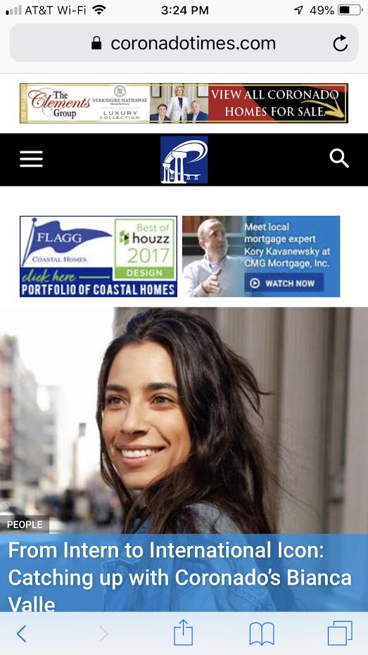
 Tracy
TracyHi,
I use “block header 4” for some of my widget title as well as on some block section on my homepage. After I updated it to the theme latest version, I notice the title font color which supposedly to be white changed to black color. I tried to change it on the tag div composer (for my homepage) however, it still shows the title color in black although I have changed it to white.
Any advice what has gone wrong?
Thank you
Simion C. Hi,
I have inspected the website, the main page seems to be empty from the header down. Other sections of the website like category pages and posts work fine.
I would suggest that you check the theme requirements guide. Check if there is enough WP memory and the necessary PHP extensions are available (especially mbstring – https://www.screencast.com/t/YX4mKZmlUPFw )
Also try the suggestion from this topic and add the mentioned code in the htaccess file
– https://forum.tagdiv.com/topic/gray-page-tagdiv/
Let us know the results.
Thanks
Calin Hope this will help you
@media (max-width: 767px){

  .td-header-sp-top-menu{

      text-align: right;

}

}
Thanks.
Calin Hi,
Please replace the above css with this one:
@media (max-width: 767px){

  .td-header-top-menu-full, .td-header-sp-top-menu {

     display: block!Important;

  }

}
Se results: https://www.screencast.com/t/ULs1sH71CHQ7
Thank you.
 rumpel2116
Hi there,
when using the sticky header/ menu and anchor links within a post, clicking on the anchor link jumps to the actual position of the set anchor but it is hidden by the menu. Would be great if you fix the behavior when using the fixed menu.
From other websites I remember they use stuff like this: https://stackoverflow.com/a/28824157 to avoid this problem. The height needs to be adjusted to the current menu height and the fix only applied if fixed menu chosen, so I believe it’s the best to integrate that fix right with the theme?
Thank you for your help,
Jan
 acavittfisher
The Newspaper Theme panel isn’t controlling Ads properly.
I have a Header Ad appearing — when there shouldn’t be one at all — and I haven’t put code in for one.
I have multiple inline ads inside of my posts — when there should only be one.
Simion C. Hi,
Most demos contain custom design, in this case the fitness demo ads a predefined color to the header menu among others
– https://forum.tagdiv.com/topic/links-color-over/
You could remove that demo customization from the demo stylesheet as mentioned in the topic.
Or use some CSS in the theme panel to override it – https://pastebin.com/cJijjEqA
The color will be the one you use in the code – https://www.screencast.com/t/mZlzfE7FZT
Thanks
Calin Hi,
In order to show the top bar menu on mobile terminal please add this custom css in Newspaper>Theme panel>Custom code > Custom css
@media (max-width: 767px){

.td-header-top-menu-full {

    display: block;

  }

}
https://www.screencast.com/t/93rdYiiLJb
Thank you.
Simion C. Hi,
Just as I thought, the art creek demo has a color defined in it’s custom design for the menu when sticky
– https://www.screencast.com/t/UHO4P636G
So the theme panel setting does not apply. Please enter this code in Theme panel->Custom code->CSS section
.td-art-creek .td-header-style-10 .td-affix.td-header-menu-wrap {

  background-color: #222222;

}
It will change the color of the sticky menu to the one you want
– https://www.screencast.com/t/rNFgpi9z9J
Thanks
 ghostmi
 hello, thanks for the reply, I saw that in the path wp-content/themes/Newspaper/mobile/ there is a mobile theme …. in this folder is not present the responsive version of the theme?
I thought about this, and then I wonder if I can add a new personal area at the top of the site responsive mobile version (not the mobile plugin).
in this case I ask which page (example: wp-content/themes/Newspaper/mobile/header.php) should I change?
I hope to erremi explained well 🙂
thank you
Catalin Hello ghostmi,
Unfortunately, the theme does not have any such an option that allows you to do this, sorry! If you want to change the header style responsive layout, you should do it yourself through adding such a CSS custom code to target the mobile devices, using the @media queries, like this -> https://www.w3schools.com/css/css3_mediaqueries_ex.asp This is just a simple suggestion! If you are not aware of the steps which are needed to take in this case, please consider hiring a freelancer/developer because we cannot provide this such an additional customizations at the moment, sorry!
All the custom CSS code should have to be added through the Theme panel, Custom Code section from here -> https://www.screencast.com/t/YaIY3vi1UWS9
Thanks for your understanding!
