No search results were found in Documentation!
 gumball44
How to disable sticky menu on mobile version ?
lowtechnation.com
Thank you
Kind regards
 TechieBraj
Hello team,
I recently upgraded from NewsPaper Default to the NewsPaer Default Pro cloud template. My footer was responsive in the NewsPaper default theme. But after upgrading to the cloud template my footer is no more responsive in mobile.
Live site with Default theme (https://keeptaxisalive.org/) -> https://prnt.sc/udhf33
Staging site with Default Pro theme(https://staging.keeptaxisalive.org/) -> https://prnt.sc/udhfj8
I know I can edit the Footer section with TD Composer as you can see here-> http://prntscr.com/ud0zcv
But there is only the option to remove inline and show it vertically, I don’t wish to show the menu vertically. I want to show it horizontally, and if the device size is smaller then the menu should shift to the next line like it is in the default NewsPaper theme here: https://prnt.sc/udhk2v
Please let me know how to solve this responsiveness issue.
Thanks!
 Rollo
RolloHi guys, I recently published my website however for some reason I can not optimize the mobile version.
It appears perfectly on desktop however it seems to go in and out of 2 designs on mobile. It also does not come up with anything when I click on any of the categories on the menu which is extremely frustrating.
Any help would be massively appreciated.
Many thanks :))
 aassi
aassiHi,
So, yes: before contacting you I disabled all plugins (using the Health Check & Troubleshooting plugin). I installed (and uninstalled) the suggested Cache plugin. Disable all cache plugins, CDN and cache in my hosting provider. I rebuilt the menu.
Nothing stopped my mobile hamburger menu to reload the page as I click on it, and not simply open it and wait until something is clicked.
When clicked, the hamburger menu opens and starts a search (just like a product search in Woocommerce). https://prnt.sc/udan0r
Thanks for your (great) support.
ps: BTW, is there a way to change the layout of the “searching” box? (That’s something that I’d like to do later on when get to the Woocommerce setup.)
 Simion C.
 Hi,
Seems there isn’t enough space to display all the menu items in a line on mobile. One solution would be to decrease the space between them on mobile. So for example while on desktop a 15px margin will be alright https://prnt.sc/ucwbdo on mobile you could reduce that to about 8px https://prnt.sc/ucwbun
The result should be like this https://prnt.sc/ucwcdq if you set it to 8. Please give it a try.
I could try and think of other methods if you should not consider that a solution.
Thank you!
 taraktalluri
when i check 768px view menu view not, how to use it as mobile view or compress to single line menu.
please check screenshoot
 SquallSFU
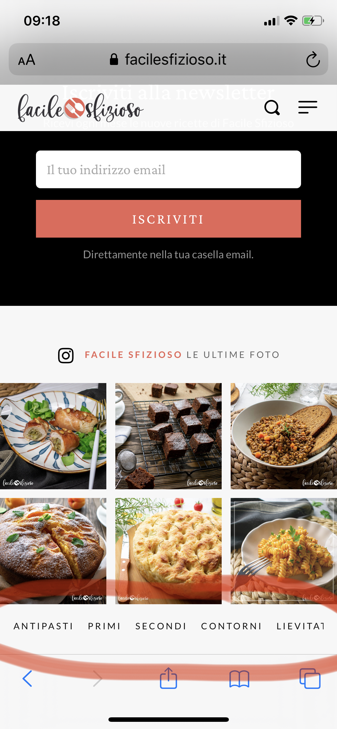
Hi guys, how can I fix this problem on the mobile version of my site? –> https://i.ibb.co/Zdd0MTr/IMG-4277.jpg
The footer menu appears cut off, the latest links are not seen.
Can I structure it on two lines?
My site: https://www.facilesfizioso.it/
Thanks a lot, as always.
 Pragnyap
I have the following issues –
1. The images in my mobile website are not displaying. Also everything appears in black and white including the header. The desktop website is working fine.
2. The menu bar loads earlier than the menu. The bar first appears with more width and then narrows to normal size.
3. Is it okay to not use a logo in the website?
Kindly help.
 Didarulislam
Hi,
Thanks for awesome themes.
I’m using the newspaper theme with Gourmet PRO preset.
Everything working great, but i encountered with 2 issues follows:
1.
just notice there is an extra icon showing with the search icon on mobile device followed by an error on console. after some digging i found that it’s related to another plugin using bootstrap.
extra icon come from bootstrap css and the console warning from bootstrap js (as it’s missing the popperjs).
the error occurring as the search trigger button uses the bootstrap-sh class names and data attribute (data-toggle=”dropdown” & class name ‘dropdown-toggle’) i believe.
This is the plugin that i’m using (which inject’s bootstrap fw): “Easy Blocks – Gutenberg Blocks Page Builder” by Liton Arefin
—
2
I’m using nginx caching with Autoptimize and Redis to speed things up.
the mega menu scripts fails when ever i turns on the ‘JavaScript’ optimization with ‘Aggregate JS-files’ option on.
Any suggestion regarding optimization (and related plugin/configuration) will be appriciated.
 stefano.rogora
The homepage of this website loads too slowly (note the loading wheel that continues without stopping). This also creates a problem in the mobile version since until it finishes loading the menu does not work.
 cursor1208
Hi,
On the mobile version of the website (nhsjs.com), the navigation menu at the top is broken. It also overlaps with the logo, making it hard to click.
 Eldigitalct
Good morning, I have a problem with the menu of my page when I see it on a mobile. When I see the page on my mobile, neither the menu nor the search option work. I have tried to remove those elements and put them back and even change the menu but they still don’t work.
 mtdas99
The login or signup form in amp menu is not working on my site. I have checked by clearing cache and others but not working. Please check https://news.cbshop.in
 Calin
Calin Hi, maybe is not the same but is closer -> https://i.imgur.com/wjNjJTw.png please set this code
.td-main-menu-logo img {

  max-height: 106px;

 margin-top: -16px;

}

.td-header-wrap {

height: 84px;

}

#td-top-mobile-toggle i, .td-search-icon i  {

line-height: 86px;

}
in theme panel> mobile theme> custom code> css.
Hope it will help you!
 tamosukas
Hello, how to change amp header color, on preloaded theme is black, how to change it. When changing colors in mobile color pars in theme menu, ther not responsing
 fabioweb90
 Hello thanks for feedback. Yes i made some customization and now i fix sticky menu and horizontal scroll.
Maybe now can you help me for fix spaces for all mobile devices?
Example Iphone5 is wrong https://ibb.co/BCyv2d8
Thanks
Calin Hi,
If you are using a cloud header or a PRO Demo, you can edit with tagDiv Composer the homepage and remove the login element using the right click https://i.imgur.com/acOqrXR.png -> https://i.imgur.com/678Y1Wk.png and make sure that the option from theme panel is disable -> https://i.imgur.com/fRIb2xO.png this will remove the code for login, but if you are using a standard/default header style, this will be only hide.
If you are using the mobile theme plugin, you can disable this option from here -> https://i.imgur.com/s72HWmZ.png
Also the menu can be edited from here -> https://i.imgur.com/0Xon4RC.png
Also the social icons can be remove from theme panel > social networks > social networks -> https://i.imgur.com/NW1U9mu.png
Thank you!
Calin Hi TkLbIY, usually this is a cache problem, we recommend to use WP Super Cache Plugin with the configuration form our guide -> https://forum.tagdiv.com/cache-plugin-install-and-configure/ you can use other cache plugin, but unfortunately know the right settings only for this one.
Also if you are using the responsive version, you can check the mobile menu using tagDiv Composer -> https://i.imgur.com/2OjVQtX.png -> https://i.imgur.com/MYxJ7aT.png or if you are using the mobile theme plugin -> https://i.imgur.com/FLGPJHx.png
Hope this will help you!
 Christoph
 Guten Morgen Calin
Ich habe es versucht und es funktioniert auf dem Desktop. Aber auf dem Mobile zeigt es das Menü nur auf einem halben Zentimeter unvollständig an. Du kannst es auch selber sehen auf der von dir als Beispiel angegebenen Homepage https://tractionlife.com/ , wenn du mit dem Mobile das Menü aufmachst.
Es sollte doch eine Möglichkeit geben, dass das Menü wie bei http://www.spiegel.de oder http://www.aarp.org erscheint. Gerade bei grossen inhaltlichen Menüs ist diese Struktur von grossem Vorteil. Was meinst du dazu?
Gruss, Christoph
 pradipbhattarai
Hello,
I want to remove the sign in button and social icons from the mobile menu. I tried a lot searching option in the template but I am unable to find. Please help me out!
 TkLbIY
Am experiencing issues with the website desktop and mobile – sometime when uipload new story, users will get mobile view on both desktop and mobile. Also manytimes the mobile version shows different version of menu than the one set up in the system.
Calin Buna Alin,
Normal limba folosita pe forum este limba engleza ca sa ii ajute si pe celalti useri care au probleme similare.
Acum referitor la “problema” cu mega menu, din cate vad eu folositi mobile theme plugin -> https://i.imgur.com/jYy5MLO.png aceasta este o tema conceputa de dezvoltatorii tagdiv peantru a obtine o versiune mai rapida pe dispozitivele mobile. Cand utilizezi acest plugin, aspectul de pe mobil nu va mai fi acelas cu cel de pe desktop, iar unele functionalitati nu sunt recunoscute de catre mobile theme, acesta fiind realizat peantru a mentine versiunea mobila cat mai simpla si rapida. Datorita acestor implementari pentru a avea un meniu functional pe dispozitivele mobile puteti creea un nou meniu ca cel principal, dar in loc the mega menu setati un link catre acea categorie (sau setati direct categoria in menu) apoi setati in theme panel > mobile theme > header > mobile menu meniul creat.
O alta varianta este sa folositi versiunea mobila a temei (versiunea responsive), acest lucru se poate efectua dezactivand mobile theme plugin, folosindul mobile theme doar ca template pentru amp -> https://i.imgur.com/uVuacM3.png sau folosint mobile theme dar si varianta responsive pe anumite pagini sau posturi, acest lucru se poate face folosind optionea pusa in editorul Gutenberg -> https://i.imgur.com/dIiLlJ0.png
Pentru moment putem oferi suport doar pe acest forum si pe email.
Sper ca acest raspuns sa va ajute!
O zi frumoasa!
Calin Hi,
If you are using a cloud header or a PRO Demo, you can edit with tagDiv Composer the homepage and remove the login element using the right click https://i.imgur.com/acOqrXR.png -> https://i.imgur.com/678Y1Wk.png and make sure that the option from theme panel is disable -> https://i.imgur.com/fRIb2xO.png this will remove the code for login, but if you are using a standard/default header style, this will be only hide.
If you are using the mobile theme plugin, you can disable this option from here -> https://i.imgur.com/s72HWmZ.png
Also the menu can be edited from here -> https://i.imgur.com/0Xon4RC.png
Thank you!
Calin Hi,
The mega menu is working only on mobile only if you are using the responsive version, the mobile theme plugin will not recognize the mega menu, therefore you’ll need to make a new menu with the elements you want to have in mobile menu and set it in Newspaper> mobile theme > header > https://i.imgur.com/031qn30.png or you can disable the mobile theme from some post/page using this option -> https://i.imgur.com/AQmgQKb.png
Hope this will help you!
pradipbhattaraiI wanted to remove the sign-in option from the mobile menu and keep it simple. Also, Instead of a full cover display, I just wanted to display as a side menu. But I am unable to find such an editable option anywhere. Please help me!