
No search results were found in Documentation!
 Bettina
 Hello!
There is an element called ” Mobile menu “. Just add it and select a menu which was already built in the Dashboard -> Appearance -> Menus.
Regarding to the screenshot 2, you can add a “list menu” element.
And you can use it as above(Just add it and select a menu which was already built in the Dashboard -> Appearance -> Menus.)
Thank you!
Bettina Hello!
There is an element called ” Mobile menu “. Just add it and select a menu which was already built in the Dashboard -> Appearance -> Menus.
Other 2 possibilities:
1. Use Modals: https://forum.tagdiv.com/modal-popup/
2. Page mega menu: https://forum.tagdiv.com/page-menu/
Thank you!
Bettina Hello!
There are some settings only in the theme panel. Here you can remove/set a picture for mobile menu background: https://www.screencast.com/t/x3Xrln2b88x
And the background color here: https://www.screencast.com/t/PbU3hQpDqHh
In this modal you can not add any element. You should choose the menu from the tagdiv Composer.
A workaround there could be to use a modal popup: https://forum.tagdiv.com/modal-popup/
Thank you!
 suaraumkm
Hi, How i can create menu like this, with icon etc…
when access on mobile ?
https://imgur.com/a/gNKBWWC
https://imgur.com/a/xnoR97Q (number 1 & 2)
 nbauorg
Hi, I use a mobile menu template. But I fail to customize it. Although I selected the right menu in the composer it does not show. Also the search modal does not look very useful. What can I do?
 ialv
ialv Perhaps I have not explained myself well.
I want a part of the menu (three lines) to appear as an extension of the menu.
It would be something like this: https://demo.tagdiv.com/newspaper_nft_pro/
Here, when you click ALL in the menu, you get more options and views of the menu itself.
And that in the mobile version it can also be displayed (or the whole menu can be displayed).
How can I do something like this?
Translated with http://www.DeepL.com/Translator (free version)
 PamTCE2022
Hey there
I am having multiple issues. I had built my site and was pretty happy with it, but then there was an error and the front page disappeared. Since I was unable to get help with this, I ended up loading a different prebuilt template and got my front page back, but now I am having multiple issue with my header. I can sometimes get the logo to be centered, where I want it, and sometimes not. But the worst is that when I am editing it it looks okay, but when I go to look at the page live, the header logo is stuck in a square box and also greatly zoomed in, so you only see a small part of it. Meanwhile, there is all kinds of extra space between the logo and the menu bar that does not seem to exist when in editing mode.
On top of this, in the desktop version, I cannot seem to get hyperlinks on images to work. Even though the links are there in the code, when you click the images, they just link to the images themselves, not the hyperlink. They do work in the mobile version.
Two questions: can you please help me, and 2. If not is there a way to get my money back from this theme? I have never had so many problems with a theme before, and it is driving me nuts.
thecarolinasequestrian.com/TCE/
 Calin
Calin Hi,
So, if I understand correctly, in bot situations you want to edit the link only to use the Ultimate Member’s user pages. Unfortunately, the mobile menu and menu login elements do not have an option to set a custom link, so I think that a solution will be if you edit the theme files.
For the menu login you can edit the wp-content/plugins/td-subscription/includes/shortcodes/tds_menu_login.php and replace the code from herf=”” -> https://i.imgur.com/rpwDNeY.png
For the rest of login/register are more modals.
This file wp-content/plugins/td-composer/legacy/Newspaper/parts/header/td-login-modal.php is responsible for the login/register content when the login button is selected.
This file wp-content/plugins/td-composer/legacy/Newspaper/parts/login.php is responsible for the login/register using the responsive version for theme for mobile devices.
This file wp-content/plugins/td-composer/mobile/parts/login.php is responsible for the login/register using the mobile theme plugin layout.
And this file wp-content/plugins/td-composer/mobile/parts/register.phpis responsible with the mobile theme plugin to display the content for login/resister
If you want to change the link from the sign in button you need to edit this file wp-content/plugins/td-composer/legacy/Newspaper/parts/login.php (because you are using the responsive version), what you need to do is to replace the id
What you need to do is to replace the id=”login-link-mob” with href=”your-url” https://i.imgur.com/QiPAxSi.png -> https://i.imgur.com/mlnxJey.png
Hope this will help you!
Thank you!
Calin Hi,
If you are referring to unique article option -> https://forum.tagdiv.com/unique-articles/
The Facebook login option it is only on “Menu login” element -> https://i.imgur.com/OwnBQBI.png by default on mobile it is not using that element.
Thank you!
Bettina Hello!
Please check with the TagDiv Composer in your mobile viewport, the mobile menu zone to be set as default and not overlay: https://prnt.sc/7smjI6Dje2fo
Let me know the results!
Thank you!
 Mallouni
My website https://thestorybehindthepicture.com/ is working fine. …but not on mobile-devices (iphone). It shows the menu, but no content, if you click on a menu item. Any ideas for helping me?
 Mclongx
Dear TagDiv,
I have two questions to seek your help:
1) Can I edit the links of the “menu login”( https://www.gowiselife.com/wp-content/uploads/2022/04/Screen-Shot-2022-04-24-at-5.06.59-PM.png ) , the icon and login settings on the upright corner?
The reason for editing the links is that I found the “menu login” direct all clicks to the pages belong to Metropolitan PRO’s Login/Register – metropolitan_pro pages, etc. What I need is to direct all member related pages to Ultimate Member’s user pages. But I can’t find a way to edit those links.
I could remove this “menu login”, but I do like the design of this login setting, it is one the reason I choose Metropolitan PRO theme. I really do not want to replace it by another menu there.
2)Can we edit the mobile menu in Metropolitan PRO?
The mobile menu page is the page appears when users touch the menu icon on the homepage in a mobile phone, the page in my site looks like this: https://www.gowiselife.com/wp-content/uploads/2022/04/IMG_7047.jpg
So far, I can only change the background image and turn on/off the “Sign in / Join”. I hope I can edit the links for those two words(for user logins) , and to redirect them to UM users pages.
Could you help me out?
Thanks!
Calin Hi,
The mobile menu can be edited using the options from here -> https://i.imgur.com/hfbUKLP.png
Also, if it is a cloud header, you can edit it using tagDiv Composer -> https://i.imgur.com/FynkKd4.png
Thank you!
 kimstipguide
 Calin
thank you.
You need to create a new mobile menu.
Does the first start start with a blank screen?
(Are you currently working on the mobile screen separately in cloud templates/Header Template 15?)
Please explain the most basic starting point.
————————————————————————————
Yes, I managed to catch it -> https://i.imgur.com/TaHGlxt.png
Normally that auto ad should have been positioned either above or below the mobile header.
What I can recommend is to change the structure of the mobile menu, please try those settings -> https://i.imgur.com/BgkCwwK.png drag the menu, logo and search elements and make sure that those are set inline -> https://i.imgur.com/3tbCnoj.png after that use this option on column -> https://i.imgur.com/tHPav1h.png
————————————————————————————
after that
As above method,
It looks like we should move on.
Thanks for the always great explanation.
 benjaone1
 No,
I would like to add 2 images to my mobilemenu with CSS. One image on top and the other one in the bottom of the mobilemenu.
Thanks
 mikej
mikej I figured my issue out mate. I amended my mobile menu styles under Theme Panel > Theme Colours > Mobile Menu / Mobile Search.
Even if you have settings applied try hitting save again to force them through.
-
This reply was modified 4 years by
mikej.
 Archerix
Need some help, there is something that I’m probably missing, I’m trying to move from the standard header to the cloud Header template default pro (trying to control the showing of ads on mobile since the bug), but I can´t get the same look as you can see in the screenshots, I can’t stretch the menu bar to the width of the page, showing tow black spots
How can I edit de Default pro to get the same look?
Live website
https://www.otakupt.com/wp-content/uploads/2022/04/Untitled-8.jpg
Edited Cloud
https://www.otakupt.com/wp-content/uploads/2022/04/Untitled-10.jpg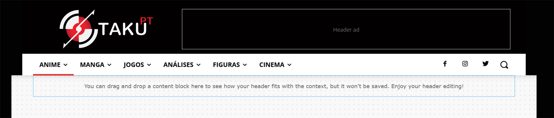
mikej Did you have any luck with this Jtoney? I’m having the same issue. Can’t seem to see where to modify the mobile menu colours or text
-
This reply was modified 4 years by
 jtoney
Looking at my website which doesn’t have separate mobile themes, when I select the menu I see a color that I don’t have selected anywhere in the platform. Where do I adjust this? Its the same red color under search when I click the search icon. Any ideas?
Calin Hi,
Yes, I managed to catch it -> https://i.imgur.com/TaHGlxt.png
Normally that auto ad should have been positioned either above or below the mobile header.
What I can recommend is to change the structure of the mobile menu, please try those settings -> https://i.imgur.com/BgkCwwK.png drag the menu, logo and search elements and make sure that those are set inline -> https://i.imgur.com/3tbCnoj.png after that use this option on column -> https://i.imgur.com/tHPav1h.png
I hope this will help!
Bettina Hello!
Please check this topic: https://forum.tagdiv.com/topic/cannot-edit-mobile-menu-sticky/
Thank you!
Calin Hi,
This is the default mobile menu https://imgur.com/a/HnZtUM1 and there is no option to set the elements like you your screen, but you can use the popup modal and you can edit it to work and look like you want.
Thank you!
 snipermantis1990
How can i change the background color and menu text : https://www.screencast.com/t/fYInCHVwR
benjaone1 Very cool!
Last thing 😀
I would love to have 2 images. A logo on top and another one in the buttom. I have tried different things without luck.
Will you help me with CSS to add images to the mobilemenu, please?
Thanks so much!
Bettina Hello!
Try this code:
.td-menu-background{ width:50%!important; background-color: white!important; }

#td-mobile-nav{ width:50%!important;}
Thank you!



