
No search results were found in Documentation!
 Neuroplastic Mind
Hi there,
I am facing an issue and the issue is When i am using Mobile theme with amp the menus are not translating hindi it remains english on both versions of the website.
My site is in two language primary lag is English and other lang is Hindi, but on the hindi version site also showing the menus in english menus.
Please help
 Calin
Calin Hi setteseitennis,
You are using the mobile menu on desktop, and that is way it looks like that. Also you do not have set for mobile menu a background color or image, please set it from here -> https://i.imgur.com/tEPHwKZ.png or here -> https://i.imgur.com/zlHokD1.png then it will look like this when you access the mobile menu https://i.imgur.com/kDgIpHa.png
Also if you want to set the mobile menu on desktop to take only a part of desktop screen, please check the suggestions from this topic https://forum.tagdiv.com/topic/php-version-7-4/
I hope this will help you!
 Paweł Gawlik
 Hi
I created a mobile website with TagDiv Composer by selecting Mobile Page.
The desktop site has a different block layout to the mobile site.
The main page for desktops after the menu starts with Big Grid Full 3. Then two columns with Flex box 1
The mobile site starts with Flex block 1, then one more and one more.
The home page on desktops looks like this. With Big Grid Full block 3
https://tknews.pl/wp-content/uploads/2021/06/Screenshot_20210628_222015_com.android.chrome.jpg
The mobile side looks like this – only Flex box blocks
https://tknews.pl/wp-content/uploads/2021/06/Screenshot_20210628_222015_com.android.chrome.jpg
When I save the design of the mobile site, Big Grid Full 3 and part of the header disappear from the desktop site
https://tknews.pl/wp-content/uploads/2021/06/2.png
After that, when I load the stationary page and save it, it’s here again
content / uploads / 2021/06 / Screenshot_20210628_222015_com.android.chrome.jpg
The mobile website looks like this:
https://tknews.pl/wp-content/uploads/2021/06/Screenshot_20210628_221946_com.android.chrome.jpg
The menu disappears, the word NEWSPAPER appears and instead of the Flex box 1 block, the Big Grid Full 3 block.
Therefore, I am asking for advice on how to make both sides independent of the blocks used
I ask for help
Thank you
 khanh
khanhPlease help me

How to remove social media at top menu mobile ?
Paweł Gawlik corrected message!
Hi
I was trying to figure out what the problem was.
Everything is fine until I create a mobile website in a different layout than the desktop one.
When I create a mobile website, it becomes stationary.
If I save the correct version for desktop again, the mobile version will adapt to it.
The menu disappears and a black bar with the word NEWSPAPER appears instead of the logo.
What should I do to make two independent versions work?
One template for the mobile (as in the first screenshot), the second for the desktop (as in the first screenshot in the previous post).
Thanks for the help 🙂
Paweł Gawlik Hi
I was trying to figure out what the problem was.
Everything is fine until I create a mobile website in a different layout than the desktop one.
One template for the mobile (as in the first screenshot), the second for the desktop (as in the first screenshot in the previous post).
Thanks for the help 🙂
When I create a mobile website, it becomes stationary.
https://tknews.pl/wp-content/uploads/2021/06/Screenshot_20210628_222015_com.android.chrome.jpg
If I save the correct version for desktop again, the mobile version will adapt to it.
The menu disappears and a black bar with the word NEWSPAPER appears instead of the logo.
https://tknews.pl/wp-content/uploads/2021/06/Screenshot_20210628_221946_com.android.chrome.jpg
What should I do to make two independent versions work?
 Demir
DemirHello!
Why is a new main menu item automatically added with the same page name when a new page is published?
For example, when I create a mobile page for an existing page in the tagdiv editor, a new menu item is added with the page name I defined for the mobile page. Every time I have to delete this record from the menu management screen.
Is there any way to prevent this?
Thanks for your interest and help!
Regards.
 Vlad S
 Hello!
Image background on the mobile menu can be done from Theme panel – Background as you can see here: https://www.screencast.com/t/ecuAotX0B1V
Thank you!
 johnsnow
 i sort it out, but how to change the background of image in mobile menu?

johnsnow another question, where to change the color of mobile version menu?

 haizattabdul
Hi i just updated newspaper theme 11 but the my website got a missing/broken menu and search button in homepage.
URL: https://www.yoy.my/
Photos: 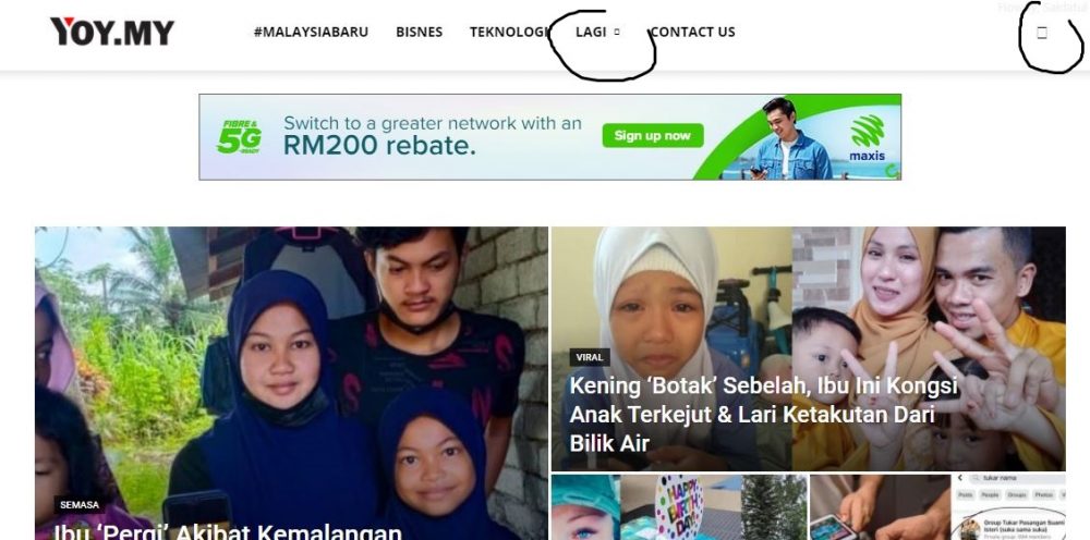
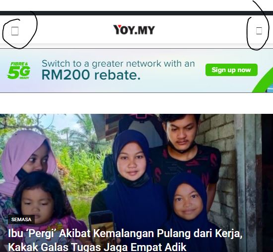
Please help.
 Jeewan
 factsbin
Hii, My website is showing different menu on mobile view and header ad is not showing as well on mobile view.
https://factsbin.com That’s my website and the problem is still not solved …
Please help me regarding this issue
Thanks
 setteseitennis
Hello,
Second Newspaper licence, first time issue with this element. I’ve added the mobile menu to a customised Retro Blog Pro template and, when clicked on, it is not displaying properly (in all viewports). See here:
and
Could you please help fix it?
Domain: https://ur-milano.it/
I can provide admin credentials if needed.
Thank you!
Edo
 robink
Hello Support,
There is this strange bug on mobile only, when you click on a main Category on header menu, on desktop, all is ok, articles showing on the Flex Bloc 2 and 1 are loading the correct current Category articles.
Desktop Beauty Cat :
http://prnt.sc/16m55ua
but on mobile, i’m getting articles from “AUTOMOBILE” categroy, in these Flex Blocs 1 and 2 instead of current cat articles.
Mobile Beauty Cat :
https://prnt.sc/16m5bpp
Look at this page for example :
https://www.trendsinriviera.com/category/beaute/
and look at it on Desktop and also on mobile, you will see that on mobile, it loads ATOMOBILE articles instead of BEAUTE articles in the top flex blocs.
Theme version 10.4, WP 5.7.2
Any clues ?
MAny thanks
Robin
 Umut
UmutThe page in Menu Can not be open on mobile.
https://www.gurmecenter.com/hakkimizda/
What should be done ?
 berrakhummet
Hello,
I am using the latest version of the newspaper theme. But in the mobile version, the search button and the menu button overlap. Actually, I did not place a search button in that field in the desktop and tablet versions. How do I solve an emergency?
My website: https://www.azjomle.com/
 kompulsa
Hi,
So far I have been able to change the background colour of the mobile menu to black, but I need to change the background colour of the desktop menu to black as well, and I have tried many ways and it stays green no matter what I do. Could you please help me?
Umut from PC / Notebook the category looks fine which I have no problem..
Would you pls try to check the Manu “hakkımızda” on mobile. The file looks empty.
my menu on mobile does not work……
 Petr Jaroň
Hi, when I click on my site on the mobile menu, the website in the lightbox is taken first.
The mobile menu will not be displayed until later, for example after 15 seconds.
Thank you for your help
 RPFlu
RPFluHello,
I was using Newspaper 7.2 and just updated to Newspaper 11.
I notice that the breadcrumb appears on the articles but does not appear on the pages.
I have also found that in Chrome my Home Page and a few other pages containing Grids (but not all of them) display the full width of the window on computer (like on a mobile) and the menu doesn’t take the color settings.
If you want to check on my website: http://www.romepratique.com
Best regards
 Bettina
 Hello!
I’ve checked your website and I can access your mobile menu, but you have just one category. You can set up another menu there.
Thank you!
Bettina Hello!
Edit the homepage with TagDiv Composer, access Website Manager click on Header -> Mobile Menu(you should be able to see your mobile version in Composer now), and set your correct header as Global template, hit the button save.
If the problem is still there, then check in the theme panel settings if you have set up the logo from your mobile version and remove it (Newspaper -> Theme panel -> Header -> Logo and favicon).
Thank you!
Umut My page in menu is not seen on mobile.
Why is this ?
Umuton PC menu looks normal but it does not open on mobile.
What is missing ?
http://www.gurmecenter.com



