
- ApiPractical example – How to add a new Block and Module
- ApiAPI – Smart Lists – Introduction
- ApiAPI – Category top section style – Introduction
- ApiAPI – Category top section template – Introduction
- Apitd_api_module::update
- Apitd_api_module::add
- ApiAPI – Modules – Introduction
- ApiUsing the Theme API in plugins
 Simion C.
 Hi,
The themes are similar in core but there are differences between them as well. There were meant to be different themes after all.
There are no plans as far as I know to change how the responsive version of the big grids look like on mobile in either themes.
There are settings in the theme panel of the Newspaper theme, for the breadcrumbs
– https://www.screencast.com/t/A3yu46bsyrkH
And also for the post title per post template or general
– https://www.screencast.com/t/RCgYEU8iq
Thanks
 devraj1986
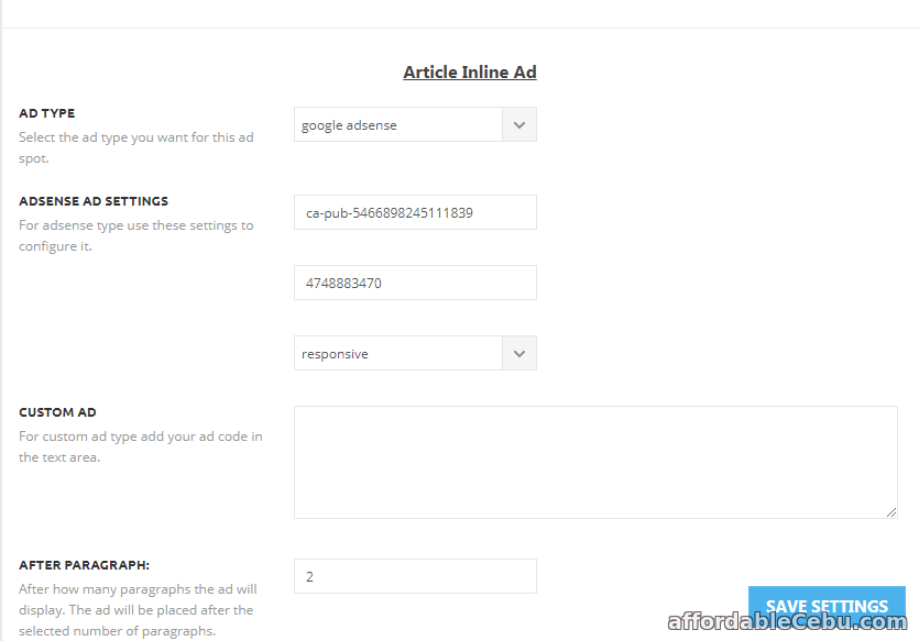
Adsense ads code not saving in your 8.7 version.
check screenshot—
http://prntscr.com/isqv6q
But in mobile section it is working perfectly.
Its still When I adding adsense code and hit save button in my theme panel its loading and loading.
PLEASE HELP ME ASAP…
 kev
kevI want the mobile menu to kick in earlier (say for screen widths under 1200 pixels).
How do I do that?
Thanks
 Anujsharma768
I am using a tag div mobile theme plugin but still, Google says your webpage is not a mobile friendly. Please help me and suggest me how to solve this issue.
Issue screenshot – https://postimg.org/image/rhj18gbrp/
 Chandan Kumar Singh
Hi Team,
please check and let me know why my site is not opening on Mobile and its became very slow.
URL: jogira.com
Please help.
Thanks
Simion C. We have not tested tabbing through the site unfortunately, as this is not a standard user behavior. The mobile menu will be loaded but the menu is hidden from view and is not accessible otherwise.
This is how the theme functions, both menus will be loaded and each served based on device. I am sorry of this is an inconvenience for you. I will add this to our list and pass this info to our development team and maybe in the future this will change.
Simion C. Hi,
I don’t understand exactly what you are asking. If you are referring to the fonts and font properties the mobile theme plugin is using, this does not have any settings to change them. They are all predefined in the mobile theme stylesheet.
If this is not what you meant, please provide some more details about it.
Thanks
Simion C. That might be a caching issue, clear all caching installed or server provided. If the plugin is deactivated the mobile theme will not be served on mobile devices. The default responsive version will be shown instead, like the live theme demo which does not have the mobile plugin installed
– https://demo.tagdiv.com/newspaper/
 nathanway
I like the mobile theme load speed, but I feel less on the home page, please tell me how to put the most popular news list on home page when using mobile theme.
Please make it possible
 great1212
Question 1: In mobile devices, the logo of the website PAKDEFENSE.COM
header merges in the dark background and barely visible. How could we
make it prominent in mobile devices without changing the header style
of the theme?
Question 2: The footer logo in mobile devices is too large than the
header logo. How could we make it somewhat smaller or look like the
header logo?
Question 2: The Instagram widget in the header is not showing any
images feed from the instagram account to the website of
PAKDEFENSE.COM. I’ve check all the parameters and there isn’t problem
there. What should I do to make the pictures visible in my website
header?
devraj1986 Very serious Issue!why not saving adsense code header footer or others?
But in mobile section it is working perfectly.
Help me ASAP.
 khen888
I already enable AMP plugin, insert adsense code in the AMP panel:
Two of my AMP pages were indexed in Google search. But when I view that pages using my mobile phone, I cannot view the ads.
Something is wrong with the AMP panel.
Please fix this problem. I read many issues here regarding adsense amp ads not working in Newspaper theme (with amp plugin enabled.).
Can you please check it and let me know it if you already fix it
Website: https://topbusinessfinance.com
 Jimmy Díaz
It bothers me to use the tagDIv mobile version plugin just for one reason. there is no option or way to hide ABOUT US and FOLLOW US in the footer. the subject newspaper I use for a personal blog not for a company nor are we several people. that problem I have only with the mobile plugin and amp. but in the normal version I could hide them. I hope you can change that in future versions.
 daosorio
Hello,
I have the theme installed on the dailyeyipantla.com site.
However, I have problems in the menu when viewing the site from a mobile device (smartphone).
The search button (right side) always works, but the left menu, which has the categories of the site, doesn’t always work, sometimes it opens, sometimes it doesn’t open.
What will it take… could you please help me…?
Thank you very much
 Ken0929
Hi, I have 2 questions.
1. I’m using pagebuilder+overlay menu for page template. At first, the header menu wouldn’t be transparent so I use the code as below and it’s working now.
.page-template-page-pagebuilder-overlay .td-header-wrap .td-header-menu-wrap-full {
background-color: transparent;
}
but it’s not working on mobile. The header menu still won’t be transparent.
2. How can I adjust padding-top when I add row ID to use smooth scrolling? I’m using sticky menu(Header style3-multipurpose). So when I scrolling, headlines will be covered with menu bar.
 chelebelay
Hi, I have purchased this theme. Though this is an excellent theme, I would like to ask a few questions:
1. The date on top bar is not showing on mobile. How can I show date on mobile?
2. Though I can customize block-fonts by td composer, but I don’t see any font customizing option when I add a block in widget section.
3. When I add a featured image renamed in a different language other than English, the image is not showing in the post or media library.
Thanks.
 aeuroweb
Hi
How can I center “the number of articles” of the author in the mobile version. Attached image to show the error.
 kame
kameHi!
I want to know if is there any option to change the way that the grids are working on mobile. I’m using Newspaper 8.7.
Newspaper PC:
https://ibb.co/hM22cx
Newspaper Mobile:
https://ibb.co/j7Dscx
Newsmag PC:
https://ibb.co/ht6ZqH
Newsmag Mobile:
https://ibb.co/i51Ojc
—
On mobile, the Newspaper Grids are working like a slider. The Newsmag Grids are working in a different way. There are any way to make the Newspaper Grids work as the Newsmag ones?
Thanks,
 coinografi
How to install it I cant found any link or file. Can you help me please?
 ladotg
Hi, I am using your responsive theme for mobile view, but when I want to see gallery I can slide it on arrow (left or right). Do you have options for touch (SLIDE WITH FINGER) to slide images?
Thanks!
 fantom
I removed the pixels, but it didn’t revert back to the mobile/tablet format. Using newsmag 4.2 on wwww.watchfantom.com
 gpm79
gpm79As I do to put typography more of the content of the post on mobile devices, I use the mobile theme plugin
 jswp
jswp Thanks for your reply. I deactivated the mobile plugin and the website still shows the mobile theme. How can I show the responsive desktop theme instead of the mobile theme?
Simion C. You cannot remove that, that is the theme functionality at the moment. The mobile menu will be loaded together with the page content and there is no possibility of removing it.
 Bogdan B.
 Hello,
Sorry but these are 2 separate containers.
the content and sidebar are 2 containers: a left one for the content and a right one for the sidebar. On mobiles these 2 containers appear one after the other. either you have the content first and then the sidebar or the sidebar first and the content after. You cannot place the sidebar after specific elements of the content.
Thank you!
