
- ApiPractical example – How to add a new Block and Module
- ApiAPI – Smart Lists – Introduction
- ApiAPI – Category top section style – Introduction
- ApiAPI – Category top section template – Introduction
- Apitd_api_module::update
- Apitd_api_module::add
- ApiAPI – Modules – Introduction
- ApiUsing the Theme API in plugins
 Bettina
 Hello!
Please uninstall the Mobile theme plugin and AMP plugin.
Thank you!
Bettina Hello Rob!
I can see that you use the responsive version. A responsive version of your website looks similar to the desktop version. TagDiv Composer is used to edit the page. Click on the mobile viewport: https://www.screencast.com/t/XDQJedlggSB. There, you can see your mobile version and edit or adjust the elements to look better.
Thank you!
 einvestigator
 Any chance you could share how you resolved the issue using Adsense?
I created an Adsense display ad, specifically sized to 320×100.
I wrapped the add code in a DIV container <div id=”ad-slot” style=”max-width: 320; max-height: 100px;”></div>
I placed the ad code in the TagDiv Newspaper theme panel > Header Ad.
On Desktop, it displays as expected as a 320×100 ad. When I resize the browser to its smallest setting, it remains as 320×100.
However, when I view on mobile, it resizes it to 300×250.
 nolandolce
 Hi Bettina,
The block was from the theme. We didn’t add any custom code to it. I did try to add a new flex1 block and you’re right the pagination works, however, in mobile the blocks don’t stack the way they do in the current block. So it’s possible the theme had added code in order to get the blocks to stack? Either way, we do need that block to operate in the same way as it does now (as it came in the theme). As such, do you know how to get a new block to stack OR any idea of how to fix the pagination in the theme’s block?
Thanks!
Megan
 iamramgarhia
HI I am using prebuilt website deign and i want to use same design with amp plugin but when i enable amp and mobile plugin it uses different design how can i use same desktop version design on mobile with amp site ?
 Snippet Media
When i go to our site: http://www.saarmagazine.nl
most of the time it shows our mobile template in stead of our desktop desktop homepage. The desktop homepage shows a grid of three recent posts, dhe mobile template shows one large post. Next to this it doesnt show the logo and menu header on desktop (when it shows the mobile layout).
Also when I go to a blog from the website on my desktop, it shows the mobile layout for posts in stead of the desktop layout. So the image shows smaller and the text is on the left side of the screen and very narrow. Also without logo/menu header.
When i do a hard refresh on that page it seems like the cache erases so i get the right version, but my colleages never get to see the right version.
Here you see the mobile layout showing on a blog desktop (just showing the top of the page), + missing logo and menu and text on the left side):
https://www.saarmagazine.nl/wp-content/uploads/2023/12/Schermafbeelding-2023-12-04-om-14.59.41.png
Here you see what it should look like (image showing entire page):
https://www.saarmagazine.nl/wp-content/uploads/2023/12/screencapture-saarmagazine-nl-ik-wil-zeggen-tegen-vrouwen-die-wel-kinderen-hebben-2023-12-04-15_02_59.png
We’re already usng WP super cache.
And I also tried the Newspaper Mobile Theme, but the same problem appears. I hope you can help me!
 WEALTHSIDE
 Hello Calin
Got it. Thank you. I can handle the desktop version now.
I have problems with the mobile version. It is not displayed correctly. Sometimes even a standard template is loaded. Do you know what I can do?
Rob
 hadharm
I created some elements and would like to show them as 2 per row on mobile. How can I achieve this pls, I have tried width to be 50% in both CSS and column settings but not working. All I see is 3 columns all the time. I want to show 2 per row. Each of the 2 should take 50% of the page each.
A screenshot is shown at => https://prnt.sc/2PurXtn5t9H_
 nagi
nagi mobile horizantal menu our css settings
—————————
https://gallery.123telugu.com/images/theme_test/Narender12-02—1.jpg
https://gallery.123telugu.com/images/theme_test/Narender12-02—2.jpg
my navbar error links
——————
1.https://gallery.123telugu.com/images/theme_test/Narender12-02—6.jpg
2.https://gallery.123telugu.com/images/theme_test/Narender12-02—7.jpg
3.https://gallery.123telugu.com/images/theme_test/Narender12-02—8.jpg
4.https://gallery.123telugu.com/images/theme_test/Narender12-02—3.jpg
Bettina Hello!
Check on your mobile viewport:https://www.screencast.com/t/XDQJedlggSB and when you click other viewport, then you can see the settings. The CSS tab should be responsive.
Thank you!
Bettina Hello @dimitrisv!
Check in the TagDiv Composer and disable the H1. For example, H1 from logo(header, footer, mobile, sticky): https://forum.tagdiv.com/topic/6-h1-tags-on-front-page-bing-have-deindexed-my-site/
Thank you!
Bettina Hello @eman!
All about translations, check these guides:
– https://forum.tagdiv.com/loading-translations/
– https://forum.tagdiv.com/customize-a-translation/
– https://forum.tagdiv.com/using-theme-translations-together-wpml/
I think there is no option for this word to translate: “go to mobile version”.
Thank you!
 safeersiddique1
 It will sync real time data, when I’m adding blog in my website it will also showing on to my mobile application ?
 Calin
Calin Hello,
Indeed, the website looks like this – https://imgur.com/a/1zYtTGP when the mobile theme plugin is not used and the amp template is not set on “Reader” – https://i.imgur.com/h07Jdi0.png. What can be done is to use only the amp with the reader option or use the mobile theme only for amp – https://i.imgur.com/ABYtYsQ.png
Thank you!
 theconsumerpark
Here my doubt is
1)How can we delete the empty column rather than hiding it in all views such as Desktop, Tablet ( Landscape, portrait), and mobile?
2) is there any way can i install a third-party plugin that can be used in Tag Composer
3) how can we add the Justify text in blocks in the editor?currently, I’m using a classic editor(advanced) to make the text-justify in my posts
4) For social media icons can we their style icons rather than using one-color icons(https://prnt.sc/S3beG8U98pdb)? what about a custom-colored icon upload
Please let us know
 Anamaria
 Hello,
Please let me know the type of ad sense. Also, please let me know if you have added them for mobile and provide the link to your website.
Thank you!
Anamaria Hello,
Usually, the color and image are set on the row, so please edit and select the row and go in the tab https://i.imgur.com/iqpxjpt.jpg -> https://forum.tagdiv.com/topic/background-color-of-the-main-menu-be-changed/ please check each row/column/zone and delete the background color/image -> https://i.imgur.com/LgeVdGD.jpg
It seems that you have a sticky header. Please follow the video to see where you can find and build your sticky header on mobile and desktop too: https://www.screencast.com/t/l6v2Belt
Thank you!
safeersiddique1I’m using your newspaper theme, And had designed and now website working good, I want my this theme layout as an mobile application development is there any possibility I can development mobile application for Android and iOS.
 Youcef
Good evening, I am currently experiencing an issue with AdSense on mobile. While the ads are displaying correctly on desktop, there is an absence of AdSense advertisements on mobile devices. I am using the Baby Pro theme. Could you please help me identify the root cause of this problem?
 GangaIndoage
search icon not opening on mobile, when click on search icon on mobile it is not working
 eman
emanHi here,
how to translate “about us”, “follow us” and “go to mobile version” in AMP display
 mashmedia
Hi, I found a lot of css problems in the RTL theme.
The header is not correct and I can’t edit it, also the footer.
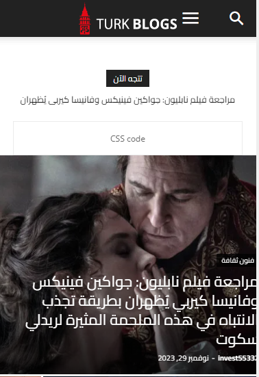
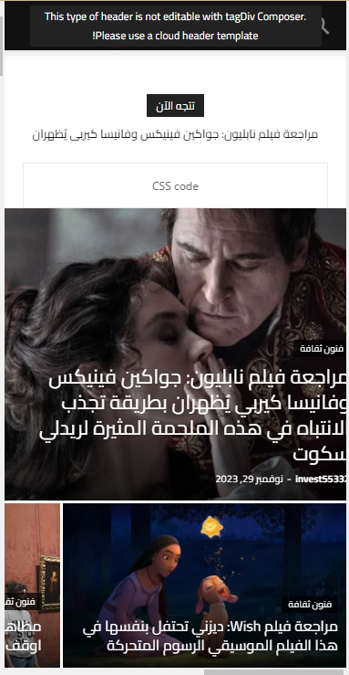
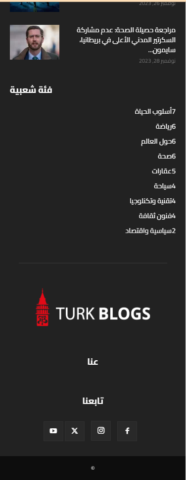
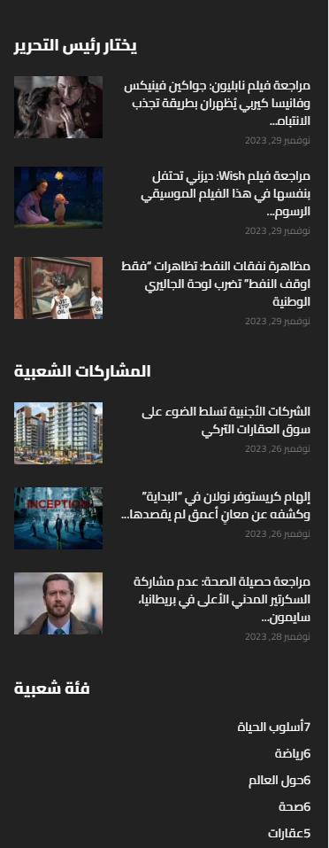
As you can see, the titles in footer is from left to right.
And at the header the menu and search to close to each others. that’s not correct ! and not acceptable..
the demo should work without any problems I just import it and didn’t do anything on it.
So if you can’t fix this issues I need a refund because I can’t work on something like this.
nagiRespected Sir/Mam,
I am a developer at Mallemaala Entertainments, located in Hyderabad. our website 123telugu.com. I am hereby mentioning that requirement.
MOBILE VERSION:
————–
1. When it comes to website speed, the mobile performance isn’t crossing beyond 40-50
2. We must solve the issues in contentful paint, large contentful paint, total blocking time, and speed index. How should we do that? Send us through screenshots
3. We are getting only 4 pics in the view tree map. We need a total of 8 pictures. What is the solution for this? Please provide the answer in a detailed manner.
PC VERSION:
———-
1. Performance is not constant. It is in the range of 60-80. We need it to be beyond 90 both in mobile and PC.
MAIN ISSUE: We want the performance to increase. We are facing severe issues due to low performance. We need 8 images in PC version and Mobile version. What should we do?
my site link
———–
https://tv.123telugu.com/telugu/ (newspaper theme installed)
my site speed screen shorts
————————–
https://gallery.123telugu.com/images/theme_test/Narender12-02—5.jpg
https://gallery.123telugu.com/images/theme_test/Narender12-02—4.jpg
Thanking you,
Regards,
Narendhar.
nagiRespected Sir/Mam,
I am a developer at Mallemaala Entertainments, located in Hyderabad. our website 123telugu.com. I am hereby mentioning that requirement.
1. In the mobile horizontal menu navbar, the menu is being displayed differently on small, medium, and large mobiles. But we need it to be of same size on every device. We will send the CSS settings as screenshots through a link. We are sending you the screenshots of our website’s mobile version navbar as screenshots. We want the navbar to be stretchable along with padding.
my site link
————-
https://tv.123telugu.com/telugu/ (newspaper theme installed)
my navbar error links
——————
1.https://gallery.123telugu.com/images/theme_test/Narender12-02—6.jpg
2.https://gallery.123telugu.com/images/theme_test/Narender12-02—7.jpg
3.https://gallery.123telugu.com/images/theme_test/Narender12-02—8.jpg
4.https://gallery.123telugu.com/images/theme_test/Narender12-02—3.jpg
mobile menu our css settings
—————————
https://gallery.123telugu.com/images/theme_test/Narender12-02—1.jpg
https://gallery.123telugu.com/images/theme_test/Narender12-02—2.jpg
I want this stretchable
————
https://www.123telugu.com/index.php
https://gallery.123telugu.com/images/theme_test/Narender12-02—12.jpg
https://gallery.123telugu.com/images/theme_test/Narender12-02—11.jpg
https://gallery.123telugu.com/images/theme_test/Narender12-02—10.jpg
Thanking you,
Regards,
Narendhar.
 fermin
 Hello Ana Maria.
Sorry, I translate into Spanish
I have already tried all possible options.
As I mentioned, it only works with ads header ad. I use it for the mobile version.
I can’t put it on the cover or in the news on the side in computer versions.
The code. I’ll send you the link so you can see it.
https://www.teleponent.cat/codi-amic/
In a few days we will be able to activate it again but if we don’t do something, the same thing as always will happen, it will only be shown on mobile and in the header.
We have been dealing with the problem for a long time, looking for solutions.
We do not know what to do.
Greetings



