- TutorialsFrom WPBakery to tagDiv Composer
- TutorialsWhat is Ajax preloading?
 sweetgunner
Hi,
I’m trying to hide the “Sign In” link from mobile menu, but when I switch off on Theme Panel > Mobile Theme nothing happens…. I really don’t have a clue where to change that. Also, I wanted to show a logo on top of mobile menu, but I don’t know how…and change the style of the font, line spacing, etc… How can I change that?
 Anamaria
 Hi,
Do you want to have a separate header/footer for mobile?
You can try to use the modal popup -> https://forum.tagdiv.com/modal-popup/
Thank you!
 gqjesus
How do I change/create mobile menus and headers and footers?
 Bettina
 Hello @maraaa !
You can remove that space : https://prnt.sc/7tY9PsVzTj-L
But, please try it in a mobile page, not a responsive version, because if you change something in the mobile viewport, it will be changed also in the desktop viewport: https://prnt.sc/0HlNeqWOjXqG
Thank you!
 maraaa
 Dear Bettina,
Order can be changed – they are movable. That’s not an issue.
The issue is that, however I rearrange them, there is a gap between first and the second image.
I assume there is some detail that I’m not seeing (very possible) or there is the way using that “Order” under Layout option – which I don’t understand how to use.
Please, if and when you can, try to change the order of the images in the mobile version of the mentioned section. You will figure it out immediately.
Thank you!
M.
 AnaPicado
 We hope we solved the issue deactivating mobile theme plugin (it mades main mobile page works properly, but amp pages don´t work) and activating again (both mobile and amp pages look to work correctly).
Thank you Bettina for your quick answer
Regards
Ana Picado
Bettina Hello @maraaa !
You can not change their order, only if you will build a mobile page for that and rebuild the style.
Thank you!
maraaa Dear Bettina,
this is the case:
-in desktop and tablet version, these svg images are in the certain order (clockwise);
-in mobile version, they are shown vertically, but not in the same order (instead of 1,2,3…, they are e.g., 6,3,5…)
When I try to drag and drop them, there are always some issues with the space.
So, if you were me, how would you arrange them by using the Layer/Order function that you mentioned, or any other way?
Please let me know if I wasn’t precise enough and if you need more information.
Thank you!
M.
Bettina Hello Ana!
Uninstall the Mobile theme plugin and check the results!
Thank you!
 Calin
Calin Hi,
I did several checks, and indeed it seems that using only amp or amp with the mobile theme, although the element of breadcrumbs appears on the page, is not in the scheme. Unfortunately, for the moment, this situation can only be corrected with an SEO plugin, because this element is not added either by amp or by the mobile theme plugin.
We would add to our list of suggestions to add a breadcrumbs scheme from the mobile theme plugin when it is used with amp, I hope that our developers will take this suggestion into consideration for the next update.
Thank you for your understanding!
AnaPicado We have tested that mobile theme plugin is active.
Kind regards
Ana Picado
AnaPicadoHello after installing the 12.4 update we have an issue with the main page https://mifamiliaviajera.com . We have a mobile main page, it´s designed with tagdiv composer, it is marked as current mobile page, but we see in our phone the desktop version of the page. We clear the cache and the problem still remains.
Kind regards
Ana Picado
maraaa Hi,
1.
Yes, that is it, thanks!
2.
This is the mentioned section (original):
https://imgur.com/a/LBNLxCu
The order of appearance of these icons&text around the central image is important to me.
When in mobile version, they are positioned vertically, and that’s OK, but they don’t appear in the same order as in the desktop version (in original as well as in my case).
When I try to rearrange them (drag&drop), they don’t look good – the first and the second image are always divided with the noticeable gap, etc. No matter how much I try, just cannot position them properly when trying to change the order.
I tried to change the dimensions of the central image, just in case if that’s the reason, but that accomplishes nothing.
Maybe you have an idea what would be the solution…
(3.) If that’s not a problem, I have an additional question – it regards the anchor links, also on the homepage.
Let’s say that, instead of opening a page, I want this to jump to this section. How can I do that? To be more precise, how do I make that or any other section a placeholder (if that is the right term).
Thank you very much for the help.
Sincerely,
M.
Anamaria Hi,
To disable login, please go to the Theme Panel -> Mobile theme -> Header -> https://i.imgur.com/9SMPWaN.png
Thank you!
Anamaria Hello,
If you have made mobile pages, you must convert the header and footer -> https://www.screencast.com/t/HrjOBNayd please check this video https://www.youtube.com/watch?v=SpGkOnJeNZY
Thank you!
 thalesbrandao
good afternoon people.
thanks for the attention.
I need to include this page in my mobile version menu.
https://www.cidademarketing.com.br/marketing/sua-marca-vai-virar-noticia/
 Linglo.pl
Hi, how do I disable the possibility of creating new accounts and logging in to the Menu in the mobile theme?
 sar_news
I have an issue with the mobile header configuration. In the mobile version, I am unable to see the logo. I am attaching the screenshots for your reference. Thank you very much.
Site URL: http://www.vitadacani.info
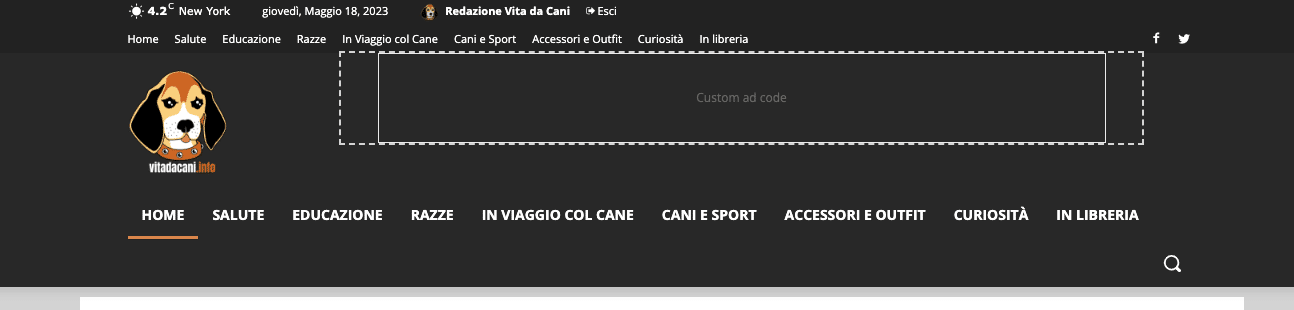
Desktop header https://vitadacani.info/wp-content/uploads/2023/05/Schermata-2023-05-18-alle-16.56.57.png
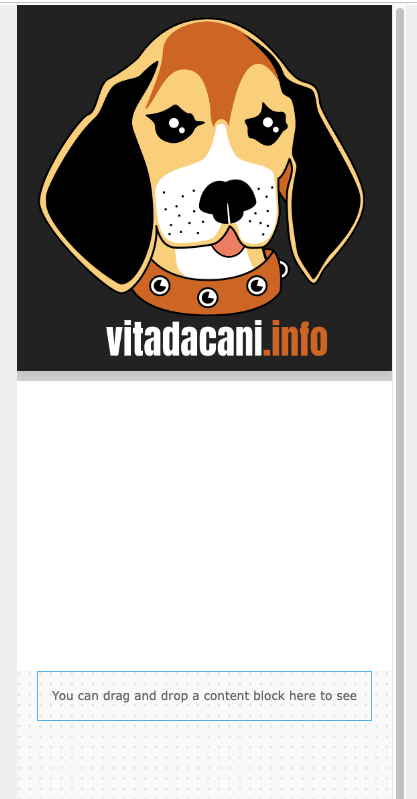
Mobile header configuration as I set it up https://vitadacani.info/wp-content/uploads/2023/05/Schermata-2023-05-18-alle-16.57.09.png
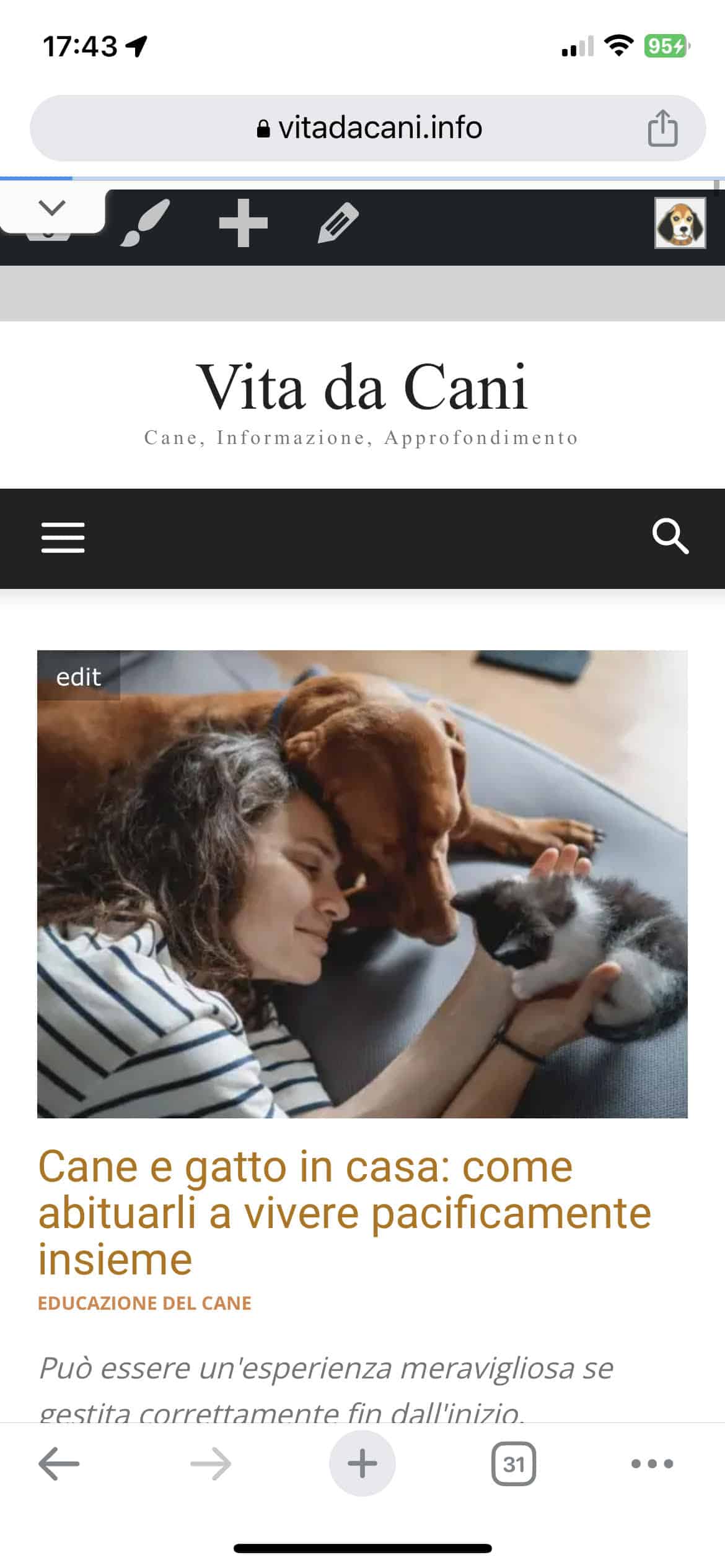
Mobile header as I actually see it https://vitadacani.info/wp-content/uploads/2023/05/mobile-header.jpeg
 Prateek
 I am using breadcrumbs on both amp and non-amp versions of my website. On non-amp version, I have used breadcrumbs shortcode from TD composer and for the amp, I have switched on the breadcrumbs option in theme panel>mobile settings>breadcrumbs. The breadcrumbs are appearing fine on both the versions. But when I check my pages in Google rich results testing tool, only the non-amp version has the Breadcrumbs Structured data. I am not having issue with displaying the breadcrumbs. The issue is structured data(schema) for the breadcrumbs in the pages.
Also I am not using any plugin to inject breadcrumbs schema in the page, so I assume it’s added by the theme on the desktop/responsive version. I am not completely sure though.
Please help
 JungYoungJe
I have updated to the latest version,
but now the “X” button in the mobile menu is unresponsive.
What should I do?
And the “<-” back button of the login in the mobile menu doesn’t seem to be responsive.
please help me.
Best
Jung
Bettina Hello Brandon!
You did not add the element to the mobile viewport. Check now!
Thank you!
Bettina Hello Ken!
You used the List Menu element, but this one won’t let you achieve what you need. So, I applied another element called “mobile horizontal menu,” and it is working now.
Thank you!
 housenest
Hello,
I hope you are well.
I wanted to ask a few questions regarding TagDiv normal Slider:
1) After hovering on any of the slides and hovering the mouse back to another place, the slides get out of sync, and one slide switches faster than another. How can I make them stop at all after hovering or keep the same switch speed?
2) On the Google Chrome browser, when slides change, there’s an animation in the middle. On Microsoft Edge, it does not appear. Is there a way to fix this?
3) I wish to have only one slide on the mobile version instead of the desktop’s 2 slides. What’s a good way to do this?
The link to the website: https://www.housenest.net/
Thank you!
Regards,
 msproductions
Hello, I was hoping the installed Prebuilt Website of “Lifestyle Pro” would be set up differently from the demo but the menus are still off.
The Header Menu appears within the footer and the custom menu appears in the slide menu – I changed this within the customize section but there are no changes.
Also, the header menu appears at the top of the website within desktop but not within mobile at all – only as a footer menu.
Website link: https://viacolombia.com/
Demo link: https://demo.tagdiv.com/newspaper_lifestyle_pro/
Anamaria Hello,
Please provide some screenshots.
Also, please let me know if you have the mobile theme plugin activated, if yes, then the problem is caused by the cache plugin.
If the cache plugin does not have mobile support then the mobile theme version can be delivered instead.
The solution would be to use the recommended WP Super Cache plugin instead and activate these settings (especially the mobile device support): https://forum.tagdiv.com/cache-plugin-install-and-configure/
Thank you!