
- ApiPractical example – How to add a new Block and Module
- ApiAPI – Smart Lists – Introduction
- ApiAPI – Category top section style – Introduction
- ApiAPI – Category top section template – Introduction
- Apitd_api_module::update
- Apitd_api_module::add
- ApiAPI – Modules – Introduction
- ApiUsing the Theme API in plugins
 nannumaniya
Hello Support Team
my Website is https://www.worldgirlportal.com/
Disable Pagination and get Every Module, Search Page, categories Page, Tag Page all is Infinite Loading + load More Button Active
Only Categories Module Enable this Option “Infinite Loading + load More”
I Need Desktop Version and Mobile Version Every Block Categories, Tag, Search Page is Get Infinite Loading + load More Option
How to Do this Enable?
—————For Example ——
I Create Search Templates this Done but Only Desktop
you se Desktop & Mobile this URL https://www.worldgirlportal.com/?s=bollywood+news
Desktop Version is Ok
But Mobile Version Some URL is Pagination – I have not Pagination but Get Infinite Loading + load More Option
Please Support
 davinity12
Hello,
In the mobile version, when I click the menu nothing happens. In the editor there isn’t an option to set the menu.
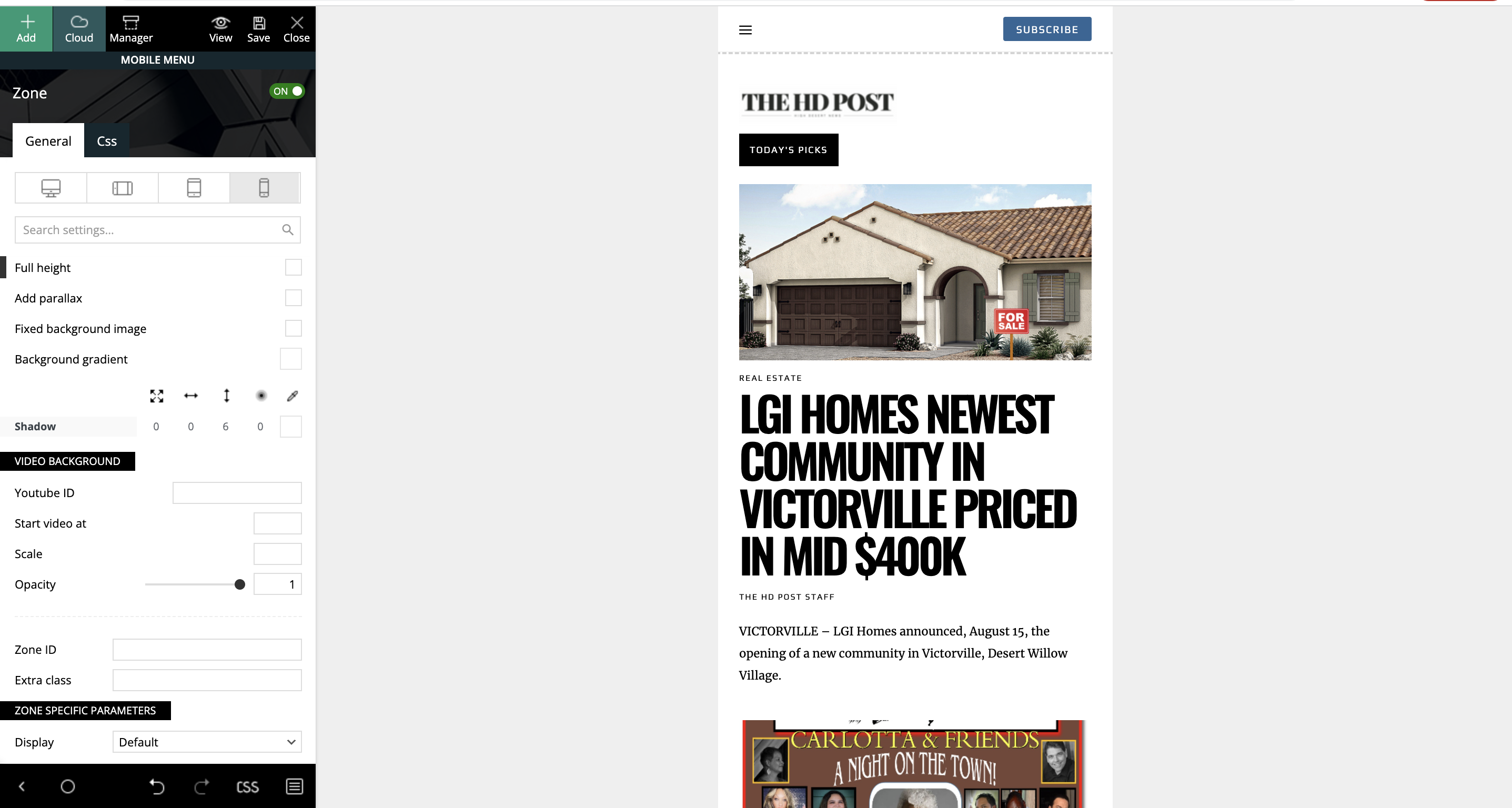
 theangrydude
Hey,
In Black Pro theme, how do I transform the header menu into hamburger menu for mobile devices?
I looked everywhere and I dont see this option, only vertical scrolling.
Thanks,
Alex
 serene
 Dear Simion C.
Thank you for replying me.
But I do not nderstand where can I change pages and single page design of tagdiv mobile theme.
I can not find these pages on “pages”.
Regards
 elvisfrog
 Thanks for the question and the screenshot, I found that my mobile theme had for some reason, undefined, and just fix it and solved the problem. No idea how that got set, but nonetheless fixed!
 Bettina
 Hello Kaitlin!
Actually, that on/off toggle is not for hiding elements. If you hover over that toggle, you can see more info about it: https://prnt.sc/u9J5LU04xkXn
If you want to hide an element, then there is an option in the CSS tab : https://prnt.sc/a694nQat_PFR
Or, if you want to hide that element only in the mobile viewport, then let it “show” in the desktop viewport and hide it only in the mobile viewport: https://prnt.sc/J0iRM2ezOMQ7
You should uncheck this option https://prnt.sc/ZR4OgO4jsV6S and align it to the left, center or right.
You can have three elements and choose to show them only in one viewport while hiding them in the others.
Thank you!
Bettina Hello @2wrd!
I just replied in your own topic, please check: https://forum.tagdiv.com/topic/amp-footer-where-to-edit-mobile-and-desktop-footer-perfect-but-amp-different/
Please let’s continue the discussion there and do not create another topic with the same issue.
Thank you for understanding!
 2wrd
2wrd thank you for the reply
the strange thing is i am using the mobile theme and have the logo to display in the mobile theme settings
the logo appears but it also shows the text About Us – i have no idea where that is coming from and want to remove it
i could probably hide with css but would like to remove via the theme
Bettina Hello @2wrd!
When you enable the mobile theme plugin with AMP, then it will overwrite the templates with their layout. This layout has some settings only in order to customize the design. These settings can be found in the Newspaper -> Theme panel -> Mobile theme -> Footer.
More information can be found at https://forum.tagdiv.com/the-mobile-theme/ and https://forum.tagdiv.com/mobile-theme-introduction/.
From my point of view, if you don’t use the Mobile Theme plugin, then there is no reason or benefit to AMP. Please read all about AMP here: https://forum.tagdiv.com/tagdiv-amp-plugin-tutorial/
Thank you!
 kaitlin
 Thanks Anamaria.
I am not trying to make a separate mobile site. The staging site is here: http://newmlp.raisingglobalhealth.org/.
We are trying to switch over from Visual Composure (which worked fine but seems increasingly less supported by the theme) to TagDiv, and it’s the latter I’m struggling with. In the old visual composer I could hide elements on different resolutions. TagDiv seems to have the same option (see screenshot here: https://snipboard.io/wsY6hJ.jpg). However the “on/off” toggle doesn’t actually do anything.
So, for example, if I add a mobile menu in responsive design like so: https://snipboard.io/0T2lmH.jpg [aside, the alignment options also look like they are broken?]
Then even if I tell it to be off for desktop, it still appears: https://snipboard.io/epnA9l.jpg.
It is also a problem in other spaces, for example if I’d like to display three posts in a row on the desktop site but only two on a tablet, I cannot do this. Whatever option I choose gets promulgated to all sizes 🙁 So it just seems like none of the responsive editing I was used to with VC works in TagDiv?
Any ideas why this is happening?
Thanks,
Kaitlin
2wrd does anyone know where / how to edit the AMP footer? the mobile and desktop footer are set but AMP shows a footer i haven’t specified and do not know where to edit it
Bettina Hello @MadhurKotharay!
Normally, when you activate the mobile theme plugin, it will overwrite the design you build for your mobile view with his own layout. It comes with its own templates/design for page, post, category, etc so your current templates from the desktop theme will get converted to the mobile theme layout. For more details, please take a look here: https://forum.tagdiv.com/the-mobile-theme/ and https://forum.tagdiv.com/mobile-theme-introduction/
A full explanation you can find here: https://www.youtube.com/watch?v=SpGkOnJeNZY
Hope that helps you!
Thank you!
 santosh.thakur
 Hi,
we want to add sticky ads at bottom on mobile amp and non amp pages. i am providing you a url for your reference. https://www.ndtv.com/. open this url on mobile and just scroll down..then you will see the bottom sticky ads
 DKF
DKFHi there,
I made a homepage in tagdiv composer for mobile, with a custom made header. When I view this in chrome, it shows the imported header from the cloud (cornovirus template). In sfarai and firefox it shows the header as I made it.
On my ipad in chrome I see the mobile layout with this coronavirus header. I don’t understand where this is coming from. In safari on ipad it works fine. Can you give me a hint?
 David Taylor
I have a dark theme, black background and white text, on my website. It works well on the desktop but in the mobile version the posts do not have it, they are displayed with a white background and black text. the website is https://tequilademaya.com
2wrdso i have finally got the website where i want it – the very last job is the footer for AMP version
i have newspaper footer template working on all devices and created a mobile version – all ok
i have AMP running because Google speed times are way way better..When i view the site on my mobile the AMP footer that is displayed isn’t want we require but i cannot for the life of me find where to edit it
website is https://2wayradio.directory
 MadhurKotharay
 Interesting. I have been breaking my head for the last 16 hours trying to solve exactly this problem. Finally, I logged into the forum to find this being discussed.
What you said works perfectly for all mobile templates such as home, tag, search, and page templates. It does not work only in the category mobile template. So I don’t think I am doing anything wrong.
I tried deleting all category templates for desktop as well as mobile and recreate them.
Even then, it simply refuses to apply the mobile theme. Actually, it applies some parts (such as limit post numbers in the post loop) but refuses to remove the flex blocks inserted earlier in the template. Looks like some shortcodes, once created, do not get deleted in category mobile template.
I used Magazine PRO templates to start with and modified them for my website, if that helps.
 Simion C.
 Hi,
AMP is very restrictive when it comes to the ads and to the content. What type of ads are you planning to use on AMP exactly? Are they compatible with AMP?
The most popular and widely used type of ads used for AMP are AMP auto ads from Google https://support.google.com/adsense/answer/9261309?hl=en
We provide a field for entering the code https://i.imgur.com/2kAsROP.png
Also the mobile theme ad spots will load ads on mobile or mobile + AMP https://i.imgur.com/YEkMJ6N.png
But for any type of other ads, with other requirements perhaps, maybe it is possible to add them via ad inserter plugins or similar. Or perhaps it will require modifications to the code, it depends.
Could you mention a few details about the type of ads you want to use? Also, if their provider has documentation for implementing them on AMP, please provide that as well so I can take a look.
Thank you!
 ccpa2318
Hi there.
I realize that the background image of the row on my homepage (https://touristsense.com) does not load properly if the users are not logged in.
I have used the incognito mode and all browsers (desktop and mobile). However, the image does not appear.
To be specific, my site should look like this: https://imgur.com/a/ITZyqLh
However, in most cases, I see this: https://imgur.com/a/87HP197
 HOB
HOBI am facing difficulty when users are trying to submit comments on AMP page while I have the mobile theme active. I am able to submit comments on Mobile Theme pages without AMP and on desktop.
Check the following link for the error: https://imgur.com/eRhdPoN
Kindly help. I checked with my host server to mend the issue. Nothing worked.
Simion C. Hi,
The composer provides options to remove elements per device/viewport.
So if you want in this case to not display the respective menu on these 3 viewports https://i.imgur.com/GuxSnWG.png you can click on the horizontal menu in the composer, and switch to the viewports one at a time, and hiding it.
The option is in the CSS tab at the bottom https://i.imgur.com/xjows44.png
So basically select the desktop viewport and hide the element, then the tablet viewports and hide the element for them as well. As a result it will remain visible only on mobile.
If you need help with it, you can send us an email at contact@tagdiv.com and provide access to the website, so we can do it and explain more how it is done.
Thank you!
Simion C. Hi,
If there was a mobile page set for the desktop page, then that would explain why modifications made to the desktop page weren’t affecting the mobile page. The mobile page has to be modified as well.
But if you removed the mobile page https://i.imgur.com/ZlrHtRx.png then the changes should be visible at all times, since it is the same page on desktop and mobile.
I suggest sending us an email at contact@tagdiv.com and there please provide a link to the website and admin login. Also mention in the email an example of a change you are making on the page and it is not applying properly. It will be faster this way, if we can check the problem directly on the website. Let me know.
Thank you!
santosh.thakur Hi Calin,
Actually we want to add sticky ads on mobile amp and non amp pages. So how do we customize the newspaper theme.
sereneDear support
I need to change height of subfooter on tagdiv mobile theme.
Because our site will add footer overlay ad there.
Please tell me how to change height of subfooter and move copyrights above.
Or to insert white space below subfooter.
Regards
Simion C. Hi,
The option should still be there. If you have a mobile page set for the homepage for example, it can be edited with the composer from multiple places:
From the frontend -> https://i.imgur.com/Htcf0oT.png
From the pages screen -> https://i.imgur.com/ybyzE11.png
From the cloud library dashboard -> https://i.imgur.com/iF6bWJ8.png
I believe you are using a mobile page for the homepage. Do none of these methods work if you try them? That would be unusual. But if that is the case, I will take a closer look at this problem. Please send us an email at contact@tagdiv.com and provide admin login for the website.
Thank you!



