
- TutorialsFrom WPBakery to tagDiv Composer
- TutorialsWhat is Ajax preloading?
 c386
c386Hi,
I’m using the tagDiv Mobile Theme plugin as an easy way to create a mobile version of our site. It covers most of the basics without having to create everything manually, but I’m experiencing problems with the ad configuration.
Under theme panel -> mobile theme -> header ad, I have a Google Adsense code that specifies a 320×100 ad. I have verified the code is correct – if I insert it into a post I see the 320×100 advertisement – yet on the mobile site the header ad is a large square.
What could be going wrong?
 MDNM2017
 Hi Anamaria, We removed every single Word Press plugin and put them back in one at a time. What we found was that your
-
MOBILE WEBSITE PLUGIN is the problem.
Once we
-
deactivated YOUR MOBILE WEBSITE plugin
, the problem went away and we were able to create a new page. However, because we deactivated YOUR MOBILE WEBSITE plugin, our website looks very bad on cell phones – both apple and android. So we had to REACTIVATE the MOBILE PLUGIN and we are still having the problem where we CANNOT ADD A NEW PAGE! We need help.
 Edanur
 Hello,
I followed the steps Wrong display for Mobile, Tablet or Desktop. Although the computer view is normal now, the mobile theme is not active in the mobile view. After disabling the mobile theme, I enabled it and cleared the cache. But still the problem was not solved. Mobile view has computer view.
Thanks, Happy year!
 Anamaria
 Hello,
Please make sure you have enabled the mobile cache for wp rocket ->
https://docs.wp-rocket.me/article/140-wrong-display-mobile-tablet-desktop
Happy new year!
 Calin
Calin Hi,
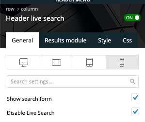
The live search is disabled only for the header search on mobile search there is no option to disable it -> https://i.imgur.com/xdYMY3C.png
I added on our list and I hope that this option will be add in the coming theme update.
Thank you!
Calin Hi,
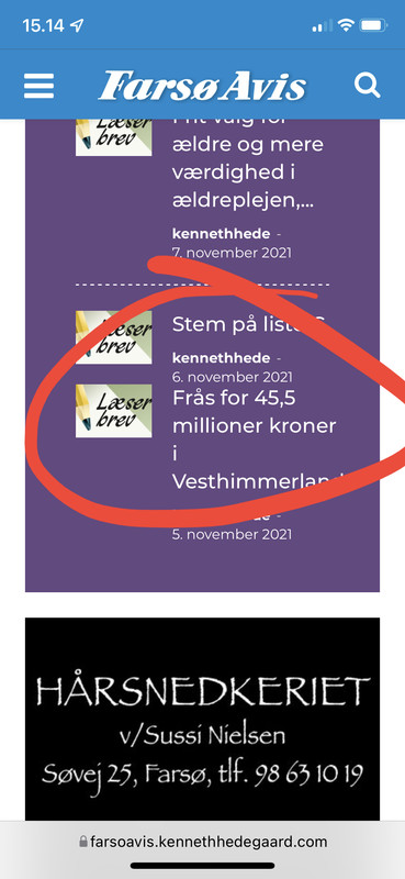
This is happen because are displayed the last posts that do not have an divider https://i.imgur.com/rRbtIKv.png
What you can do is to use this custom css
body .td_flex_block_3 .td_module_flex_3:nth-last-child(2) {

    margin-bottom: 20px !important;

    padding-bottom: 20px !important;

}

.td_flex_block_3 .td_module_flex_3:nth-last-child(2):before {

content: '';

    position: absolute;

    bottom: 0;

    left: 0;

    width: calc(100% - 48px);

    height: 1px;

    margin: 0 24px;

    border-width: 0 0 1px 0;

    border-style: dashed;

    border-color: #ffffff;

}
Set the code in the theme panel > custom code > advance css > mobile section (to apply it only on mobile).
I hope this will help you!
Anamaria Hello,
Usually, this happens with cache plugins. If the cache plugin does not have mobile support then the mobile theme version can be delivered instead. The solution would be to use the recommended WP Super Cache plugin instead and activate these settings (especially the mobile device support): https://forum.tagdiv.com/cache-plugin-install-and-configure/
I hope this helps.
Thank you!
EdanurHello, I am using the mobile theme actively in my newspaper theme. But I am having some problems. Most of the time, mobile theme is active in computer and tablet view, and computer view is active in mobile view. It works the opposite way. I clear the cache to fix this but it doesn’t help. It goes back to past after 1-2 minutes. Can you solve this problem?
I share photos and videos
site name: guzellikbirikimi.com
 knthdgd
Hi.
Have a little issue with the header search on mobile devices – but only on mobile devices.
Even if live search is disabled:
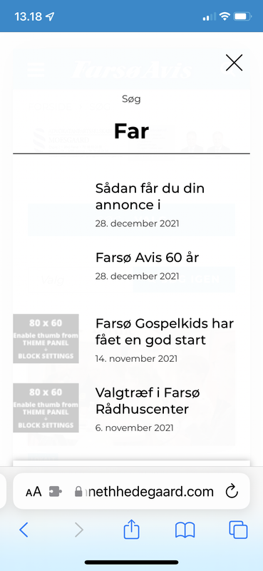
knthdgdHi.
I have a little issue with Flex Block 3 – but only on mobile resolution.
After the last post a separator is missing?
 dharma3d
 Ok, thanks! I would like to suggest, since 90+% of users are mobile users, that you put more energy in developing your mobile theme.
Anamaria Hello,
Seems you have the mobile theme plugin activatedhttps://i.imgur.com/8GcalWE.png, please deactivate it, clear all cache and check after the mobile version.
Also, please check this topic where I explained each mobile version -> https://forum.tagdiv.com/topic/mobile-version-not-working-properly-2/ and choose what mobile version you want.
Hope this helps you!
Thank you for your kind words!
Anamaria Hello,
1. This issue can be caused by a plugin conflict, or, did you use any plugins to optimize your images?
Did you use WP Bakery? If yes, we strongly recommend using only one of those plugins with our theme (WP Bakery or tagDiv Cloud Library, but not both).
2. You can change the background color for mobile header from Theme Panel -> Theme Colors -> Mobile Menu => https://i.imgur.com/mbGT1D5.png
Thank you!
Calin Hi,
If you have a different layout on mobile then desktop, then it is because you are using the mobile theme plugin, just disable it and you’ll use the response version.
I hope this will help you!
Anamaria Hello,
Usually, this happens with cache plugins. If the cache plugin does not have mobile support then the mobile theme version can be delivered instead. The solution would be to use the recommended WP Super Cache plugin instead and activate these settings (especially the mobile device support): https://forum.tagdiv.com/cache-plugin-install-and-configure/
If the issue is still present you can try deactivating all non-theme plugins and check again in order to rule out a plugin conflict.
I hope this helps.
Thank you!
Anamaria Hello,
You need to change the background color for mobile header from Theme Panel -> Theme Colors -> Mobile Menu => https://www.screencast.com/t/Ou8CBHm25
If this is not what you mean, please provide some more details, screenshots.
Thank you!
 Vpage1
Hi, I love the theme for newspaper on the computer. However, the mobile view keeps messing up almost every week. Photos aren’t showing and pages aren’t showing on the phone, but show up in the mobile preview. I have researched the issues, fixed some of them but a week later it happens again. At this point, I would rather keep the newspaper theme on the PC and ipad and just use WordPress for mobile viewing. Is this possible? If so, how do I disable the mobile theme for Newspaper but keep it for PC and iPad viewing? My website is http://www.tellersuntold.com.
 Avispa Midia
PICTURE OF THE PROBLEM: https://imgur.com/a/bDUJhtP

Hi there! I’ve got a problem with a SLIDE element inside our website. On mobile mode, when we arrive to the homepage, the SLIDE element works just fine, but when we rotate te phone to landscape mode, most of the time, the element doesn’t resize correctly and it appears with the same width as if it were on portrait mode. There’s been a couple of times when it shows correctly, but most of the time, it appears as we described before.
Something weird also happens when after this incorrect display on landscape mode, we return to portrait one. When we do this, the column with the Slide element appears to have the correct width, but the title text appears cut, uncomplete, as if it recognize the landscape width instead of the portrait one.
What could be happening? Any idea on how could we fix this?
The only significant thing we’ve made that may be interfering is a change we’ve made to the main css section of the site. We wanted to achive wider blocks on mobile mode, so we wrote the next code lines:
.tdc-row.td-stretch-content, .tdc-row-composer.td-stretch-content {
padding-left: 5px;
padding-right: 5px;
}
And that’s it. We’ve done this “portrait-landscape” experiment erasing those code lines but it’s still happening, so we’re not completly sure that’s the cause.
Any idea on what could we do to solve this? Thanks a lot for your attention and future answer. Greetings!
 xmirz0
1.how to setting mobile logo size. i upload same size logo, sometimes it becomes small..sometimes it is normal size but sometime it is normal saiz.This problem happen after updates the Newspaper 11.4. I’m not install tagDiv Mobile Theme
2.How can I change the background color for a mobile display view ( now is black color, want to change to white color) .
 Stanford Nix
When i view my theme in wordpress it looks good, but when I view it live on a different browser and mobile, it doesn’t work AT ALL. I go to ‘customize’ on WordPress and no matter what I change the homepage to, it always goes to a broken webpage
Stanford NixI am working on getting the newspaper theme installed. I have everything setup correctly to my best knowledge. But it seems to not work when I actually view the theme live. When I go to edit a page in tagdiv it looks really good. And when I ‘view site’ it looks how it should. But if I take that link to an incognito window or mobile, it doesn’t look the same. Literally the same link. I need help getting all the links to work, and the pages to show up how they should. Inside WordPress they look great. Outside of WordPress in the actual view, its terrible
xmirz0 nwnuyhs
 Thank you very much for your patience, when I deactivate the Mobile Theme plugin, my mobile site works fine.
The ways you recommended is a bit complicated, so I decided not to use AMP for now.
Thank you very much
 lemetamag
Hello,
I’ve done my website and now when I check the articles on mobile, is absolutely not the same design as on Computer. May I have any help to find where to modify it ? I’ve check the forum but every links = Error 404. thank you.
 Bettina
 Hello @nwnuyhs!
I just replied you here, please check: https://forum.tagdiv.com/topic/smarphone-error-web/
Also, deactivate the Mobile Theme plugin and see if the issue is still there. Make sure you do not use any extra non-tagdiv plugin.
Let us know the results!
Thank you!



