
- TutorialsFrom WPBakery to tagDiv Composer
- TutorialsWhat is Ajax preloading?
 Simion C.
 Hi,
That is possible. A post template can be set in a few ways. Either in general if the posts are set to use the theme panel setting https://prnt.sc/y05jpe -> https://prnt.sc/y05k00
Or per post by selecting the post template directly https://prnt.sc/y05krb
So you can set a post template of your choosing, standard or cloud, for the posts you want.
The mobile theme uses its own post template, regardless of the template that is set for desktop. So the mobile theme + AMP posts will not be affected by the template the post uses on desktop.
Thank you!
Simion C. Hi,
AMP seems to work for the pages as well, it is just that the pages have no content. The content that is displayed for pages when the mobile theme is active, will be the one entered in the mobile editor for each page https://prnt.sc/y04xe5
Each page will require content there, or it will be empty in this case.
Thank you!
Simion C. Hi,
The news ticker looks like this https://demo.tagdiv.com/newspaper/news-ticker/
On mobile it should look like this – https://prnt.sc/y0433h this would be better than displaying the title on the left, as there will be more space to display the article titles.
It could be made to display like that, with the title on the left, if it is what you want. Please provide a link to the website where the ticker is displayed, so I can try and create a code for it, and see how it looks.
Let me know.
Thank you!
 Jose
Jose Hi Simion C,
The problem is that he sees too big. I want the size to be the same in the posts as in the homepage (responsive version), from a mobile.
How can I do that? Keep the same size of the logo, in any part of the web.
Simion C. Hi,
That is a code that will increase the logo size on the responsive version, as I see it looks somewhat blurry. That can happen if the logo is larger, it will be resized by the CSS set for it, the quality of the image may be affected by this.
The code will make it look like this – https://prnt.sc/y03yxa it will be in it’s original full size. The mobile header can be adjusted further if needed, let me know.
The code must be entered in the advanced CSS section for phones – https://prnt.sc/y0405o Please try it and see how it looks after entering it.
Thank you!
 TAPA-GLOBAL
Hi Tagdiv,
I would like to use https://demo.tagdiv.com/newspaper_gadgets_pro/big-grid-flex-18-gadgets-pro/? for desktop view but for the mobile layout, I would need it to be one big featured image, followed by 2 small images on the 2nd row, and 2 small images on the 3rd row.
I tried looking for it but it seems that most of the blocks for the mobile view is using a scrolling type of layout for the 2nd row.
Please kindly recommend me a suitable block or let me know how I am able to do that using CSS?
Thank you,
Jasmine
 Autotrader – Cox Automotive
We added the Single Post Comments component, and we are using the Mobile Theme Plugin. When we view the mobile pages though, there is no comment box. Is there a way to enable comments on Mobile?
 ddj
ddjI have a site where one category is not loading correctly. No other different categories are displaying this error.
Here is the category: https://www.schoolnewsnetwork.org/category/grand-rapids-community-college/
(It also appears on subsequent pages of the category such as https://www.schoolnewsnetwork.org/category/grand-rapids-community-college/page/2/)
This seems to be a recent issue because in some browsers/computers that have that page cached, it will appear correctly.
When I test it in an incognito browser or mobile browser, the issue is obvious.
I have tried all of these things, and none of them fixed the issue.
– Opening it in Tag Div Composer and saving. The page looks correct all the time.
– Clearing page cache and site cache.
 freekancemarketer
 Same problem for Single Post or category, it seems that this do not read the mobile cloud templates.
freekancemarketer The Homepage (cloud) has an Mobile Template (created with same content)
 Rlfdpx
Hi, I’m having an issue with my website metropole.ht. The pages that have the YouTube playlists show on the Desktop versions but not on the mobile.
Example pages: https://metropole.ht/le-point-metropole-haiti/
https://metropole.ht/metronews/
https://metropole.ht/reportages-tele-metropole/
https://metropole.ht/rendez-vous-economique/
Am I missing a step?
 Calin
Calin Hi,
For me on mobile or desktop I see the same layout with the same posts, maybe I do not understand were is the problem, please provide some screenshot how is look for you on desktop and how is on mobile.
Thank you!
 Anamaria
 Hello,
It seems to use the mobile theme plugin, you can use for this page the responsive version on the mobile theme (to get the same layout as on desktop on mobile) -> https://i.imgur.com/m0bVB5T.png you can check more details about mobile theme in our documentation -> https://forum.tagdiv.com/the-mobile-theme/
Hope this helps you!
Thank you!
 Anonymous
Hello!
The Unique articles feature (https://forum.tagdiv.com/unique-articles/) is not available, or working, on the Mobile Pages?
I tried to implement it in my homepage, made with the Mobile Pages feature, but it didn’t work.
Thanks for the patience!
freekancemarketerMobile theme-Version is not visible/loading on Mobile Phone on HOMEPAGE (ONLY) there is a page visible with only the last articles. We have create a mobile version as you explain in documentation. All other plugins are disable, also cloudflare cache. We have try everything, AMP, Mobile+AMP, Disable AMP on homepage – everything!! Mobile version of the homepage theme is not showing on phone. Website is liberta-news.gr
 katjadebeurs
 Okay.
So right now I am working again with the mobile pages. I still have the problem that my upper row won’t stretch in landscape (at my own mobile): https://www.screencast.com/t/LOEdo9ymR. How can I fix this?
Second I checked my website at another mobile which has a bigger screen. In portrait, it is like this: https://www.screencast.com/t/dl4T5dn88Ne2
You can see the title here is not centered. Because it is in the same “area” I cannot change it. It won’t be centered on my own mobile, or it won’t be centered at the mobile of the other person. How can I fix this?
Last, the person I checked with the bigger screen, has this screen in landscape: https://www.screencast.com/t/S5hn8pXnfv6. The menu is white and there is no logo. How can I change this?
Thank you.
Hope to get an answer soon.
 sabyp
sabypHi
I probably know the answer but still wanted to make sure before implementing it. I have a default post template set for the entire site, but let’s say I want to create just a few post with a different template, then is it possible? Secondly, Can i use a cloud post template for just few or maybe just one post? Thirdly, I am using the mobile theme for my AMP singular posts, so I hope it won’t reflect or change the amp post layout as I would want the unique templates applied to the desktop version only? Thanks in advance
 Bettina
 Hello!
From what you describe it seems you have installed Mobile theme plugin.
The Mobile Theme is a performance optimized theme included in the Newspaper main theme and it loads only for mobile devices. It comes with it’s own templates for page, post, category, etc so your current templates from the desktop theme will get converted to the mobile theme layout. For more details, please take a look here: https://forum.tagdiv.com/the-mobile-theme/
Better deactivate the plugin and see the results.
Thank you!
 Seashore
Hi,
We have create a temporary homepage – while a new website is being created – but we do not want a menu and no search option there. Now every header style shows a menu, so I created a blank menu. And I could hide the search position. That works fine on desk/laptop and tablet, but in mobile view you see the menu and search icons. How can we get rid of these there?
Regards,
Martin.
Anamaria Hello,
Does the mobile theme version appear on the desktop? Please make sure that you do not have a plugin conflict, please deactivate ALL plugins except tagDiv plugins (theme plugins), also if you are using child theme or cache plugin, deactivate them, clear all cache and try again.
Let me know the results.
Thank you!
 abbozdag
Hello friends,
I made a contact page for my site. Using the tagDiv Composer. But this page looks fine in desktop mode. On mobile, the page does not appear at all or gives the error in the picture. I created a separate page for mobile. It turns out the same again. The theme I use is Newspaper.
I would be glad if you help.
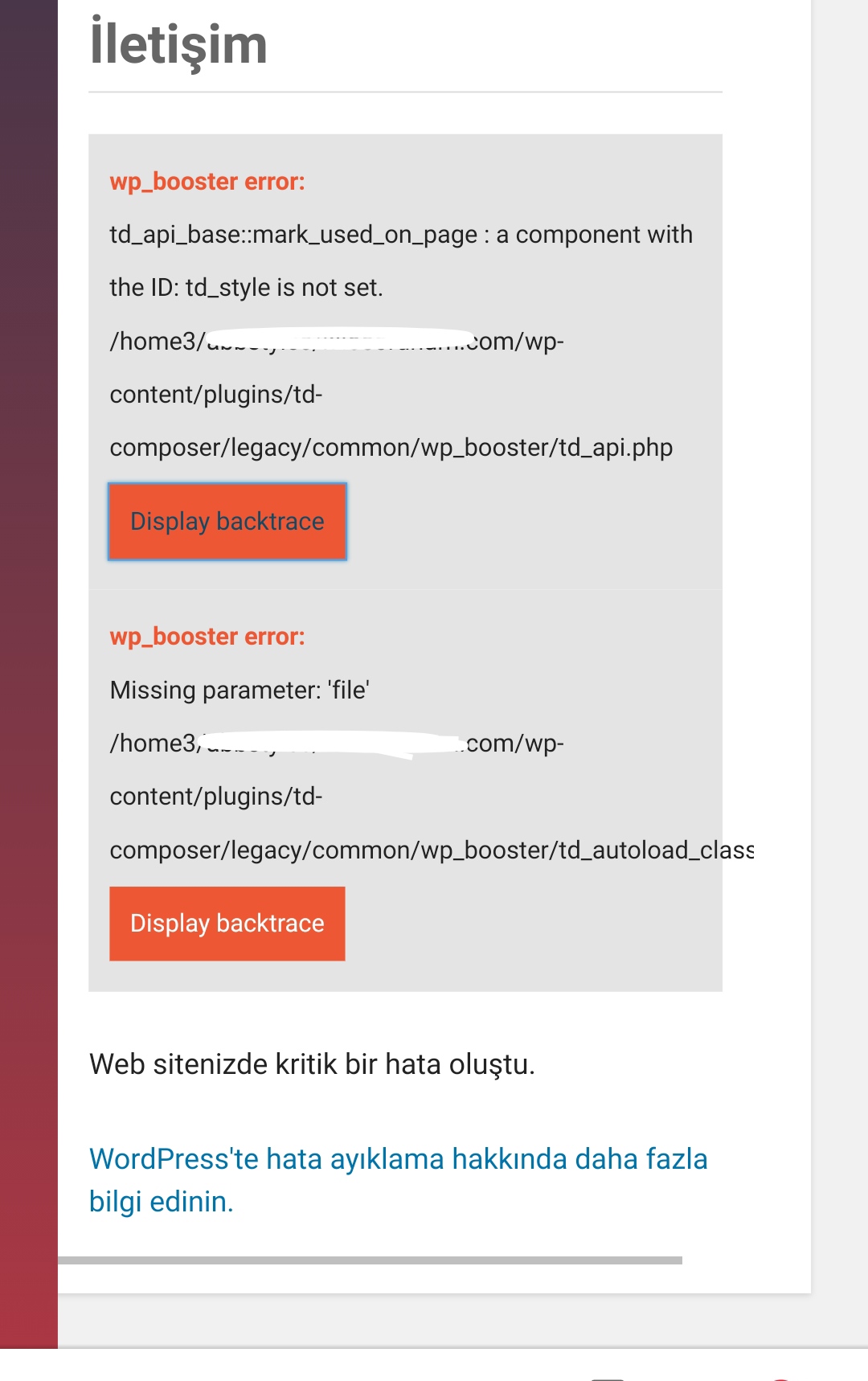
 drift1943
 Hi,
I move the mobile page to trash.
But when I go to the site on mobile.
The mobile page header remains.
Why is that? It is supposed to be a desktop RWD version…
https://www.screencast.com/t/Oeq73EOIk3Ls
https://www.screencast.com/t/UOTM93SimHl
Please advise. Thanks.
Bettina Hello!
If you created the mobile pages with TagDiv Composer, then when you install Mobile Theme plugin, your pages will be overwritten by the plugin.
The Mobile Theme is a performance optimized theme included in the Newspaper main theme and it loads only for mobile devices. It comes with it’s own templates for page, post, category, etc so your current templates from the desktop theme will get converted to the mobile theme layout. For more details, please take a look here: https://forum.tagdiv.com/the-mobile-theme/
About AMP version is going well with Mobile Theme activated only.
You can choose the way is suitable for your needs.
Thank you!
TAPA-GLOBALHi,
How can I make the news ticker into a scrolling piece of text displayed horizontally (scrolls text to left)? Also, how can I make it into one row in the mobile version (instead of box on top and text in the bottom)?
Thank you,
Jasmine
drift1943 Another question:
What if I choose NON-Pre-Designed Mobile Template?
I want to choose a desktop homepage template with no mobile vervion.
Will it display wrongly?
To be clear, I want to use this theme https://demo.tagdiv.com/newspaper_classic_pro/
But in my point of view, it looks ok on mobile.
So my question is:
What’s the difference between a Pre-Designed Mobile Template and Non-Pre-Designed Mobile Template?
Thank you.

