- TutorialsFrom WPBakery to tagDiv Composer
- TutorialsWhat is Ajax preloading?
 Vlad S
 Hello !
When switching from a view port to another one please make sure to refresh your page. W Now when I switch to your mobile view on this page: https://www.screencast.com/t/T9zVO2yU The AMP automatically loads but here is no content. You will have to recreate your pages into the Mobile editor or completely disable the mobile theme. The mobile editor will not render shortcodes !
Thank you !
 pagondorf
Hello,
I have this error message when I try to activate The Mobile Theme :
Fatal error: Cannot declare class Mobile_Detect, because the name is already in use in /var/www/vhosts/geekovore.com/httpdocs/wp-content/plugins/td-mobile-plugin/Mobile_Detect.php on line 23
Thank You
pagondorfHello,
When I try to activate The Mobile Theme, I have this error message :
Fatal error: Cannot declare class Mobile_Detect, because the name is already in use in /var/www/vhosts/geekovore.com/httpdocs/wp-content/plugins/td-mobile-plugin/Mobile_Detect.php on line 23
Thank you !
 YSWebsites
Is there a way to create a contact page where the written information is seen while using AMP? My information on contact page is not seen on mobile. https://blacktvfilmcrew.com/contact/
 andreeaj
 @Bettina I have installed Mobile theme plugin. The drop down categories from the Main Menu, present in main theme, don’t work in the Mobile theme plugin. Only the page categories can be seen in the drop menu on the Mobile theme. Basically the Main Menu from the main theme is not fully compatible with the Main Menu from the Mobile theme. I do understand the fact that the two are not the same and one of them is optimized for performance BUT still…is there a way I can build a Main Menu for the Mobile theme separately? Or is there any other way to make the Main Menu work on both ways?
 Bettina
 Hello!
It seems you have installed Mobile theme plugin. If you created the mobile pages with TagDiv Composer, then when you install Mobile Theme plugin, your pages will be overwritten by the plugin.
The Mobile Theme is a performance optimized theme included in the Newspaper main theme and it loads only for mobile devices. It comes with it’s own templates for page, post, category, etc so your current templates from the desktop theme will get converted to the mobile theme layout. For more details, please take a look here: https://forum.tagdiv.com/the-mobile-theme/
Better deactivate the plugin and see the results.
Thank you!
 TAPA-GLOBAL
 Hi Anamaria,
I have imported a cloud template and tried to tweak a little. Tried ur method to align the categories and tags on a single row using the inline method but failed for both desktop and mobile view.
Unlike shown in your video, when I added the categories, it appeared center-align and I couldn’t make it left-aligned unless I add -140 margin on the left. And making the element ‘inline’ didn’t work as well.
Here’s the page that I tried it on: http://tapa-global.hostinghunk.com/zuellig-pharma-hong-kong-demonstrates-supply-chain-excellence-in-the-pharmaceutical-industry-by-achieving-tapa-tsr-certification-with-sgs/
Please let me know how I can solve this issue.
Thank you,
Jasmine
 Anamaria
 Hello,
If you use the mobile theme, please check if this option is enabled from Theme Panel -> Post Settings -> Post and Custom post types => https://www.screencast.com/t/jhBXHxUjQAjb
Thank you!
 stanipro
Hello,
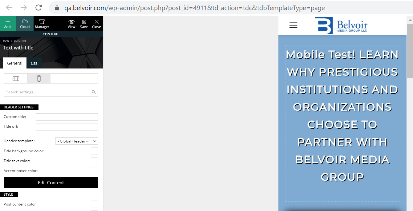
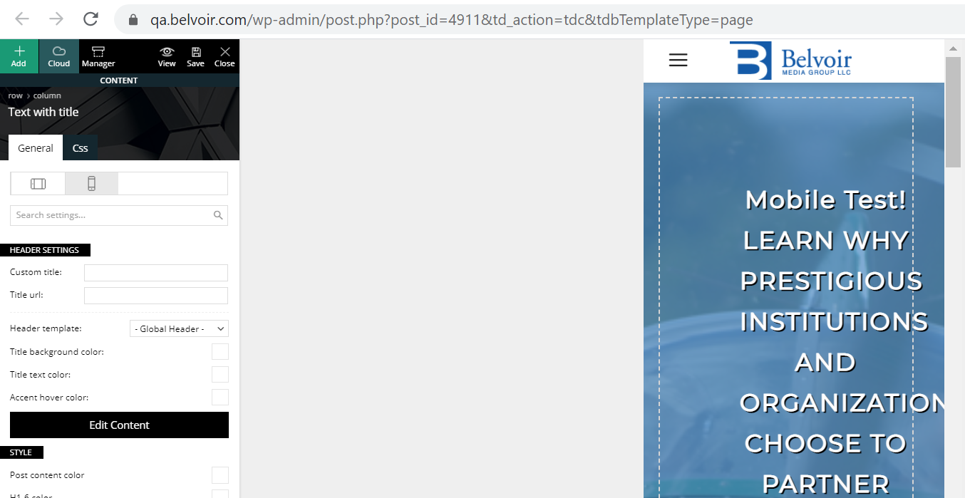
When editing a mobile page in TagDiv the page loads and the mobile portrait view is highlighted by default but when making changes it is really making changes to the desktop view. You need to actually click on the already highlighted portrait view to make changes to your mobile page. The desktop view that initially loads goes away when you click either landscape or portrait view and you cant get back to it.
This is confusing and frustrating. The desktop view is gone when editing a mobile page (as expected) but that is what initially gets loaded even though the landscape view is already highlighted.
Here is the view when the page loads initially in mobile edit.
https://qa.belvoir.com/wp-content/uploads/2021/02/tagdiv-mobile-initial-view.png
This is the actual portrait view of the page (after clicking portrait view) that should be loaded initially as it is already highlighted when the page loads.
https://qa.belvoir.com/wp-content/uploads/2021/02/tagdiv-mobile-potrait-view.png
Is there a fix for this so that the desktop page is not loaded on mobile pages?
Thanks-
Stan
Anamaria Hello,
You can display more Related articles if you use the mobile theme plugin and go in Theme Panel -> Post -> Related article => https://www.screencast.com/t/mdoRjUBlm -> https://www.screencast.com/t/crSChR7UNWy
Hope this helps you!
Thank you!
 aaronaw90
Apologies if this has been brought up recently, but I’ve just gone to update 10.3.9.1 on WordPress and it says theme update failed – has anyone had this issue?
Full error thread below:
Unpacking the package…
Updating the theme…
Removing the old version of the theme…
The update cannot be installed because we will be unable to copy some files. This is usually due to inconsistent file permissions. tagdiv-deploy-mode.php, font-newspaper.css, woocommerce, woocommerce/single-product.php, woocommerce/archive-product.php, search.php, sidebar.php, comments.php, editor-style.css, style.css, archive.php, functions.php, translation, translation/ru_RU.po, translation/de_DE.po, translation/de_DE.mo, translation/hi_IN.po, translation/es_ES.po, translation/pt_PT.po, translation/ta_LK.po, translation/mr_IN.mo, translation/ja.po, translation/ta_LK.mo, translation/pl_PL.mo, translation/pl_PL.po, translation/ro_RO.mo, translation/ur_IN.po, translation/ja.mo, translation/el.po, translation/nl_NL.po, translation/th.po, translation/id_ID.mo, translation/th.mo, translation/fi.po, translation/id_ID.po, translation/ru_RU.mo, translation/fi.mo, translation/tr_TR.mo, translation/nl_NL.mo, translation/default.po, translation/es_ES.mo, translation/pt_PT.mo, translation/el.mo, translation/mr_IN.po, translation/ro_RO.po, translation/ur_IN.mo, translation/tr_TR.po, translation/default.mo, translation/hi_IN.mo, loop-single.php, style-buddypress.css, includes, includes/tagdiv-page-generator.php, includes/wp-booster, includes/wp-booster/tagdiv-options.php, includes/wp-booster/wp-admin, includes/wp-booster/wp-admin/tagdiv-view-support.php, includes/wp-booster/wp-admin/tagdiv-view-welcome.php, includes/wp-booster/wp-admin/css, includes/wp-booster/wp-admin/css/plugins.less, includes/wp-booster/wp-admin/css/welcome.less, includes/wp-booster/wp-admin/css/general.less, includes/wp-booster/wp-admin/css/wp-admin.less, includes/wp-booster/wp-admin/css/wp-admin.css, includes/wp-booster/wp-admin/plugins, includes/wp-booster/wp-admin/plugins/class-tagdiv-old-plugins-deactivation.php, includes/wp-booster/wp-admin/plugins/class-tagdiv-theme-plugins-setup.php, includes/wp-booster/wp-admin/plugins/class-tgm-plugin-activation.php, includes/wp-booster/wp-admin/js, includes/wp-booster/wp-admin/js/tagdiv-theme-plugins-setup.js, includes/wp-booster/wp-admin/tagdiv-view-theme-plugins.php, includes/wp-booster/wp-admin/images, includes/wp-booster/wp-admin/images/font, includes/wp-booster/wp-admin/images/font/tagDiv.svg, includes/wp-booster/wp-admin/images/font/tagDiv.eot, includes/wp-booster/wp-admin/images/font/tagDiv.ttf, includes/wp-booster/wp-admin/images/font/tagDiv.woff, includes/wp-booster/wp-admin/images/plugins, includes/wp-booster/wp-admin/images/plugins/plugins-installed-success.gif, includes/wp-booster/wp-admin/images/plugins/rev-slider.png, includes/wp-booster/wp-admin/images/plugins/cloud-templates.jpg, includes/wp-booster/wp-admin/images/plugins/tagdiv-newsletter.png, includes/wp-booster/wp-admin/images/plugins/visual-composer.png, includes/wp-booster/wp-admin/images/plugins/label.png, includes/wp-booster/wp-admin/images/plugins/standard-pack.jpg, includes/wp-booster/wp-admin/images/plugins/mobile.png, includes/wp-booster/wp-admin/images/plugins/td-composer.png, includes/wp-booster/wp-admin/images/plugins/success.jpg, includes/wp-booster/wp-admin/images/plugins/social.png, includes/wp-booster/wp-admin/images/plugins/invoice.png, includes/wp-booster/wp-admin/images/plugins/tagdiv-amp.png, includes/wp-booster/wp-admin/tagdiv-view-header.php, includes/wp-booster/tagdiv-util.php, includes/wp-booster/tagdiv-global.php, includes/wp-booster/tagdiv-admin-notices.php, includes/wp-booster/tagdiv-wp-booster-functions.php, includes/tagdiv-panel-docs.php, includes/js, includes/js/tagdiv-theme.min.js, includes/js/tagdiv-theme.js, includes/tagdiv-config.php, single.php, style-bbpress.css, loop.php, index.php, error_log, loop-archive.php, style-woocommerce.css, header.php, page.php, tag.php, footer.php, attachment.php, bbpress.php, 404.php, screenshot.png, searchform.php, author.php, images, images/admin-panel, images/admin-panel/logo-panel.png, images/editor-style, images/editor-style/grid-sidebar-desktop.gif, images/editor-style/grid-no-sidebar-desktop.gif, images/no-thumb, images/no-thumb/medium_large.png, images/icons, images/icons/newspaper.svg, images/icons/newspaper.woff, images/icons/newspaper.eot, images/icons/newspaper.ttf, gutenberg-editor.css, category.php
Theme update failed.
 Anonymous
 Thank you, Calin!
The issue with the contrast in the background of Twitter is fixed!
Also, I was able to find the code of the search button and fix it, in both mobile and desktop views (though they are indeed in another lines of the code).
The Newsletter form is a mistery for me, because I implemented it as I was told to; I’ll try to redo it and inform you about the success of it.
Thank you very much for now!
 freekancemarketer
 I use the newspaper_pulses_pro demo and do not make serious changes only to the text. Is this Demo not compatible with mobile version? Not responsive?
How to create the homepage demo in mobile version? With shortcodes? without tagcomposer? No way to do this.
Something else is the problem. Do you have any extra settings for PULSES PRO Demo?
 Calin
Calin Hi,
Is look that is a similar situation about mobile theme plugin that was discussed here https://forum.tagdiv.com/topic/mobile-pages-content-display/
Hope this will help you!
Calin Hi,
looks that you manage to solve the problems indicate by Vlad, also I saw that on mobile the favicon can is not loading -> https://i.imgur.com/XGJkLCK.png make sure that this is set and you can try to set it as in this guide https://www.wpbeginner.com/wp-tutorials/how-to-add-a-favicon-to-your-wordpress-blog/
Thank you!
Calin Hi,
I see that you have the same problem like the one describe on this similar topic -> https://forum.tagdiv.com/topic/mobile-pages-content-display/
Hope this will help you!
Have a nice day!
freekancemarketerMobile theme-Version is not visible/loading on Mobile Phone on HOMEPAGE there is a page visible with only the last articles. We have create a mobile version as you explain in documentation. All other plugins are disable, also cloudflare cache. We have try everything, AMP, Mobile+AMP, Disable AMP on homepage – everything!! Mobile version of the homepage theme is not showing on phone. Website is liberta-news.gr
The Homepage (cloud) has an Mobile Template (created with same content)
Same problem for Single Post or category, it seems that this do not read the mobile cloud templates
Anamaria Hello,
To do the menu sticky you can set with tagDiv Composer in Manager(Website Manager), you can enable the sticky menu on desktop and on mobile => https://www.screencast.com/t/aRTGl84qtn5L
Hope this helps you!
Thank you!
Anonymous Hi, Calin!
I can’t use the Flex Block 1, for that to me accomplish the same design I’d have to put a lot o CSS fixes, and it would be a worse solution for my problem… I am bound to use the Flex Block 2, which doesn’t have the property to fix width and height.
I’ll wait and hope for the next update then…
And yes, 0.007 is not a lot, but is something, and if you add 0.007 here, 0.007 there, 0.01 somewhere else, it gives you a lot.
Right now, my CLS on mobile is 0.377 and and my CLS on desktop is 0.007. The desktop one is fine (not perfect) but the mobile is terrible..
 katjadebeurs
 Thank you. This was helpful and it is fixed now.
I have a mobile header called ‘Global Template’. In portrait, it is the way I want it (in green, with my logo). If I change it to no header, then I won’t have a menu in portrait. But in Landscape there is a whole different menu type and I don’t understand how I can change this. Because there is no option to have different headers voor portrait and landscape view.
 talkbasket
Hello,
We have a strange issue on the site. When we add an ad code within a <div> via the theme’s mobile ads it loads on AMP pages. For example, in theme settings -> Mobile theme -> Header ad we place an ad code within a div (to solve Cumulative Layout Shift issue). So it would be something like <div style=”height:313px;”>[AD CODE]</div> inside the theme’s Header ad field. It works fine on mobile version. But when you open an AMP version of the site, we have a blank space in the header as the ad is not AMP so it does not appear. How can we prevent mobile ads from being loaded on AMP pages?
We have AdSense AMP ads enabled via the theme’s settings and that would fine if the blank mobile ads were not being loaded as well.
TAPA-GLOBAL Just to add on to the above, the mobile layout that I am looking for is similar to https://www.freightwaves.com (their featured post layout).
Anonymous Hi, Simion!
I was able to activate the option on the mobile page, but it didn’t work.
I’ll send a message to the email.
Thanks for the attention!
 Simion C.
 Hi,
It should be available, a mobile page is a page as well.
I checked and it is available https://prnt.sc/y06fzs -> https://prnt.sc/y06gcy
It also seems to work. So if with it disabled there are duplicates like this in the mobile page https://prnt.sc/y06ipb after activating it there are not https://prnt.sc/y06jkx
If for you it is not working we could take a look at it. Please send us an email at contact@tagdiv.com and provide a link to the respective page and admin login. Include a link to this topic in the email.
Thank you!
Simion C. Hi,
I believe that issue with the background is happening because of the CSS set for the row. I see that the row has a fixed width set https://prnt.sc/y05trs Did you maybe set this width? Please click on that row and check in the CSS tab https://prnt.sc/y05vei
Regarding the title alignment, I see it has a bigger right margin than the left margin https://prnt.sc/y05w6t Please click on the inline text element used, and check in the CSS tab as well.
In this mobile page, have you set a mobile header and footer template? there is something unusual there from what I can see. Please check in the website manager if a mobile header and footer template is set, for example https://prnt.sc/y0615d
Thank you!