- TutorialsFrom WPBakery to tagDiv Composer
- TutorialsWhat is Ajax preloading?
 Bettina
 Hello Bhanu Srivastav!
1. In the mobile viewport, there is a modal popup, and it can be modified from here: https://app.screencast.com/fRsnDrE6AdPVN -> view and edit it with the tagdiv Composer.
Suppose you check the menu in the Appearance -> Menus. Click the courses, and there you can see the page ID used there: https://app.screencast.com/97p31pKgCjCcH
2. Edit the page with the tagDiv Composer, ensure the shortcode plans switcher is present, and choose a plan. On the right side, there is the plans button shortcode, and you need to choose a valid free plan there.
3. Edit the blog page with the tagdiv Composer, and check the block if you have any offset, delete it, or use a flex block instead of the posts loop shortcode. Check if you have the posts assigned to that category and if they are published posts.
4. You should have the Contact Form 7 plugin.
Thank you!
 rbulus
 Thanks for the info. I’m assuming this is using a cloud header template? We aren’t using any cloud templates and when I’m in the composer, it says this header isn’t editable. Is there way to do it in CSS? Instead of having it show the main menu, swap it to show the top bar only on mobile devices? We tried enabling the tagDiv Cloud Library plugin and it crashes the site, not sure why so aren’t using it since the theme is working perfectly.
 Anamaria
 Hello,
You can create a new menu and assign it to the mobile menu -> https://forum.tagdiv.com/main-menu/. To set the menu, go to the mobile viewport, click on the menu icon and check if you choose a menu from this dropdown: https://app.screencast.com/kXblv69NkhU60
Also, you need to use header template to do it.
Thank you!
 JavierAlquimia
Hi, on my website mobile menu and search pop-up are not working fine. cosladaweb.es
Let me know if you need something else. Thanks
rbulusHi there
Is there a way to replace the mobile menu on mobile devices with the top bar menu? Instead of seeing the main menu on mobile, we want to see only the top bar menu when you tap on the 3 lines in mobile devices.
Thanks
 ekimdemirci
 Hi, sorry for my late response. I have deactivated mobile page plugin and solved my issue. The problem here was caused by the mobile theme plugin.
 thebackbenchers
 1) hi on mobile header here – bankpediaa.com how to change header menu sub items -see here – https://prnt.sc/rI015b6oLu4V there are 3 sub items in each 6 menu items i tried a lot but was not able to change them
2) on header when pricing is clicked, the new page which opens, two buttons were there in demo which vanished completely see here – https://prnt.sc/_09UBmVoYMpp the vanished buttons were Monthly & yearly switcher and central button on right form i tried adding button but it doesn’t comes in centre it is in left.
3) On blog page, the blogs which are posted latest doesn’t appear
4) Contact form on contact page is vanished
Please help in above 4 things n website https://bankpediaa.com/ it will be very kind of u
 etinos
Hi, i can’t find a way to change the background of the mobile menu, I don’t use anything special for mobile, just the default theme, I follow these steps:
https://ibb.co/z2yCgzP
https://ibb.co/n3SDLbS
And that blue background shows a car wheel, that’s not related at all to my site. Please let me know if it can be changed.
 Castu
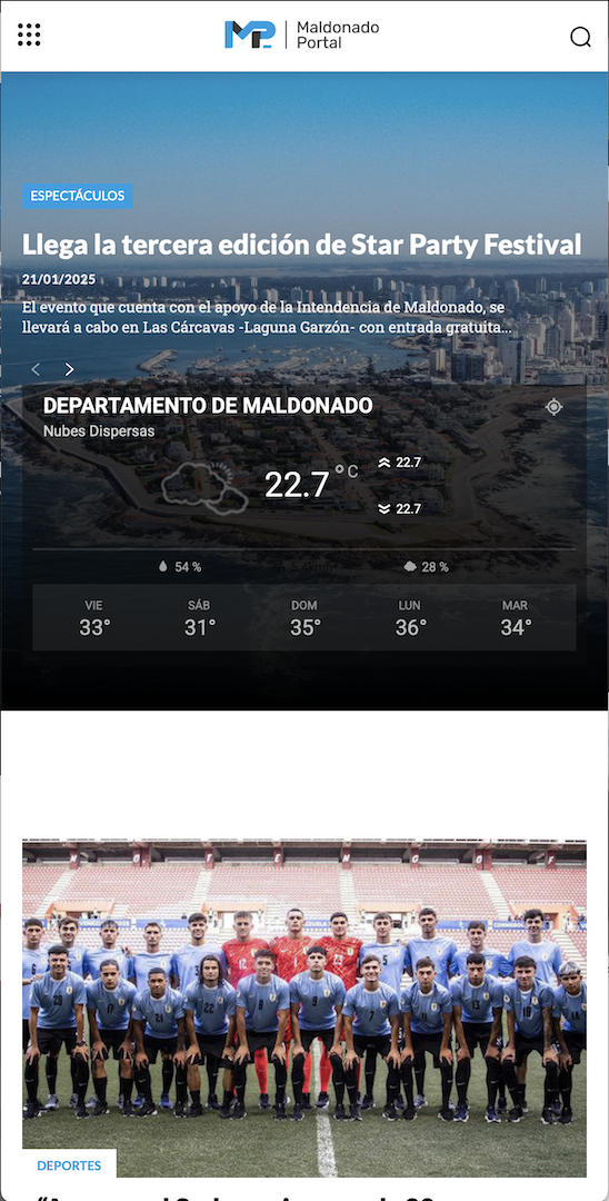
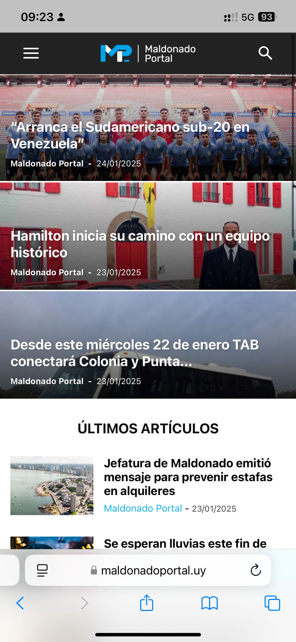
CastuHi, I went live with my website yesterday and the homepage on mobile looked beautiful, then out of nowhere the style changed.
This is how it looked yesterday and how it should look now:
https://maldonadoportal.uy/wp-content/uploads/2025/01/Captura-de-pantalla-2025-01-24-a-las-09.29.51.png
and this is how it actually looks:
https://maldonadoportal.uy/wp-content/uploads/2025/01/WhatsApp-Image-2025-01-24-at-09.23.51.jpeg
If you could assist me with this please.
 duck1970
Good morning. I have a question to ask.
I show a photo every hour in the header of my website
https://www.radiomarcabarcelona.com , this photo changes every hour according to my programming. This photo in the web version, is seen without problems and without cuts. But when you visit my website from a mobile, it appears cut off, as I show in the attached photo.
Is it possible with some code to make the photo go up a little, so that it is not shown cut off?
I hope for your help. Thank you
 diegocoru
Hi
I published a new article in my blog yesterday and it’s not showing properly. Sometimes appears at the home, sometimes not, at desktop appears more times and on mobile doesn’t appear… do you know why this can happen?
 ddonzal
Love the product so far, and people love the design. So, Thanks!
I have a Flex Block 1 on our front page at https://www.justhacking.com. As you can see, I have 4 sections within the block. This was part of a pre-made template, so this block was already there. It doesn’t show the titles and buttons until you hover over the block. I’ve been through all of the settings, but I can’t figure out how to make the titles and buttons show all the time without the need to hover. It’s a cool effect, but then on mobile our visitors don’t see the titles and buttons at all.
Thanks in advance
 nearview
 No, it’s not resolved. We just decided to NOT check the “Enable Filters on Mobile” checkbox as way to get around the issue.
Anamaria Hello Greg,
Please check this topic where I explained each mobile version -> https://forum.tagdiv.com/topic/mobile-version-not-working-properly-2/
Also, you can create a new page and check if the issue persists, maybe there was some misconfiguration when it was created. You can also delete the elements/blocks that you don’t want with right-click.
Thank you!
 Simion C.
 Hi,
The AMP plugin is compatible with the theme. If you want to use it we recommend using it together with our mobile theme plugin. Also it should be used with these URL structures https://prnt.sc/TTzdDQb2X_3P I see you’re not using either of those, please set it to the default URL structure and test again.
But as Chris mentioned, AMP is very rarely used these days. I check a lot of websites daily and I never see it. It’s still an option however, if you want to use it there’s no problem. I only suggest using the default URL structure, or the legacy one.
Thank you!
Simion C. That is possible with a code like this https://pastebin.com/yS3C424t It will change the color of the to bar on mobile https://prnt.sc/L6t91BavrmAE Please change the color to what you want, then add it in the same location as the previous code. Please try it.
Thank you!
Anamaria Hello,
Please let me know from where you have changed the logo, from the theme panel, or you have edited the header template -> https://imgur.com/cR7F0v4 https://www.youtube.com/watch?v=HXQQygkCCJo -> https://forum.tagdiv.com/add-logo-newspaper/
For mobile please edit with tagDiv Composer, select the viewport on phone, select the header logo and change it => https://i.imgur.com/cR7F0v4.png
Thank you!
 simchris
 You should just move on from AMP and make sure your pages are responsive and work well on mobile without too much overbuilding.
AMP was pretty much abandoned by Google 2 years ago.
I posted a thread on here awhile back on how to setup 301 redirects to retire AMP endpoints entirely on your site.
Ideally you’d want your ‘actual’ pages on your website loading and not some /amp version which was Google’s attempt to track you by loading your pages on their cloud servers.
(I don’t work here.)
 eliaq
eliaq Hello, code works perfect and corectly.
Is it possible change backround color for the menu when showing in mobiledivice? now it is blue. Is it possible change? Thanks
Eliaq

 Greg
GregDear Support Team,
I attempted to create a mobile homepage as there was no existing mobile homepage linked to the top button. I created a new one, named it “Mobile Homepage,” and checked the box to copy content.
After that, I clicked on the top button and used the pencil icon to edit it. However, when the page opens, I see all the content displayed twice. Could you please advise where I can adjust the settings to prevent the duplicate content from appearing?
Thank you for your assistance!
Best regards,
Greg
 LKZ
LKZ Hello,
every viewport is right, in our opinion.
We just found out that he manually zoomed (115%) in Safari that’s why it happened.
This problem occurs on other tablets too (Safari).
So, if you zoom in, it loads the mobile version of the website. And at this moment the header disappears. This of course shouldn’t happen.
It only comes back when you zoom out to 100% again. Then it loads the tablet version again.
Do you know what we can do to solve this problem?
You could try it out yourself.
Thank you!
LKZHello,
this is our website: https://ludwigsburger-wochenblatt.de/
The website runs for about 1 month now and we have little to none problems by now – nice!
Though, one colleague opened the website on an iPad Air (4th Gen) in Safari and had following problem.
The browser loaded the mobile site without the header, not the tablet site (portrait mode). As soon as he rotates the tablet to landscape it loads correctly. But everytime he uses his tablet in portrait mode it would load the “wrong” mobile site without header.
The problem doesn’t occur in Chrome on the same tablet or on any other tablet I’ve tested.
Do you know how this problem can be solved?
Thanks for your help!
Regards, Valentin
Anamaria Hi,
This usually happens with cache plugins. If the cache plugin does not have mobile support, the mobile version can be delivered instead. Please make sure that you have enabled the mobile cache -> https://imgur.com/Es7nHNh -> https://i.imgur.com/W1KaV3U.png
Please check this topic where I explained each mobile version -> https://forum.tagdiv.com/topic/mobile-version-not-working-properly-2/
Thank you!
Anamaria Hello,
Unfortunately, you can not have a separate menu for mobile for the standard header. I recommend using a cloud template, where you can also set global, but you have more flexibility, like, for example, setting a different menu for mobile -> https://forum.tagdiv.com/header-manager/
Thank you!
Anamaria Hello,
You can not customize the tagdiv mobile version with tagdiv Composer. The available options are in the Theme Panel -> Mobile theme.
Thank you!