
- ApiPractical example – How to add a new Block and Module
- ApiAPI – Smart Lists – Introduction
- ApiAPI – Category top section style – Introduction
- ApiAPI – Category top section template – Introduction
- Apitd_api_module::update
- Apitd_api_module::add
- ApiAPI – Modules – Introduction
- ApiUsing the Theme API in plugins
 JuanValFlauta
Hi!
On the menu of my website’s mobile version, when I select the english version the pages on the menu don’t change, only changes the page where I was. The main language is spanish. I can change for every page to english, but the menu doesn’t change completely to the english version. I use Polylang plugin and I don’t have budget to pay a translation plugin. How can I solve that?
My website: https://www.juanvalflauta.com
Thanks!
 Nathan45
I hide one of my columns in the Footer while working on the Mobile Viewport by mistake and now I can’t find a way to unhide it. It is still visible in the other views.
 be2name
Hello,
my AMP-pages looked just fine, but I think with the newest version of the AMP-plugin all my colour-settings of the header, footer, links etc. are gone and set to ugly default. The rules applied in the mobile-theme-settings have no effect. I also use Yoast SEO, which has also AMP-colour settings, but these setting also have no effect. Where can I change the colour of my MAP pages, where can I add additional CSS to my AMP pages to get the latest layout back?
 Shekhar
All item/frame is shifted towards the left side in the mobile view.
 Dale-R7
Hi there – I’m using Flex Block 5 and trying to turn on the Modules Divider option (under Layout tab) but when I am editing the Mobile Phone view and turn it on, it turns on across all views (desktop, tablet, etc.)
I’m not sure if that’s expected behaviour? Usually when I adjust a setting specifically in mobile view – it only affects that view?
Thx!
 Topfgartenwelt
 Ok, I don’t use a special cache plugin, because my hoster provides already a cache. Is there a way to set a favicon for the mobile version?
Greetings Kathrin
Topfgartenwelt Ok, but on the mobile version it should be seen 1,2,3 …. and in this case very often the number 3 doesn’t work and shows instead the mobile version the desktop version.
Topfgartenwelt Sorry, it doesn’t work. One time it shows me the correct mobile version and minutes later you can see the desktop-version again. Please, give me a working solution! I bought the theme awaiting that I get a working mobile version like you promise it in your advertisement. But the mobile theme isn’t working.
Now I have deleted Disable Gutenberg but the problem still exists. If I do any change on the blog, even wright an new article, the mobile theme is lost!!! So I have to update the homepage-settings again that I see the mobile theme again. What is the solution therefore?
Greetings Kathrin
-
This reply was modified 6 years by
Topfgartenwelt.
Topfgartenwelt It seems that is was the disable Guttenberg Plugin. I disabled it for pages and enabled the mobile grid. And at first it worked correctly but after clicking through the pagination the desktop-version of the blog appeared again and doesn’t go away…
On an IPhone still the desktop-version of the blog is loaded…
Greetings Kathrin
-
This reply was modified 6 years by
 imdarshanpetkar
Even after selecting Post template: 5 in my blog post it showing the featured image at the very beginning of the post in mobile view… is there any different setting for the mobile view. I don’t want featured images to be shown.
Sry for bad English. Thank you!
 varshneymohit
I installed and activated AMP (WordPress and Mobile Theme both). After that i set all the parameters in theme panel.
After that pages are not opening in mobile. While it is working well in PC.
Please tell me how to fix it or where am i wrong in this procedure.
 3dcards
hi how do I disable the mobile theme option for the entire posts in 1 go instead of each one ?
 BuddhaNET777
 thats not wht im asking.. before adding the desktop header black pro it would show the mobile theme when resizing on desktop to smaller window.. i would like it to do that with the desktop header set to the blackpro.. please advise
Topfgartenwelt When the mobile theme is shown, GMetrics tells me that the images in the grid aren’t scaled correctly. You can see it on the pictures here: https://www.topfgartenwelt.com/newspaper-4. Unfortunately sometimes the desktop-version of the blog is loaded on the mobile phone than this problem doesn’ appear…
Greetings Kathrin
-
This reply was modified 6 years by
 tareqjhe1
Well, I really become so much when I saw my website speed is 100. I never expected to have this. Because I just use shared hosting. Also, don’t use any CDN. Even I didn’t use the minify plugin also. So how is this possible?
Although I checked again but also 99 and for mobile also 94/95.

Topfgartenwelt Thank you Calin, but my layout looks a little bit different. I haven’t any symobols for desktop and mobile on the pages-site. Just a mobile editor which is emtpy. The mobile symbol just appears in the postings…
I have disabled Gutenberg. Could this be the problem?
The pictures in the link show what I see: https://www.topfgartenwelt.com/newspaper_3
Greetings Kathrin
 guvenck
Hello,
My regular posts the Single Template – Pulses PRO template. When I try to edit the template, everything looks perfect. But when I visit the post page, it looks different and broken, as if it is not using this template at all. The header logo image appears smaller and the footer does not appear in columns side by side, instead each column takes up all the width of the browser, as if it is a mobile footer.
What is wrong here?
 ccanjang
Hello,
Thank you for your good theme and services.
I want that featured image don’t be displayed on post pages.
Already I turned off the options SHOW FEATURED IMAGE and FEATURED IMAGE PLACEHOLDER.
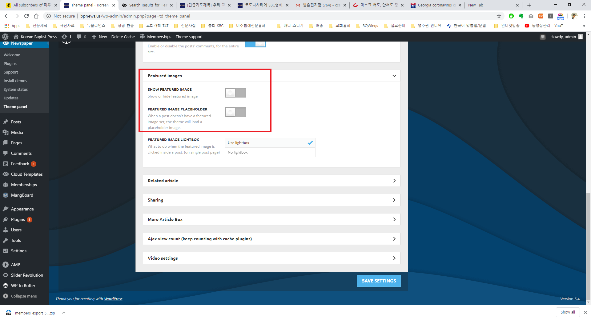
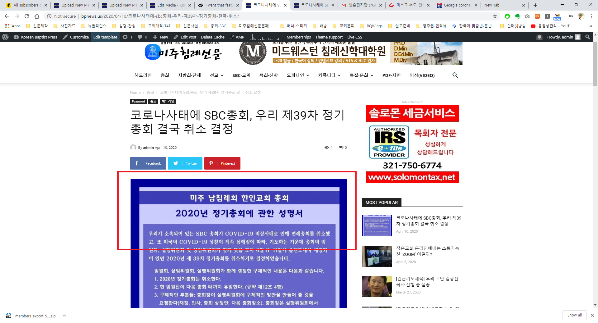
However still I see the featured image even I have tried other laptop(because I worried cache problem).
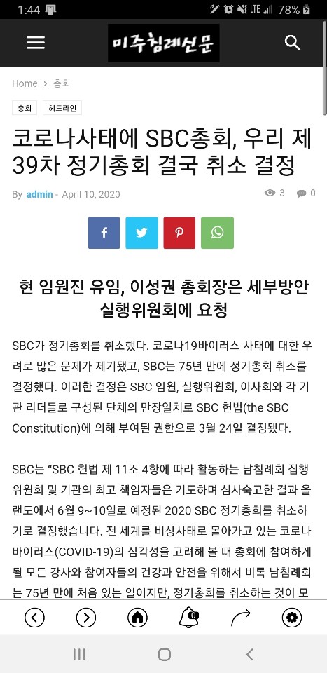
But I don’t see on mobile device.
I don’t know what is problem.
I will wait your reply.
Thanks
 ericfantich
 I’m not sure if it’s the mobile-menu.jpg time out? I don’t even know what the file is, or where to find it/remove it?
https://192.168.0.208/wp_011_sound_radar/wp-content/uploads/2017/04/mobile-menu.jpg
 Calin
Calin Hi,
“tagDiv Mobile Theme slide full size not change” please provide some more details about this problem, also some screenshots will help.
The revolution slider provide with our theme can be install and use like this :
How to install Revolution Slider v5
Import Revolution Sliders on demos if you want to have access the pre-made templates from Revolution Slider then you need to buy it.
No, must not purchase any license of WPBakery Page Builder, sorry! Please check the following topic from here -> https://help.market.envato.com/hc/en-us/articles/213762463-Bundled-Plugins
Thank you!
 chip303
I have activated AMP, it is also shown to me, unfortunately it does not appear in the dashboard.
Does anyone know advice?
Under the activated PlugIn:
The tagDiv Mobile Theme now works best with the AMP plugin to provide a complete solution for your content on mobiles. You can find out more here.
Calin Hi,
When the mobile version or amp is displaying on desktop is a cache problem, we recommend to use WP Super Cache with the settings from our guide -> https://forum.tagdiv.com/cache-plugin-install-and-configure/ also if you are using other cache plugins please deactivate them and make a test.
Let me know the results!
Thank you!
Calin Hi,
If you are using a PRO Demo then you can use tagDiv Composer -> https://i.imgur.com/MZlD2Er.png to add the social icons -> https://i.imgur.com/xbQ3gVf.jpg these from theme panel -> https://i.imgur.com/gKo59Ef.png will apply on mobile theme plugin and on standard demos and styles.
Thank you!
 rnbjunk
I don’t understand but my site is loading Mobile Theme on Desktop browsers.


 Boldoo2018


