
- ApiPractical example – How to add a new Block and Module
- ApiAPI – Smart Lists – Introduction
- ApiAPI – Category top section style – Introduction
- ApiAPI – Category top section template – Introduction
- Apitd_api_module::update
- Apitd_api_module::add
- ApiAPI – Modules – Introduction
- ApiUsing the Theme API in plugins
 caraos
Sorry for the bad English
For the boys of Tag Div
I have looked in the forum and have touched on this point many times, you have argued that this is the default option for AMP soon.
But you must understand a little to those of us who use this topic. By making that change we are risking losing our web traffic by changing the structure of / amp to? Amp
For a site that is starting out perfect, but for those of us who have thousands of urls indexed with that structure we can lose more than traffic and it’s a lot of money, I hope you understand us
 MahmoudKhadra
 I’ve already pasted it a long time ago and it worked greatly (The screenshot that I provided in the first paragraph shows what you intend to tell me), but after I installed the Ad Inserted plugin, the ads on mobile phone version broke down.
Thank you.
-
This reply was modified 7 years by
MahmoudKhadra.
 TimeToGoogle
Greetings
Is it possible to show the more article box mobile?
And purely by the settings, it is not possible to change the design fundamentally or?
If you prefer to show the box as bottom bar, could you do that through custom styling?
Best regards
 Vlad S
 Hello !
It appears that you are using the Mobile Theme Plugin wich comes included in our package. In order to display your ads on mobile devices you will have to go into Theme Panel – Mobile Theme – Mobile Ads and paste the codes there: https://www.screencast.com/t/1vUt6dfJAsTG
Thank you !
 thalesbrandao
 Catalin,
thanks.
Forgive me – I use Google Translate to talk.
about my link – how do I click to go to this page https://www.screencast.com/t/sOwz5x4LojLR >> notícias >>
http://www.cidademarketing.com.br/marketing/category/noticias/
on the first question – I need this page http://www.cidademarketing.com.br/marketing/category/noticias/ to be the home page in my mobile version. >> https://drive.google.com/open?id=1fU4pXdjMyMFVRAc8ni28bo1h13p34bcQ
how should I do?
thanks
 aleister
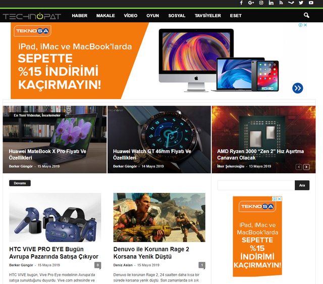
We have a weird bug that causes the website to be served in what I think of the mobile version. This happens from time to time.
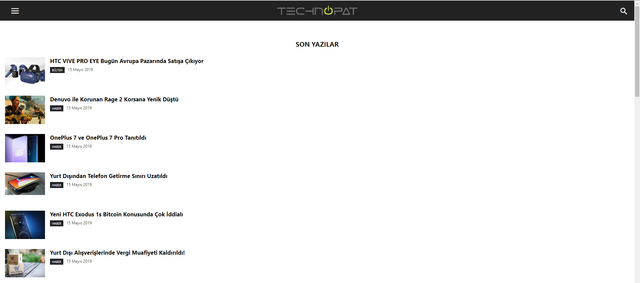
Normally, it looks like this:
Litespeed Web Server
PHP 7.3
Lightspeed Cache
WP 5.2
Newsmag Version 4.8
This started with v4.8.
MahmoudKhadra I used the “Ad inserted” plugin to add Google Auto AMP Ads, so I paste the header and body code in it, after that the ads stopped showing on via mobile (ONLY on mobile phones), so maybe some changes on html code caused that.
-
This reply was modified 7 years by
 Calin
Calin Hi,
If you are using the mobile theme the content from mobile editor will be update with the same button ( will be the same page with different content).
If you do not want to use the mobile theme you can deactivate it and use the responsive version of Newspaper theme, the mobile theme plugin is made to make your website faster on mobile version, only that.
Thank you!
 Simion C.
 Hi,
From what I know from searching online something must have changed on Facebook’s side, pasting the link to a Facebook video in the post content will not work anymore
– https://wordpress.org/support/topic/facebook-videos-dont-show-on-the-classic-editor/
– https://stackoverflow.com/questions/56143270/facebook-video-url-not-working-in-wordpress-sie
I get this – http://prntscr.com/nou6j8 – http://prntscr.com/nou6op
Using the embed code seems to still work – http://prntscr.com/nou70k
– http://prntscr.com/nou73w
This works in the mobile theme and AMP is active as well – http://prntscr.com/nou7hu
So if you embedded thee videos as mentioned they will work in the mobile theme + AMP version.
But the modal you are referring to when images are clicked (mobile theme active) will not work. That will work only for desktop. The mobile theme is kept as simple as possible, for increased speed. Some users asked for a solution to remove any interaction with the images, that could be done with CSS – https://forum.tagdiv.com/topic/disable-click-on-photo-in-the-mobile-theme/
Thanks
MahmoudKhadra Hi,
I know, the ads are working perfectly on Desktop version of website, but on mobile version they are not.
Please take a look on the website using a mobile phone browser.
Thanks ❤
Simion C. Hi,
There were quite a lot of similar issues reported here in the forum, one of our users found why it is happening. It is because of a setting in Adsense – https://prnt.sc/nc11h0
Try the same setting as in the screenshot, then the ad sizes should be respected on mobile.
Thanks
Simion C. Hi,
Maybe it is happening because of browser cache, I checked again with desktop Firefox
– http://prntscr.com/noraly – http://prntscr.com/norar2 – http://prntscr.com/noraup
And mobile Firefox – http://prntscr.com/norcog
Try to clear the cache of the browsers you are testing with, then check if it works the same for you.
As a side note, if you reply multiple times in the topic it will delay our answer. The topic will be moved to the back of the line because the topics are sorted by oldest.
Thanks
 Catalin
 Hi ShowbizCool,
First of all, thank you for your kind words! If you want to change the color and font family for your blockquote on mobile, you need to use a bit of custom CSS code for that, as you can see here -> https://www.screencast.com/t/KCokMBljpni
I have checked your license and I saw that it was expired for a long time, as you can see here -> https://www.screencast.com/t/t2uK62Jx, sorry! Please note that due to the previous warnings regarding the support period we will no longer to help you with your support request. Please understand our position and extend your support or we will be required to block your access to this forum. It is not fair to the other customers which pay for support, sorry!
Thank you for your understanding!
Simion C. Hi,
I see it, it looks like this – http://prntscr.com/noqrhf Only if I close the ad the socials and close icon can be seen.
I could give you a code to push the container down, so they will be visible. Something like this – http://prntscr.com/noqs8m – http://prntscr.com/noqtyu
It will apply for the mobile menu or search modal. Enter it in the phones section of the Advanced CSS section – http://prntscr.com/noquqp
.td-menu-mob-open-menu #td-mobile-nav,

.td-search-opened .td-search-wrap-mob {

margin-top: 94px;

}
Thanks
Calin Hi,
The mobile version is look like that because you have the mobile theme plugin that provide you a better speed then responsive version of theme, but in order to achieve that speed you’ll need to create a new content for pages because in the most of cases those were made with builders ( tagDiv Composer, WPBakery ) and you need to use only the mobile editor ( you need to set the content for pages in mobile editor and this content will be display on mobile theme)
-> https://www.screencast.com/t/ebUIzt4se
Mobile Theme: Automatic Optimization for Mobile with Newspaper Theme -> https://tagdiv.com/mobile-theme-automatic-optimization-for-mobile-newspaper-theme/
Also for the 3 blocks, you’ll need to have set same feature posts (that have set feature category) -> https://forum.tagdiv.com/featured-posts-2/ -> https://www.screencast.com/t/QsJ6ppY4
If you want the responsive version and amp you should use this opinion -> https://www.screencast.com/t/jZct5ueBqOrb but if you have amp activate on pages you’ll need to create in Mobile editor a content for AMP version of page.
If you do not have the featured category, you’ll need to add some posts in feature category -> https://forum.tagdiv.com/featured-posts-2/ if you do not have this category you can create it, just make sure that you set the category name to be
Featured
Let me know if you have more questions!
thalesbrandaoHello good day. I need to change the home page of the mobile version. my site is http://www.cidademarketing.com.br – how do I leave my home page being this link http://www.cidademarketing.com.br/marketing/category/noticias/
another question: the first three names of my mobile version menu do not work. how to solve?
background image not visible
https://drive.google.com/open?id=1fU4pXdjMyMFVRAc8ni28bo1h13p34bcQ (home)
https://drive.google.com/open?id=1O8AvmNTyDFe4xRW-Z21Y-gmOInAd2JLl (menu – 3 first items not working)
thanks.
thalesbrandao Simion, hello.
I have the same problem. I updated the theme to version 4.8 and installed the mobile theme – mobile + AMP plugin. my pages are not being treated as valid by Google Console. What do you suggest? Is there really an error in this plugin that could compromise the indexing of my site? I await a return. I’m losing traffic after the new update. My site: http://www.cidademarketing.com.br
https://drive.google.com/open?id=124i8izsVls3h2CSeFeXM0mhgMnjkM9k4 erro google console
https://drive.google.com/open?id=1JlPhVw-9RUdsmENsT5SpHqCD6CsE6b56 erro AMP invalid
help me!
-
This reply was modified 7 years by
thalesbrandao.
-
This reply was modified 7 years by
thalesbrandao hi Calin,
in the content for page appears to me the mobile version. and in the post option does not appear the space for publishing the mobile version. how to solve? another question, can not this page invalidation error in the Google Console be removed and this situation causes page indexing problems?
 DeanoAus
Hi guys 🙂
I’m thinking of enabling the mobile version with AMP, but when I do I have the following issues:
– All previously embedded videos (400+ posts) fail to parse and just show a url.
– All images which would normally present a popup / modal image box link directly to the image file, navigating away from the page.
When using the mobile theme, is there a way to support embedded video links, without me having to edit 400 posts to include facebook embed code?
Can support be given to allow users viewing a post in the mobile theme to be able to click an image and not be navigated away from the post?
Website : https://www.flashover.com.au
Thank you!
 rush86999
 when i deactivate the mobile theme, it starts working again. I have kept it deactivated.
rush86999hello,
on the mobile version, i m getting the above message. It is a wordpress multi-site install on aws elastic beanstalk. This is a fresh install
 ShowbizCool
 Thanks for the reply… Umm, so seems having made some adjustments to the standard theme thought the settings it might be difficult to match the main website to the mobile version with your theme.
Not sure I know how or even if it is possible to use inspector browser functionality with a mobile. Shame you could not give an example of the coding that might be required.
I give the problem some thought to see if there is another way to get around this problem.
 Ladiesabroad
 Hi again
I really love what the CSS changes above does to my blog, both on desktop and mobile. But after the last WP/theme update something has changed on the desktop; the two columns with pictures next to eachother are no longer the same size of the pictures in the text blog/width. https://www.ladiesabroad.se/2019/04/isla-holbox-mexiko.html, scroll down a bit. (At least I noticed it had changed today, and I did the updates yesterday.)
At the moment I have this CSS pasted into the Costum CSS section:
.single .wp-block-column:not(:last-child) { margin-right: 5px; } .single .wp-block-column:not(:first-child) { margin-left: 5px; } .single .wp-block-image{ margin-bottom: 8px; } .single .has-2-columns .wp-block-column{ margin-bottom: 0px; } .td-post-content p { margin-top: 26px; }
And this in the Advanced CSS -> iPhone section:
.single .wp-block-column:not(:last-child) {
margin-right: 0px;
} .single .wp-block-column:not(:first-child) {
margin-left: 0px;
}
 enessolh
Hello,
When I use 250×250 ads, it shows in the middle but when I tried to use 300×250 adsense ads it is little bit outside the page and it annoying so How can I solve this issue? Thank you
teknovv.com
https://www.screencast.com/t/SQiiewdja8g
https://www.screencast.com/t/ZLID1F1LbWTj
 walterwap
Hello,
I ask for help with the mobile version of my website.
When I do not use the AMP plugin the responsive version no longer fits for mobile or small screens as this prints
Mobile: https://imgur.com/guuHEk6
iPad: https://imgur.com/GLVnZYq
When I use the configuration-independent AMP plugin –
and create a mobile version, the AMP site hides the desktop version of the site in any browser
I want my site to bring the user independent desktop and mobile experiences if I’m going to use responsive or AMP.
Someone help me?
