
No search results were found in Documentation!
 Anamaria
 Hello,
The issue is that the image has extension webp for og:image https://developers.facebook.com/docs/sharing/webmasters/#media
Also, it depends. Do you use a plugin to add the extension webp or upload the images with this extension?
Also, you can set an image here https://i.imgur.com/P0c1Ll3.png
Thank you!
 NyttenET
Hi Team,
I am managing eurasaintimes.com and I am getting an issue where the amp URL of one of the category is showing as blank i.e https://www.eurasiantimes.com/category/indo-pak-news/?amp Please check and let me know incase of any further details required!
Error Log : https://drive.google.com/file/d/171AMNY2y6F4xquIMNnnfrV1Gl4hXMD1b/view?usp=sharing
 homebusinessmag
Hello,
Is it possible to increase the width of the website, so that it takes up more width when viewed on a display monitor. See screenshotS. I included screenshots from 2 other content websites. Their content stretches most of the width of the screen. Where homebusinessmag.com is much narrower. Can homebusinessmag.com existing content be enlarged so that it fills in more of the width of the screen (no actual change to the content). Also, the current narrow website view makes the website look dated? maybe there is some kind of display setting that can be fixed to controls this display view? I’m noticing that most all content websites are much wider than HBM, fill in more width and are more readable. If you can please advise. Thanks!
Richard
Screenshots other websites:
https://drive.google.com/file/d/1jlOxDQQn3kJmJaEE67HSlGjRD3Eoqndj/view?usp=sharing
Entrepreneur magazine:
https://drive.google.com/file/d/1B53Z6jj9qCtFaZQIuAf5GADTBkIs2ntG/view?usp=sharing
PARENTS CANADA MAGAZINE:
https://drive.google.com/file/d/1nNFtMRdfY8MEkDu8to2t9wi3P1u_hHzz/view?usp=sharing
 Stephan
Hello, I have the following problem: When I share one of my articles on Facebook, the image that appears is not the featured image of my post, but instead an image of the number 12. How can I fix this issue? I want my featured image to be displayed on Facebook.
Here a picture: 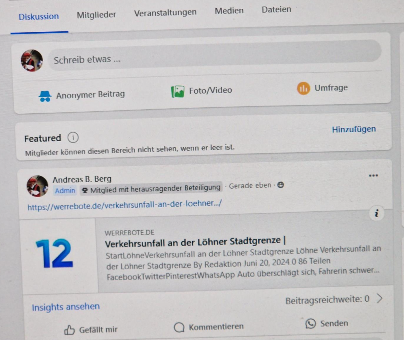
Best
Stephan
Anamaria Hello,
The issue is that the image has extension webp for og:image, if you have checked another post the share works -> https://developers.facebook.com/docs/sharing/webmasters/#images
Thank you!
 simchris
 I’ve gotten no notice from FB that they are changing the default “share post” method used forever on billions of web pages.
Theme, like most share plugins, uses the normal default share link method, not something unique to theme.
FB just periodically has issues. Page not available error on share to my logged in account has nothing to do with share link, for instance.
Usual thing is “try again later.”
Just my experience anyway. I started sharing our content to social in 2005, so been through the ringer on this topic 🙂
 efisher_ftec
In the last couple of days, we have noticed that using the Facebook share icon in the posts no longer works. Instead, we get a ‘reload’ button on the facebook page. At first, we thought it was a plugin, but turns out that your demo site does the same thing. If you go to:
and click the Facebook icon, you are directed to:
You must be logged in to Facebook before the blank page with reload button appears.
Sharer.php seems to be deprecated and no support according some posts on Facebook’s forums. Do you have any updates or new ways we can use to share posts to Facebook, or should we be looking at using a dedicated plugin for that?
 cloverjim
 .td_data_time {margin-left: 32px; margin-right: auto;}
.top-header-menu li a {margin-left: 16px; margin-right: auto;}
.top-header-menu .avatar {margin-left: 6px; margin-right: auto;}
.top-header-menu .td-icon-logout {margin-left: 2px; margin-right: auto;}
.mfp-content .td-login-inputs label {left: auto; right:0;}
.td-header-row [class*=”td-header-sp”] {float: right;}
.top-bar-style-1 .td-header-sp-top-widget {float: left;}
.sf-menu li {float: right;}
.td-header-main-menu {padding-right: 0; padding-left: 48px}
#td-top-search {right: auto; left:0;}
.sf-menu .td-icon-menu-down {padding-left: 0; padding-right: 7px;}
.sf-menu a.sf-with-ul {padding-left: 31px; padding-right: 14px;}
.td-mega-menu ul.sub-menu {left: auto !important; right:-23px !important;}
.sf-menu li:hover ul, .sf-menu li.sfHover ul {left: auto; right:0;}
.sf-menu > li.td-normal-menu > ul.sub-menu {left: auto; right:-15px;}
.td-mega-span {margin-left: auto; margin-right: 22px; float: right;}
.td-admin-edit {left: auto; right: 0;}
.td-post-category {margin-right: auto; margin-left: 5px;}
.td-mega-span h3 {line-height: 24px;}
.td_mega_menu_sub_cats .cur-sub-cat::before {right: auto; left: 0;}
.td_mega_menu_sub_cats::after {right: auto; left:0;}
.td-mega-menu .td_block_mega_menu .td-next-prev-wrap {margin: 0 22px 22px 0;}
.td-icon-menu-right::before {content: ‘\e80c’;}
.td-icon-menu-left::before {content: ‘\e80d’;}
.header-search-wrap, .header-search-wrap .td-drop-down-search {right: auto; left: 0}
.header-search-wrap .td-drop-down-search::before {right: auto;left: 19px;}
.td-header-wrap #td-header-search {border-left: 0; border-right: 1px solid #e1e1e1;}
.header-search-wrap .td-drop-down-search .btn {right:auto; left: 20px}
.td-next-prev-wrap .td-ajax-next-page {padding-right: 2px; padding-left: 0;}
.td-next-prev-wrap .td-ajax-prev-page {padding-left: 1px; padding-right: 0;}
.header-search-wrap .td-aj-search-results .td-module-thumb {margin-left:auto; margin-right: 20px;}
.header-search-wrap .td-aj-search-results .item-details {margin: 5px 115px 10px 20px;}
.header-search-wrap .td-aj-search-results {padding: 10px 0 5px 0;}
.td-main-menu-logo {float: right; margin-right: auto; margin-left: 10px;}
.td-trending-now-wrapper .td-next-prev-wrap {right: auto; left: 0px; position: absolute;}
.td-trending-now-wrapper .td-trending-now-nav-right {padding-left: 0; padding-right: 2px;}
.td-next-prev-wrap a {margin-right: auto; margin-left: 7px;}
.td-trending-now-post {padding-right: 0; padding-left: 119px;}
.td-trending-now-display-area {padding: 0 15px 0 0;}
.td_block_big_grid_3 .td-big-grid-post {float: right;}
.td_block_big_grid_3 .td-big-thumb {margin-right: auto; margin-left: 3px;}
.td_block_big_grid_3 .td-big-grid-post-3 {margin-left: auto; margin-right: 3px;}
.td-grid-style-1 .td-big-thumb .td-big-grid-meta {margin: 0 20px 0 0;}
.td-big-grid-post .td-module-meta-info {margin: 11px 20px 20px 0;}
.td-grid-style-1 .td-medium-thumb .td-big-grid-meta {margin: 20px 19px 14px 0;}
.td-big-grid-post.td-small-thumb .td-big-grid-meta .entry-title {line-height: 32px;}
.td-grid-style-1 .td-small-thumb .entry-title {font-size: 14px;}
.td-grid-style-1 .td-medium-thumb .entry-title {font-size: 18px;}
.td-big-grid-post.td-big-thumb .td-big-grid-meta .entry-title {line-height: 46px;}
.td-grid-style-1 .td-big-thumb .entry-title {font-size: 24px;}
.td-subcat-filter .td-subcat-list .td-subcat-item {margin-left: auto; margin-right: 30px;}
.td-subcat-filter {right: auto; left: 0;}
.td-subcat-filter .td-subcat-dropdown .td-subcat-more {margin-left: auto; padding-left: 0; margin-right: 15px; padding-right: 15px;}
.td-subcat-filter .td-subcat-dropdown ul {right: auto; left: 0;}
.td-block-row [class*=”td-block-span”] {float: right;}
.td_module_wrap .entry-title {line-height: 32px; font-size: 16px;}
.td-module-comments {float: left;}
.td_module_6 .entry-title {font-size: 13px; line-height: 26px;}
.td-excerpt {line-height: 26px;}
.td-module-comments a::after {right: 0; left: auto;}
.td_module_6 .td-module-thumb {right: 0; left: auto;}
.td_module_6 .item-details {margin-right: 116px; margin-left: auto;}
.td_module_mx2 .entry-title {font-size: 13px; line-height: 24px;}
.td-social-style4 .td-sp {margin-right: auto; margin-left: 5px;}
.td_social_type .td_social_info {padding: 0 9px 0 0;}
.td_social_type .td_social_button {float: left;}
.td_module_mx4 .entry-title {font-size: 14px;}
.td-column-1 .td_module_mx4 .entry-title {line-height: 25px;}
.td_module_10 .td-module-thumb {left: auto; right: 0;}
.td_module_10 .item-details {margin-left: auto; margin-right: 244px;}
.td_module_mx2 .item-details {margin: 0 90px 20px 0;}
.td-grid-style-6 .td-small-thumb .td-big-grid-meta .entry-title {line-height: 32px;}
.td_ajax_load_more i {margin-left: auto; margin-right: 6px;}
.page-nav a, .page-nav span {float: right;}
.page-nav .pages {float: left;}
.widget_categories li .td-cat-no {float: left;}
.td-footer-wrapper .widget_categories li span {margin-left: 0; margin-right: auto;}
#td-mobile-nav {transform: translate3d(99%, 0, 0); -webkit-transform: translate3d(99%, 0, 0); -moz-transform: translate3d(99%, 0, 0); -ms-transform: translate3d(99%, 0, 0); -o-transform: translate3d(99%, 0, 0); right: -1%; left: auto;}
.td-subfooter-menu li a {margin-right: auto; margin-left: 16px;}
.td-subfooter-menu li:last-child a {margin-right: auto; margin-left: 0;}
.footer-text-wrap {line-height: 28px;}
.td-social-style-2 .td-social-icon-wrap {margin: 5px 0 10px 10px;}
.td-pb-row [class*=”td-pb-span”] {float: right;}
.td-social-style-2 .td-social-icon-wrap:last-child {margin-left: 0;}
.td-sub-footer-container .td-sub-footer-menu {float: left;}
.td-search-wrap-mob .td_module_wrap {text-align: right; padding-bottom: 35px;}
#td-mobile-nav .td-guest-wrap .td-menu-avatar {margin-right: auto; margin-left: 10px;}
.td-mobile-content .td-icon-menu-right {float: left; right: auto; left: -4px;}
.td-mobile-content .td-icon-menu-right::before {content: ‘\e80c’;}
.td-mobile-content .td-icon-menu-right{transform: rotate(0deg); -webkit-transform: rotate(0deg); -moz-transform: rotate(0deg); -ms-transform: rotate(0deg); -o-transform: rotate(0deg);}
.td-mobile-content .td-sub-menu-open > a i {transform: rotate(-90deg); -webkit-transform: rotate(-90deg); -moz-transform: rotate(-90deg); -ms-transform: rotate(-90deg); -o-transform: rotate(-90deg);}
.td-mobile-content .sub-menu a {padding: 9px 36px 9px 26px !important;}
.td-mobile-content li a {font-size: 18px;}
.td-mobile-close {right: auto; left: 1px;}
#td-mobile-nav .td-menu-socials {padding: 0 20px 0 65px;}
#td-mobile-nav .td-social-icon-wrap {margin: 20px 0 0 5px;}
.td-icon-read-down::before {content: ‘\e83d’;}
#td-mobile-nav .td-register-section .td-icon-read-down {transform: rotate(-90deg); -webkit-transform: rotate(-90deg); -moz-transform: rotate(-90deg); -ms-transform: rotate(-90deg); -o-transform: rotate(-90deg);}
#td-mobile-nav .td-login-panel-title span {margin-bottom: 30px;}
#td-mobile-nav label {left: auto; right: 10px;}
.entry-crumbs .td-icon-right::before {content: ‘\e802’;}
.post header .entry-title {font-size: 28px;}
header .td-post-author-name {float: right;}
.td-post-author-name div {margin-right: auto; margin-left: 2px;}
header .td-post-author-name a {margin-right: auto; margin-left: 3px;}
header .td-post-date {margin-left: auto; margin-right: 4px; float: right;}
header .td-post-comments {float: left;}
.td-post-template-default .td-post-title .td-post-comments {margin-left: auto; margin-right: 22px;}
header .td-icon-comments {margin-right: auto; margin-left: 5px;}
header .td-post-views {float: left;}
.td-post-template-default .td-post-title div.td-post-views {margin-right: auto; margin-left: 0;}
header .td-icon-views {margin-right: auto; margin-left: 5px;}
.td-social-sharing-buttons {margin-right: auto; margin-left: 10px;}
.td-social-facebook .td-social-but-text, .td-social-twitter .td-social-but-text {border-right: 1px solid rgba(255, 255, 255, 0.1); border-left: none;}
.td-social-but-text {padding-left: 0; padding-right: 10px; margin-left: auto; margin-right: 12px;}
.td-social-google .td-icon-googleplus {left: auto; right: -4px;}
h3 {font-size: 18px; line-height: 38px;}
.wp-caption-text, .wp-caption-dd {text-align: right; line-height: 24px;}
.td-page-content p, .td-post-content p, .wpb_text_column p, .td_block_text_with_title p, .woocommerce #tab-description p, .mce-content-body p, .td-page-content li, .td-post-content li, .wpb_text_column li, .td_block_text_with_title li, .woocommerce #tab-description li, .mce-content-body li {line-height: 30px; font-size: 14px;}
.td-page-content, .td-post-content, .wpb_text_column, .td_block_text_with_title, .woocommerce #tab-description, .mce-content-body {line-height: 30px; font-size: 14px;}
ul li, ol li {margin-left: auto; margin-right: 21px;}
.td-footer-wrapper li {margin-right: 0;}
.top-header-menu li {margin-left: auto; margin-right: 0;}
.td-subfooter-menu li {margin-left: auto; margin-right: 0;}
.td-page-content .td-arrow-list li::before, .td-post-content .td-arrow-list li::before, .wpb_text_column .td-arrow-list li::before, .td_block_text_with_title .td-arrow-list li::before, .woocommerce #tab-description .td-arrow-list li::before, .mce-content-body .td-arrow-list li::before {content: ‘\e802’; float: right; margin-right: -16px; margin-left: auto; line-height: 30px;}
.td-page-content blockquote p, .td-post-content blockquote p, .wpb_text_column blockquote p, .td_block_text_with_title blockquote p, .bbpress blockquote p, .woocommerce #tab-description blockquote p, .mce-content-body blockquote p, .comment-content blockquote p {line-height: 45px; font-size: 26px;}
.td-post-share-title {margin-right: auto; margin-left: 20px;}
.td-post-next-prev-content a {line-height: 28px;}
.author-box-wrap .avatar {float: right;}
.author-box-wrap .desc {margin-left: auto; margin-right: 117px;}
.author-box-wrap .td-author-social .td-icon-font {margin-right: auto; margin-left: 15px;}
.td_block_related_posts .td-module-title {line-height: 26px;}
.comment .avatar {float: right; margin-right: auto; margin-left: 15px;}
.comment {margin-left: auto; margin-right: 0;}
.comment .children {margin-left: auto; margin-right: 70px;}
.comment .comment-content p {line-height: 26px;}
.comment .comment-content, .comment .comment-meta, .comment .comment-respond {margin-left: auto; margin-right: 70px;}
.comment-link {padding-left: 0; padding-right: 10px;}
textarea {line-height: 26px;}
.comment .children .comment .comment-content, .comment .children .comment .comment-meta, .comment .children .comment .comment-respond {margin-left: auto; margin-right: 56px;}
.td_block_18 .td-column-1 .td_module_mx8 .entry-title {font-size: 16px;line-height: 30px;}
.td_module_mx8 .td-post-date {margin-right: auto; margin-left: 22px;}
.td-tags li {margin-right: 0; margin-left: auto; float: right;}
.td-tags span:first-child {margin-right: 0;} /* ino khodam add kardam */
.td-post-template-11 .td-post-header .entry-title {line-height: 42px;}
.td-post-template-11 .td-post-title .td-post-date {margin-left: 22px; margin-right: 4px;}
header .td-post-views {margin-right: auto; margin-left: 22px;}
.td-post-template-11 .td-related-title {text-align: right !important;}
.td-post-template-11 .td-related-title .td-related-left, .td-post-template-11 .td-related-title .td-related-right {padding: 9px 0 5px 20px !important;}
.td-post-template-11 .td-related-title .td-related-right {margin-left: 50px !important; margin-right: 0 !important;}
.td-post-template-11 .td-related-title .td-related-left {margin-right: 0 !important; margin-left: 0 !important;}
.td-post-template-11 .td_block_related_posts .td-next-prev-wrap {right: auto; left:0;}
.td-post-template-11 .td_block_related_posts .td-next-prev-wrap a {margin-right: 10px; margin-left: 0;}
.td-related-row [class*=”td-related-span”] {float: right;}
.td-related-full-width .td-related-row .td-related-span4 {padding-left: 0; padding-right: 22px;}
.td_block_big_grid_7.td-grid-style-5 .td-small-thumb .td-meta-info-container {padding: 0 18px 0 30px;}
.td-grid-style-5 .td-small-thumb .entry-title {font-size: 16px; line-height: 32px !important;}
.td_block_20 .td-module-comments {margin-right: auto; margin-left: 0; right: auto; left: 20px;}
.td_block_big_grid_1 .td-big-grid-post {float: right;}
.td_block_big_grid_1 .td-big-thumb {margin-right: auto; margin-left: 3px;}
.td_block_big_grid_1 .td-big-grid-post-1, .td_block_big_grid_1 .td-big-grid-post-3 {margin-right: auto; margin-left: 3px;}
#td-mobile-nav .td-menu-avatar {left: auto; right: 20px;}
#td-mobile-nav .td-menu-username {margin: 0 95px 0 100px;}
#td-mobile-nav .td-menu-logout {left: 20px; right: auto;}
.td-theme-slider {direction: ltr;}
.td_block_slide .td-slide-meta {direction: rtl;}
.iosSlider-col-3 .entry-title {font-size: 28px;}
.td_block_slide .td-post-date {margin-left: auto; margin-right: 4px;}
.td_block_slide .td-post-comments {margin-left: auto; margin-right: 10px;}
.td_block_slide .td-icon-comments {margin-right: auto; margin-left: 5px;}
.widget li {margin-right: 12px;}
.td-block-span6 .td_module_8 .entry-title {font-size: 14px;}
.td_module_16 .td-module-thumb {left: auto; right: 0;}
.td_block_21.td-column-1 .item-details {margin-left: auto; margin-right: 115px;}
.td_block_21.td-column-1 .entry-title {font-size: 14px; line-height: 28px; padding-right: 0;}
.td_module_16 .item-details {margin-left: auto; margin-right: 174px;}
.td-post-template-8 .td-post-header-holder {text-align: right;}
.td-post-template-8 .td-post-header .entry-title {font-size: 32px;}
.td-post-template-8 .td-post-title .td-post-date {margin-right: 4px; margin-left: 22px;}
.td-image-gradient-style8::after {left: auto; right: 0;}
body .td-stretch-height {left: -50%; transform: translateX(50%); -webkit-transform: translateX(50%); -moz-transform: translateX(50%); -ms-transform: translateX(50%); -o-transform: translateX(50%);}
.td_block_big_grid_8 .td-big-grid-scroll .td-big-grid-post .td-big-grid-meta .entry-title {line-height: 32px;}
.td-grid-style-3 .td-big-thumb .td-big-grid-meta {margin: 20px 20px 20px 0;}
.td-grid-style-2 .td-big-grid-post.td-big-thumb .td-big-grid-meta .entry-title, .td-grid-style-3 .td-big-grid-post.td-big-thumb .td-big-grid-meta .entry-title {font-size: 28px; line-height: 58px;}
.td_block_18 .td_module_mx8 .entry-title {font-size: 22px; line-height: 42px;}
.td-grid-style-5 .td-big-grid-post.td-big-thumb .td-big-grid-meta .entry-title {font-size: 24px;}
.td_block_big_grid_2 .td-big-grid-post {float: right;}
.td_block_big_grid_2 .td-big-thumb {margin-right: auto; margin-left: 3px;}
.td-subcat-filter .td-subcat-dropdown li {margin-right: 0;}
.td-big-grid-slide .td_block_wrap {direction: rtl;}
.td-big-grid-post.td-big-thumb .td-big-grid-meta .entry-title {font-size: 20px;}
.td_block_19 .td_module_mx2 .item-details .entry-title {line-height: 28px; font-size: 13px;}
.iosSlider-col-1 .entry-title {font-size: 16px; line-height: 30px;}
.td_module_7 .entry-title {font-size: 13px; line-height: 28px;}
.td-big-grid-post.td-small-thumb .td-big-grid-meta .entry-title {font-size: 16px;}
.td_block_16 .td_module_mx7 .entry-title {font-size: 15px; line-height: 28px;}
.td_module_11 .td-module-thumb {left: auto; right: 0;}
.td_module_11 .item-details {margin-left: auto; margin-right: 350px;}
.td-big-grid-post.td-tiny-thumb .td-big-grid-meta .entry-title {font-size: 14px; line-height: 28px;}
.iosSlider-col-2 .entry-title {font-size: 22px; line-height: 44px;}
.td-footer-instagram-container .td-footer-instagram-title {letter-spacing: 0;}
.td-category-header .td-category-pulldown-filter {right: auto; left: 0;}
.td-category-header .td-pulldown-filter-item {margin-left: auto; margin-right: 0;}
.td-category-header .td-pulldown-filter-list {text-align: right;}
.td-weather-top-widget {margin-right: auto; margin-left: 32px;}
.td-category-header .td-icon-menu-down {margin-left: auto; margin-right: 5px; top: 0;}
.td-grid-style-2 .td-big-thumb .td-big-grid-meta {margin: 20px 20px 20px 0;}
.td-category-description p {line-height: 32px;}
.td_block_template_1 .block-title {text-align: right;}
.mfp-title {text-align: right;}
.td_block_template_2 .td-block-title {text-align: right;}
.td-mega-menu ul.sub-menu {transform: unset; -webkit-transform: unset; -moz-transform: unset; -ms-transform: unset; -o-transform: unset;}
.td-post-small-box span {float: right;}
.td-post-small-box a {float: right; margin-right: 4px; margin-left: auto;}
#td-mobile-nav .td-guest-wrap .td-menu-login {margin-right: 20px;}
.td-post-template-12 .td-post-header .entry-title, .td-post-template-13 .td-post-header .entry-title {line-height: 68px; letter-spacing: 0;}
.td_block_big_grid_9 .td-big-grid-post .entry-title {line-height: 32px;}
.td-page-content .td_quote_box, .td-post-content .td_quote_box, .wpb_text_column .td_quote_box, .td_block_text_with_title .td_quote_box, .bbpress .td_quote_box, .woocommerce #tab-description .td_quote_box, .mce-content-body .td_quote_box, .comment-content .td_quote_box {border-left: none; border-right: 2px solid #4db2ec;}
.td-location-icon {right:auto; left: 10px;}
.td-weather-city {margin-bottom: 14px;}
.td-post-template-12 .td-post-header .td-post-title .td-post-comments, .td-post-template-13 .td-post-header .td-post-title .td-post-comments, .td-post-template-12 .td-post-header .td-post-title .td-post-views, .td-post-template-13 .td-post-header .td-post-title .td-post-views {margin-right: 22px; margin-left: 0;}
.td-search-form-widget .wpb_button {right: auto; left: 0;}
.td-search-form-widget .td-widget-search-input {border-right: 1px solid #e1e1e1; border-left: 0;}
.td-search-form-widget div {text-align: right;}
.td_block_template_8 .td-block-title {text-align: right;}
.td_block_template_8 .td-block-title > * {padding-right: 0; padding-left: 20px;}
.td-block-title-wrap .td-wrapper-pulldown-filter {right: auto; left: 0;}
.td-block-title-wrap .td-wrapper-pulldown-filter .td-pulldown-filter-display-option span {padding-left: 0; padding-right: 20px; margin-right: auto; margin-left: -14px;}
.td-block-title-wrap .td-wrapper-pulldown-filter .td-pulldown-filter-display-option i {margin-left: 10px; margin-right: 20px;}
.td-block-title-wrap .td-wrapper-pulldown-filter .td-pulldown-filter-list {left: 0; right: auto;}
.td-post-sharing-top, .td-post-sharing-bottom {direction: ltr;}
.td-post-sharing-top .td-social-but-text, .td-post-sharing-bottom .td-social-but-text {padding-left: 12px; padding-right: 17px; margin-left: -6px;}
.td-ps-border-grey .td-social-but-icon, .td-ps-border-grey .td-social-but-text {border-color: #e9e9e9;}
.td-page-content .dropcap, .td-post-content .dropcap, .wpb_text_column .dropcap, .td_block_text_with_title .dropcap, .bbpress .dropcap, .woocommerce #tab-description .dropcap, .mce-content-body .dropcap, .comment-content .dropcap {float: right; margin: 9px 0 0 13px;}
.td_category_template_7 .td-crumb-container {left: auto; right: 0;}
.td_mega_menu_sub_cats {text-align: left;}
.td-header-style-5 .td-main-menu-logo img {margin-right: auto; margin-left: 20px;}
.td_block_template_5 .td-block-title {text-align: right;}
.td-post-template-3 .td-post-title .td-post-comments, .td-post-template-3 .td-post-title .td-post-views {margin-left: 0; margin-right: 22px;}
.td-page-content .td_box_left p, .td-post-content .td_box_left p, .wpb_text_column .td_box_left p, .td_block_text_with_title .td_box_left p, .bbpress .td_box_left p, .woocommerce #tab-description .td_box_left p, .mce-content-body .td_box_left p, .comment-content .td_box_left p {text-align: right;}
.td-page-content .td_quote_box p, .td-post-content .td_quote_box p, .wpb_text_column .td_quote_box p, .td_block_text_with_title .td_quote_box p, .bbpress .td_quote_box p, .woocommerce #tab-description .td_quote_box p, .mce-content-body .td_quote_box p, .comment-content .td_quote_box p {line-height: 26px;}
.td-page-content .td_box_right p, .td-post-content .td_box_right p, .wpb_text_column .td_box_right p, .td_block_text_with_title .td_box_right p, .bbpress .td_box_right p, .woocommerce #tab-description .td_box_right p, .mce-content-body .td_box_right p, .comment-content .td_box_right p {text-align: right;}
.td-category-siblings .td-subcat-dropdown li {margin-left: auto; margin-right: 0;}
.td-category li {margin: 0 0 5px 5px;}
.td_block_author .td-author-description {line-height: 26px;}
.td_module_18 .td-module-comments {right: auto; left: 0;}
.tdc-row[class*=”stretch_row”] > .td-pb-row > .td-element-style {right: 50% !important; left: auto !important;}
.sf-menu .sub-menu .td-icon-menu-down {right: auto; left: 19px;}
a.sf-with-ul i.td-icon-menu-down::before {content: ‘\e807’;}
.sf-menu .td-normal-menu ul ul {left: auto !important; right: 100% !important;}
.td-boxed-layout .td-post-template-3 .td-post-header-holder {left: auto; right: -48px;}
.select2-container {z-index: 99999;}
.td-instagram-user {direction: ltr;}
.td-instagram-meta {direction: ltr;}
.td_block_template_11 .td-block-title {text-align: right;}
.td_module_19 .td-module-image {right: 0; left: unset;}
.td-pb-span12.td-main-content .td_module_19 .td-item-details {margin-right: 564px; margin-left: auto;}
.td_module_19 .td-item-details {margin-right: 294px; margin-left: auto;}
.td_module_19 .td-post-category {right: 0; left: auto;}
.td_block_template_11 .td-related-title a {margin-right: auto; margin-left: 20px;}
.td_block_24 .td-column-3 .td-item-details {margin-right: 564px; margin-left: auto;}
.td_module_9 .entry-title {line-height: 32px;}
.td-next-prev-wrap .td-trending-now-nav-right {margin-right: auto; margin-left: 0;}
.comment-form-cookies-consent label {margin-left: auto; margin-right: 8px;}
.widget_recent_comments a, .td_wp_recentcomments a {margin-left: auto; margin-right: 5px;}
.td-post-template-2 .td-post-title .td-post-date {margin-right: auto; margin-left: 22px;}
.td-header-style-6 .td-main-menu-logo {margin-right: auto; margin-left: 42px;}
.td_block_template_4 .td-block-title {text-align: right;}
.td_block_template_4 .td-block-title > ::before {left: auto; right: 10px;}
.td_block_template_8 .td-related-title a:last-child::after {right: 100%; left: auto;}
.td_block_big_grid_8.td-grid-style-2 .td-video-play-ico img, .td_block_big_grid_8.td-grid-style-3 .td-video-play-ico img {left: 0; right: auto;}
.td-post-template-2 .td-post-header .entry-title {font-size: 28px;}
.td-subfooter-menu li a {line-height: 28px;}
.td-smart-list-button .td-icon-right {padding-left: unset; padding-right: 11px;}
.td-smart-list-button .td-icon-left {padding-right: unset; padding-left: 11px;}
.td-smart-list-button .td-icon-right::before {content: ‘\e802’;}
.td-smart-list-button .td-icon-left::before {content: ‘\e803’;}
.td-mx-13 .entry-title {font-size: 13px; line-height: 24px;}
.td-big-grids-fl .td-module-meta-info {margin-right: 0; margin-bottom: 0;}
.td-post-template-4 .td-post-title {padding: 21px 0 0 21px;}
.td_block_big_grid_fl_2 .td-big-grid-post .entry-title {line-height: 32px;}
.td_block_template_13 .td-block-title {text-align: right;}
.td_block_template_13 .td-block-subtitle {right: -4px; left: auto; font-size: 70px;}
.td_block_template_2 .td-related-title a {padding: 0 0 0 20px;}
.td_block_template_12 .td-related-title > a.td-related-left, .td_block_template_13 .td-related-title > a.td-related-left, .td_block_template_12 .td-related-title > a.td-related-right, .td_block_template_13 .td-related-title > a.td-related-right {margin-right: 0 !important; margin-left: 15px !important;}
.td_block_template_12 .td-related-title a, .td_block_template_13 .td-related-title a {margin-right: auto; margin-left: 20px;}
.tdc-row[class*=”stretch_row”] > .td-pb-row > .td-element-style {transform: translateX(50%) !important;}
.td_block_template_12 .td-block-title {text-align: right;}
.td-pinterest-wrap {direction: ltr;}
.td-footer-template-13 .td-social-name {margin-left: auto; margin-right: 10px;}
.td-category-title-holder .td-page-title {font-size: 24px; line-height: 42px;}
.td-instagram-wrap {direction: ltr; text-align: left;}
.td-search-wrap-mob .td_module_wrap .entry-title {font-size: 14px; line-height: 28px;}
.td-post-template-6 .td-post-title .td-post-date {margin-right: auto; margin-left: 22px;}
.td-header-style-8 .td-header-top-menu {margin-left: auto; margin-right: 282px;}
.td-header-style-8 .td-header-main-menu {padding-left: unset; padding-right: 282px;}
.td_module_8 .entry-title {font-size: 15px; line-height: 30px;}
.td-post-template-7 .td-post-header .entry-title {font-size: 32px; line-height: 62px;}
.td-post-template-7 .td-post-title .td-post-date {margin-right: 4px; margin-left: 22px;}
.td_mega_menu_sub_cats a {font-weight: 500;}
.td_module_18 .td-icon-menu-right {margin-right: 8px; margin-left: auto; vertical-align: -1px;}
.td-header-style-7 .sf-menu {float: left;}
.td-header-style-7 .td-header-sp-logo {margin-right: auto; margin-left: 42px; float: right;}
.td-scroll-up {right: unset; left: 5px;}
.td_smart_list_6 .td-number-and-title {text-align: right;}
.td_smart_list_6 .td-sml-current-item-title {padding-left: unset; padding-right: 56px;}
.td-sml-current-item-nr {left: unset; right: 0;}
.td_smart_list_7 .td-smart-list-pagination .td-smart-next {float: left;}
.td_smart_list_7 .td-smart-list-pagination .td-smart-back {float: right;}
.td_block_big_grid_fl_8 .td-big-grid-post {float: right;}
.sf-menu a.sf-with-ul {padding-right: 14px; padding-left: 31px;}
.td_block_related_posts .td-module-title {font-size: 14px;}
.td_block_slide .iosSlider-col-1 .entry-title {line-height: 32px;}
.td-post-template-3 .td-post-header .entry-title {font-size: 28px;}
.td-post-category {font-size: 12px;}
.author-box-wrap .desc {font-size: 13px;}
.td_module_19 .entry-title {font-weight: 700;}
.td_module_19 .td-excerpt {font-size: 14px;}
.td-header-menu-social {float: left;}
.td-header-menu-no-search .td-header-main-menu {padding-left: 0;}
.td-header-menu-no-search .td-header-menu-social {margin-right: 3px !important; margin-left: 0 !important;}
.td_block_template_9 .td-block-title {text-align: right;}
.td_block_template_9 .td-block-title::after {left: auto; right: 0;}
.td_block_template_9 .td-related-title a {margin-right: auto; margin-left: 20px;}
.td_module_17 .td-icon-menu-right {margin-left: auto; margin-right: 8px; vertical-align: 0;}
.td_module_17 .td-read-more a {padding: 0 0 10px 10px;}
.td-page-title {font-size: 27px; line-height: 42px;}
.tdm-social-wrapper {direction: ltr;}
.tdb-author-social, .tdb-author-socials {direction: ltr;}
.tdb-author-social {float: right;}
.tdm-btn i:last-child {margin-left: auto; margin-right: 14px;}
.tdm-header-style-1 .td-main-menu-logo, .tdm-header-style-2 .td-main-menu-logo, .tdm-header-style-3 .td-main-menu-logo {margin-right: auto; margin-left: 42px;}
.tdm-header .header-search-wrap {float: left; margin-left: auto; margin-right: 15px;}
.tdb-single-related-posts .td-category-pos-image .td-post-category {right: 0; left: auto;}
.td_module_flex_3 .td-module-meta-info, .td_module_flex_4 .td-module-meta-info {padding: 0 16px 0 0;}
.wp-block-image figcaption {text-align: right;}
.td-post-content .td-gallery {direction: ltr;}
.td-gallery-slide-count {direction: rtl;}
.td-gallery-slide-copywrite {text-align: right; direction: rtl;}
@media (max-width: 1140px) {
.td-boxed-layout .td-post-template-3 .td-post-header-holder {left: auto; right: 0;}
.td-big-grid-post.td-medium-thumb .td-big-grid-meta .entry-title {line-height: 32px;}
}
@media (min-width: 1019px) and (max-width: 1140px) {
.td-full-layout .td-category-grid-fl .td_block_big_grid_fl_5 .td-big-grid-post .entry-title,
.td-full-layout .td-stretch-content .td_block_big_grid_fl_5 .td-big-grid-post .entry-title {line-height: 28px;}
.td-big-grid-post.td-medium-thumb .td-big-grid-meta .entry-title {font-size: 17px;}
.td-header-style-8 .td-header-top-menu {margin-right: 212px;}
.td-header-style-8 .td-header-main-menu {padding-right: 212px;}
}
@media (min-width: 1019px) and (max-width: 1140px) {
.td-header-style-1 .td-header-sp-logo {margin-left: 28px; margin-right: 0;}
.iosSlider-col-3 .entry-title {font-size: 26px;}
.td-pb-span8 .td_module_11 .item-details {margin-left: auto; margin-right: 324px;}
.td-header-style-5 .sf-menu a.sf-with-ul {padding-right: 12px; padding-left: 26px;}
}
@media (min-width: 1141px) {
.td_stretch_content .td_block_mega_menu .td_mega_menu_sub_cats .cur-sub-cat,
.td_stretch_content_1200 .td_block_mega_menu .td_mega_menu_sub_cats .cur-sub-cat,
.td_stretch_content_1400 .td_block_mega_menu .td_mega_menu_sub_cats .cur-sub-cat,
.td_stretch_content_1600 .td_block_mega_menu .td_mega_menu_sub_cats .cur-sub-cat,
.td_stretch_content_1800 .td_block_mega_menu .td_mega_menu_sub_cats .cur-sub-cat {border-left: none; border-right: 1px solid #eaeaea;}
.td_stretch_content .td_block_mega_menu::before, .td_stretch_content_1200 .td_block_mega_menu::before, .td_stretch_content_1400 .td_block_mega_menu::before, .td_stretch_content_1600 .td_block_mega_menu::before, .td_stretch_content_1800 .td_block_mega_menu::before {left: 100%; right: auto;}
}
@media (max-width: 1018px) {
.td-post-template-11 .td-post-header header .entry-title {line-height: 46px;}
.td-post-template-2 .td-post-header header .entry-title {font-size: 24px; line-height: 38px;}
.td-mx-15 .entry-title {line-height: 24px !important;}
.td-mx-23 .entry-title {line-height: 32px !important;}
.td-mx-17 .entry-title {line-height: 28px !important;}
.td-post-template-12 .td-post-header header .entry-title, .td-post-template-13 .td-post-header header .entry-title {font-size: 24px; line-height: 42px;}
}
@media (min-width: 1018px) {
.td_block_big_grid_fl_3 .td-big-grid-post .entry-title {line-height: 32px;}
.td_block_big_grid_fl_4 .td-big-grid-post .entry-title {line-height: 28px;}
.td_block_big_grid_fl_8 .td_module_mx19 .entry-title {line-height: 34px;}
.td_block_big_grid_fl_8 .td_module_mx25 .entry-title {font-size: 14px; line-height: 28px;}
.td_block_big_grid_fl_1 .td-big-grid-post .entry-title {line-height: 42px;}
}
@media (min-width: 768px) and (max-width: 1018px) {
.td_block_big_grid_fl_7 .td_module_mx23 .entry-title {line-height: 24px !important;}
.td_block_big_grid_fl_5 .td-big-grid-post .entry-title {line-height: 26px !important;}
.td-big-grid-post.td-big-thumb .td-big-grid-meta .entry-title, .td-big-grid-post.td-medium-thumb .td-big-grid-meta .entry-title {line-height: 34px;}
.td_module_6 .item-details {margin-left: auto; margin-right: 90px}
.td-pb-span8 .td_module_10 .item-details {margin-left: auto; margin-right: 210px;}
.td-pb-span8 .td_module_10 .entry-title {line-height: 28px;}
.td_block_inner .td_module_mx2 .item-details {margin-left: auto; margin-right: 95px;}
.td_module_mx4 .entry-title {font-size: 14px; line-height: 28px;}
.td_module_mx1 .entry-title, .td-pb-span8 .td_module_10 .entry-title, .td-block-span6 .entry-title, .td_module_5 .entry-title {line-height: 28px; font-size: 15px;}
.td-block-span4 .entry-title {font-size: 14px;}
.td_module_6 .entry-title {font-size: 13px; line-height: 24px;}
.td-grid-style-6 .td-small-thumb .entry-title {line-height: 26px !important;}
.td-post-template-default .td-post-header header .entry-title {font-size: 24px; line-height: 42px;}
.td-post-template-11 .td-post-title .td-post-author-name, .td-post-template-11 .td-post-title .td-post-date, .td-post-template-11 .td-post-title .td-post-comments a, .td-post-template-11 .td-post-title .td-post-views {float: right;}
.td-post-template-11 .td_mod_related_posts .td-module-title {font-size: 13px; line-height: 24px;}
.iosSlider-col-3 .entry-title {line-height: 50px;}
.td_block_21.td-column-1 .item-details {margin-right: 60px;}
.td-post-template-8 .td-post-header header .entry-title {font-size: 28px; line-height: 46px;}
.td-grid-style-2 .td-big-grid-post.td-big-thumb .td-big-grid-meta .entry-title, .td-grid-style-3 .td-big-grid-post.td-big-thumb .td-big-grid-meta .entry-title {font-size: 22px; line-height: 42px;}
.td-grid-style-5 .td-big-grid-post.td-big-thumb .td-big-grid-meta .entry-title {font-size: 20px; line-height: 44px;}
.td-big-grid-post.td-small-thumb .td-big-grid-meta .entry-title {font-size: 14px;}
.td-pb-span8 .td_module_14 .entry-title {font-size: 16px; line-height: 30px;}
.td-pb-span8 .td_module_11 .item-details {margin-left: auto; margin-right: 210px;}
.td_block_big_grid_6.td-grid-style-1 .td-big-thumb .td-big-grid-meta {margin: 0 14px 0 0;}
.td_block_big_grid_6.td-grid-style-1 .td-big-thumb .td-module-meta-info {margin: 7px 14px 14px 0;}
.td-pb-span12.td-main-content .td_module_19 .td-item-details {margin-right: 430px; margin-left: auto;}
.td_module_19 .td-item-details {margin-right: 230px; margin-left: auto;}
.td_block_24 .td-column-3 .td-item-details {margin-left: auto; margin-right: 430px;}
.td_block_big_grid_fl_7 .td_module_mx24 .entry-title {line-height: 22px !important;}
.td-mx-19 .entry-title {line-height: 32px !important;}
.td-post-template-6 .td-post-header header .entry-title {font-size: 22px; line-height: 38px; font-weight: 500;}
.td-header-style-8 .td-header-top-menu {margin-right: 152px;}
.td-header-style-8 .td-header-main-menu {padding-right: 152px;}
.td-post-template-7 .td-post-header header .entry-title {font-size: 24px; line-height: 54px;}
.td_block_big_grid_fl_8 .td_module_mx25 .entry-title {font-size: 14px !important; line-height: 28px !important;}
.td-big-grid-post.td-medium-thumb .td-big-grid-meta .entry-title {font-size: 90%;}
.td-trending-now-wrapper .td-next-prev-wrap {left: 30px;}
}
@media (min-width: 1140px) {
.td-full-layout .td-category-grid-fl .td_block_big_grid_fl_5 .td-big-grid-post .entry-title,
.td-full-layout .td-stretch-content .td_block_big_grid_fl_5 .td-big-grid-post .entry-title {line-height: 36px;}
.td_block_big_grid_fl_7 .td_module_mx24 .entry-title {line-height: 22px;}
.td-full-layout .td-category-grid-fl .td_block_big_grid_fl_3 .td-big-grid-post .entry-title, .td-full-layout .td-stretch-content .td_block_big_grid_fl_3 .td-big-grid-post .entry-title {line-height: 32px;}
}
@media (max-width: 767px) {
.td-big-grids-fl.td-big-grids-scroll .td-big-grid-post-0 .entry-title {line-height: 38px !important;}
.td-big-grids-fl.td-big-grids-scroll .td-big-grid-scroll .td-big-grid-post .entry-title {line-height: 32px !important;}
.td-trending-now-post {padding-left: 0;}
.td-trending-now-display-area {padding: 0;}
.td-column-1 .td_module_mx4 .entry-title {line-height: 32px;}
.td_module_10 .item-details {margin-right: 165px;}
.td-sub-footer-container .td-sub-footer-menu {float: none;}
.td_block_inner .td_module_mx2 .entry-title {font-size: 14px;}
.td_module_mx4 .entry-title, .td-column-1 .td_module_mx4 .entry-title {font-size: 14px; line-height: 26px;}
.td_module_6 .entry-title {font-size: 14px;}
.post header .entry-title {margin-bottom: 15px;}
.td-post-template-default .td-post-header header .entry-title {font-size: 24px; line-height: 38px;}
.author-box-wrap .avatar {margin-bottom: 5px; float: none;}
.author-box-wrap .desc {margin-left: auto; margin-right: 0;}
.td_block_related_posts .item-details {padding-right: 110px; padding-left: 0;}
.td_block_related_posts .td-module-title {font-size: 14px;}
textarea, input[type=”text”], input[type=”url”], input[type=”tel”], input[type=”email”] {font-size: 13px;}
.logged-in-as a:last-child {float: left;}
.td-footer-wrapper li {margin-left: auto; margin-right: 0;}
.td-big-grid-post.td-big-thumb .td-big-grid-meta .entry-title {line-height: 38px;}
.td-post-template-11 .td_block_related_posts .item-details {padding-left: 10px; padding-right: 110px;}
.iosSlider-col-3 .entry-title {font-size: 22px; line-height: 46px;}
.td-column-3 .td_module_mx4 .entry-title {line-height: 22px;}
.td_module_16 .item-details {margin-right: 95px;}
.td_block_21.td-column-1 .item-details {margin-right: 95px;}
.td-post-template-8 .td-post-header header .entry-title {line-height: 48px;}
.td-grid-style-5 .td-big-grid-post.td-big-thumb .td-big-grid-meta .entry-title {font-size: 20px;}
.td_block_big_grid_8 .td-big-grid-post-0.td-big-grid-post .td-big-grid-meta .entry-title, .td_block_big_grid_8 .td-big-grid-post-1.td-big-grid-post .td-big-grid-meta .entry-title {line-height: 46px !important;}
.td_block_big_grid_8 .td-big-grid-scroll .td-big-grid-post .td-big-grid-meta .entry-title {line-height: 32px !important;}
.td_block_big_grid_7 .td-big-grid-post-0 .entry-title {font-size: 19px !important;}
.td_block_16 .td_module_mx7 .td-module-image {float: right;}
.td_block_16 .td_module_mx7 .item-details {margin-left: auto; margin-right: 115px;}
.td_block_16 .td_module_mx7 .entry-title {font-size: 14px; line-height: 26px;}
.td_block_19 .td_module_mx2 .item-details .entry-title {font-size: 14px;}
.td_module_11 .item-details {margin-left: auto; margin-right: 220px;}
.td-big-grids-fl.td-big-grids-scroll.td-grid-style-7 .td-big-grid-post-0 .entry-title {line-height: 43px !important;}
.td-post-template-3 .td-post-header header .entry-title {line-height: 38px;}
.td_block_14 .td-block-span12, .td_block_14 .td-block-span4 {float: right;}
.td-header-style-5 .td-main-menu-logo img {margin: auto;}
.td-pb-span12.td-main-content .td_module_19 .td-item-details {margin-right: 115px; margin-left: auto;}
.td_block_24 .td-column-3 .td-item-details {margin-right: 115px; margin-left: auto;}
.td_block_big_grid_3 .td-big-grid-post-0 {float: none;}
.td-category-title-holder .entry-title.td-page-title {font-size: 24px; line-height: 42px;}
.td-mx-19 .entry-title {line-height: 32px !important;}
.td-post-template-6 .td-post-header header .entry-title {font-size: 22px; line-height: 38px; font-weight: 500;}
.td_category_template_7 .td-crumb-container {right: 10px;}
.td-header-style-8 .td-header-main-menu {padding-right: 0;}
.td-post-template-7 .td-post-header header .entry-title {font-size: 22px; line-height: 42px;}
.td-post-content .alignnone, .wpb_text_column .alignnone, .td_block_text_with_title .alignnone, .woocommerce #tab-description .alignnone, .mce-content-body .alignnone {margin: 0 0 0 10px;}
.td_block_big_grid_5.td-grid-style-1 .entry-title, .td_block_big_grid_5.td-grid-style-2 .entry-title, .td_block_big_grid_5.td-grid-style-3 .entry-title {font-size: 18px !important; line-height: 32px !important;}
.td_block_big_grid_10 .td-big-grid-post .entry-title {line-height: 30px !important;}
.td_block_slide .iosSlider-col-1 .entry-title {font-size: 20px;}
.td_block_wrap .td-big-grid-wrapper .td-big-grid-scroll .td-big-grid-post {float: none;}
.td_block_big_grid_fl_1 .td-big-grid-post {float: none;}
.td_block_big_grid_fl_2 .td-big-grid-post {float: none;}
.td_block_big_grid_fl_3 .td-big-grid-post {float: none;}
.td_block_big_grid_fl_4 .td-big-grid-post {float: none;}
.td_block_big_grid_fl_5 .td-big-grid-post {float: none;}
.td_block_big_grid_fl_6 .td-big-grid-post {float: none;}
.td_block_big_grid_fl_7 .td-big-grid-post {float: none;}
.td_block_big_grid_fl_8 .td-big-grid-post {float: none;}
.td_block_big_grid_fl_9 .td-big-grid-post {float: none;}
.td_block_big_grid_fl_10 .td-big-grid-post {float: none;}
}
@media (min-width: 767px) {
.td_block_big_grid_fl_9 .td_module_mx25 .entry-title {font-size: 13px; line-height: 24px;}
.td-header-style-10 .td-affix .td-main-menu-logo {right: 0;}
}
@media (max-width: 500px) {
.td_module_mx4 .td-module-image {left: auto; right:0;}
.td_module_mx4 .entry-title {padding-left: 0; padding-right: 115px;}
.td-column-1 .td_module_mx4 .entry-title {padding-left: 0; padding-right: 0;}
.td_module_10 .item-details {margin-right: 115px;}
.td_module_wrap .entry-title {line-height: 26px; font-size: 14px;}
.td_block_inner .td_module_mx2 .entry-title {line-height: 26px;}
.td-pulldown-size {margin-right: 0 !important;}
.iosSlider-col-3 .entry-title {font-size: 18px; line-height: 32px;}
.td-column-3 .td_module_mx4 .entry-title {padding-left: 0;}
.td_block_18 .td_module_mx8 .entry-title {font-size: 14px; line-height: 26px;}
.td_module_11 .item-details {margin-left: auto; margin-right: 0; padding-left: 0; padding-right: 110px;}
.td_module_14 .td-post-author-name {margin-left: auto; margin-right: 14px;}
}
Can these codes be used to right-align the template?
This link not working: https://i.imgur.com/JAbOAa2.png
Thank you!
 BaronDavis225
Hello,
I want to remove the recommended content from the mega menu and keep only the submenu. How should I remove these 4 recommended contents?
Thank you.
 Jabed
JabedMy site’s menu bar is working well at home page in both desktop view and mobile view. But when I try to see all the menus from a post page on mobile view in incognito mode, it’s not showing.
I need help to be honest. It’s been 4 days, and I’m working on just fixing my my header again and again.
I’m learning from my mistakes.
Whenever I need help, I post here. But it takes too much time to get a reply from tagdiv team that’s why I reset my site with wp reset plugin and started working with it from the beginning.
This is what I’ve been doing in circle : Trying > Making Mistakes > Fixing > If it doesn’t get fixed, I try to reach tagdiv team here, but it does not work all the time, even after getting indications > Then I reset my site to start working on it from the beginning 😅
I’m sharing two images.. Check them out please. and tell me how to fix this problem. 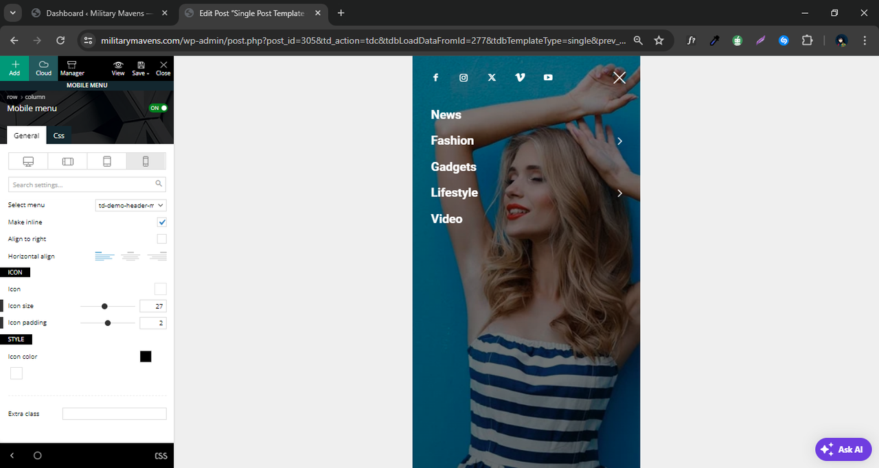
 LBN_2024
Hi Team,
We need your help to display our event page on the home page. We are using a plugin for upcoming events but are unsure how to add the event cards to the home page. I will share a sample to show how it should look. Please check it and let us know if this is possible.
1. https://drive.google.com/file/d/112ypY9vrs0WI33wGn31P5hm_flhD1APR/view?usp=sharing
2. https://drive.google.com/file/d/1ksreNbYWMoVAz-5Ke4ycXugHd4AV3fP3/view?usp=drive_link
I have shared two images: one for reference and the second showing where we want to place the event cards on the home page.
Thanks.
 digicom
 Hello,
Thank you for your feedback and for sharing your optimisation guides.
So, would you recommend that I use WP Rocket instead of Super Cache?
 nplus4925
 vijay_pathania
 Console gives nothing. When I’m trying to change the Ads code in the section and apply Save Settings it return the Saved response but when refreshing the Theme Panel page no changes done.
Please see the video in link: https://drive.google.com/file/d/1cxaat3uh4wmutAbJJPyldttva0TXlL1F/view?usp=sharing
 The Villager
I’m unable to drop new elements into the layout–I can only move existing elements around.
Here’s what it looks like: Dragging and dropping elements
 Bettina
 Hello!
I see that you solved the issue with article loading.
If you edit a template, then it looks like dummy data, not actually the template you use.
That element is the one that can share the post on social media: https://forum.tagdiv.com/social-sharing/
You can enable the option from the theme panel -> social/apis.
Thank you!
The Villager This doesn’t seem to be working. The sports category here has id 16 but when I input that in the tabbed content, I get no posts.
Thanks for the help!
 Calin
Calin Hi simchris, thank you for sharing with us the experience you had retiring the AMP plugin.
Thank you!
simchrisRIP blue bird. Twitter.com now switched to x.com and redirecting.
API links for auto tweeting of posts and sharing links still work (for now).
Presumably due to decade of inbound links and content the redirects should work for quite some time.
 knaggsy
 So let me get this right. The plugin for social sharing you put into the themes plugins, you no longer take responsibility for. You’ve just done this to me with the mobile plugin and the APM plugin saying they dont work anymore. Even if they don’t work anymore you’re still responsible for selling them as part of the theme. Maybe if you’d stuck to this being a newspaper theme instead of trying to now diversify it into a woocommerce theme the original plugins would work.
Yours, extremely disappointed.
The VillagerCan I add a third field here? If possible, how would I do so? Thank you
Website Link
image
knaggsyPreviously I could use the social sharing icons to share my post. On Facebook specifically, it would allow me to share to groups and pages. Now that option seems no longer to exist and the only sharing the post allows is to my own Facebook timeline. Could you please advise? https://labourheartlands.com/
Anamaria Hi,
This issue has already been discussed here: https://forum.tagdiv.com/topic/social-sharing-6/
Thank you!
 Atithya
 I tried with every row options and colour changing scheme also. No change in cls. I am sharing pagespeed report, please check mobile: https://pagespeed.web.dev/analysis/https-www-electronicsforu-com-electronics-projects-hardware-diy-40-metre-direct-conversation-receiver/osr2emsfgh?form_factor=mobile
 JBarrett
Hi – I’m putting together a website using the Urban Oberserver Template and the client would like to know if this particular widget still exists – Does anyone know what element this is and how to get this to work? It looks like the AUTHORS widget – but it doesn’t seem to have the customization elements needed to make this particular layout happen.
https://drive.google.com/file/d/1g8HthVhUfNOfTnmjgvSKEz_MzOwgURVl/view?usp=sharing


