Seashore
 Hi Buffalo,
This was what I did wrong: I should have selected in WP’s media library to display ‘full size’…
– Martin.
Seashore OK, I now think that it must have been a plugin. I downloaded and added it – so this question is solved now.
Seashore Thanks!
Seashore But I solved the issue by adding a row under the top part of the footer, with no content, a white background and a top margin of 1. Always better to look at these things in the morning with fresh coffee!
Thanks!
Seashore Ah, must be a browser related issue then. Too bad, I thought it would look rather slick.
https://seashore.nl/lijn.jpg
Thanks!
Seashore I should add that the homepage is a static page, and that everything else are posts.
Seashore Now I’ve managed to do what I want – I had problems where to select that particular area, but the video helped.
Thanks!
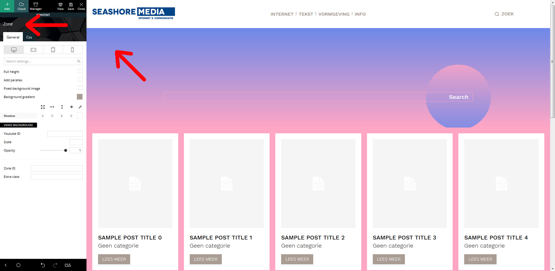
Seashore Hi, yes, I understand how it basicly works. But when I want to edit the background, it says “zone”. And in the “zone” settings, there’s nothing in the settings (‘general’, nor ‘css’) that corresponds with the blue to pink background gradient. Hence, I don’t understand how to edit this.
See: https://seashore.nl/uitleg.jpg
Thanks.
-
This reply was modified 5 years by
Seashore.
Seashore All is well now. Thanks!
Seashore Thanks!
– Martin.
Seashore Hi, I did find how to change the next/prevous icon hover colour. Still looking for the moving icon and the ‘go back up’ icon…
Seashore Hi,
I sent screenshots replying to the emailmessage, but they were refused by your firewall. However, since this issue is solved as I indicated above, there’s no need to send them anymore.
Thanks!
Seashore Thanks, setting the memory to 256M solved the issue.
Seashore Hi,
Thanks for your explanation. I realized that there is a workaround. For the category I want to display, I created a new user, and attributed this user as the author of the posts in that category. This way I can display the posts there that I want.
Thanks!
Seashore Here’s a smaple of what I get:
https://seashore.nl/nieuw/online-klantgegevens-en-de-wet/
The items in the Flex Block are smaller than in the “single more from author” also provided in this page, and the ‘previous’ and ‘next’ items (vorig artikel / volgend artikel) do not correspond with waht is displayed in the Flex Block.
Thanks,
Martin.
Seashore Update: I copied all styles, but what I get is simply the same as if I would import Flex Block 1 and select a category there. Not the nice lay out of the “single more from author” element, and not the previous and next item – just the most recent. How to solve this?
Regards,
Martin.
Seashore Hi,
I have the Cloud Library plugin activated, but should I also import the Template Builder, and if so, from where? Because your image shows an “edit template” tag above your screen, while I see “edit template” in the left hand side template menu. Or is that the same?
Second, when you click “copy style”, you get five options. Which one should I select?
Cheers,
Martin.
Seashore I know how to change the backgroud colour, but I want to change the text colour for the inline text element. I can not find where I should edit this. I just discovered that this is the “links colour” in “general style”.
Regards,
Martin.
-
This reply was modified 6 years by
Seashore UPDATE: I gave the logo white space above and under, and that’s what does it. Problem solved now.
Thanks!
Martin.
Seashore Hi,
Concerning logo alignment, that’s what I did, but our logo is too big. Uploading a smaller version gave it a centered position. However, I managed to center the larger logo by adding values for the horizontal margins in css.
About the second question. If you look at https://seashore.nl/nieuw/homepage-test2/, you see that the space above and under the logo does not have a white background. What I want is that the entire box where the logo sits has a white background. Is that possible? Or does it require to add white space in the logo itself?
Thanks,
Martin.
Seashore OK, I see the problem – I simply should have selected on WP’s media library ‘full size’… My apologies to have bothered you with this!
Thanks,
Martin.
Seashore Err, well, no. I do use photos with the correct dimensions, I understand that. Like I said, for this page I used the same photo the template uses: https://seashore.nl/nieuw/homepage-test/
It’s dimensions are 1920 x 1440 pixels.
And for this page, I even used a 3504 x 2336 photo:
https://seashore.nl/nieuw/homepage-test2/
Blurry again.
It seems that Newspaper somehow converts the photos to a kind of smaller ‘thumb’ with a 1024 px width.
Seashore Hello,
I was running version 9, but upgraded to 10 this morning. And now everything is there.
Thanks!
Seashore Btw, when I go to Cloud Templates, click ‘add new’, I simply do not get the option to go to the Cloud Library and select a category. I ‘ve tried both in versions 9 and 9.5. Both to no avail. And I do have the tagDiv Cloud Libray plugin activated.
Seashore .